Skip to content Skip to sidebar Skip to footer
Good contrast versus poor contrast.

Color Contrast: Infographics and UI Accessibility

Sufficient color contrast is a prerequisite for readable text and accessible websites, and visual contrast has a significant role in the updated Web Content Accessibility Guidelines (WCAG 3.0). Unfortunately, contrast is often given secondary importance by designers in lieu of other design elements. This article discusses color contrast for text readability and user interface design,…
Inclusive Design

Inclusive Design (Book Review)

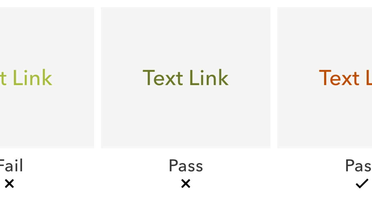
Inclusive Design for a Digital World includes practical advice and strategies for designing inclusive and accessible products that take into consideration best practices used around the world. These strategies also ensure that people who have auditory, cognitive, neurological, physical, speech, visual disabilities, or situational challenges with access are fully able to use products we design.
Photo of a pizza on a plate on a table

Technology Moats: The Dark Pattern of Intentional Friction Barriers

Corporations desire to hear their customer complaints…or do they? We take a close look at ways companies use technology to raise the drawbridge on customers. Technology barriers exist for many reasons; some are good and some are bad. Automated customer service systems can speed up the support process for customers while cutting costs for businesses.…
E-mail
Password
Confirm password