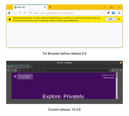
Get a sense of users’ expectation mismatch when using a privacy-first browser versus how the browser needs to work to protect privacy.
Variable fonts are here, and they’re going to change how you think about the relation between typography and user experience.
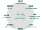
Design systems require significant organizational effort. Its champions can follow these practical tips to gain buy-in and create a clear vision for its future.
Nielsen’s heuristic evaluation is one of the standard usability assessment tools outside of actual testing, but it has failed to adapt to the changing ecosystem of design.
Use big data and analytics to enhance traditional static navigation and intelligently anticipate the type of content that your users are trying to reach.
Handling a security breach has UX implications. Three case studies of how Home Depot, Wendy’s, and Omni Hotels responded to such incidents show how to maintain and regain customer trust after a breach.
When you design a website for a fundraising event, there are many roles to consider, each with different needs. Untangling the relationships and roles is the critical first step.
Understanding our user’s needs, inspiring positivity, being forgiving, respectful, and even humorous can help provide users with a more effective and satisfying interaction.数字界面是其创造者的延伸,用户每次与这些界面交互时都会感受到创造者的个性。这解释了为什么需要“以人为本”的设计。디지털 인터페이스는 창작자의 연장이므로 사용자가 인터페이스를 접할 때마다 인터페이스는 창작자의 성격을 인식하게 됩니다. 이것이 ‘사람 중심 디자인’이 필요한 이유입니다.As interfaces digitais são uma extensão de seus criadores, e sempre que um usuário interagir…
This updated edition of a text about designing user-interfaces is testament to the evolution of these and other related topics the past two decades.