Localizing your site for Asia may mean a radically different design, brand-new elements, or country-specific SEO.

“Designing in the browser” is a method that allows designers to efficiently create and make changes to a responsive prototype intended to render of a variety of display sizes. 通过“在浏览器中设计”这一方法,设计人员可以高效地创建和更改显示在各种尺寸的显示屏上的响应原型。“브라우저에서의 설계”는 설계자가 다양한 디스플레이 크기에 맞게 결과를 만들어줄, 반응이 좋은 프로토타입을 생성하고 이것에 변화를 줄 수 있도록 하는 기법입니다. “Projetar no navegador” é um método…

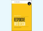
A review of Responsive Web Design by Ethan MarcotteMaking a case and practical instruction for creating a design that scales based on platform.In his new book “Responsive Web Design,” Ethan Marcotte makes a case and offers practical instruction for creating a design that scales based on platform.In his new book “Responsive Web Design,” Ethan Marcotte…
