This is an introductory paragraph. Maybe it’s the very beginning of the article. And, it introduces a collection of examples relevant to the article, like images of people in a workshop.
Image Browser: Examples of Visualizations
These visualizations link to the interactive page, so you can see them in action.
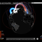
Google’s Small Arms Imports & Exports visualization displays a spherical image that invites readers to explore by rotating it. As the visualization loads for the first time, a short animation reinforces this intuition. Users can filter by country. This view enables users to compare the volume of exchanges of the selected country with that of its business partners.
View on Google
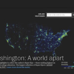
The macro view of Washington: A world apart, illustrates relative income and education levels by zip code in the US. A color scheme distinguishing degrees of education and income enables users to perceive the geographic distribution at a glance.
View at the Washington Post
Scientific American’s Flavor Connection represents flavor commonalities in various foods. The abundance of graphic elements makes for difficult interpretation and tricky interaction. Also, this macro view doesn’t lead to any specific conclusion and few trends are apparent. A view emphasizing the relationships between entities would be more appropriate.
View on Scientific American
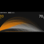
The U.S. Gun Deaths site provides an excellent primer, using an animation to show the user how to interpret what they see. The yellow section of the graphic indicates the how long victims of gun crime live, while the gray section indicates how many years were stolen from the victims’ lives.
View on Periscopic
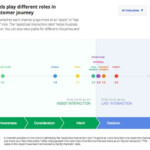
Google’s Customer Journey to Online Purchase represents different channels of communication as a function of their importance in the purchase decision. But because it provides no indication of how to interact with it, the behavior appears unpredictable.
View on Think with Google
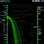
Peoplemovin illustrates the flow of immigration through various countries. As the visualization loads, an animated instruction shows the reader how to interact. Information is communicated simply and the indicator of how to interact with it is unobtrusive and easy to spot.
View on PeopleMovin
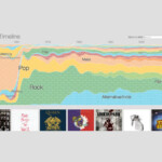
Concerthotels.com’s 100 Years of Rock reveals its content progressively, so that the logic of the visualization – a timeline – gradually becomes clear. The animation ends on an instructive note, explaining what the user needs to do to continue to explore the data (i.e., click on a musical genre.)
View on ConcertHotel
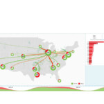
FlightAware’s Misery Map shows the proportion of delayed or cancelled flights at several U.S. airports. The abundance of graphic information, the fact that it changes continually and the absence of cues as to how to interact with it leaves viewers at a loss.
View on FlightAware
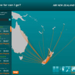
Air New Zealand’s “How far can I go?” presents a simple and specific message. It’s great power is in showing nothing more than what vacationers really want to know: where can I go given my budget?
View on Air New Zealand
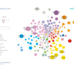
This health InfoScape visualization from GE illustrates the relationship between various health issues and medical practices. Because its message lacks specificity, no clear conclusion surfaces.
View at MIT
Google’s Music Timeline illustrates music trends since the 1950s. It emphasizes the popularity of each trend at different points in history. The visualization uses animations for transitions, which enable readers to understand the relationship between one view and another.
View on Google
In selecting a country on The Refugee Project, an animation shows where refugees have come from and where they arrived. This enhances the quality of the narration. The micro view reveals detailed information about the selected country.
View at the Refugee Project.
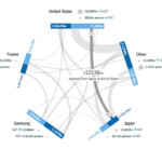
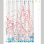
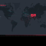
This GED VIZ visualization illustrates fiscal transactions between countries. As the reader hovers, it becomes clear that the user is about to reveal more details about the exchange.
View on GEDVIZ
And, now we’re back to the text in the article
Another header
The text goes on here.