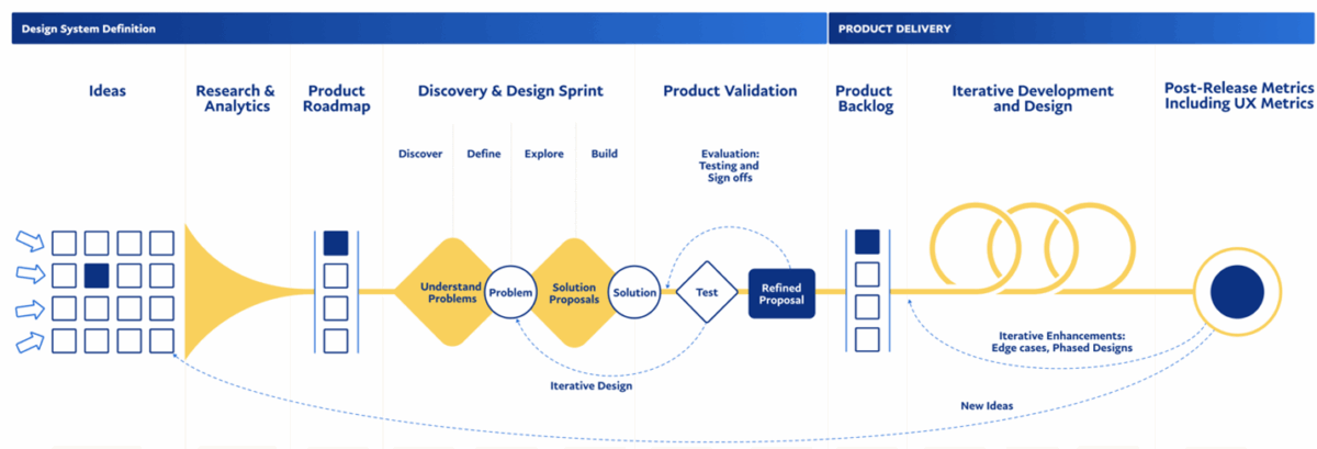
…these interactions, the product team can quickly understand which interactions could be improved through software or indirectly modified or affected through the introduction of software (see Figure 1). Figure 1….
…experiences, motion elements and micro-interactions can enhance usability and engagement. If data indicates that a new interaction pattern improves accessibility or simplifies a workflow, designers must collaborate to test, validate,…
…efficiency of Sync interactions compared to manual interactions. Surprisingly, we found that, on average, tasks were completed faster using the iPod and cell phone than when using Sync. Users took…
Jim Thatcher, co-author of Web Accessibility: Web Standards and Regulatory Compliance and a noted accessibility expert, has a great way to think about accessibility. He says, “I’ve gotta be able…
…hire me as an interaction designer. It was at the startup where I learned the basics of interaction design from some amazingly talented and generous people. When that startup needed…
…say, conversation designers need to also consider the overall interaction with the user: Set user expectations early. Use a common language. Enable users to have flexibility in interaction. Design to…
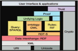
…interaction. This can be done in other ways, but the Semantic Web’s focus on relationships between data and common data formats facilitate this interaction, and means that anyone can share…
…She says, “I think that happened because there was so much peer review interaction as well as instructor interaction during the course, even though it was entirely asynchronous.” Other students…
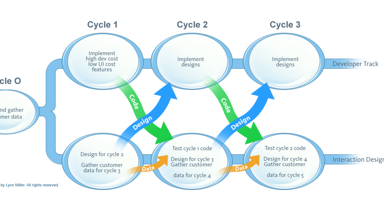
…and interaction design work taking place in the Interaction Designer Track, which is exemplified by Lynn Miller’s diagram in Figure 1. The Sy and Miller model has been exceptionally helpful…
…division has a standalone UX team that acts on a consultancy basis to other projects, loaning out our interaction designers (and our dedicated developer) as needed. Since our developer is…