…elements that assist users in presenting familiar UI controls with established interaction methods. Such phones are driving mobile web use disproportionate to their handset market share. Nonetheless, there is still…
…should work as expected The user should always know how things are going Interaction should be distraction-free Things Should Work as Expected Users bring expectations to every experience. When these…
…user will experience and judge the artifact during the usability test. When Does Interaction Really Occur? In these cases, interaction took place long before the research study: seeds of expectation…
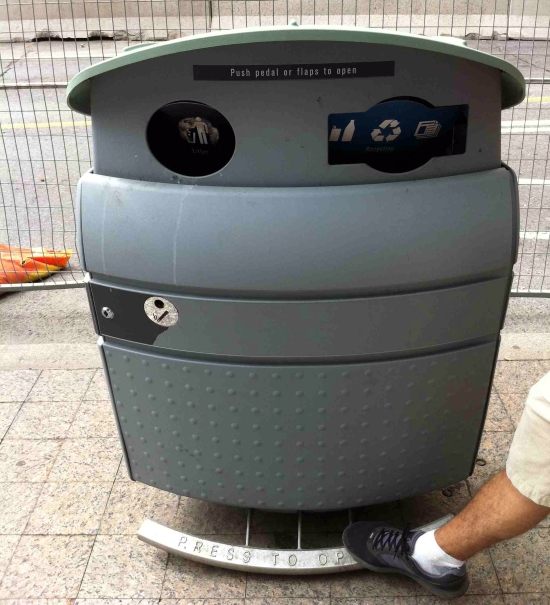
…mundane, utilitarian interactions would have been figured out by now; yet, it is surprising how basic tenets of usability are often disregarded in high-use public environments. Most of us in…
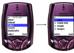
…to the contextual usage of words in the local dialect. Information Architecture The information architecture (IA) for these applications needed to be optimized for repeatable, efficient, task-based interactions. Additionally, we…
…touch screen table could accommodate six players at a time, which encouraged collaborative interaction, but limited the visibility of game elements. Unlike Call of Duty or Assassin’s Creed, our game…
…the competitions included entertainment, finance, tourism, relationships, and communication. Competitors worked in a variety of user-centered design disciplines, such as interaction design, industrial design, media design, communication design, and architecture….
…captured through user interactions with a product. This is where design comes into play. An interface must be designed that users can interact with in a way that’s helpful to…
…a digital product to capture interactions, I needed to find a new method to record this. I also needed a way to send different surveys to participants each day of…
…cultural diversity is matched by differences in the way people conduct business and—getting closer to our main topic—how business models or interaction styles cannot be adopted in a one-size-fits-all style….