Information visualization, the practice of representing a set of data visually, has been an infatuation of UX design for some time now. The method is meant to make data easy to understand and to communicate. But how often have we seen impressive graphical representations of data where we hadn’t the slightest idea of what the creator was trying to explain? So many visualizations fail to incorporate basic UX principles.
Add the element of interactivity and the data may become even more muddled. In static visualizations, an entire set of data needs to be understood at a glance. But interactive displays enable readers to freely explore an entire data set, or to focus on a specific subset of that data. The increased complexity and level of specificity could easily cause more confusion than comprehension.
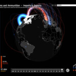
Google’s Small Arms Imports & Exports visualization displays a spherical image that invites readers to explore by rotating it. As the visualization loads for the first time, a short animation reinforces this intuition. Users can filter by country. This view enables users to compare the volume of exchanges of the selected country with that of its business partners.
View on Google
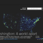
The macro view of Washington: A world apart, illustrates relative income and education levels by zip code in the US. A color scheme distinguishing degrees of education and income enables users to perceive the geographic distribution at a glance.
View at the Washington Post
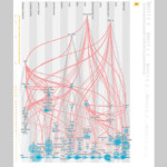
Scientific American’s Flavor Connection represents flavor commonalities in various foods. The abundance of graphic elements makes for difficult interpretation and tricky interaction. Also, this macro view doesn’t lead to any specific conclusion and few trends are apparent. A view emphasizing the relationships between entities would be more appropriate.
View on Scientific American
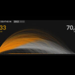
The U.S. Gun Deaths site provides an excellent primer, using an animation to show the user how to interpret what they see. The yellow section of the graphic indicates the how long victims of gun crime live, while the gray section indicates how many years were stolen from the victims’ lives.
View on Periscopic
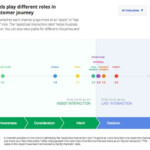
Google’s Customer Journey to Online Purchase represents different channels of communication as a function of their importance in the purchase decision. But because it provides no indication of how to interact with it, the behavior appears unpredictable.
View on Think with Google
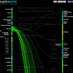
Peoplemovin illustrates the flow of immigration through various countries. As the visualization loads, an animated instruction shows the reader how to interact. Information is communicated simply and the indicator of how to interact with it is unobtrusive and easy to spot.
View on PeopleMovin
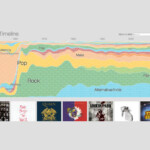
Concerthotels.com’s 100 Years of Rock reveals its content progressively, so that the logic of the visualization – a timeline – gradually becomes clear. The animation ends on an instructive note, explaining what the user needs to do to continue to explore the data (i.e., click on a musical genre.)
View on ConcertHotel
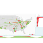
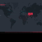
FlightAware’s Misery Map shows the proportion of delayed or cancelled flights at several U.S. airports. The abundance of graphic information, the fact that it changes continually and the absence of cues as to how to interact with it leaves viewers at a loss.
View on FlightAware
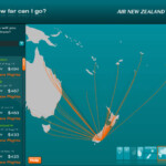
Air New Zealand’s “How far can I go?” presents a simple and specific message. It’s great power is in showing nothing more than what vacationers really want to know: where can I go given my budget?
View on Air New Zealand
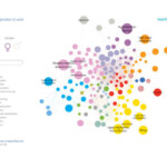
This health InfoScape visualization from GE illustrates the relationship between various health issues and medical practices. Because its message lacks specificity, no clear conclusion surfaces.
View at MIT
Google’s Music Timeline illustrates music trends since the 1950s. It emphasizes the popularity of each trend at different points in history. The visualization uses animations for transitions, which enable readers to understand the relationship between one view and another.
View on Google
In selecting a country on The Refugee Project, an animation shows where refugees have come from and where they arrived. This enhances the quality of the narration. The micro view reveals detailed information about the selected country.
View at the Refugee Project.
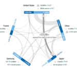
This GED VIZ visualization illustrates fiscal transactions between countries. As the reader hovers, it becomes clear that the user is about to reveal more details about the exchange.
View on GEDVIZ
There are six basic principles to help you create effective information visualizations and interactive experiences. The accompanying slideshow offers example visualizations, along with explanations for what makes them succeed or fail.
1. Know your Role
With a visualization, you are telling a story. And like any good story, a good information visualization conveys information progressively. Your story should have three elements: a primer, a plotline/storyline, and a conclusion.
In an interactive visualization, the primer may take several forms, including:
- Animation to introduce the visualization
- Instructional text to explain the visualization
- Instructions that are revealed gradually as the user interacts with the visualization
In the primer, it’s important to reveal the purpose of the visualization and how the interactions work. The big “What should I understand here?” or “Why should I care about this?” is often expressed in the title. Clues about how the visualization functions are generally given in textual or symbolic form as an invitation to interact.
The storyline is where the user reads and interacts with the visualization. It steers the user to a conclusion. Then the conclusion is the takeaway—what the user retains after interacting with the visualization.
2. Define the Message
Before you start to structure information in a visualization, it’s crucial to identify what you’re trying to communicate. All the stylistic and structural decisions you’ll make should support the transmission of this message. Steer clear of vague or sweeping goals such as, “We’ve got a set of data that we want to represent.” An information visualization isn’t an exercise in data synthesis; it’s an exercise in making data understandable to a wide audience. Far beyond representing data, a well-designed information visualization makes data compelling, guides users in interpreting it, and engages them to draw a conclusion. An absence of guidance places the burden of interpretation entirely on users, alienating all but the most rigorous and motivated, and therefore diminishing the project’s impact.
Two qualities mark a well-crafted message:
- Simplicity: A message that’s easy to understand will have more impact than a message that isn’t.
- Specificity: A precise, narrowly defined message enables the user to draw a meaningful and relevant conclusion. A vague or ambiguous message may lead to a vague or ambiguous interpretation.
3. Structure your Visualization
A visualization may have up to three levels of specificity, or three views onto a given representation of data: the macro, meso, and micro views. Each affords a different interpretation of the information. When developing a strategy for your message, be sure to define the appropriate level(s) of specificity and set the order in which you’ll expose readers to these views, so as to support them reaching a conclusion.
- Macro (or systemic) view. The macro view presents the entire set of data. It’s typically used to communicate patterns or trends in the dataset rather than to surface specific data. These patterns or trends are central to a visualization’s message.
- Meso (or local) view. The meso view of a visualization presents data in a way that’s detailed enough to let users distinguish individual data points, compare them with one with another, and spot similarities and differences. Make use of this view to provide context for the data that’s displayed. At this level, avoid bombarding users with more details than they can reasonably absorb. Instead, enable users to isolate and examine a subset of the data by allowing them to zoom in on a section of a visualization, for example, or by positioning elements in 3D space.
- Micro view. The micro view reveals detailed information or explanations of individual segments of the data. These details typically appear when an individual segment of the data visualization is selected.
4. Format your Visualization
Although the structure of your visualization is crucial, structure alone won’t guarantee effectiveness. Stylistic choices can make or break the quality of an information visualization experience. Here are some aspects to consider.
Emphasize important elements
When making stylistic decisions, aim to guide users in reading the visualization. In doing so, the following strategies suggested by gestalt principles are helpful.

Group by proximity. Elements that are close to one another are perceived to belong to the same group (Figure 1). In creating your visualization, ensure that unrelated elements aren’t inadvertently grouped together. On the flip side, placing related elements beside one another in space will reinforce the perception that they are related.
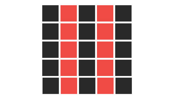
Group by similarity. By the same token, elements with similar visual characteristics for example, color, shape, or size, are perceived to belong to the same group (Figure 2). Again, it’s important to be sure that no visual groups are inadvertently created in your visualization. Use this strategy to highlight similarities between elements. You might decide to use the color red to identify all problematic elements. Or you might accentuate the differences between two groups by creating contrast in their shape or size. Use grouping by similarity wisely, preferably to distinguish two or three groups at most. Above this limit, too many visual characteristics compete for attention and make it difficult to decipher the main focal points.
If too many groups are portrayed in a visualization, it becomes important to prioritize the information according to the message you’re trying to convey. Generally, you’ll want to emphasize one category of information at a time. Use animations or a navigation scheme to enable users to transition from one category of data to another. And help the reader focus by highlighting information at the right time.
5. Then Add Interactivity
Interactive visualizations have an advantage over static visualizations in that they convey a message in multiple steps. This creates a narrative that encourages readers to move from one step to the next. After all, engaged readers retain a message more effectively than passive ones. Only after the foundation and direction of the visualization are set do you decide the interactive elements.
Clicks, taps, and other gestures
Clicks or taps are the most prominent interaction paradigms for information visualizations. If other gestures (scroll, pan, etc.) trigger behavior, it’s important to make them obvious to the reader. Choose your gestures wisely; not all visualizations lend themselves naturally to all gestures. Rotating a spherical visualization, for instance, would be more intuitive than rotating a linear one.
Guidance and anticipation
Enable the reader to anticipate the effect their clicks, taps, or other gestures will have. For example, if a user may filter data by clicking on a heading or other visual element, make this behavior obvious so that user doesn’t have to guess what will happen.
Animated elements
Animation reveals information gradually rather than all at once. This creates a narration that works well if your visualization tells a particularly complex story.
Animation also is useful in transitioning from one view of the visualization to another, say, from a macro to a meso view. In some cases, animated transitions are useful in orienting the user. A zoom animation may help readers understand that they’ve focused in on a specific region of the visualization.
Animation may also be used to draw attention, give further explanation, indicate what a reader should do next, or demonstrate how to interact with the visualization.
6. Choose Graphical Treatment and Copywriting
Once you’ve defined your visual communication strategy, you’ll need to decide what sort of graphic treatment and textual tone will best convey your message, support your structure, and enforce your style. Generally, you’ll want to turn to specialists in information and graphic design to ensure that your graphic treatment and tone of voice coheres with the message you’re trying to convey.
Putting it Together
In summary, focus on defining the message of your visualization and create the story you’ll use to convey it. As the storyteller, how will you set up the story (for instance, what will users see first)? How will the story unfold (what different views will users be exposed to, and how will they interact)? Above all else, an interactive visualization is meant to be useful. It conveys a message and generates understanding without imposing the burden of interpretation on the reader. An interactive information visualization is a story in which readers play an active listening role. The easier it is to understand, the more impact it will have.
Happy designing!
[bluebox]
More reading
- Making Data Visualizations – A Survival Guide by Gregor Aisch
- Data Visualization – Best Practices by Jen Underwood
- I Like Pretty Graphs – Best Practices for Data Visualization Assignments by University of Wisconsin-Madison DesignLab (video)
- Top Trends in Data Visualization 2013 by Scott Murray (video)
- Beyond The Pie Chart: Creating new visualization tools to reveal treasures in the data by Hunter Whitney (UX Magazine)
- Five Steps to Storytelling with Data by Dominic Quigley (UX Magazine)
- Gestalt Psychology from Wikipedia.
[/bluebox]
信息可视化是指通过可视形式显示一组数据的做法,旨在使数据易于理解。但是,有很多信息可视化方式难以解读,并且目的不明确。成功的交互式信息可视化就像讲故事,可以让阅读者成为积极的倾听者。它们能够传达信息并帮助理解。本文对可视化进行了分析,说明了实现有效可视化的方法,并介绍了构建有效的信息可视化和交互体验的原则。
정보 시각화, 즉 일련의 데이터를 시각적으로 표현하는 방법들은 데이터를 이해하기 쉽게 만들려는 것입니다. 그러나 많은 정보 시각화들이 이해하기 어렵고, 사람들의 목적도 분명치 않습니다. 성공적인 쌍방향 정보 시각화는 독자들이 적극적인 청자(듣는 사람) 역할을 하도록 이야기를 이끕니다. 메시지를 전달하여 이해를 얻어내기도 합니다. 무엇이 시각화를 작동하게 하는가에 대해 시각화가 분석되며, 효과적인 정보 시각화 및 쌍방형 경험을 창조하기 위해 원칙들이 제공됩니다.
A visualização de informações, que consiste em representar de forma visual um conjunto de dados, tem a finalidade de facilitar a compreensão de dados. Mesmo assim, muitas visualizações de informações são difíceis de interpretar, e seu objetivo não é claro. As visualizações de informações interativas bem-sucedidas contam uma história na qual os leitores desempenham uma papel ativo de ouvintes. Elas transmitem uma mensagem e geram entendimento. As visualizações são analisadas de acordo com o que as faz funcionar, e princípios são oferecidos para criar visualizações de informações e experiências interativas eficazes.
O artigo completo está disponível somente em inglês.
情報の視覚化、つまり一連のデータを視覚的に表現することで、データは理解しやすくなる。しかし、視覚化された情報の多くは解釈し難く、その意図も明確ではない。インタラクティブな情報がうまく視覚化されれば、そこに語られるストーリーの中で読者はアクティブな聞き手の役割を演じることができる。そのような視覚化はメッセージを伝達し、理解を生み出す。視覚化というものが「どうしたらそれがうまくいくか」という観点から分析され、効果的な情報の視覚化とインタラクティブな体験を作り出すための原則を共有する。
La visualización de información, es decir, la práctica de representar de forma visual un conjunto de datos, está diseñada para facilitar la comprensión de datos. Sin embargo, muchas visualizaciones de información son difíciles de interpretar, y su propósito no es claro. Las visualizaciones interactivas de información exitosas cuentan una historia en la que los lectores desempeñan un rol activo de oyentes. Transmiten un mensaje y generan comprensión. Las visualizaciones se analizan según lo que las hace funcionar, y se ofrecen principios para crear visualizaciones de información y experiencias interactivas eficaces.
La versión completa de este artículo está sólo disponible en inglés