With tight user research budgets it may be difficult to afford the cost of statistical analysis software such as SPSS or SAS, or the subscription fees charged by online card sort providers. There are alternatives.
Here are detailed instructions on how to conduct, interpret, and present the results of remote, unmoderated card sorts using only free software (LibreOffice or OpenOffice, and the statistical analysis suite R).
Out of the free suites of office software (analogous to Microsoft Office) the most complete are LibreOffice (www.libreoffice.org) and OpenOffice (www.openoffice.org). Of course if you already have Microsoft Office, you don’t need additional office software. Just use PowerPoint instead of Impress, and Excel instead of Calc.
[bluebox]
What is Card Sorting?
Card sorting, one input in a user-centered design process, involves users sorting a series of cards into groups that make sense to them. Each card is labeled with a piece of content or functionality. These cards can help generate an overall structure for your information, as well as suggestions for navigation, menus, and possible taxonomies.
Characteristically a low-tech approach using index cards, card sorting has evolved to include sophisticated online software programs. Various statistical methods can be used to analyze the data. The purpose of the analysis is to extract patterns from the population of test subjects so that a common set of categories and relationships emerges. This common set is then incorporated into the design of the environment, usually the information architecture.
[/bluebox]
Types of Card Sorts
There are three key methods for conducting a card sort:
- Open card sort: Usually the first card sort conducted in a series, an open card sort is suitable for exploratory research. Participants can create as many categories as they want for the content items and they can label the categories in any way they want.
- Closed card sort: All the category labels are provided, and participants don’t add any categories of their own in a closed card sort. It is useful either as a validation exercise after an open card sort has already been conducted, or in cases where the categories have already been defined and the only question remaining is how cards should be assigned to those categories.
- Hybrid card sort: As the name suggests, a hybrid card sort is a mixture of open and closed sorts. It provides a set of categories, but also allows participants to add one or more categories of their own if they do not think the cards fit into the pre-existing categories.
Whatever type of card sort you intend to perform, you must have the cards to show participants in your study.
Try to test at least 15 participants. Jakob Nielsen, in his article “Card Sorting: How Many Users to Test,” says that 15 is the minimum acceptable number of participants for card sorts.
Prepare the Cards to Share
To share cards with remote test participants, create a slide show using PowerPoint, Impress, or another presentation software.
Step 1: Create Randomly Ordered Cards
Using either Calc or Excel, you can create card labels in random order by following these steps:
- Enter card labels in Column A, one card label per row
- In Column B, beside each card label, enter the function =RAND()
- Copy Column B.
- Use Paste Special with only Numbers selected in Calc, or only Values selected in Excel, to paste Column B into Column C.
- Delete Column B.
(Steps 3-5 are included because RAND() updates every time you make any edits, including Sorting.) - Select All and Sort on Column B (now the only column with numbers)
Step 2: Prepare the Cards to Share
Create one slide for each card, using the random order you generated previously. Enter the full set of cards into a single presentation file.
Narrow the slide margins and set the font so that the font is as large as possible, but do not use different font sizes or margins for different cards. The fonts must be large enough for the cards and category labels to be legible in the slide sorter view where participants will rearrange the order of the cards.
Before the first card slide, insert one instructions slide and one or more category label slides, which are slightly different for open, closed, and hybrid card sorts.
- Open card sort slides. For open card sorts (where all categories are created by participants), include one category label slide, but instruct participants to copy and edit that slide for each of their categories (Figure 1).
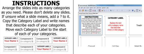
- Closed card sort slides. For closed card sorts, include one category label slide for each of the predetermined categories (Figure 2).
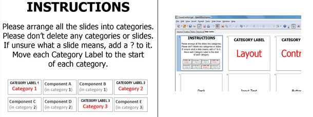
- Hybrid card sort slides. For hybrid card sorts (where some categories are predetermined, but participants can also create their own categories if they want), include one category label slide for each of the predetermined categories, plus a special category label slide for participants to copy and edit. For hybrid card sorts the instructions will end, “If you need to, you can add new categories by copying and editing the first category label slide and renaming your categories.”
Step 3: Save and Share Your Card Sorting Slides
Immediately before saving the file, change the view to Slide Sorter and configure the view to maximize the number of visible cards. If a presentation is saved in Slide Sorter view in PowerPoint, reopening it in PowerPoint will reopen it in Slide Sorter view, in the same state you previously configured. Unfortunately, Impress reopens files in Normal view not Slide Sorter view, so to be on the safe side, give participants instructions on how to change the view to Slide Sorter. It is safest to save your presentation in PowerPoint (.ppt ) format, as this is most widely compatible.
Now you can share your file with your test participants. Either upload it to a location that prevents editing of the file and email participants the URL, or email them individual copies of the file, preferably with unique file names.
Participants simply arrange the card slides and category label slides into the order that shows how they categorize the cards, and email their edited file back to you.
Analyze the Card Sort Data
Coding card sort data is so straightforward it can be done with even the simplest text editor. But since you have access to Calc or Excel, using either of those programs is easier.
Step 1: Enter Data
In your spreadsheet software, enter the data from the participants.
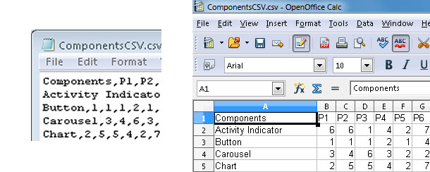
- Set aside the first row as a Header row. In cell A1, enter the label of whatever you’re sorting (Component, Command, Feature, Webpage, etc.).
- In cells B1 and rightwards, enter the label for each participant. One participant’s data occupies one column of the file.
- Enter the card names in Column A (cell A2 and downwards) in alphabetical order for your own ease in coding.
- For each participant, every card in that participant’s first category is given the code of 1. Just type 1 in that card’s row. All cards in that participant’s second category are coded 2, and so on. The order of categories doesn’t matter, so it’s easiest to just go through the participant’s file, using that order of categorization.
- Save the data in .csv format for import into the R statistical analysis program. CSV is simply Comma-Separated Values and can be produced in any text editor (Figure 3).
Step 2: Conduct Hierarchical Cluster Analysis
R is a free, highly customizable environment for conducting statistical analyses. For the analyses in this article, R is all you need. Download R from www.r-project.org.
However, if you would like to use R for other purposes, it’s an excellent idea to also install RStudio. RStudio is a free IDE, which makes R much easier to use. Download RStudio from www.rstudio.com. There are many sites with manuals and tutorials for configuring and using R and RStudio.
To analyze your card sort with an average weighted Hierarchical Cluster Analysis (the usual statistical method for analyzing card sort data), type the four commands below into R’s command window, one command per line. Replace the variables (ImportedDataName and ClusterAnalysisName) and the cell names with your own values, but don’t change anything else. These four commands assume a data file with a header row, as in the previous section. The third command assumes 15 participants.
ImportedDataName <- read.csv("C:/My Documents/
DirectoryName/CSVFileName.csv")

rownames(ImportedDataName) <- ImportedDataName$A1CellContents

ClusterAnalysisName <- hclust(dist(ImportedDataName[,
c("B1CellContents", "C1CellContents", "D1CellContents",
"E1CellContents", "F1CellContents", "G1CellContents",
"H1CellContents", "I1CellContents", "J1CellContents",
"K1CellContents", "L1CellContents", "M1CellContents",
"N1CellContents", "O1CellContents", "P1CellContents")]),
method = "average")

plot(ClusterAnalysisName)
All four commands should run without returning any messages in R’s command window. The only output is a dendrogram plot, which opens in a separate plot window. If the dendrogram looks too crowded, drag the plot window to expand it, and/or use the Resize menu option in the plot window. You can save your dendrogram in .bmp, .emf, .eps, .jpg, .pdf, .png, and .tiff formats.
Once you’ve saved your dendrogram, it’s a good idea to copy your commands and paste them into a text file so you can easily rerun them later. When you close R, it will ask if you want to save a workspace image; you don’t need to, so click No.
Step 3: Edit Dendrogram Images
Saving your dendrogram is only the start.
The dendrogram plot that R generates (Figure 4, left) is rotated 90° counterclockwise. For ease of reading the cluster labels and the Height axis, I strongly recommend rotating the image 90° clockwise. At the same time I also delete extraneous text labels (Figure 4, right). This can easily be done using either a free image editor such as Inkscape (www.inkscape.org), or using a simple image editor bundled with your OS, such as Microsoft Paint.
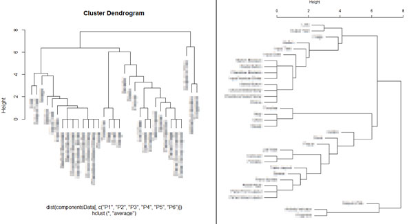
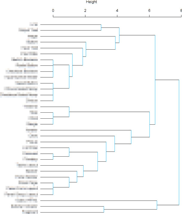
R’s dendrogram plot puts card labels shortly after their final branch. This format has the advantage that the labels visually reinforce the location of branches.
However, I prefer to use SPSS’ dendrogram format. As well as manually rotating the dendrogram in Inkscape, Microsoft Paint, or another bundled or free image editor, I also manually move all card labels to Height 0 and extend all label lines down to Height 0. This dendrogram format has the advantage of allowing a mnemonic that makes the relationship between clusters and cutoff explicit (which is especially useful when introducing new stakeholders to dendrograms): the number of clusters always equals the number of lines crossing the cutoff, no matter where the cutoff is set. I also manually color all branch lines to draw the eye to them, since they are crucial to interpreting dendrograms (Figure 5).
Step 4: Interpret and Present the Dendrograms
Now that you have your dendrogram edited, you have to interpret it. Interpretation is not a cut and dried process. I strongly recommend setting a cutoff at several heights (at the highest and lowest branches, and at least one intermediate height, preferably several).
You will also want to make explicit the different clusters that result from setting the cutoff at different heights. Rather than editing the dendrogram image itself, place several copies of the dendrogram image into separate slides in Impress or PowerPoint, and add cutoff lines at different heights, and circles around different clusters, from inside the presentation software.
Showing a series of dendrograms with cutoffs set at different heights helps stakeholders understand these key facts about interpreting dendrograms.
The number and variability of clusters you get from any dendrogram depends on where you set your cutoff. Where you set your cutoff depends on how much sense is made by the resulting clusters of cards (Figure 6). When the cutoff is lower:
- There are more clusters
- There are fewer cards within each cluster
- Variability within clusters is lower
Collating all these dendrograms into a single Impress or PowerPoint file is an easy way to present them in a meeting. I precede the dendrogram slides with a couple of slides summarizing how to interpret dendrograms. The slides contain the following points:
- Dendrograms show how tightly or loosely different items cluster together.
- You can split items into sets of clusters of varying degrees of cohesion by varying the height of the cutoff line. The height of the cutoff line determines how much variability you will have in your clusters.
- When the cutoff line is low, variability within clusters is low and there are many tight clusters containing a few cards.
- When the cutoff line is high, variability within clusters is high and there are a few loose clusters containing many cards.
- The blue vertical lines show the heights at which clusters divide.
- The number of horizontal lines crossing the cutoff is the number of clusters.
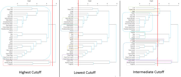
Highest Cutoff: Don’t Group Together
The first branch in a dendrogram is of particular interest. The resulting two clusters of cards should never be placed in the same category
If the first branch separates just a few cards from the majority (as in this example), then it’s often the case that participants didn’t know what the labels on those few cards meant, or weren’t sure how to categorize them, or both. In open or hybrid card sorts, cards in minority first branches tend to be placed in an “Other/Miscellaneous” or a “Don’t know” category (Figure 6-left).
Lowest Cutoff: Don’t Split Apart
The branches that split at Height 0 are also of particular interest. The members of these clusters usually should not be split into different categories (Figure 6-center).
An exception to this rule is where label similarity has influenced results. Cards may be grouped together simply because their labels are similar, even though their actual functions differ. (Presumably, the labels can’t be changed to reduce similarity: If they can, then of course this should be done before the card sort.)
If you have cards whose labels are similar but whose functions are dissimilar, then along with asking participants to sort cards into categories, you could also ask them to describe the functions of any cards with similar labels so you can determine whether similarity of labels may have biased their categorization.
Intermediate Cutoffs
In most cases, setting the cutoff at some intermediate height is the most useful. The data is grouped into a manageable number of clusters, members of which are close enough in meaning to make the nature of each cluster easy to interpret and label (Figure 6-right).
Stakeholders who are domain experts should play a key role in a collaborative discussion with the user researcher, deciding together on a final cutoff height and a final set of clusters that make the most sense, according to the meanings of the cards in each cluster.
It’s a good idea to edit your dendrogram so that the cutoff is at a range of several intermediate heights. This set of dendrograms with intermediate cutoffs, as well as two with cutoffs at the lowest and highest point, will act as a discussion starter for a meeting with stakeholders. As well as all the dendrograms with various cutoffs, you should also provide an unmarked version of the dendrogram in case the stakeholders want to set the cutoff at a different height from any previously plotted.
I hope you can now feel confident about conducting, analyzing, and interpreting your own remote unmoderated card sorts without spending any money on online card sort providers, or on any statistical analysis or presentation software.