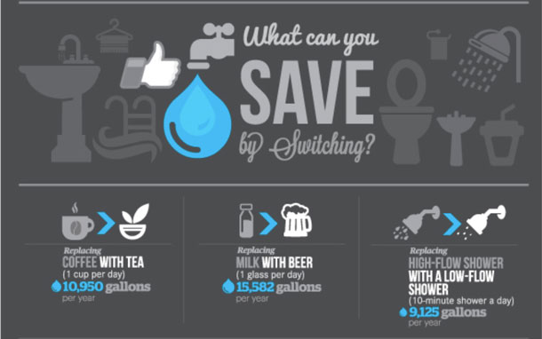
Complex numerical data can be difficult to present in a way that is both meaningful and understandable to your audience. What exactly does the number of calories in a Big Mac mean to your daily caloric intake? Why exactly should you care about the amount of garbage the average U.S. citizen produces in a day? Often, design teams are tasked with making this type of data meaningful to a broad audience. Social math provides a method and a means to make data on social issues, such as water conservation (see Figure 1) visually meaningful to laypeople.
What is Social Math?
Social math is a way of telling a story using data. Social math makes statistical and numerical data more approachable to your audience. You can use the numbers to tell a compelling story, or relate them to concepts that people find more familiar. An example would be something like taking the number of calories and fat in a large buttered movie theater popcorn. If you wanted to explain the health impact of eating a large buttered popcorn as you sit watching a movie, you could state the facts: eating a large buttered popcorn while watching the latest Marvel Comics superhero-based movie at Regal Cinemas causes you to consume 1,200 calories and 60 grams of saturated fat. This example relies on the user understanding daily caloric and fat intake. There is no easily accessible anchor for the reader to understand what 1,200 calories in one sitting really means. Is this good or bad, why should the reader care? Can they have a soda with that?
You could use social math to reframe the message by saying: “The amount of calories and fat in a large buttered movie theater popcorn is more than the number of calories and saturated fat found in two Big Macs. You have healthier options than eating the equivalent of two Big Macs during a movie.” Most people will instantly understand that eating two Big Macs as a snack during a movie is not a healthy thing to do; neither is consuming an entire large popcorn. Celery sticks please!
Visualizing social math moves beyond a simple infographic. Most infographics present data; social math tells a story with data. Stories help explain the unfamiliar or abstract concepts numerical data tell. Additionally, social math asks people to engage in some behavior to promote a cause. Any crafty designer could think of ten different ways to visually display the information I presented above in a way to motivate readers to think more about their health before downing a tub of buttered popcorn. According to the Center for Disease Control, social math helps messages resonate with the target audience by referencing or comparing the issue’s numbers to:
- Familiar numbers or costs (for example, the cost of car payment)
- Dramatic events (the number of residents displaced following Hurricane Katrina)
- Costs that are smaller and understandable (the program would cost less than the cost of a cup of coffee each day)
- Current numbers from other issues (it’s more than one-third of what we spend on prescription medication each year).
You can see that the social math story must be both relevant to the data and familiar to your users. It would not be a good idea to relate something complex and vague to another thing that is complex and vague. For example, you would not want to compare the calories in movie theater popcorn to the number of rotations it takes Mars to circle the Sun. That doesn’t make sense to most people.
Who Uses Social Math?
Nonprofit and political organizations have championed social math as a potential cure to the ills of difficult to frame numerical data. This makes sense; these types of organizations must meaningfully convey statistical facts about the issue they are concerned with. Also, these organizations advocate specific stances on an issue. A nonprofit organization seeking to eradicate hunger does not just want to raise awareness of issues related to hunger, they want to motivate behavior such as donating money to provide food for the hungry or participating in food drives. Social math has the potential to be very evocative, particularly when combined with effective visual design.
Examples of Social Math
Let’s look at a few examples of visual designs using social math:
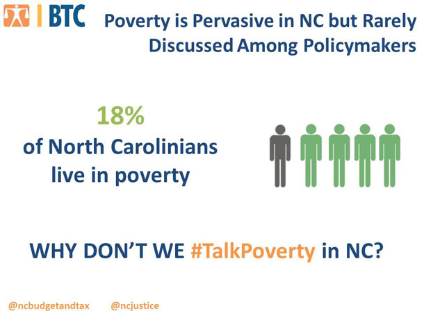
The North Carolina Justice Center, whose focus is on eradicating poverty in North Carolina, uses social math to raise awareness and begin a conversation around poverty. Their illustration (see Figure 2) does all of the thinking for you. You don’t need to understand that 18% is one in five people. I think the call to action should be stronger, telling people to talk about poverty, rather than relying on the Twitter hash tag and asking why North Carolinians don’t talk about it. This leaves out non-Twitter users. Is Twitter the only place North Carolinians should discuss poverty? The visual design is clean and simple for viewers to take in the message. In this case, though, the effectiveness of the graphic is lost in the ambiguity of the message.
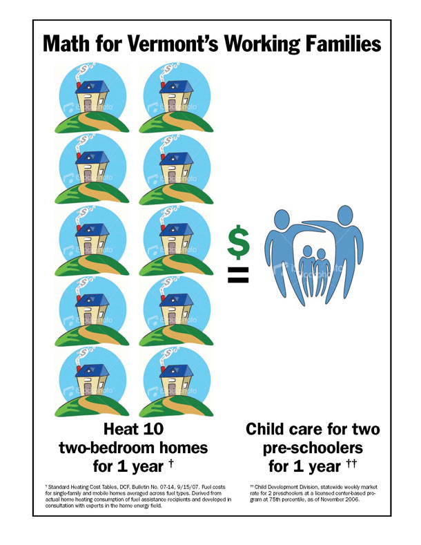
I found this infographic for Vermont’s working families cited as an example of social math on a few different websites and blogs. The visual provides a powerful message around the cost of childcare (see Figure 3). Unfortunately, there is no call to action. There is no easily identifiable information as to which organization created the graphic. If I encountered this poster in a hallway, I would walk away thinking it is a passive-aggressive attempt to convince me not to have children—they sure cost a lot. Again, an interesting and compelling graphic goes to waste without an effective call to action or any context for the reader to understand the purpose of the message.
There are many other examples you can find searching “social math” on the Internet. I did not come across very many I found to effectively combine both a call to action and visual design. This makes sense; the history of social math is in the written message (think healthcare pamphlets provided at health clinics). There are many examples of how to create good messaging, including the Center for Disease Control’s guide I cited earlier. I am sure that we have the ability to create effective messages and graphics using social math as a technique.
Let’s discuss this a bit more.
How to Design with Social Math
Your design should account for the following guidelines to ensure you create the most effective message possible using social math:
- Define your issue. First you need to understand the topic you are creating your message to address.
- Determine the focus of the data you will use for your story. Your design team will need to narrow down your issue to one specific topic so that your message is as focused as possible. Keep it simple. For example, if your issue is childhood obesity, your next step is to decide if your message will focus on nutrition or exercise, probably not both in the same call to action.
- Find reliable data. You need to use verified data from a reliable source. There are many places that you can access data, butnot all of these places are using correct It is up to you to research the way numbers were determined, and ultimately you need to make a judgment call that you will stand behind the numbers someone else is reporting. You will need to cite your sources unless you do the research yourself or create the statistic from data your organization has collected. In the example above, the information for calories in a large Regal Cinemas popcorn came from WebMD, which cited statistics from the Center for Science in the Public Interest. The Center for Science in the Public Interest states they sent the popcorn to independent labs for analysis. I found the information on calories in a Big Mac in an article from The Washington Post, which reported data provided by McDonalds.
- Identify a meaningful comparison for your audience. The story you tell must be familiar and relevant. If you were talking about nutrition to six-year-olds, it would not make sense to reference a concept they would be unfamiliar with, such as reducing their medical expenses over time by consuming fewer calories. It would make perfect sense to reference art supplies, books, games, or pets (things that age group is familiar with). Think of a message about walking your dog or playing games or sports involving running as topics that six-year-olds can easily relate to.
- Tell your audience what you want them to do or think. You need to do more than just spin a good yarn with your social math, you need to inspire some type of action: learn more, donate money, volunteer. You saw in my earlier examples that even well-done visuals are ineffective without a strong call to action. You should reinforce the call to action with your visual.
- Double check your facts. Now that you’ve found your facts, identified your comparison, and created a message, you need to double check your facts. You should find another source to verify your information. This is critical; if you don’t double check your facts, someone else will. This article highlights examples where fact checkers found politicians were engaging in fuzzy social math. You do not want your employer or client to go from riding the high of a successful campaign using social math-based data visualizations to being the goat found using incorrect data in these same visualizations.
- Triple check your facts. I’m only kind of kidding. Incorrect facts can ruin your credibility—for a long time.
- Turn your story into a visualization
- Refine the story. Your message needs to focus on the social math. This means do not crowd your message with other numbers or statistics.
The Takeaway: Go Forth and Social Math
Statistical data can be confusing to laypeople. You can use social math to alleviate confusion and motivate behavior. Design teams have many opportunities to reach their audiences using social math. I have given you these steps as a guideline for ensuring you cover the basics of social math. You should be as creative as you want in creating and designing your visual and message, as long as your facts are rock solid. These steps can serve as a checklist to make sure you don’t miss anything vital before releasing your social math-based design to the world.
[bluebox]
Resources for Data
US federal, state, and local government data
[/bluebox]