COVID-19 and Internet Usage
In this past year, you have probably thought to yourself about the nature of this pandemic and how it is causing radical reformations to nearly every field all around the world. Who would have expected that a global pandemic would have been a catalyst to radically increase the usage of the digital spaces we employ every day for socialization, work, and even digital healthcare?
According to a McKinsey report, just 11% of consumers were using telehealth in 2019. By May of 2020, however, nearly 50% of in-person visits had been converted to digital visits. Clinicians saw 50 to 175 times the number of patients via telehealth than they did before COVID-19. Besides healthcare, a lot of socialization is happening online. Technology has been a lifesaver for many, connecting people at a time when they could not meet in-person because of social distancing.
With governments and media warning older adults that they are the most at risk, many older adults started using video calls during the COVID-19 lockdown to connect with their friends and families. However, unlike younger populations, older users haven’t been using the web their whole life. Many of them had first-time experiences with some of the mainstream apps and started using other technologies, besides online video call apps, for entertainment and information during a time of isolation.
The Harris Poll conducted a survey in early May 2020 asking people if they were using social media more, less, or about the same since the beginning of the pandemic. For the respondents who were older than 65, 34% of them reported their usage of social media was up. As comparison to other age groups, for people who were in the 18 to 34 group, they reported a 60% increase. For those in the 35 to 49 age group, they reported a 64% increase; for those in the 50 to 64 group, they reported a 43% increase. (If you are interested in seeing the data, you can download a PDF of the entire report.)
Discrimination by Design
In recognition of the adoption of technology by aging adults in this short period of time, we should acknowledge that mastering new technology is often complicated for many, especially for many older people who have no baseline experience in using technology until relatively recently. There have been long standing usability issues with the design of products that do not consider the abilities of older generations. The design of digital products need not be complicated for any age group.
Don Norman’s article, written just before the pandemic, “I Wrote the Book on User-Friendly Design. What I See Today Horrifies Me” outlines the multitude of problems he sees with the design of many products, including technology devices. The points that Norman discusses are that the designs of many products are usually influenced by the age of the company’s target audience and what they think that target audience wants or needs. These companies are not taking into account older adults or people who have different impairments that could be permanent, temporary, or situational (more on this later) who want to use their products.
When there is a radical shift in how we live, such as during a pandemic, this raises a crucial question for UX practitioners: How do you adapt rapidly when usage behavior, the age of the target audience, and expectations are changing so much and so fast?
Inaccessible design choices irritate users of all ages, for instance, the small type causes problems even among teenage users. When some basic principles of interaction design are broken, the product becomes difficult to use for all its users regardless of their demographics.
Figure 1 shows an example of joining a Zoom call. This popular video-conferencing tool, which has become part of so many households because of this remote reality we have been living in, is a great platform, but the interface is cluttered with various buttons with confusing names. I usually struggle with multiple windows before pressing the big blue button. A simpler design could improve things here.
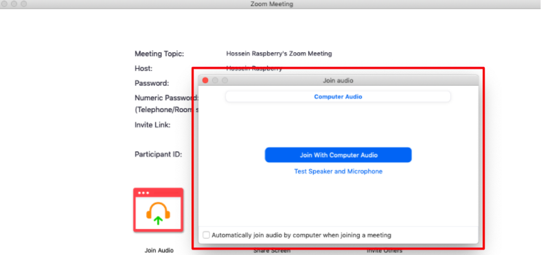 Figure 1. Zoom interface when joining a call.
To take the Zoom example further, the call screen has as many as 11 buttons; that’s when I usually start to lose track of things in spite of being familiar with Zoom. The user experience of any video calling platform consists of looking at the screen and having a conversation with other people over a video call. So, the buttons that the user cares about are invite, share screen, and chat. Other buttons could be simply accessible in a menu bar.
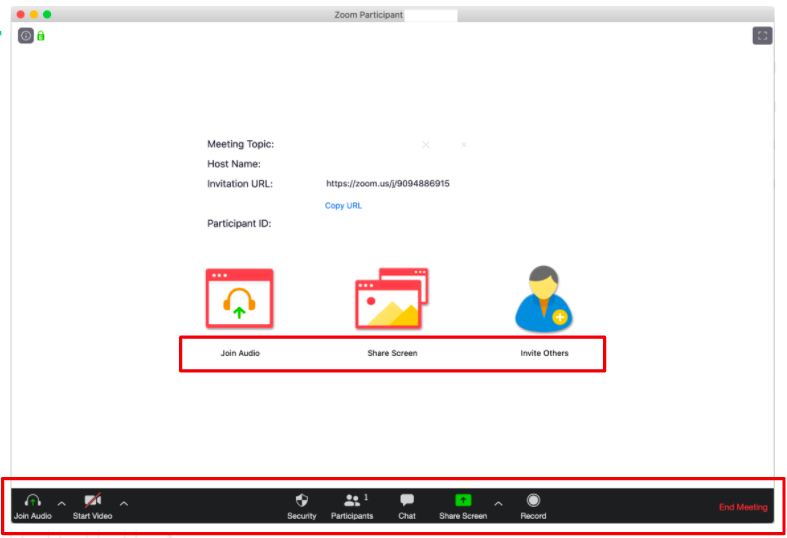
Figure 2. Main Zoom screen.
The basic tasks of using Zoom include launching the app, calling or inviting others, recording the call, and ending the call; however, in this instance, a successful video call is what primarily counts as good UX. As I’ve mentioned, I’m a regular Zoom user and find the layout and functionality of the tool confusing; imagine what it’s like for someone, like an older person, who is on the platform for the very first time.
What Does the Pandemic Teach Us About the Aging Population?
Although older people are not a niche market, they usually have more free time and discretionary income than younger people. According to the US Census Bureau, people over the age of 65 generally have the highest household wealth figures of any age group. On a global scale, the group of people over 60 is growing more rapidly than any other demographic. There are 75 million baby boomers in the United States, and around the world people are having longer life expectancies than before. In 2019, the Pew Research Institute revealed that 73% of people over the age of 65 used the internet.
It is clear that digital products have been adopted by different age groups, especially older people during the pandemic. Perhaps, it’s time to stop expecting our audiences to be made up entirely of iPhone-using millennials and start thinking about the needs of older people too. Ultimately, the benefit of designing products with older adults in mind will lead to expanding the pool of potential users for the future.
This pandemic is a reminder that some assumptions about older adults using technology are wrong:
False assumption 1: Older adults are too old for acquiring knowledge to use technology.
Truth: The technology usage of older adults during the pandemic proves that an older population can and has adopted technology and its advantages in a short and stressful timeframe.
False assumption 2: Designing for only one type of audience makes a functional product.
Truth: Designing for only one type of audience does not make a functional product for all and may not be enough for satisfying the needs of older generations. The results of focusing on the assumed abilities of one demographic can have negative effects on the functionality and aesthetics for digital (and physical) products. As Don Norman advocates, “Designs that make it easier for elderly people often are of equal value for younger people. In fact, for everyone. Help the elderly, and the results will help many more, including yourself, someday.”
By examining our assumptions, we can focus on creating products that benefit all audiences without discrimination.
Demystifying Inclusive Design
Age is one of the significant dimensions of demographics that we should consider when developing a product. In the context of product design, the approach of inclusive design pragmatically accepts that it is not always possible for one product to meet the needs of the entire population. However, this approach advocates the idea of setting our default mode to thinking beyond the assumptions we have about a target audience.
Probably anyone who works as a developer, designer, or really anyone associated with a product or service tries to create more accessible products. However, the following are some common justifications that many may have heard for avoiding accessibility for an older population:
- “Our product is made for larger businesses. Older people don’t tend to work at those kinds of places.”
- “Our user base is quite small and none of them are older people.”
- “This is just an internal product; it does not have to be accessible for older people.”
As we’ve seen with the increased usage of technology during this pandemic, you don’t know who is going to use your product and when. Older people do work and may be in your company. So why make any product difficult to use for any major demographic?
There is also a misconception that designing a product for older adults means that the product must be designed to be too simple which makes it “boring.” But it doesn’t have to be that way. You can still keep all the graphics and colors while providing an accessible, functional product. The US White House and Apple.com are examples of beautiful yet fully accessible websites.
UX designers don’t have to make the products too simple or boring to make them comfortable for older people to use. Taking the basic principles of interaction design seriously and following usability guidelines leads to products that are accessible to all users, regardless of age or any physical or cognitive impairments (age-related or otherwise).
Redefining Accessibility
Regarding accessibility and the misconceptions around this topic, I’d like to suggest that it’s helpful for UX practitioners to think about accessibility needs as mismatches.
Kat Holmes, a design director at Microsoft, Google and now at Salesforce, suggests in her book Mismatch: How Inclusion Shapes Design that we all face various forms of disabilities every day. Disability could be redefined as a mismatch interaction between the features of a person’s body and the features of the product.
We all experience mismatches in different ways. We may encounter mismatches in many moments in our day, but there are people who experience higher degrees of encountering mismatches. This concept is visualized in Figure 4, where people have varying degrees of impairments that can be permanent, temporary, or situational.
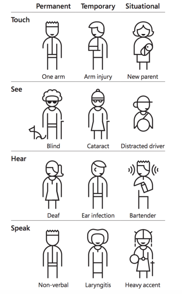 Figure 3. Examples of physical impairments that could have an effect on using a device or service. (figure from Inclusive 101 Toolkit: Inclusive Microsoft Design, © Microsoft 2016 Licensed under Creative Commons Attribution Non-Commercial-No Derivatives, CC BY-NC-ND).
If we think about these issues as mismatches to the products and services that we create rather than labeling users for special accessibility needs, it squarely puts the responsibility on us as engineers, as designers, and teams to stop, think, and recognize that every choice we make in the design of our solutions can have an effect on someone’s ability to use a feature of a product or service.
As an industry, we have the obligation to decrease the mismatches between our products and users’ capabilities. Inaccessible design has always been a problem; it’s not a new thing. But the pandemic showed us that the adoption of technology by different generations means that we have to design our products beyond our assumptions about our target audience.
By embracing inclusive design, we can understand that it is not about meeting everyone’s needs, but it is about embracing everyone on equal terms. The UX communities, product owners, and designers will need to play essential roles in maintaining a focus on aging adults and their well-being as we endure and emerge from the current pandemic.