In the Beginning
In the beginning of the COVID-19 pandemic, hospitals worldwide bought as much personal protective equipment (PPE), ventilators, face shields, N95 masks, and testing supplies as possible, which led to a worldwide shortage of medical equipment. This shortage, combined with the United States’ Emergency Use Authorization allowing the use of improvised PPE, resulted in a number of unregulated and untested products becoming available. As COVID has continued months after initial stopgaps were implemented, it remains important to evaluate the tools still in use.
During the time of COVID, my team of Human Factors professionals and I, embedded within a healthcare system (Carilion Clinic) in Roanoke, Virginia, have been busier than ever. Our group works closely with our Simulation, Quality & Patient Safety, Process Improvement, and Innovation groups, as well as the frontline healthcare workers throughout our healthcare system. It has become clear to everyone that COVID has had a way of uncovering the cracks in a number of systems. Our team believes that adding UX into our solutions toolbox has helped solve some of the challenges COVID-19 has exposed within our healthcare environment.
Our team performed UX assessments to evaluate internal website design and improve communication on updated COVID policies, COVID testing booths prior to purchase, and temperature scanning kiosks at patient screener stations, to name a few. Our COVID project catalog also includes assessing face shields (3D files and design progression that can be found at The Parker Lab’s Face Shield Project), exhalation filters on respirators to expand PPE supply, intubation hood design testing for emergency department physicians, surgical hood testing in the operating room, and user guide creation and design. This work was made more difficult due to the need to incorporate social distancing, disinfection protocols, and possible exposure logs into our usability testing methodologies.
For this article, I focus on three different project case studies relevant to our situation to give depth to some of our COVID projects. These include
- inconsistent messaging specifically from our website,
- accuracy issues with thermal temperature scanners, and
- structural issues with our COVID testing booth.
Inconsistent Messaging: The Call Is Coming from Inside
From my perspective, the first problem healthcare encountered was the ever-changing information. Daily changes made to travel, PPE, patient visitors, and policy and procedures were spinning around and being presented to staff with little expectation that this would be the final change. Our marketing team had developed a Coronavirus Hub page that provided updated materials for staff. Once the page was live with all of the updated information, staff could visit the page.
And then came the phone calls. After staff were forced to search for information they needed, they gave up and phoned infection prevention. A flood of calls to the infection prevention office would start at the beginning of each shift and persist throughout the day. Staff needed guidance to do the right thing, and this webpage held captive the information they needed.
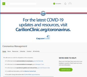 Figure 1. Original design of the Coronavirus Hub page: Information most sought after was difficult to find.
With a quick look at the opening webpage layout (see Figure 1), we concluded that the issue was due to the design. For example, the banner at the top of the page displayed a website for public use on COVID restrictions and precautions. This information had nothing to do with our internal policies that staff needed immediately accessible. The size and placement of the banner also created another problem: scrolling. We know scrolling increases the time to find information, leading to increased frustration and disengagement from the task—resulting in the phone calls. The needed information was also hidden in the third header link named “resources.” Once we selected the correct link, the information was listed in no particular order; it wasn’t categorized, alphabetized, or listed by date of change. It was a free-for-all of information, making the process of finding the newest policy more akin to a word search puzzle.
To improve the proximity and compatibility of information, the links were re-organized into categories through grounded theory. Links were organized into six groups: Updates, Clinical Resources, PPE, Communication, Education, and Policy. The link descriptions were reworded to avoid confusion and search delays, in accordance with our aesthetic heuristic for minimalist design. For example, when one needed to find the PPE guidelines, it was necessary to remove distracting terms such as “coronavirus,” “updated,” or “hospital” before the term “PPE.” These words were irrelevant here and slowed the search task by adding too much information. Users knew this was an internal website and that the PPE link was for the hospital staff. They knew any information on the page was for Coronavirus when they were on the “Coronavirus Hub” page. They already knew it was the updated version when only the newest information was presented on this page. Semi-structured interviews with infection prevention led us to prioritize the most sought-after information by staff within each newly defined group (see Figure 2).
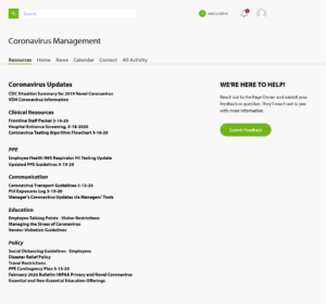 Figure 2. Redesign proposal: Making the information most sought after front and center. We organized the links by grouping like items together and removed as much scrolling as possible to reduce the time to find information.
By removing the design barriers to finding and selecting the correct information, the webpage began to see higher usage and phone calls decreased. With a few simple changes to the webpage, Infection Prevention could focus more time on preventing infections. There was a little less confusion for our frontline staff, a little less frustration from staff triaging phone calls, and a little more calm in knowing what the right thing to do was, at least for that day.
Thermal Temperature Scanners: AKA “Predator Project”
As the fall and winter months progressed, reports from frontline staff indicated that there was an issue with the handheld thermometers reading too low at the screener stations. It was important to obtain an accurate temperature of the patients and staff to make sure people were not coming into contact with someone who might be ill. Training was pushed out to ensure that we were obtaining accurate temperatures, but the low temperature readings persisted.
While thermal scanning devices were seen as overkill at the beginning of the pandemic, after several months, they turned out to be what staff needed to safely screen temperatures of patients and staff. To assess the benefit of implementation of a new thermal scanning device, our Human Factors team was tasked to assess the current risk with the handheld temperature scanners and the acceptance of a new contactless device.
We tested two different contactless devices on two consecutive days on staff who entered the building at the start of their shift. Staff who wanted to participate were scanned by both a handheld device and a contactless device, then were given a paper survey (a modified UMUX-LITE) to complete. The whole process took less than 2 minutes, which gave us the opportunity to collect opinions from 184 staff members.
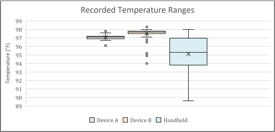 Figure 3. The two automated temperature scanning devices showed a smaller variance in staff temperatures than the handheld device. All staff were healthy and ready for work even though the handheld device might have indicated hypothermia at anything 95° F and below.
Our results showed a gap in safety (see Figure 3). The survey feedback showed that staff thought either of the contactless devices was a better and safer option than the handheld version. However, there were concerns over privacy because the camera could be used to capture staffs’ image and temperature reading. These concerns existed for some even after assuring them those features were totally disabled.
A trial with patient screeners at a busy outpatient setting proved invaluable to streamlining implementation of the new thermal scanners. After a week of use, the patient screeners were given a semi-structured interview to understand the use, preferences, frustrations, and any workload adjustments. With this short trial, we gained several key implementation insights. For example, the scripting had to be adjusted to get patients to stand in the correct spot. Also, we added scripting to ease patients’ concerns that the device was indeed not capturing their image and temperature information. The device placement was also adjusted at an angle to accommodate shorter adults, children, and patients in wheelchairs. The staff felt safer using the device with the increased distance from the patients and even affectionately named the scanner “Nigel.”
Testing Booth: AKA “Social Distance Hug Booth”
The process of performing the COVID nasopharyngeal swab on patients puts clinical staff at risk of exposure because the specimen collection process is an aerosol generating procedure. For example, a patient may cough during the procedure which produces airborne particles that may contain the virus. To protect staff, patients, and the community, we considered the purchase of a dozen testing booths to isolate the healthcare workers from potential exposure (see Figure 4).
Before purchasing these booths, a usability assessment was requested to assess any possible barriers to safety and ease of use of the booth. Initially, our group assessed the testing booth using ergonomic and anthropometric design principles. We then asked one physician, one nursing director, and two nurses who routinely performed COVID testing to provide feedback in a focus group. We used a semi-structured interview to obtain this feedback. The focus group participants assessed the booth during and after their interaction with it. In addition to the feedback, we also generated considerations for future design to help the manufacturers accommodate to user needs.
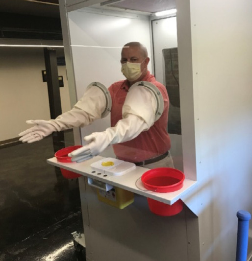 Figure 1. Anthropometrically speaking, this booth was designed for use for a five-foot-eleven adult male, as demonstrated by my colleague Robert in this photo.
Our results showed that the booth had too many physical and safety limitations for the operators to be useful for protecting patients and staff. The design didn’t account for staff who are of different heights and physical capabilities. Also, additional time would have been needed to disinfect the booth between patients, gather and label supplies, and disinfect inside every hour for rotating staff. This might have led to a bigger risk of cross contamination with a buildup of people getting tested at the site. The tasks that the clinical staff users needed to perform for each patient interaction were limited by the booth.
There were also safety concerns of patients falling when using the booth. For those of us who have gotten the swab before, it is natural inclination to pull away. When enclosed in the booth, you cannot prevent a patient from falling.
While the booth was an interesting idea, staff unanimously found that the product did not meet patient care requirements needed for collecting specimens. Even though the booth was rejected for COVID-19 testing, some thought that the booth could potentially be repurposed as a hug booth for people who needed a hug during a pandemic.
Conclusions
By using our expertise when evaluating the three examples presented in this article, we were able to successfully address and fix usability issues for website messaging and accuracy of temperature screening. This improved the user experience for our users, staff and patients. We also headed off a potentially extreme usability problem by user testing a product, the COVID testing booth, that could have had some pretty bad outcomes if it had been implemented.
We found that user feedback—even in an emergency such as a pandemic—is essential. The methods chosen for each project were driven by project timeline demands. So, the flexibility of methods to uncover the safety issues and risks were essential to the success of each project.
We want staff to have the right tools and, more importantly, make these tools as easy and accurate to use as possible so that they may continue to do the amazing work that they do. We are grateful that healthcare workers have taken and continue to take the time out of their lives, especially in this highly chaotic time, to talk to us and give us their opinions and feedback. We, as their Human Factors UX colleagues, are always here to listen.
Being a part of a healthcare system allows us to build relationships and receive requests from departments across the system. Working with Marketing Communications to improve messaging, Informatics to test temperature devices, and Materials Management to assess a new device prior to purchase all happens because we are a known and visible part of their team.