Comparing two long lists of any kind is always a challenge. For example, you may have experienced the difficulty of reconciling a bank or credit card statement when comparing the list with your personal tally of transactions.
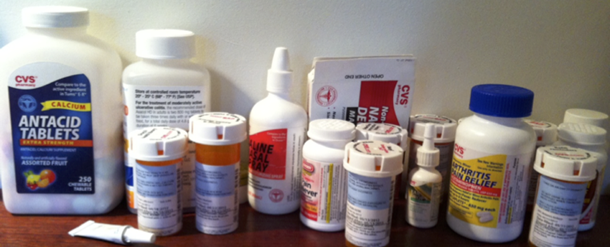
In healthcare the challenge is even more daunting when physicians have to maintain an up-to-date list of a patient’s medications, compare the medications taken at home with the ones taken during a hospital stay, and rapidly put together a new list. Home medications may have been temporarily suspended or had the dosage modified, and new medications may have been added at the hospital. So when a patient leaves the ward, what medications should they take? (see Figure 1)
Twinlist makes it easy to compare two lists (home and hospital) by automatically matching similar drugs and offering visual cues to the healthcare provider for matching the remaining drugs. The interface was built as an inspirational prototype to encourage health IT designers to apply advanced interface concepts to improve clinician performance and patient safety. The work of producing the final reconciled list of medications for hospital discharge is made faster, safer, and more accurate through the use of spatial layout and multi-step animation.
[bluebox]
Scenario: Coronary patient is discharged from the hospital
Mr. Jones is 74 years old, married, and a retired businessman. He’s receiving treatment for coronary artery disease, constipation, diabetes, hyperlipidemia, esophageal reflux (aka GERD), hypertension, and mild dementia. His primary care physician, Dr. Barnes, sent Mr. Jones to the hospital Monday morning after his wife insisted he go to the clinic—he was having trouble breathing and was rubbing his chest. Mr. Jones had been fine until the previous night; his wife said he had seemed quite well Sunday afternoon when two of their sons came over to watch the game with him.
While examining Mr. Jones, the hospital physician found moderate fluid buildup in the lungs but no evidence of a heart attack in EKG or lab testing. Because of his past medical issues and the strong history of heart attacks in his family, he was admitted and treated. By Wednesday afternoon Mr. Jones has been cleared to leave. One of the medical house officers has to reconcile his medications as part of the discharging process.
[/bluebox]
In this scenario, the physician discharging the patient has to compare two lists:
- The list of medications the patient was taking at home (recorded by an intake nurse when the patient arrived at the hospital, or obtained from an EHR, Electronic Health Record), that is, the “intake list”
- The list of medications on the last day of the patient’s hospital stay, that is, the “hospital list”
The lists might include drugs that are exactly the same or drugs that are similar (for example generic versus brand name). The physician must find the differences between the two lists before deciding which medications should be continued after the patient is discharged.
Grouping and Animation Directs the Eye
Let’s look at how Twinlist guides the healthcare provider through the process. You can read on or start with this two-minute video to see how Twinlist uses a novel layout to reveal similarities and differences, and animation to explain the layout to new users.
The Twinlist Design
![[:en]Two lists of medications, each in alphabetical order. Callouts identify the home and hospital medication[:]](https://uxpamagazine.org/wp-content/uploads/2015/06/15-3-Plaisant-Browser1-1-150x150.png)
This is an example of what the screen looks like before Twinlist starts matching similar drugs. The black annotations were added for this article. The screen is also fairly representative of some existing reconciliation interfaces; physicians have to scan and scroll the lists multiple times to determine what is the same and what is different.[:]
![[:en]The screen shows 4 lists of medications.[:]](https://uxpamagazine.org/wp-content/uploads/2015/06/15-3-Plaisant-Browser2-1-150x150.png)
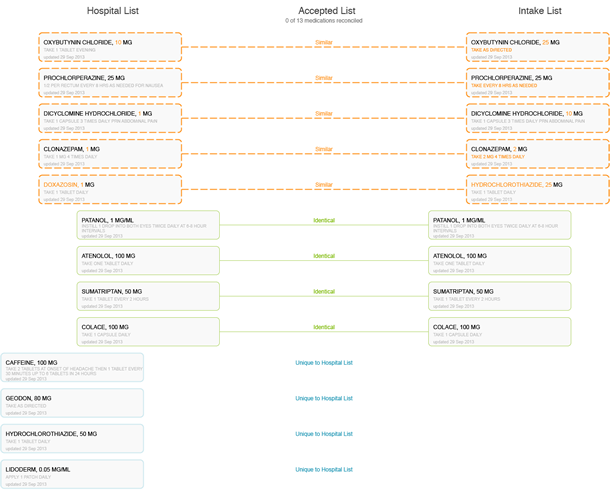
Similar drugs (e.g., Aricept and donepezil) have aligned below, with the differences between them highlighted in yellow. The unique drugs have moved to the top.[:]
![[:en]The screen shows the hover action, matching a generic and brand name[:]](https://uxpamagazine.org/wp-content/uploads/2015/06/15-3-Plaisant-Browser3-1-150x150.png)
![[:en]The screen shows one drug being seleted[:]](https://uxpamagazine.org/wp-content/uploads/2015/06/15-3-Plaisant-Browser4-1-150x150.png)
The list is ready for review. The bright green areas indicate what drugs are selected. The final list is saved to the EHR chart, and the patient receives a copy.[:]
An effective, efficient interface
About 50% of elderly patients take five or more medications, and 12 percent take 10 or more according to research in the Journal of the American Medical Association. Errors happen when the medication lists are long and hard to compare. Physicians are under time constraints and might keep two or more equivalent drugs on the list, or they might miss an important unique drug. Compound drugs that include multiple active ingredients make things more difficult. Here are some of Twinlist’s design features that make it an effective interface to reduce the incidence of errors during the decision-making process.
- Spatial grouping: The closer things are, the more alike they are.
- Highlighting: Key differences are visible and facilitate decision-making.
- Rapid selection: The large rectangular buttons are easy to select. On a tablet gestures also can be used to indicate selection or deselection.
- Animation: Users can quickly learn the meaning of the layout and how the drugs are grouped. This is important for new users.
Behind the interface
Identifying similar drugs is facilitated by pre-processing the data.
- An algorithm matches “identical” medications and merges them, thus reducing the physician’s mental effort.
- An algorithm matches “similar” medications and aligns them on the same horizontal row. This reduces the need for repetitive visual scanning of the two lists and of remembering all variant names for the same drug.
- “Unique” medications appear in only one column and move to the perimeter of the display, making it clear where they are used.
The Twinlist prototype takes advantage of the way the human brain processes information (specifically “pre-attentive attributes”) by spatially grouping like items together.
- These spatial groupings allow physicians to quickly identify the key groups of medications (those that are identical, similar, and unique). The more different two drugs are, the farther apart they appear horizontally. Identical drugs are in the center.
- Differences between similar but non-identical medications are highlighted in golden-yellow, which reduces the need for physicians to repeatedly scan, read, and compare the list items. These differences are the details that drive the clinical decision making.
The animation helps users learn and understand the groupings of drugs. As the user grows familiar with the tool, the animation can be sped up or turned off.
- Making the list compact saves vertical space. Similar but non-identical drugs that physicians may have to think harder about how to reconcile are together in the lower section of the screen.
- Identical drug pairs merge in the center and are thus visually identified as perfect matches.
Physicians can interact with the interface to discover more relationships.
- Hovering over a drug displays details at the bottom of the screen, such as drug class or indication (for instance the problem being treated). It also highlights similar drugs. Clicking to select a drug in a “similar but not identical” group rejects the others. This reduces work and improves safety.
- The menu at the top functions in a way that allows users to take actions on multiple drugs at the same time (for example select all).
- Users can easily change or reverse their decision by clicking on drugs to toggle through accepted, rejected, or undecided states.
Formal evaluation
Twinlist was compared with a baseline interface, where medications were presented side by side in two columns. Twenty physicians were asked to read a patient summary and then reconcile the medications for four patients. The patients were “difficult cases”—prescribed several medications—and the chances for mistakes were very high.
Participants were 18% faster when using Twinlist, with 40 percent fewer clicks and 60% fewer scrolls. Participants liked the layout and indicated that the included animation would be valuable for novices, but not necessary for advanced users.
Serious errors, as judged by peers, were made but only 11 times using TwinList as opposed to 31 times with the baseline. However, six out of the 11 Twinlist errors were due to a mistake in the similarity algorithm for an uncommon compound drug. The algorithm has since been corrected.
How Twinlist Began
One of the many goals of the American Recovery and Reinvestment Act of 2009 was to increase the use of Electronic Health Record (EHR) systems in hospitals and doctor offices. Another goal: to encourage research in support of improvements in the quality, safety, and efficiency of healthcare through advanced information technology.
In 2010, the Office of the National Coordinator for Health IT asked the University of Maryland to design several inspirational prototypes that would promote better user interface design for EHRs. Several problems were described as particularly challenging and associated with major patient safety issues. The list included wrong patient selection or missed results, and also medication reconciliation, a relatively new term at the time. Medication reconciliation can occur in many different situations; this project focused on the hospital setting.
One design, many applications
It can take years for prototype ideas to find their ways into real products, but there are early signs of such technology transfer, with vendors and other designers of EHR systems actively developing their own prototypes inspired by Twinlist (see Figure 2).
Some adapted Twinlist’s spatial layout to other medical reconciliation tasks (such as the problem reconciliation in Figure 3, or allergy reconciliation). Others used bits of the design, such as simply using the highlighting of difference.

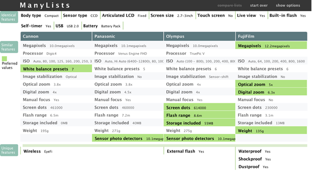
Additional types of list comparison situations, such as product comparison, have also been explored (see Figure 4 and http://www.cs.umd.edu/hcil/manylists/).
The Twinlist project demonstrated the capacity of careful iterative design to produce potentially lifesaving medical interface improvements. Our four-year refinement of the spatial layouts and staged animation produced strong measurable performance improvements in a life-critical task while suggesting how these ideas could be applied to many other consumer and analytic tasks.
[bluebox]
More reading
- The project webpage has video demonstrations, papers, and access to live demonstrations and the source code.
- Twinlist was described in detail in Inspired EHRs, an electronic book written for electronic health record developer teams about human factors and design. The book helped make the prototype widely visible to designers of many medical systems.
- Plaisant, C., Chao, T., Wu, J., Hettinger, A., Herskovic, J., Johnson, T., Bernstam, E., Markowitz, E., Powsner, S., Shneiderman, B., Twinlist: Novel User Interface Designs for Medication Reconciliation, of AMIA Annual Symposium (2013) 1150-1159
- Plaisant, C., Wu, J., Hettinger, A., Powsner, S., Shneiderman, B., Novel User Interface Design for Medication Reconciliation: An Evaluation of Twinlist, J Am Med Inform Assoc., 22, 2 (2015) 340-9
[/bluebox]
[greybox]
Acknowledgements
Twinlist started as a class project in Ben Shneiderman’s information visualization class. It was refined by University of Maryland Computer Science undergraduate student Tiffany Chao while being presented in medical informatics venues. Visibility at such venues—where the interface garnered an enthusiastic reception—resulted in feedback from dozens of physicians, nurses, and other medical professionals.
This work was supported in part by Grant No. 10510592 for Patient-Centered Cognitive Support under the Strategic Health IT Advanced Research Projects Program (SHARP) from the Office of the National Coordinator for Health Information Technology. We also thank all our colleagues of the SHARP project.
[/greybox]