Death and taxes—we all know the cliché, but taxes are a real mystery to many people. The typical United States citizen doesn’t understand where his or her refund or balance due amount comes from and generally only becomes engaged in understanding the tax system when something changes from the previous year. Let’s take a look at a couple of common scenarios.
Scenario One: Assisted Client
John visits the tax professional he has been using for years to have his tax return prepared. Bob, his tax preparer, asks John questions about what’s changed this year and enters the new data from John’s tax forms. Then something strange happens. Instead of the refund he was expecting, John is informed that he owes money to the Internal Revenue Service (IRS). John is surprised and doesn’t understand why his tax situation has changed. Bob attempts to explain the changes using a data table, but that doesn’t clearly explain the changes or how things are related, especially if someone isn’t good with numbers.
Scenario Two: Do-It-Yourself Client
Jane does her taxes herself. As she begins filling out her online return she watches her refund amount fluctuate, but doesn’t understand which entries make it go up and which make it go down. By the time Jane gets to the bottom of her pile of forms, she sees that the refund amount isn’t the same as it was the year before. She thinks that it is likely that the tax laws have changed, but she doesn’t dig further into her return to learn what caused the difference in her refund.
Two scenarios with one problem. Most taxpayers in the United States don’t understand how income taxes work. They just understand the process in simple terms: enter tax information and output the tax refund or amount owed. They have no idea how to make changes that have an impact on their finances. Let’s take a look at two projects that solved this problem using data visualization.
Project 1: Assisted Tax Preparation
To understand this issue, a field study was conducted to observe clients who visit a tax professional in person. A lot of the questions the clients asked their tax professionals centered on the final number at the end of the return—the tax refund or balance due. When questions came up the tax professional would often show the client numbers on the screen to try to help explain what was going on.
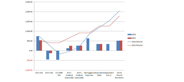
These numbers were displayed in complex tables that frequently made no sense to the client and didn’t help facilitate the conversation about the client’s outcome (see Figure 1). The screens were geared toward tax professionals who understand the numbers and were designed to highlight their expertise. The screens also failed to show how the numbers are related to each other. In addition, the numbers were often displayed on different screens, requiring the tax professional to switch back and forth during the discussion.
Some of the tax professionals that were observed resorted to drawing pictures by hand to explain the situation. The clients they showed these pictures to came away from the discussion with a better understanding of their situation than those who only saw the tables. To make the screens more understandable and user friendly, we decided that adding pictures would be a good place to start.

Using the diagrams that tax professionals had drawn during the field research as inspiration, sketches were created to show what the future screens might look like (see Figure 2). The inputs that go into the refund or balance due amount were mapped out to show how they impact each other. A few other options were evaluated to show the relationships between the numbers. The proposed design was then reviewed with our internal tax professionals for accuracy and further refined. A visual designer polished the diagrams and a second iteration was conducted before settling on a single concept to use to solicit feedback from the tax professionals in the field.
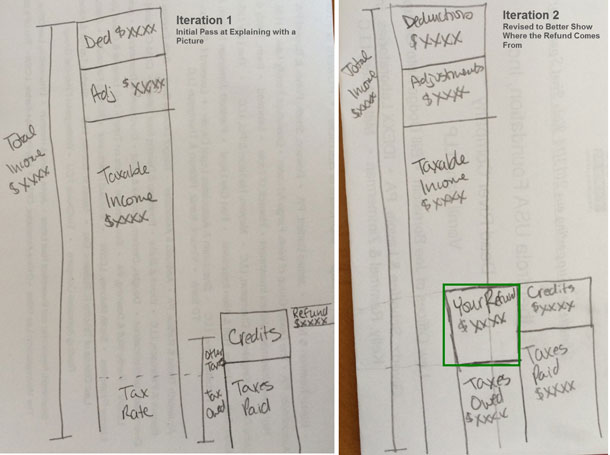
To get feedback from the field, we prototyped the screen and put it in the context of a full tax return. During the user testing study, tax professionals were asked to prepare a full return for a staged client and were shown the new design concept at the end of the return to simulate the actual experience. They were then asked to explain the return to the client using the newly designed diagram. The tax professionals had positive reactions to the design and commented that it would help them have clearer, more productive conversations with clients. We took the explanations tax professionals used with clients during the study and used them to formulate a script to use when new tax professionals are trained to use the screen diagram to answer client questions.
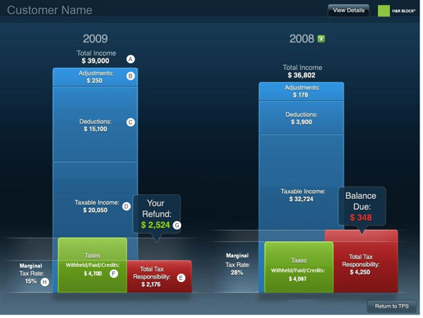
The script is shown below. See Figure 3 for the location on the graph which corresponds to each letter:
- Start with your total income of $39,000 (A)
- Subtract your Adjustments (B) and Deductions (C) to get your taxable income (D).
- This is the amount of money you owe to the IRS (E).
- See at how much you paid in taxes (F), which includes money withheld from your paycheck, estimated payments you’ve made, and any credits you are entitled to, and subtract that from the amount you owe to the IRS.
- The difference between step 3 and step 4 is your refund amount (G).
After refining the script, clients were brought in and the tax return process was simulated using the new screen and script. Customers walked away from the experience with a much better understanding of their tax return than when they arrived for their appointment. They were impressed by the visuals at the end of the otherwise mundane return process. A few minor changes were made to the design after the study.
- The tax credits were combined with other tax payments because the nuances of that breakout added unnecessary complexity that users had a difficulty understanding.
- The marginal tax rate (H) was removed from the script because it also added complexity. The tax rate remained in the diagram in case it was something the client asked about.
The diagram shown in Figure 3 was the preferred visualization. It allowed the tax professional to point out high level blocks that represent where the tax money comes from and to where it goes. The visualization can be used to facilitate a conversation without overwhelming the client with details while highlighting the tax professional’s knowledge. The tax professional can then take cues from the client to determine whether to dig further into the details and provide explanations, as necessary. This visualization has proven to be a highly effective tool for tax professionals.
Project 2: DIY Preparation
In the Do-It-Yourself (DIY) version, market research revealed that DIY clients seek the same information for their tax returns as those in assisted tax preparation. Understanding how their forms and receipts impact their tax returns is a primary outcome sought by clients when preparing their returns online.
To design a solution for DIY clients, a comparison and brainstorming session was conducted to identify different options for explaining how the client’s refund is calculated. Varied interaction design and infographic approaches were explored within the DIY product to provide additional context to explain the “why” behind the tax return (see Figures 4-6).
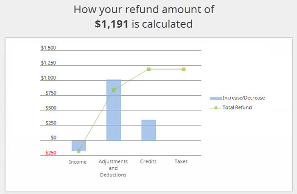
The initial design was a detailed chart with descriptions of the impact each line has on the client’s tax return outcome (see Figure 7A). Qualitative research with DIY clients who were shown this design indicated that the charts were complicated and difficult to understand. This type of visualization worked well for clients in the offices of tax preparers, but without the benefit of the tax professional explaining the chart, it was too much for clients to comprehend.
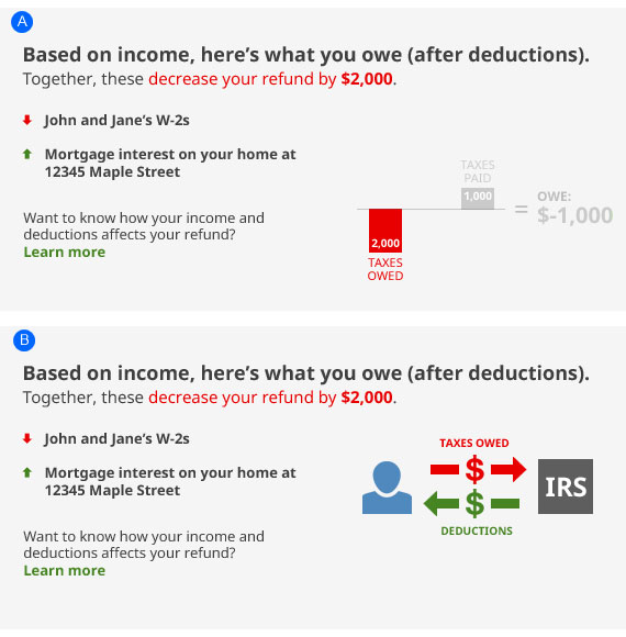
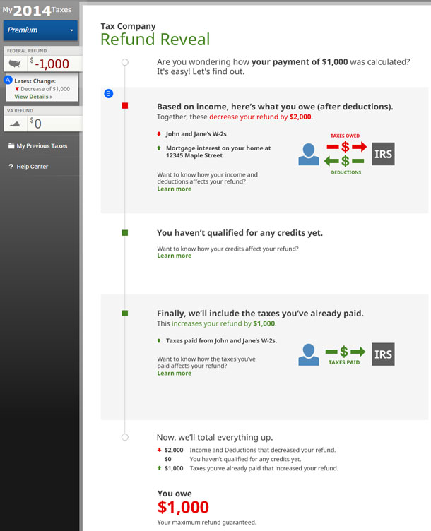
To eliminate the confusion clients experienced with the first design, a second simpler, higher-level version of the design was created (see Figure 7B). This version was more focused on the overall concept of money moving between the IRS and the client, illustrating the line-by-line impacts on the refund or balance due within the feature.
The two designs were compared against one another in a quantitative study. Attributes such as comprehension, likelihood of use, and preference were measured. The research showed no definitive preference between options A and B. Considering the relative ease of implementation, a simpler version of option B was created. This version used a metaphor of money moving to and from the IRS while still providing line-by-line descriptions showing the impact on the return.
Because certain clients showed a slight preference for the chart-based visualization in option A, future consideration is being given to this approach. For clients who saw a higher value in the more detailed visualization alongside the line-by-line descriptions, this feature provides a more personalized experience.
Designing for Audience Need
Both projects (finding the right visualization for both the assisted client and the DIY client) uncovered solutions to help clients understand why their tax refund amount changed from year to year. However, because they were for different audiences, custom solutions worked best for users in each channel.
Assisted clients are focused on the relationship with their tax professional and the expertise a tax professional provides. Providing a higher level of information that allows the opportunity for the tax professional to provide context proved necessary. A simple, data-driven visualization with the ability to drill down into the details works well for this audience.
In contrast, DIY clients watch the refund amount throughout the process as changes to the data impact the result. A visualization that provides continuous feedback about the current status works better for this audience. This design provides details with each entry, describing the impact on the return, and includes a visual infographic element to help illustrate the overall effect for each section of the return.
Summary
These two projects demonstrate that understanding the context of a task, the user’s desired outcome(s), and the user’s environment are essential to delivering the most effective experience to our widely varied clients. Simply incorporating the design for the assisted client into the DIY client experience would not have delivered the value the DIY client seeks. In an assisted scenario the conversation is important, and in a DIY scenario continuous feedback is important. In addition, facilitating qualitative research during conception and design is critical to creating an experience that truly meets—or exceeds—client expectations and delivers on the trust our clients place in our hands each year.