Introduction to the Visual Card Sort Method
In user interfaces, users depend on icons, buttons, and labels to complete tasks and navigate efficiently. Designers can use the visual card sort method to understand how users expect visual UI elements to be grouped, which reveals valuable insights into users’ mental models, making it easier to design navigation interfaces.
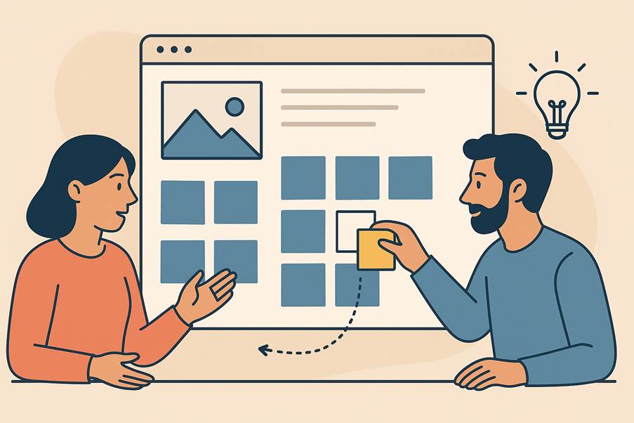
Figure 1. A user participating in a visual card sort exercise (generated with ChatGPT).
Imagine you are leading the redesign of a personal finance app. Several teams are a part of this effort. Every team has ideas and strong suggestions for placing their feature in a high-visibility area of the app. The artificial intelligence (AI) team wants their features in the spotlight, but the payments team insists recent transfers deserve prime real estate. The challenge is that there is only so much high-visibility real estate in the user interface.
Usage data or beta tests can anchor design decisions in evidence, but only after the product or feature is released. When no early feedback is available, there is a risk that teams default to the HIPPO (Highest Paid Person’s Opinion). Complex systems with dozens of features and workflows raise a key question: Is there a way to implement the users’ mental model for placing and grouping artifacts on a UI before the product is released?
Traditional card sort methods are helpful to understand users’ mental models. As NNGroup explains:
“A mental model is what the user believes about the system (web, application, or other kind of product) at hand. Mental models help the user predict how a system will work and, therefore, influence how they interact with an interface.”
Although traditional card sort methods have several applications and benefits, the method does not necessarily help us to understand where users expect to see these groups on the actual layout. As a result, interface layouts may reflect stakeholder opinions more than user expectations.
This gap in knowledge led the author to develop a visual card sort method that combines the advantages of the card sort method with participatory design, allowing for “a collaborative design approach that involves end-users in the design process… to create products and services that better meet the needs and expectations of users by applying their knowledge and experiences” (per IxDF).
Instead of traditionally sorting cards into categories, in the visual card sort, users directly arrange and label features on a prototype or interface skeleton. This lets you see which features belong together, where users expect to find the features, and why. By allowing users to place, reorganize, and label features directly on a prototype, the method captures real-world mental models to ensure that high-demand interface space is allocated in a way that best supports the users’ workflows, making the user experience intuitive.
Benefits
- Prioritize content effectively: Understand what users deem important or relevant for smarter content prioritization to ensure that critical features are prominent and accessible. This method provides hard data to explain why certain icons should be grouped together or be placed in certain locations in the UI. If designers face pressure to include more features, or more icons in popular locations, this method can bring clarity to what users actually value, and that sometimes, fewer key features in the UI are more effective than crowding the interface.
- Enhance discoverability: Tailor the layout to align with common mental models to improve the intuitiveness of navigation. Users can easily find the affordances because they are placed in locations users expect.
- Refine iconography and labels: Improve icon design and labeling. During the visual card sort session, users provide feedback about icons or labels that are unclear. Gather this input early to ensure that icons and words that resonate with the user are chosen, thereby reducing confusion.
The visual card sort method offers many benefits, yet there are a few important considerations you should keep in mind to ensure the exercise provides meaningful insights.
Things to Keep in Mind
The key purpose of the visual card sort method is to understand users’ mental models, not have users design the interface for you. The groups they create or the placements they come up with will give an insight into the why behind their decisions.
If you design a new product, it is important to understand user workflows before you do this exercise. Early interviews or existing user data about workflows are where the feature list comes from.
Note that the visual card sort method works best for designing new interfaces or large-scale product redesigns. It is not recommended for incremental design updates, such as introducing a single new feature.
Activity and Facilitation
The goal of this activity is to capture how users naturally organize and prioritize features on an interface, which reveals their mental models for the layout and grouping. After you complete this activity with five to eight participants, you will begin to see recurring patterns; for example, which features users consistently group together, the areas on the interface they prefer for certain actions, and which icons and labels cause them confusion.
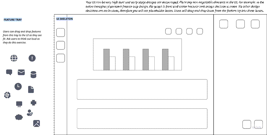
Figure 2: Feature tray with icons (left) and a mock-up (right). Participants place the icons on the mock-up to show their expected organization.
Card Sort Exercise
- Begin with a short warm-up exercise to help participants get comfortable with the activity. In this exercise, have them place a few sample icons or labels on the mock-up.
- Provide users with a list of icons or labels and the design mock-up containing placeholders, such as in Figure 2. You can use a whiteboard tool of your choice (including paper and sticky notes), or you can access the MIRO™ template.
- Ask users to place icons and labels on the mock-up to reflect their expectations of information organization on the page.
- Encourage users to think out loud, which tends to explain their reasoning for the placement and grouping. Do not interrupt users as they do this activity; save deeper probing questions for the debrief.
- Have users label each group they create (for example, the top-right section of the UI might be labeled Account Settings) to further explain their mental model.
- Allow users to rearrange icons if the icons no longer fit their group labels.
- Note if users do not pick icons from the tray; this indicates that a feature may not be as important to them.
- With users’ permission, capture the outcome by taking photos or screen captures or record the outcome for later analysis.
- At the end of the activity, askusers follow-up questions about their grouping choices and expectations for the interface. Follow-up questions help surface deeper expectations to ensure you capture features or actions that may not have been included in the activity itself.
Completing visual card sort sessions with multiple users will provide clear insight into how users organize and prioritize features. Let’s look at how to analyze the data.
Analysis
Once the visual card sort sessions are complete, review the placements and groupings across all users to identify patterns and trends. Look for features that consistently appear together or occupy similar areas on the interface as recurring layouts indicate strong mental models. Pay attention to outliers, which might reveal alternative workflows, or highlight areas of confusion. When analyzing results, avoid over-interpreting a single participant’s arrangement. Focus on recurring patterns across multiple users to guide design decisions.
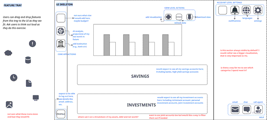
Figure 3: A sample visual card sort output showing how User 1 placed features, including their comments, such as “Not sure what these icons mean and how they would fit.”
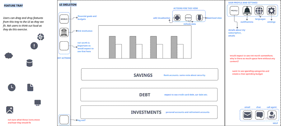
Figure 4: A sample visual card sort output showing how User 2 placed features.
In Figure 3, one user placed notifications, language, and settings together in a section called Account Settings, whereas in Figure 4, another user grouped the same features but also added the Profile feature to the mix. Although the groupings differed slightly, both participants located notifications, language, and settings in the top-right corner, which indicates a shared expectation of where account-related actions belong. With five to eight participants, these kinds of similarities and differences become clearer and strong trends begin to emerge.
Conclusion
The visual card sort method fills a critical gap: It clarifies how users expect features to be grouped and placed on an interface. Instead of relying on assumptions or the loudest stakeholder voice, the card sort method provides evidence of how people naturally think about navigation and layout. The team can analyze results across multiple participants and see which expectations are widely shared and which are unique to guide decisions about what features to standardize and where to allow flexibility. The result is an interface shaped by real user mental models, not guesswork.
Resources
Participatory Design, Interaction Design Foundation (IxDF)
Mental Models, by Megan Chan, Nielsen Norman Group
Visual Card Sort Template, Miro

Rajasi Desai is a Principal UX Researcher at MathWorks, focused on enhancing the user experience for technical users. She also leads the Inclusive UX Group, embedding inclusivity into the broader UX strategy. Rajasi holds a graduate degree from the University of California, Berkeley.
User Experience Magazine › Forums › Understanding User Mental Models: The Visual Card Sort Method