This article will cover the story of a patent for an augmented reality (AR) application which needed a completely new interaction model. The interesting thing to a UX practitioner will be learning about some of the challenges we faced, constraints of the system, and how to use emotion and gesture as inputs. The final product was the patent USD 813249S1, a patent which is still being referenced today.
When I joined Banuba among the first ten employees, augmented reality was not yet mainstream. Snapchat filters were new, Apple’s ARKit did not exist, and most people still thought of AR as a novelty. As Banuba’s founding designer, my brief was simple in words and vast in scope, build an interaction language for digital content that lives in the same space as the user.
Banuba is now a substantial business. Its AR technology powers experiences for Gucci, Océan, RingCentral, Vidyo, Parler, Ekino, Airmeet, and Greenbee. Looking back, I can see how much of that trajectory traces to the design foundations we set early on. One milestone from that period is a U.S. design patent I co-invented, USD813249S1, covering an animated, adaptive interface for AR. It has been cited 21 times by other patents, including several from Apple. For a designer, that is both a professional compliment and evidence that our approach travelled well beyond our own products.
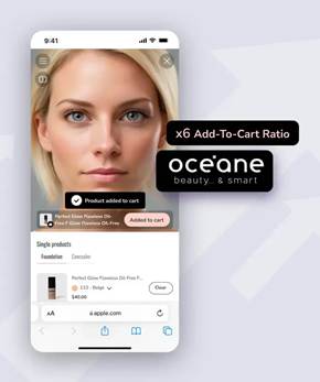
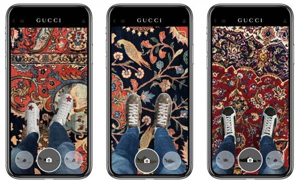
Figure 1. Examples of Banuba SDK in the wild, Océan and Gucci. Alt text for accessibility: On the left a screenshot of Océan app for trying on beaty products on the face in real time. On the right a screenshot of Gucci app for trying on shoes.
The early days at Banuba
We began in Minsk with a small team and a large conviction. AR would become a normal way to communicate, try products, and learn. There was no established toolkit for AR UX. No standard patterns. That absence was liberating and uncomfortable in equal measure.
We learned quickly that AR experiences cannot behave like flat apps. The background changes constantly. Lighting varies. People and objects move. Attention is split between the physical world and the augmentation. Any visual element must earn its place.
We kept circling back to three simple questions. How can someone pick and then adjust an effect without covering their face? What counts as a home screen when the screen is the room? How should anything enter and leave so it feels native to three dimensional space?
A quick example, choosing a background can be a simple pinch and dwell, not a heavy multi layered 2D buttons interface.
Figure 2. example how choosing a background could be just a matter of a simple and natural gesture instead of heavy multilayered conventional 2d buttons interface. Alt text for accessibility: A woman swiping with her hand in the air to change backgrounds behind her.
The problem we set out to solve
We wanted interaction that felt human. Rather than piling on buttons, we asked how the system could respond to intent signalled by expression and gesture. Could a smile become the trigger for a playful response, could a simple hand movement adjust an effect with no menus in sight. Our answer was to treat motion and animation as conversation, the experience reacts to you, not the other way round. Animation carries meaning, and gestures provide precision when it is needed.
From concept to patent, with dates
The interface that became USD813249S1 began as motion studies. We explored how effects might surface when intent is detected, then recede. After many iterations, we arrived at a design expressed through ten sequential frames. Each frame captured a distinct state and transition. Together they formed a narrative:
- the user signals intent
- an animated element appears with clarity
- the action completes
- the animation finishes, focus returns to content
For context, the concept work ran through 2016 and early 2017. We filed the design on 22 February 2017, and it was granted as USD813249S1 on 20 March 2018. We folded the interaction into production SDKs during 2017 to 2019.
https://patents.google.com/patent/USD813249S1
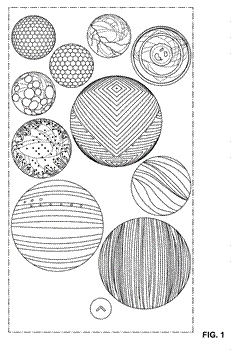
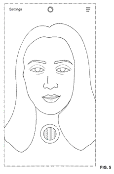
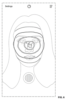
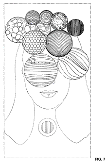
Figure 3. Image from the patent itself. They are using a special styling. Alt text for accessibility: A selection of black and white images showing the patent claim.
In plain language, the patent covered more than just the look and feel of the app. It covered an adaptive layout for the AR, where animated elements would appear only when useful. It also defined a sequence of transitional frames which keeps the user orientation and intent clear. Finally it covered the ornaments which make the animation feel as though it belongs in the environment, and not just sitting on top of it.
It is not merely a look. It is a set of behaviours that keep the person in flow. You smile and a playful character reacts. You pinch and an effect adjusts with a clear animated response. No clutter, no second guessing.
From experiments to a working standard
During my tenure we turned the patterns into a small internal standard that shipped with our SDK defaults. It focused on intent signals and response behaviours.
- Intent signals: This includes facial cues, such as smiling, openness of eyes, and hand gestures (e.g., pinch, dwell, open hand).
- Motion tokens: small building blocks of timing and easing that give the interaction a predictable rhythm. Think of them like punctuation. React is a quick beat, adjust is a short phrase, confirm is a nod, finish is a tidy full stop. Our base timings were react 140 ms, adjust 180 ms, confirm 120 ms, finish 160 ms.
- Spatial anchoring: involves pinning objects to specific locations in space, which allows alignment to stable facial landmarks and keypoints on the hand so animation feels attached to the person.
Reading emotion and gesture in lively scenes
Real scenes are lively, heads move, hands wave, and light changes. To keep emotion and gesture readable we do three simple things. First, confidence then react, we wait a brief beat until detection stabilises, only then play the animation. Second, anchor to the body, we attach visuals to the cheekbones, jawline, or fingertips so they feel grounded rather than jittery. Finally, match the scene’s energy, in busy moments we increase travel time slightly and use gentler easing so motion reads clearly, in calm moments we keep movements short and soft so they feel natural.

Figure 4. Example of anchoring to special face points and the importance of good blending of AR and reality. Alt text for accessibility: On the left an octopus character gently hugging a user’s face as a reaction on user’s smile. On the right a classic virtual hat placed on the heads of different people.
Designing when there is no playbook, the tools I used
When starting a new interaction model, one begins in a fog. What helped me turn fog into a design you can ship was a small set of habits.
Habit 1: Framing the Unknowns Before The Solutions
At the start of each cycle, we would create an Unknowns Brief. Each brief had three columns: showing what we believed, what we must learn, and how we would learn it. This kept the team focused on the questions we needed to answer rather than the product features.
As an example of the unknowns brief might be the belief that people ignore elements that cover facial features. In the Need To Learn column might have “Where can effects live without stealing attention?”. Finally, the How To Learn column might have “Ten minute hallway tests with a rough coded prototype.” Unfortunately, paper prototyping did not work well in a spatial environment as we learned in the early steps of our research.
Habit 2: Name the principles early, then let them evolve
We wrote five rules on a single card and treated them as living guidance. Context before chrome means the scene comes first, if anything stays on screen after the task is done it goes. Reduce cognitive load means remove choices that do not help. Motion as meaning says animation should explain cause and effect, not decorate. UI as an object in scene reminds us to respect proportion, occlusion, and parallax so elements feel placed, not pasted. Think spatially from the start keeps depth, reach, and comfort as first class constraints. We ran a quick principles check on every change, if user evidence beat a rule, we updated the rule.
Habit 3: Use a motion grammar that expresses emotion and intent
We treated motion like punctuation. React is the quick beat that says I heard you, about 140 ms. Adjust is the short phrase where the change happens, about 180 ms. Confirm is the little nod that signals success, about 120 ms. Finish is the tidy full stop that clears the stage, about 160 ms. We always kept the order react, adjust, confirm, finish, no overlaps. In busy scenes movements travel a bit more and ease a touch slower, in calm scenes they are short and soft.
Habit 4: Build the smallest experiment that can falsify an idea
We used 24 hour spikes instead of big prototypes. We wrote the question first, for example can a cheekbone ring feel natural, then hacked the tiniest demo we could, even a static image with a screen recording overlaid, and showed it to five people in two lighting conditions. We set a kill rule before testing, if two or more people tried to tap the ring like a button, the model was misleading. If the idea survived, we kept it, if not, we moved on.
Habit 5: Anchor design to the body and the world
Controls and effects only work when they live where the body can carry them. We map zones to stable landmarks and reach. The green zone sits just outside the cheekbones and jaw line, it is readable yet does not occlude features. The amber zone is the lips and brow, useful only for brief cues. The red zone is the pupils and nostrils, we avoid it. Thinking this way keeps elements comfortable and makes them feel attached to the person, not sliding on top.
Habit 6: Decide how you will decide
We paired a simple rule for making decisions with a tiny log of the decisions we made. The rule is forward looking, before a sprint we write how we will choose, what evidence we will watch, and an expiry date to force a revisit. The log is backward looking, after we choose, we record the problem, options, choice, why, date, and the expiry. Together they create a loop, the rule guides today’s choice, the log reminds us what we tried and when to check it again. When the expiry arrives we look at the evidence, keep the choice if it worked, or change it with the same calm process. Basically infinite loop for iteration on any feature or problem.
Habit 7: Define done as behaviour, not pixels
Defining an interaction as done means the experience has survived three stresses, low light, head turns, and fast camera moves. If the same action still triggers on the first try and the scene settles cleanly when it is finished, it is done.
Examples
A, Emotion driven, octopus character responds to a smile
No visible UI. The effects are switching just from users input: smile and head shakes in that case

Figure 5. The user controlling the effect with a smile and head shakes. Alt text for accessibility: The scene with face beautification and hair recolouring where the user controlling the effect with a smile and head shakes.
B, Gesture interactions
With hand in frame, user could interact with the machine without physical interaction.
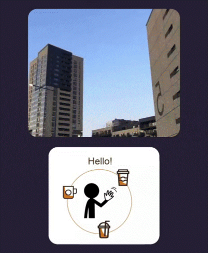
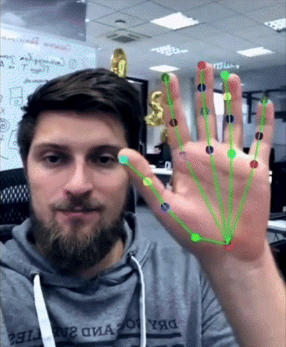
Figure 6. The user controlling the interface without touching, just with hand gestures. Alt text for accessibility: On the left the person is ordering a coffee with only gestures without touching. On the right the visual representation of user’s hand bones with anchor points.
C, Video effects in conferencing
An effects tray can be present, but the primary control is gesture, for example a pinch to toggle background blur. The tray serves as feedback, not as the main interaction.
Recognition beyond Banuba
Since being granted, USD813249S1 has been cited 21 times, including by Apple. Patent citations are not marketing copy. They indicate that later inventions considered earlier work meaningful prior art. For a small team in Minsk, seeing our approach echo into other companies’ filings was a quiet moment of pride. It suggested that our way of thinking about AR interaction had become part of the wider conversation.
Banuba’s growth and partnerships
While we were refining these patterns, the platform matured. Banuba’s SDKs now sit inside products across sectors.
- Gucci uses AR to power virtual try ons at a luxury standard
- Samsung integrates mobile AR capabilities at scale
- RingCentral, Vidyo, and Airmeet enhance meetings with real time effects
- Parler and other social platforms bring interactive layers to communities
- Ekino and Greenbee apply AR to retail and marketing journeys
These partnerships stand on a design philosophy we set early. Clarity first. Motion with purpose. Experiences that respect attention and belong to the scene, not on top of it.
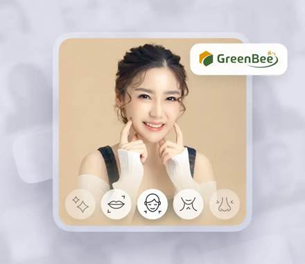
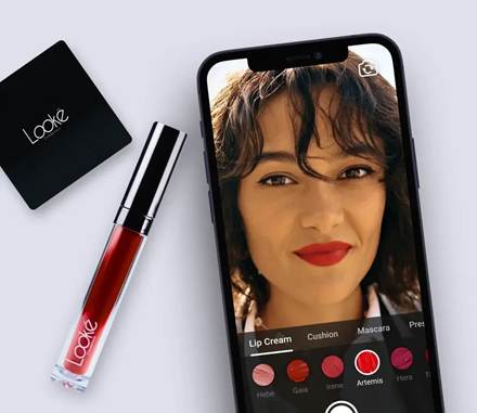
Figure 7. Examples of Banuba SDK, GreenBee and Looke. Alt text for accessibility: On the left a screenshot of GreenBee app for beautification. On the right a screenshot of Looke app for trying on different makeup products.
Practical lessons for teams adopting AR
If you are building AR today, start by prototyping emotion and gesture response early, even as quick storyboards, because timing choices are product choices. Test in varied environments, not only a bright office, to spot contrast and legibility gaps. Agree a small vocabulary of states so designers and engineers talk about behaviour, not just visuals. Treat performance as part of UX, a dropped frame is a broken interaction. Write down the rationale as well as the result, it speeds onboarding and cuts regressions. For rough interactive demos I often used Origami Studio before the first coded draft, it worked far better than paper in a spatial context.

Figure 7. an example of how rough coded early prototype look like. The technology is there, although experience and visually it is far from done. Alt text for accessibility: On the left a screenshot of GreenBee app for beautification. On the right a screenshot of Looke app for trying on different makeup products.
Why it still matters
The industry is moving toward spatial computing. Devices are beginning to treat the environment as the interface. Voice and gesture strengthen each other. AI helps with context, prediction, and focus. In that world, the principles behind USD813249S1 become more relevant, not less. In the future, experiences will react when there is real intent and stay quiet when there isn’t. Guidance will surface when needed rather than being on permanent display. The most elegant AR experiences will be the ones that leave the smallest footprint and the cheapest trail.
Closing thoughts
Being a founding designer at Banuba meant making choices without precedent and defending simplicity in a medium that can overwhelm. USD813249S1 is a snapshot of that effort. The system it captures does not try to impress. It tries to help, then get out of the way.
I am grateful to see those ideas live on in products people use every day and to see them reflected in how other companies approach AR. Good interfaces tend to disappear. Good ideas quietly travel.

Ivan Dzmitryievich is a product and interface designer with more than fifteen years’ experience. As a founding designer at Banuba, he helped invent US Design Patent USD813249S1. His work focuses on spatial interfaces, motion systems, and simple products for complex environments.
User Experience Magazine › Forums › Designing the Future of AR Interfaces, My Journey with Banuba and Patent USD813249S1