Design is a plan for arranging elements in such a way as best to accomplish a particular purpose. – Charles Eames
Design is about relationships. Whether digital, print, or physical artifacts, designers manage and structure the relationship between form, material, and content. As UX designers, we manage the relationships of content, navigation, and user journeys within the confines of a user interface. Increasingly, the content we want to publish must exist across many interfaces at once and be ready for platforms and devices yet to come. We need a way of making our content ready for anything the future will bring.
What is Future-friendly Content?
Future-friendly content is content that has been stored, structured, and connected outside any user interface—prioritizing content resources before interface representations. It allows content to be reused across all hardware devices and software platforms. It anticipates future user needs—even requirements for content we’re not yet able to supply. It provides a scalable structure and navigational model that won’t break, no matter how much content we eventually have.
Future-friendly content design starts by understanding how a subject fits together. You’ll begin with a model of your entire content universe, or subject domain, first adding structural detail then narrowing as you decide which parts to offer to your readers.
Structure is essential to making content future-friendly. You will take blocks of content and break them down into smaller chunks which can be reused, remixed, restyled, and repurposed as needed. With a detailed content model in place, you can plan for implementation in a content management system (CMS) and for display across all your target interfaces.
Advantages of structured content
Let’s look at a few reasons why you want to have structured content and why it’s future friendly.
- Structured content is inherently cross-platform ready. Whether it’s desktop, mobile, tablet, TV, or things we haven’t thought of yet, it’s all driven by the same data—semantic meaning and relationships stored in the database and expressed through the interface. With relationships held at data level, rather than just at page level, you can design interfaces that allow readers to explore the content many different ways.
- Structured content is robot-readable. Content publishing algorithms such as the Google Knowledge Graph cannot extract meaning from documents like humans can. Structured content makes it possible for computers to make sense of the data. Because you have created content as entities and not display pages, you can reuse the same content in different places whether you create the spaces or someone else does.
- Structured content scales. You can’t know what your future publishing needs will be, but a content structure based on real-world concepts and relationships has a greater chance of remaining valid longer and supporting limitless instances. In one example, when the BBC switched to this approach to build pages for their TV and radio shows, they created a structure that supports 1,500 new shows being added every day.
A Future-friendly Website
To show these concepts in practice, let’s look at the website for the 2015 IA Summit, an annual conference about information architecture. Our goal was to build a future-friendly website, supporting the 2015 conference and every event yet to come. Breaking from the history of one-off disposable sites, our reusable website can be continuously improved by each new custodian of the conference. Interfaces may change, devices may come and go, but the relationships between speakers, sessions, events, and locations will always hold true.
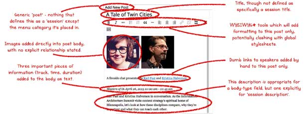
Figure 1 shows a typical web page with bits of information trapped in the content management system’s “body” field as one big blob of stuff. Relationships between the speakers, their sessions, and the session’s time, duration, and location are only implied on this one page. This solution limits reuse across different interfaces because the information isn’t structured.
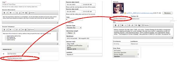
In our future-friendly version of the website, we broke down the content into smaller chunks and applied structure (see Figure 2), separating the content from the design. The chunks of content became data, with the relationships explicitly described in a way that both people and robots can understand. Because data is stored as an entity separate from any page-based representation, it’s future-friendly—ready for any interface yet to come.
Dissecting the Subject Domain
Future-friendly content design starts from sharing a common language with the users we are designing for and the wider team we design with. The space and context we are designing for has inherent terms, relationships, and rules. Our role as UX researchers and designers is to tease out these mental models and resolve them into an overall picture of a subject domain.
Understand the subject by talking to users
When you start a project you may not know what terms are used in a subject area or where the complexity lies. That’s where your UX research skills come in. You can extract domain knowledge from experts and users to make a best-fit understanding using interviews, contextual inquiry, search logs, and card sorting.
Start with a subject-matter expert. Experts help you map the world. Get an overall picture of their world. Find out which things are important, what those things are called, and how they relate to one another.
Then talk to users. Users mark the points of interest. They’ll have a different view of where the subject begins and ends. They’ll likely have less objectivity than experts, and you can use that to prioritize. Find out what terms they use and favor their language where you can.
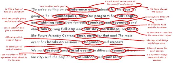
Every interface you later design will be an expression of the things and relationships in that subject domain. Figure 3 shows how you can extract the concepts from an interview and put them to use in your domain model. Your model should strike a balance between having enough authority to please experts but enough accessibility to appeal to all users.
Create a domain model of the subject
Your research with subject-matter experts and users uncovers all the important concepts and terminology within the subject domain, and your keen questioning helps you understand the relationships between them. You can capture this understanding by drawing a domain model––a boxes-and-arrows diagram focused on the concepts and their relationships.
- Concepts are the things that exist within a subject. Their exact definition is often specific to a particular context. For example, the word “site” means something different in the web design industry than it does in construction. Concepts are intended to be reusable. You might think of them as a category of thing rather than the thing itself. Within our conference subject domain if our concept was session, then “Workshop” and “Lightning Talk” would be two different examples. (The concept will break down further into descriptive properties—we’ll get back to that.)
- Relationships explain how the concepts fit together. Think about the real-world relationship here and cast from your mind any thought of website navigation. Any concept can have a relationship to one or more other concepts. In a domain model you actually describe what that relationship is. If you have a concept of moon and a concept of planet you could connect them and explicitly describe that connection by stating that the moon “orbits” the planet. That gives an extra dimension to understanding the subject domain, and when eventually expressed through an interface, can teach how the world joins up. Learning through linking!
Fleshing out all the concepts and relationships usually takes a lot of group discussion, a few iterations, and a big waste paper basket. It’s a good idea to write each concept out on a separate sticky note, then arrange them on a larger sheet of paper to start sketching relationship lines.
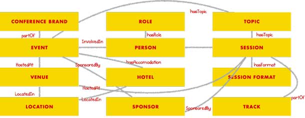
In Figure 4 our conference brand is IA Summit, which supports multiple events such as the 2015 event. We make the distinction because we want to support future events, which may each have a specific theme or topic, under the same brand umbrella. The specific event has a venue, such as the Minneapolis Hyatt, which has a real-world location. Conferences often have an official hotel for attendee accommodation. For our event this hotel was also the venue, but that’s not always the case.
While it was tempting to think about “speakers,” we realized that many of the same faces attended the IA Summit every year. This year’s attendee might be next year’s session speaker and may even rise to conference chair. Regardless of their role in a specific event, they’re always the same person.
Sessions fill out our conference program with formats including lectures, workshops, and social gatherings. The IA Summit schedules up to three concurrent tracks. Each session, particularly the socials, might be lucky enough to attract a sponsor, though a sponsor may choose to support the overall event.
Make sense? Would you have done it differently? Vive la difference! Your model is only your own best take based on your own research. Like other kinds of design you can test, validate, and make rapid iterations—especially while your design is made from sticky notes and string!
The process of domain modeling is great for really figuring out the hidden complexities within a subject. It communicates subject understanding with stakeholders and team members to make sure everyone is on the same page.
A domain model isn’t a site map, but an abstract expression of a real-world system. You won’t necessarily have all the content to support every concept, but that’s fine. You can decide later how much of the model to expose through an interface. You’re thinking future-friendly—gaining a complete understanding of our content universe to anticipate and build in support for future content gathering.
Modeling Content
With your domain model in place, it’s time to look in detail at how each concept breaks down into smaller chunks. Abstract concepts start to become real as they get defined as “content types,” descriptive entities defined through specific properties that will become populated with content. As you move from the abstract to the specific, your domain model becomes a content model.
Similar to the domain model, the content model expresses relationships between content types. In our example (see Figure 5), sessions have speakers and sponsors and take place in a venue. A person can be assigned a role and session per event. Events take place in venues and can have sponsors and people who take part. A pro tip here is to add cardinality, expressing how many instances of each content type can be related to another. So a session may have one or more speakers, and zero, one, or more sponsors.
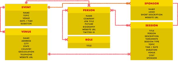
Each content type is made up of constituent properties. For example, each person has a name, a company, a job title, and a biography. They may also have some associative data like a website address, Twitter handle, and the all-important headshot picture. Remember that by breaking down content types into smaller chunks, each property holds a piece of reusable data. If we want to design a landing page with just names and photos it’s no problem, we have that data. If circumstances cause someone to need to change their name, no problem, we can make that change in one place, and it will be automatically updated everywhere.
Content modeling is an iterative exercise and you should expect your model to change as your understanding both of user needs and the subject domain improves.
Planning Content
Once you’ve translated research into a high-level domain model and applied detailed definitions to transform abstract concepts into specific content types, you’re ready to assess the content itself and define the system that will manage it.
Conduct a content audit
Auditing is where you take a long, hard look at the content you have available. Audits typically assess content against quality, timeliness, and relevance. Your detailed content model based on users’ mental models serves as a great way to quickly uncover what you have too much of, where gaps may occur, and where content may need a little reshaping or chunking to better suit the concepts identified in the model.
The audit may uncover opportunities for your organization to fill an unmet need or to cut unnecessary material. You may also find that some content is duplicated, whether within your content universe or in someone else’s. It is usually better to link to what exists than to recreate or duplicate it.
While auditing, you’ll make final decisions about which content types you’ll expose. Have too little of one type of content and no means to produce it? No problem. That content type can still exist in the model and eventually be populated in the future.
You always have the overall domain model to guide long-term content development. It is a constant, whereas the content model may shift as you have the means to expose more or less of the subject’s universe.
Define the content management system
The content model serves to define the content types and their associated properties. That’s all fine in theory, but how do we make that work in a content management system?
CMS developers and front-end developers are your friends here. They’ll help you translate your paper model to a relational database schema and figure out any extra content chunks needed for proper display across all screen sizes and interfaces. And you’ll help them to move into the build phase with a clear plan. Content planning happens anyway, with or without the involvement of a UX designer. Developers may not have the insight you’ve gathered into user needs or the subject domain, so through your coaching and leadership you’ll save time, money, and several headaches for the life of the product and beyond.
Your content model describes all your content types, the relationships between them, and their constituent properties. To implement this model in the CMS, you’ll need to take another pass through the model to ensure you have considered details such as inherent quirks of the CMS, how the content is created, which fields need author flexibility, and which fields need to be rigid for governance purposes.
After your detailed pass, you might decide to break down a person’s name into First Name and Last Name. You also might define that a session’s Start Date and End Date is a robot-readable “date” field type and includes both date and time so that the session’s duration can be calculated programmatically. Additionally, you might allow an author to have a rich-text area to write and format a person’s biography but make them pick that person’s role from a predefined list in order to avoid ambiguity or error.
Content types and properties don’t need to be perfect on the first iteration. Things will change as you plug in real content and start finding new relationships or exceptions to the structural rules. You need to find the right level of granularity and structure to be easily consumable across devices. More content types means more reusable content, but too many content types becomes hard to manage and hard for content authors to make the right choices. Your goal is to have just the right number of content types. Not too many or too few.
Work as a team
Sound daunting? Never fear! Unless you happen to be a content strategist, designer, and developer all in one, content-first CMS implementation is a team sport.
Step 1: Team up
Grab your models and content audit then gather the team in a room, fire up a collaborative spreadsheet (here’s a template), and settle in. When complete the spreadsheet will document which content you’re going to publish, how that content is structured through content types and properties, and how it will be represented through your chosen interface.
If at all possible, the project manager, content strategist or information architect, UX designer, front-end developer, and backend developer should all be in the meeting. You might also want to include a client or stakeholder representative if that person is savvy enough to understand the process. Questions will arise that can be answered only by a stakeholder, but those can be documented and talked about separately.
Step 2: Define content types
As a team, review and define exactly which of the content types from your model will be implemented in the CMS. Expect to iterate as you run through examples and add complexity. As you start to think about how content needs to be displayed or supported by other editorial or contextual content, you’ll probably find additional CMS-specific content types appear. For the IA Summit, this process revealed the need for content types Blog Post and Article. Those are more editorial than conceptual so had not been included in the original domain or content models.
Step 3: Determine fields
Here you get down to the atomic level, determining exactly which fields the CMS needs to support. Review the properties from the content model and discuss requirements to determine which properties you’ll translate into CMS fields.
You will not only want to write down the field names but also determine field types and display labels which should match the terminology used in the content and domain models. Consider the needs of the content and the author experience when selecting field types. Some fields are simply plain text, others benefit from a little inline formatting, and still others are more specific, such as an ISO date stamp or validated email address.
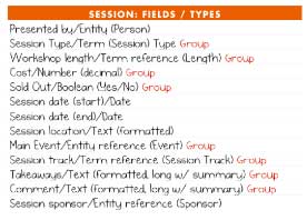
Some fields actually refer to whole other content types. Figure 6 shows the fields included in the content type Session. One of the properties to describe the Session is the Person who is presenting. Person is a whole other content type with its own properties so we refer to the field type as an entity. By including content-type entities as properties of other content types, you create in the CMS the relationships you first expressed in the conceptual content model.
Here is the gist of what Eileen Webb has written about Training the CMS: make the fields as foolproof as possible and set up authors for success. Provide help text, groupings, and just enough flexibility or rigidity as necessary to make it easy for authors to enter the content. Think of this step as an exercise in usable form design.
Step 4: Determine display requirements
You could stop there and be miles ahead of the usual handoff from design to build! But since you’ll be defining interface structures and planning user journeys, you’ll also want to determine how data will be displayed, sorted, or filtered. For example, to include a “speakers” page on our website with people sorted alphabetically by last name, we’d need to include fields for First Name and Last Name.
You also define here which fields are explicitly exposed as content, and which are used to inform display logic. For example, as shown in Figure 7, we want to display the Keynote Speakers. We want every Person (the content type) with the Role of “Keynote Speaker” to be shown. For the display of our speakers page we only want their name and photo. We want them displayed in ascending (starting with A) alphabetical order by Last Name and then First Name. When it comes to visual display, we’ve chosen not to explicitly list each person’s role but allow the designer to assign a different style to keynote speakers than to regular speakers.

Step 5: Enter sample content
How do you know you got your structure right? By entering real, sample content. Test drive the CMS by entering at least one example of every content type. For the IA Summit site we used examples of every type of role and every type of session to fully test the entry and display of content. Testing is a good idea prior to large-scale content migration, especially if you find you need to add a new field or content type.
It takes practice to get this process running smoothly, but you are on your way to a future-friendly, content-first process—one where tweaks can be made rapidly and content can be created in parallel to design and development. Guided by conceptual models and detailed specifications, the entire team has a shared understanding of what needs to be done, and why.
The Future is Now
We love content strategy and information architecture, so we’re a little biased, but getting to content is the whole point of UX. In most cases, do people really want to immerse themselves in an experience for its own sake, or do they just want to get stuff done? Helping users complete tasks efficiently and satisfactorily is what we do. Typically, that means getting them to the right content.
In UX we’re passionate about empathy and collaboration. That means having a better understanding of how our colleagues think and work. The future-friendly approach looks at structure as a developer would—separating out the model, the various interface views, and the controlling interactions. You’ve probably experienced the issues that crop up when you start with wireframes or visual designs filled with lorem ipsum placeholder text. When the content eventually comes it doesn’t match the designs, and as a result either design or content are compromised. Designing content-first ensures the interface design supports the content. Not only will this process better serve the users, it will allow content to be created in parallel with the design and implementation.
Designing future-friendly content means applying as much effort to planning and creating content structures as you would to designing interfaces. For companies it maximizes their investment in content production, making content more findable, reusable, and ready for all devices and publishing platforms—think Facebook’s Instant Articles or Google’s Accelerated Mobile Pages—and content outlets yet to come. And when the inevitable website redesign comes along, you’ll know you’re building on a solid foundation.
This process might seem daunting, but it’s really just another application of your UX skills. You are using the same user-centered process to design a content structure that you’ll later use to design an interface. You’ll be engaging with your stakeholders at their point of subject-matter expertise, and neatly sequencing the design concerns of information, representation, and interaction. By ensuring the structure accurately reflects the topics we want to represent, interface design becomes much more straightforward. As form follows function, so interfaces serve the needs of content. Better content structure means more accurate interfaces.
Start from understanding and language, iterate with detail, and once your content exists as a structural model, make it shine through every interface you lay over it. As Alan Kay famously remarked, “The best way to predict the future is to invent it.”
[greybox]
Figure 1.
A sample page of a session description as a single “blob” of content within a content management system’s editing interface. Handwritten callouts annotate the elements on the page:
- Add New Post: Generic “post”: nothing defines this as a ”session” other than the menu category it’s placed in
- A Tale of Twin Cities: title, though not specifically defined as a session title
- Toolbar: WYSIWYG tools which add formatting to this post only, potentially clashing with global stylesheets
- Headshot: Images added directly into the post body with no explicit relationships stated
- Links to speakers’ names: static links to speakers’ bios added by hand to this post only
- Session type and time: three important pieces of information (track, time, duration) added to the body as text
- Description: this description is appropriate for a body-type field, but one explicitly for “session description”
[/greybox]
[greybox]
Figure 2.
The same content as Figure 1, but now in a content management editing interface designed with many structured fields:
- Title
- Session takeaways
- Presented by
- Session date
- Cost
- Session type
- Workshop length
- Main event
- Session track
- Location
- Speaker photo
- Speaker name
- Speaker bio
- Speaker role
A hand-drawn annotation shows that the speaker is explicitly associated with a specific session.
[/greybox]
[greybox]
Figure 3.
Transcript of a stakeholder interview, with handwritten callouts circling the nouns and showing the interviewers questions and notes. Transcript reads: “So we’re putting on a conference event about IA. This year it’s going to be in Minneapolis, MN. Our program has full-length and lightning talks from fantastic speakers and keynotes, and other folks giving full-day and half-day workshops, on topics like Future-Friendly Content. Book early for that one! The main event has hands-on sessions for beginners and experts.
We host sessions and social events in different venues all over the city, with the help of our volunteers and sponsors.”
Notes read:
- MINNEAPOLIS, MN: new location each year?
- LIGHTNING TALKS: is this a type of talk or a duration?
- FOLKS: what are people giving workshops called?
- SPEAKERS: can a speaker also give a workshop?
- BEGINNERS: difficulty? which session types?
- SOCIAL EVENTS: is social just a kind of session?
- VOLUNTEERS: can volunteers also be speakers? what about in the future?
- CONFERENCE EVENT: is each event an instance of the overall “conference”?
- UX: is the topic always the same?
- KEYNOTES: Is a keynote different than a speaker?
- HALF-DAY: all sessions have variable duration?
- TOPIC: is this kind of topic like the main event topic?
- BOOK EARLY: ticketing? availability? workshops only?
- VENUES: different venue for each session?
- SPONSORS: is a sponsor always associated with a session?
[/greybox]
[greybox]
Figure 4.
Domain model diagram for the topic of “conferences.” Shows the principal concepts of:
- Conference brand
- Event
- Venue
- Location
- Role
- Person
- Hotel
- Sponsor
- Topic
- Session
- Session format
- Track
It also shows the relationships between these concepts:
- Event – partOf – Conference Brand
- Event – HostedAt – Venue
- Venue – LocatedIn – Location
- Event – hasTopic – Topic
- Event – hasAcccomodation – Hotel
- Event – SponsoredBy – Sponsor
- Person – InvolvedIn – Event
- Person – hasRole – Role
- Session – hostedby – Person
- Session – hasTopic – Topic
- Session – hostedAt – Venue
- Session – hasFormat – Session Format
- Session – SponsoredBy – Sponsor
- Session – partOf – Track
[/greybox]
[greybox]
Figure 5.
A partial content model diagram for the topic of conferences. It shows each main concept, the properties of that concept, and the relationships between concepts.
- One Event has one or many Persons
- One Event has one or many Venues
- One Event has zero, one, or many Sponsors
- One or many Persons has one or many Roles
- One or many Persons has zero, one, or many Sessions
- One Session has zero, one, or many Sponsors
Event has the following properties:
- Name
- Topic
- Venue
- Date / Time
- Duration
Venue has the following properties:
- Name
- Address
- City
- State
- Country
- Geolocation
- Telephone
- Website URL
Person has the following properties:
- Name
- Company
- Job title
- Picture
- Biography
- Website URL
- Twitter ID
Role has the following property:
- Title
Sponsor has the following properties:
- Name
- Logo
- Short description
- Website URL
Session has the following properties:
- Title
- Person
- Description
- Takeaways
- Session type
- Topic
- Time / Date
- Duration
- Venue
- Cost
- Sponsor
[/greybox]
[greybox]
Figure 6.
Field names and properties for the Session content type:
- Presented by/Entity (Person)
- Session Type/Term (Session) Type – Group
- Workshop length/Term reference (Length) – Group
- Cost/Number (decimal) – Group
- Sold Out/Boolean (Yes/No) – Group
- Session date (start)/Date
- Session date (end)/Date
- Session location/Text (formatted)
- Main Event/Entity reference (Event) – Group
- Session track/Term reference (Session Track) – Group
- Takeaways/Text (formatted, long with summary) – Group
- Comment/Text (formatted, long with summary) – Group
- Session sponsor/Entity reference (Sponsor)
[/greybox]
[greybox]
Figure 7.
Basic specifications for how to display the keynote speakers for the 2015 IA Summit on the Speakers page.
Name
- Keynote speaker
Fields
- User ID (linked to node)
- Picture
- Name
Pager/Number of
- Display all items
Filters
- Person status = yes
- Person role = Keynote speaker
Sort
- Last name ascending
- Name ascending
[/greybox]
