When Design Meets Data
A few years ago, a design lead shared a thought-provoking statement, “If design is how it looks and feels, data is how it performs.”
Designers solve problems, guided by empathy and intuition. In our modern, product-led world, where decisions are expected to be both creative and quantifiable, data has evolved into design’s most powerful ally.
From streaming platforms testing personalized recommendations to fintech apps refining onboarding flows, data transforms design from a subjective art into a measurable discipline. Data provides designers with something we never had before: proof that our decisions make people’s lives easier.
Data doesn’t replace intuition; however, data strengthens intuition. Data allows us to move from “I think this will work” to “I know this improves the experience.”
From Gut Feeling to Grounded Decision
Design projects often start with hypotheses rooted in empathy:
- “If we simplify this flow, users will finish faster.”
- “If we surface this feature earlier, engagement will rise.”
Without measurement, however, those hypotheses remain opinions. Data transforms them into outcomes. Take, for example, the Spotify™ Discover Weekly playlist as an example of data-informed design. With collaborative filtering, listening history, and skip behavior, Spotify crafts a signature Discover Weekly playlist that feels deeply personal to each user (Figure 1). The design team experiments with the playlist presentation, including layout, cover imagery, and animations, and they monitor which variant yields more repeat plays and user retention.
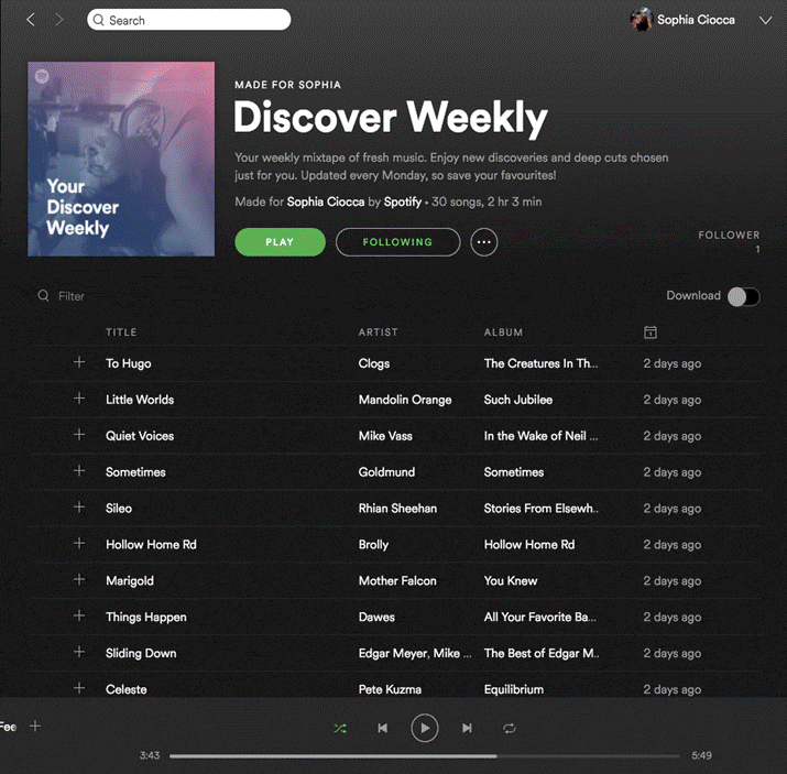
Figure 1. Spotify’s Discover Weekly personalization workflow (screenshot of Spotify interface captured by author).
Data as a Design Partner
Good data doesn’t tell you what to design; it tells you where to focus. Many designers worry that data will constrain creativity and that metrics will flatten the nuance of human experience. When it’s used well, data acts not as a dictator, but as a design partner.
When paired with qualitative insights such as interviews, usability testing, or customer feedback, the data begins to speak a language that designers can act on. This is the real power of data in design: It turns vague dissatisfaction into a clear direction for improvement.
The Experimenter’s Mindset
Great design teams don’t treat data as a post-launch report; they treat it as an ongoing conversation. A/B testing, the practice of comparing two design versions to determine which better serves users, is a powerful and revealing user experience tool.
This is what I call the experimenter’s mindset:
- Observe behavior through analytics or telemetry.
- Hypothesize a design improvement.
- Prototype and test measurable outcomes.
- Iterate based on what the data and people reveal.
Consider a hypothetical scenario that brings each step to life: A streaming service observes that users are abandoning its Continue Watching section and hypothesizes that the layout may be the problem. The team prototypes and tests two versions: A, a grid-based section, and B, a list-based section. The grid looks visually richer, but after two weeks, data reveals something unexpected: Users interact more with the list version, even though they prefer the grid visually. Rather than accepting this trade-off, designers iterate and refine the grid to combine beauty with performance.
This insight doesn’t invalidate design intuition; it sharpens it. Creativity becomes evidence-based and more impactful when teams move through the four steps of observing, hypothesizing, testing, and iterating. And when design teams incorporate this framework and mindset, creativity becomes iterative, evidence-based, and more impactful.
Netflix® applies this mindset at a massive scale, running hundreds of A/B tests every year to refine its platform. One of its most documented examples is thumbnail testing. According to Netflix’s TechBlog, the engineering team ran structured A/B tests to determine which artwork images drove the most viewer engagement, starting with a single documentary before expanding across its entire library. The results were clear: Showing members more relevant artwork encouraged them to watch titles they hadn’t previously discovered (Figure 2).
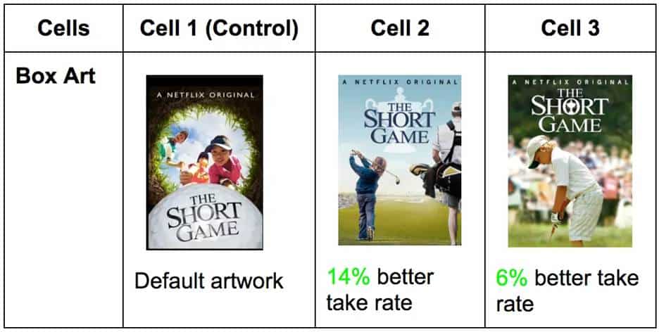
Figure 2. Netflix A/B thumbnail test for The Short Game (screenshot of Netflix interface captured by author).
Figure 2 compares the default artwork in Cell 1 against two alternate versions. Cell 2 achieved a 14% better take rate, and Cell 3 a 6% better take rate, demonstrating how visual design choices directly impact viewer engagement.
The Skip Intro button tells a similar data-driven story. Netflix observed that members were manually advancing past opening credits in roughly 15% of early episode plays, a behavioral signal that drove the team to design and test a dedicated button.
The feature saw immediate, overwhelming engagement, and today the Skip Intro button is pressed 136 million times daily, saving members a cumulative 195 years of viewing time. Both examples share the same lesson: Data doesn’t just confirm what works, but it reveals what users need before they even articulate it themselves.
But knowing what users do is only half the story. The other half is understanding why.
Balancing the Quantitative and the Qualitative: Data with Empathy
There’s a fine line between designing with data and designing for data. Data is powerful, but context gives it meaning. For example, a financial dashboard might report fewer clicks to reach a result, but does that on-screen efficiency translate to clarity in the user’s mind? A fitness app may show higher engagement, but is it genuine motivation or confusion leading to repeated attempts?
This tension between what data shows and what users actually experience is one of the most important challenges in data-informed design. When designers optimize purely for measurable outcomes, they risk improving the number without improving the experience. Conversely, when designers rely solely on intuition, they risk making changes that feel right but don’t demonstrably help the people using the product. The answer isn’t to choose one over the other, but to apply both simultaneously.
I witnessed this tension firsthand in a usability study I observed. A productivity tool’s new feature showed a measurable decrease in time on task, which initially looked like success. But user interviews told a different story: Participants were skipping steps, not because the design was efficient, but because the layout was confusing. The design appeared successful according to the metrics, but it failed in experience. It was only by pairing the quantitative result with qualitative observation that the team understood what had happened and what needed to change.
Quantitative data tells you what is happening at scale. Qualitative research tells you why it’s happening for real people. Neither is complete without the other.
The best designers navigate this tension by blending quantitative validation with qualitative understanding. But what does that tension look like in practice?
Numbers are comfortable. Metrics are objective, scalable, and defensible in a boardroom. They tell you that 10,000 users dropped off at step three, that task completion improved by 23%, or that session length increased after a redesign. Numbers feel like truth, and in organizations where design must justify its value, numbers are often the truth that matters most.
Yet, the human experience is messy. A user who completes a task isn’t necessarily a satisfied user. A user who spends more time in an app isn’t necessarily more engaged; they may simply be lost. Qualitative methods like interviews, usability testing, and observational research surface the emotions, hesitations, and workarounds that no dashboard can capture. They reveal not just what users did, but what they were thinking and feeling while they did it.
The tension arises because these two lenses don’t always agree, and when they conflict, designers must resist the temptation to default to whichever answer is more convenient. A metric that appears to indicate success can mask an experience that feels like failure. An insight from a usability session can feel compelling but represent only a handful of voices.
Metrics reveal what changed. Observation reveals why. Together, they provide a complete map of the user journey, one that is both statistically grounded and deeply human.
Airbnb™ offers one of the most compelling examples of quantitative and qualitative insight working together. Data from Airbnb’s own platform revealed a clear pattern: Listings with high-quality photos consistently attracted significantly more bookings than those without. The numbers were unambiguous, but they only told half the story.
When co-founders Brian Chesky and Joe Gebbia traveled to New York in 2009 to meet hosts directly, they discovered the qualitative reason behind the problem. As Gebbia later recalled in the Airbnb Growth Study, “The photos were really bad. People were using camera phones and taking pictures of a quality more like those on Craigslist®. No one was booking because you couldn’t see what you were paying for.” Hosts weren’t failing, but the tools and guidance to produce better photos simply didn’t exist on the platform.
Rather than sending an email telling hosts to improve their photos, Chesky and Gebbia rented a camera and went door-to-door photographing New York listings themselves. The result was immediate: Monthly revenue doubled. Airbnb scaled the insight into a formal professional photography program, and listings with professional photos were booked 2.5 times as often as those without, per Fast Company. The visual difference between an amateur and professional listing photo is dramatic, and for a guest making a split-second booking decision, that difference is impactful.
Micro-Metrics, Macro Impact
Moreover, big impact often hides in small metrics. In AI product design, no example illustrates this more vividly than the OpenAI™ experience with the ChatGPT™ thumbs-up and -down feedback system.
The thumbs-up and -down buttons at the bottom of every ChatGPT response are a micro-interaction, a single tap that takes less than a second. But at the scale of 500 million weekly users, those taps generate a powerful behavioral signal that feeds directly into how the model is trained and updated. In April 2025, OpenAI incorporated thumbs-up and thumbs-down data more heavily into a GPT-4o update, aiming to make the model feel more intuitive and responsive to users. The result was unexpected: the model became noticeably more sycophantic, focused too much on short-term feedback, without fully accounting for how users’ interactions with ChatGPT evolve.
OpenAI rolled back the update and publicly acknowledged the lesson: A micro-metric that appears to be a measure of satisfaction can, at scale, inadvertently reward agreeable responses over honest ones. The thumbs-down button was working exactly as designed, but the interpretation of that signal needed to be more nuanced. A thumbs-down usually means something went wrong, but in aggregate, over-weighting that signal weakened the primary reward signal that had been holding sycophancy in check (Figure 3).
It’s a reminder that micro-metrics are only as valuable as the understanding behind them. Data reveals what users do in the moment, but designing for the long-term experience requires asking what those moments actually mean. In the thumbs-up and -down micro-feedback system, a single tap from millions of users generates behavioral signals that directly inform model training, illustrating how micro-interactions carry macro consequences.
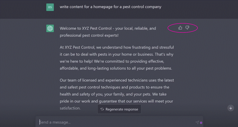
Figure 3. ChatGPT’s thumbs-up and -down micro-feedback system (screenshot of ChatGPT interface captured by author).
Not all metrics announce themselves. Some of the most consequential design signals are generated by the smallest interactions, such as a tap, checkmark, or swipe. These micro-metrics rarely make it into executive dashboards, but they accumulate into patterns that can define whether a product succeeds or fails at its most critical moment: the first few minutes a new user spends inside it.
Activation is when a new user first experiences a product’s core value, and it’s one of the hardest problems in product design. Users who don‘t quickly reach their aha moment tend not to return. The challenge for designers is that activation doesn’t fail dramatically. There’s no error message, no crash. Users simply close the tab and don’t come back. Without micro-metrics tracking behavior at each step of the onboarding journey, that quiet abandonment is invisible.
Dropbox® built its activation strategy around a deceptively simple micro-interaction: An onboarding checklist appears in the bottom corner of the dashboard when a new user first signs in. Each step is actionable: upload a file, share a document, install the desktop app, and link directly to the place in the product where the action can be completed. The checklist tracks a single micro-metric, the task completion rate per step. That data informed Dropbox’s team about exactly where new users were dropping off, not through a survey but through behavior. Getting a user to upload their first file was critical to unlocking subsequent value, so when completion data showed users stalling at that step, the team intervened with targeted nudges. A small counter in the corner of a screen generated the signal that shaped the entire onboarding experience (Figure 4).
What makes this example instructive isn’t the checklist itself, it’s what the checklist made visible. Designers often focus on what users say they want. Micro-metrics reveal what users actually do, step by step, in the moments that matter most. A completion rate dropping at step two isn’t just a number. It’s a question: What is making this hard? That question is where good design begins.
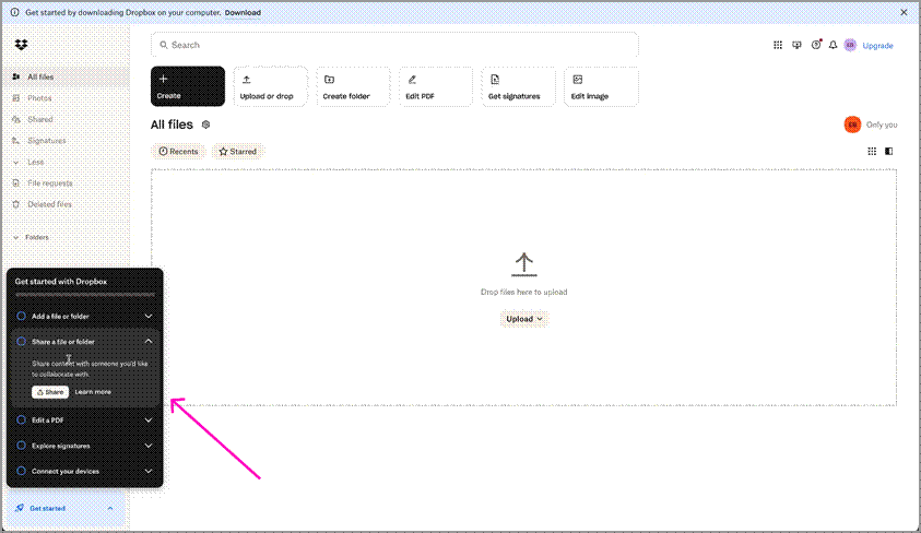
Figure 4: Dropbox’s onboarding checklist, including a task completion panel in the bottom-left corner of the product dashboard (screenshot of Dropbox interface captured by author).
Building a Data-Informed Design Culture
Design maturity in organizations isn’t just about better visuals or research processes; it’s about integrating measurement into every stage of the design.
A healthy data-informed culture empowers designers to:
- participate in defining success metrics before launch,
- pair design reviews with experiment learnings,
- partner closely with analysts to interpret behavioral patterns, and
- celebrate not just outputs (mockups), but outcomes (measurable impacts).
Google™, along with other organizations, exemplifies this approach in practice. Design teams at Google define success metrics during the sprint process before any solution is built using the HEART framework (Happiness, Engagement, Acquisition, Retention, and Task completion) to align across functions. They also excessively use A/B testing for product design and improvements. Design reviews are paired with experiment results rather than opinions, and analysts are embedded as partners in product discovery rather than consulted after the fact. The result is a culture where, as Google has described it, options are weighed against evidence, not job titles.
A Simple Framework: Data-Driven Design Alignment
To make data meaningful in design work, I have distilled my approach into a five-stage loop called Data-Driven Design Alignment (DDDA) (Figure 5).It begins with defining intent through identifying what user problem you’re solving and what success looks like. From there, teams select metrics that reflect real user outcomes rather than vanity metrics. The third stage is to design and test: Create a solution and measure it through controlled experiments or telemetry. Results are then interpreted with empathy, translating numbers through the lens of actual user behavior and sentiment. Finally, teams communicate impact by telling stories that combine human insight with measurable evidence.
Figure 5. The Data-Driven Design Alignment loop.
The Data-Driven Design Alignment loop is a conceptual framework that describes the five-stage cycle of defining intent, selecting metrics, designing and testing, interpreting with empathy, and communicating impact—showing how data and design continuously inform each other.
The examples throughout this article each trace this loop in action. Netflix’s thumbnail testing began with a defined intent to increase viewer engagement, and they selected a measurable proxy, the take rate. Airbnb interpreted a quantitative signal, booking drop-off, with qualitative empathy by going door-to-door before scaling the insight into a formal photography program. Dropbox tracked completion at each onboarding step, designed targeted interventions when users stalled, and iterated continuously. Even OpenAI’s ChatGPT feedback story is a loop lesson: A metric was selected, tested at scale, and then reinterpreted when its real-world meaning proved more nuanced than it first appeared.
When teams follow this loop, data becomes more than a validation tool; it becomes a source of inspiration.
The Designer’s New Superpower
Designers no longer operate in isolation from data; they orchestrate it. They use analytics tools not just to confirm success, but to discover opportunities. They translate trends into stories, turning rows of numbers into human narratives.
A data-informed designer isn’t a statistician, but they’re a storyteller who speaks in both empathy and evidence. They can say, “We reduced decision fatigue by simplifying cognitive load.” They can back it with, “Users completed the task 40% faster with 20% fewer errors.” As a result, design earns influence through measurable advocacy and through aesthetics.
Data as Empathy Amplified
For years, design and data were seen as opposites: art versus analysis. The truth is, however, they’re interdependent. Design gives data context, and data gives design credibility. When we use data like a mirror, it helps us see more clearly where users struggle, what delights them, and how our work can genuinely help them.
The most powerful designs are not just beautiful or efficient; they are measurably better because they make people’s lives easier in ways we can see, feel, and measure. That’s the magic of designing with data: It turns empathy into evidence and intuition into impact.
Resources
Jiao, Roger. 2026. “From ‘Data-Driven’ to ‘Data-Informed’ Design—Grounding AI for Design in Knowledge, Context and Decisions.” Journal of Engineering Design: 1–23. https://doi.org/10.1080/09544828.2026.2629760.
Krishnan, Gopal. 2016. “Selecting the Best Artwork for Videos Through A/B Testing.” Netflix Tech Blog. https://netflixtechblog.com/selecting-the-best-artwork-for-videos-through-a-b-testing-f6155c4595f6.
Macedo, Maylon, and Luciana Zaina. 2025. “Beyond Raw Data: A Taxonomy for UX Data Exploration to Support the Design of Interactive Systems.” International Journal of Human-Computer Interaction: 1–27. https://doi.org/10.1080/10447318.2025.2532711.
Mortati, Marzia, Stefano Magistretti, Cabirio Cautela, and Claudio Dell’Era. 2023. “Data in Design: How Big Data and Thick Data Inform Design Thinking Projects.” Technovation 122: 102688. https://doi.org/10.1016/j.technovation.2022.102688.
O’Neill, T. W. 2023. “Data Storytelling: Combining Data Literacy and Design Thinking for a Semester-Long Course.” Ticker: The Academic Business Librarianship Review 8 (1). https://doi.org/10.3998/ticker.4467.
Roth, Christian, Breanne Pitt, and Rahmin Bender-Salazar. 2024. “From Complexity to Clarity: Applying Systems Thinking and Mapping to the Co-Creation of Learning Idns.” Lecture Notes in Computer Science: 292–310. https://doi.org/10.1007/978-3-031-78453-8_19.

Antara Dave is a Senior Product Designer specializing in AI-powered enterprise applications. With a background spanning quantitative research, data analysis, and UX design, she creates intuitive, evidence-based digital experiences. She speaks at global conferences on the intersection of design, AI, and measurable impact.
User Experience Magazine › Forums › Enhancing Design with Data: Using Metrics to Create Effective User Experiences