Designing the user experience (UX) for enterprises comes with a unique set of challenges. For example, large, complex organizations often have competing demands. Over the past five years, we at Human Factors International (HFI) have helped large enterprises establish and expand successful UX teams. This experience has given us valuable insights that we now employ when diffusing human-centered design (HCD) through large organizations.
A bit of background: HFI focuses on enterprises with large, complex systems. As you can imagine, complexity magnifies the number of items that the UX team must consider when working on a project:
- Multiple stakeholders with sometimes opposing perspectives
- Varied user types, including external users (customers) and internal staff, each with their own sets of goals, needs, and expectations
- Complex technology stacks that determine what can and cannot be built, a lot of which is old, but still robust and reliable
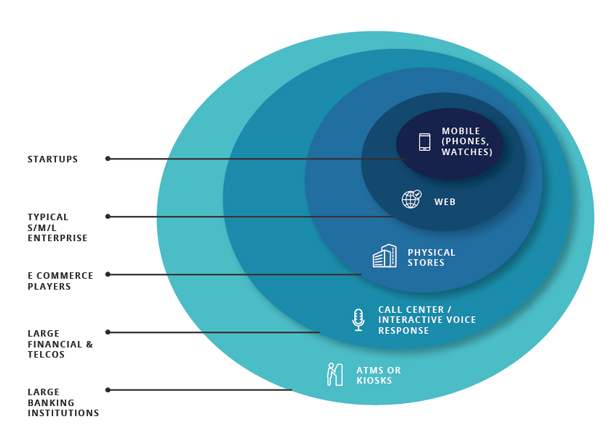
- Multiple channels. Besides the usual suspects (for instance, mobile or web), larger enterprises might have physical spaces (for example, branches or stores). They might also have Interactive Voice Response (IVR) systems. And in some cases, they might have standalone physical kiosks or ATMs. (See Figure 1.)

The complexity of large organizations has been the greatest challenge we have faced at HFI. It’s difficult to maintain all the moving parts and remain focused on the end-user experience. It’s important that we move organizations away from the older ideas of “If we build it, they will come,” or “If it’s hard to build, it should be hard to use.”
We spoke of insights that we have gained. These insights came from three long-term engagements with organizations in India and South Africa. All three organizations were early in their UX journey. They could be described as being at Stage 4 (out of 8) in Jakob Nielsen’s stages of corporate UX maturity, or Level 2 (out of 5) in HFI’s organizational certification. This means that the UX ground realities were as follows:
- Some business and product owners had a high level of understanding about creating good experiences using HCD. They just need guidance regarding how to go about it. We did not need to convince these individuals about the benefits of good UX, and they became our flag bearers within the organization.
- Other business stakeholders were unfamiliar with the field of UX and its processes. The wider teams—program managers, project managers, technology stakeholders, change management, and training development teams—were also unfamiliar with the field of UX. They might have heard of the term UX and in some cases associated UX with good visual design, but they did not know much beyond that.
The lack of knowledge about UX meant that the project teams were still feature-centric or schedule-centric. They were happy adding additional features as long as they met timelines and as long as the end product fulfilled a function. Helping to change this culture was a large part of our evangelization work. It took some effort to get teams to think not from the developer’s point of view, but from the user’s point of view, and to build something useful, usable, and appealing.
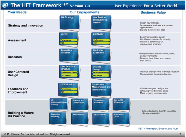
In the conversations we had with UX folks in our training sessions, it seemed that driving cultural change was easier when driven by HFI because of the HFI Framework™, which established activities and processes that project teams could use to solve user problems. (See Figure 2.) Using the HFI Framework as a guide also helped in the evangelization process with stakeholders. The stakeholders saw that the framework was evidence-based, systematic, scientific, and pragmatic, as opposed to subjective and opinion-based. Knowing that the framework had been refined over many years and that it combined practical experience with UCD scholarly research helped build stakeholder confidence.

As a UX team in an enterprise environment, our work spanned the organization and included multiple activities:
- We ensured business continuity by integrating with tactical projects across channels. Some of these tactical projects led to more strategic work. For example, an expert review of an internal website led to a rethink of the future direction and positioning of a specific product.
- We started integrating our processes into the development team’s project plans to ensure that time was set aside for UX activities based on the needs of the project. For example, some projects were complete or near completion, so the development teams were looking only for an expert review, while other development team had just formed and needed high-level structural designs, or had a structure but needed detailed screen designs. We also customized these processes to the client’s culture and context.
- We built and trained in-house UX teams. This involved recruiting staff with the right skill set, providing domain training, providing UX skills and process training, and mentoring UX team members.
A large part of our work involved institutionalizing the UX capabilities. We started off with our own teams of 20-40 UX staff members, and then began to build out the UX capability of the organization by including in-house resources or recruiting externally. What we learned regarding activities, strategies, and processes is described in detail next.
Showcase the Value of UX Work Early and Often
Over the past decade, we’ve seen UX transition from an “unknown unknown” to a “known unknown.” In other words, teams have now heard about UX, but they aren’t clear how it’s done. In the beginning, there was a constant need to reiterate the value of our activities at various levels of detail and for different audiences. We accomplished this goal with clear, continuous, and open communication.
Project teams
For project teams, we provided a view into what we were doing and why. That is, we not only delivered screen designs—which the teams were primarily interested in—but we also shared the insights that led to those designs (for example, inputs from user research, personas, optimized process flows, usability testing results, and more.)
Often at the beginning of an engagement, project teams had a limited understanding of what the UX team could provide regarding value. Some teams expected the UX team to exclusively focus on providing visually attractive screen designs. Therefore, the questions we asked about business models, user goals, and the relevance of specific functions were met with confusion. “Why are you asking these questions?” “Why do you need this information?” Over time, as the project teams saw how we were using this information and how the information translated into good UCD (and sometimes better business strategies), the project teams were more supportive of our inquiries.
Of course, getting the project teams to participate in UX activities resulted in better buy-in from the project team members. Therefore, the project teams were included in the research sessions, design workshops, and usability test sessions. (Usability tests, in our experience, are still the best way to convert someone to the UCD approach.)
Project managers
For the project managers, it was critical to show how we were making their development teams more efficient by simplifying workflows, reducing the number of screens, or by using standardized components. Project managers are very focused on ensuring that projects stay on track, but they were appreciative of the insights we shared about their end users.
Project sponsors
Our project sponsors and their management were interested in both user and project updates. Project sponsors were interested in user research and in how that research produced designs that were useful and supported project goals (for instance, efficiency or user satisfaction). This was also where we showcased before and after comparisons. We also highlighted changes that we introduced and those we recommended, but that were not possible in the current iteration. Additionally, we described the effects the changes we recommended would have on their return on investment (ROI). This ensured that all stakeholders understood what we were doing and why.
In addition to the direct communication above, we also started to bring design artifacts out of the digital space and into the physical space. This made our work much more tangible. For example, we converted personas into wall posters and showcased the posters in our project spaces and utilized them in project meetings.
A Thorough Onboarding Process for UX Folks
Just like the development team required UX onboarding, the UX team required culture, domain, and project onboarding.
Country and culture onboarding
The projects were quite varied in terms of locations, either in a different city or in a different country, so onboarding had to include culture-specific training. For example, for team interactions it was important for team members to know how to respond to personal greetings, which are quite different in India compared to South Africa. For client interactions, it was important to know what to wear to client meetings (larger enterprises often have a more conservative dress code). For general interactions, it was beneficial to understand social norms regarding behaviour in the cities and countries we were visiting.
Domain and enterprise onboarding
There was also domain and enterprise-specific knowledge that our team members had to learn (for instance, vision, personnel, politics, hierarchy, terminology, business models, and business verticals). In addition, the teams had to learn the technology stack utilized on the projects. Last but not least, the teams had to become familiar with the UX projects’ short-term and long-term goals, project history, and project progress. It was important to be aware of any UX work that had been done in the past (for instance, usability studies) so that we could leverage that work. We found that getting the UX team up to speed was easier when we had an up-to-date knowledge base and a well-organized artifact repository.
Project onboarding
Project onboarding encompassed the nitty-gritty details about a project. It included learning who the team members were and what role each played. It meant learning about the processes the team followed, the designs that had been completed, and work still under development. Project onboarding normally involved staff either shadowing team members or being mentored by a team lead.
Keep the Team on Track With Both External and Internal Directional Checks
The teams were structured so that we had a view of the work being done at various levels.
- The usability specialist owned the experience for their piece of the functionality and would converse with business and technical folks to bring it to life.
- The UX project lead ensured that different pieces fit together. For example, different parts of getting a new account set up might be worked on by different teams. The project lead ensured that all the components worked together in one cohesive, understandable unit. This person also ensured that UX activities were included in the project plan and they would coordinate those activities (for instance, wireframing, content development, visual design, prototyping, and usability testing) between the different UX contributors.
- The UX program lead ensured that the overall product components were consistent and worked well across streams.
- The UX governance committee ensured overall UX quality.
Establishing this hierarchy of clear roles ensured that the voice of the user was pushed forward at multiple levels from design of screens (by the UX specialist), to the flows within a feature and how the features worked together (by the UX project lead), and what features were packaged in a release (by the UX program lead).
Standards! Standards! Standards!
With many parallel streams and teams churning out flows and screen designs, ensuring consistency and alignment between teams was critical. We tackled this on two levels. The first level involved internal reviews, which kept everyone moving in the same direction. The second level involved the use of standards:
- Detailed styling: font size, style, padding for components
- Tone and styling for textual content
- Page level templates: panels, section headings, and typical content for a page
- Flow templates: for example, for a transaction, we might use a data entry form, confirmation, and acknowledgment pages
On most projects, we started off with a pre-existing basic set of standards. We refined those standards as we moved forward. Ensuring your team has a set of standards at the beginning of the project helps to reduce the amount of rework required later.
Robust Knowledge Management and Sharing
With the varied set of roles involved in creating, modifying, and viewing UX artifacts, a robust knowledge system became essential. At a minimum, it was necessary to have access to older project artifacts so that we could reuse elements versus starting from scratch. Browsing work in progress helped to ensure that the UX teams were focused on the right projects and it allowed us to identify work to be showcased.
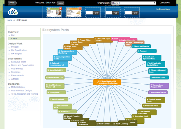
UX Enterprise (UXE) is a tool produced by HFI that we found to be essential when working with large enterprises. Over time, with various UX activities (including stakeholder interviews, user research, and more), a multitude of UX knowledge objects are created or identified (for instance, methodologies, processes, screen specifications, user profiles, scenarios, etc.). Documenting and connecting these objects so that they can easily be located for reuse was a huge time saver. When you save time, you add value. (See Figure 3.) The ecosystem view of the UX knowledge objects provided a very useful understanding into what UX objects were present and how they were interrelated. For example, you could quickly identify user tasks based on personas. You could see which projects had an impact on a certain persona, what screen design was used, what methodology was employed, and how the project elements connected to specific executive intents.

Robust Staff Management
To ensure continuity both for projects and for people, we realized that staff management was critical. Good UX requires different levels of expertise—specialists, project leads, product owners—and different skill sets—content writers, visual designers, and HTML prototypers. Resource management is a careful balancing act in which you must ensure you have staff available when needed. With shifting priorities and staff levels, a layer of project management was required. The addition of a project manager ensured projects were appropriately staffed to meet project needs and that onboarding was provided to new staff members.
The project manager was also responsible for keeping the teams focused and motivated. Weekly meetings were hosted to share status, discuss issues, and exchange strategies that worked well (or didn’t).
Next Time, Let’s Also Do This…
There are always lessons learned and things that could have been done better. You can always do it better. Here are a few things we would do differently:
- Move away from feature-centric or technology-centric releases. Design for a minimum viable experience instead of a minimum viable product. Users should not have to deal with half-baked features or functionality. It’s important to move away from speed and toward accuracy when we are building products. We need to move from being feature-focused to being experience-focused as described in Eric Schaffer’s article.
- Communicate at all levels. We had the support of upper management and the tactical project teams, but middle management sometimes strayed from the common vision, which required a few project course corrections. We had to conduct a number of workshops with middle managers late in the projects to overcome these hurdles. In the future, we will conduct knowledge transfer workshops earlier in the project.
- Go wider. While we talked to channel owners, there were interesting things happening in other areas of the enterprise (for example in chatbots, data mining, assorted AI experiments). Bringing those features in proactively, instead of waiting for the product owner to see their utility, would have added additional impact.
- Showcase visual artifacts. A lot of our work was hidden behind the digital wall. Whenever we had the opportunity to showcase UX outputs in a physical space (through affinity charts, persona posters, or visualizations of our research output), we increased the level of acceptance and understanding. We will showcase visual artifacts much earlier and much more often in the future.
All in all, it’s been a great journey getting UX up and running and percolating through the hard rock that is large enterprises. While the journey has just started, I see a bright future for HCD in large, complex enterprise systems.
