In 2012, I left my corporate newspaper job as director of mobile news at a newspaper publisher, Lee Enterprises to move to Washington, DC to lead mobile product, strategy, and design at the Broadcasting Board of Governors (the federal agency that oversees US international media), helping catapult that small federal agency a decade forward into the digital age.
The BBG apps team built dozens of mobile applications on four platforms (Android, Apple IOS, Symbian, and Java) among six brands (the Voice of America, Radio Free Asia, Alhurra, Radio Sawa, Marti Noticias, and Radio Free Europe). We also built digital messaging products and websites supporting more than 90 news services and 60 languages—from Affan Oromo to Vietnamese—some of which aren’t supported natively by the modern mobile operating systems. In terms of reach and languages supported, we were one of the largest media organizations in the world, with the BBC being the closest peer in size.
The combined audience of the BBG entities is large—215 million weekly—and it is also the most diverse possible, reaching individuals from low-tech countries like Cuba and Eritrea, to high-tech places like Thailand and Qatar, and straight-up oppressed and censored people in countries like Iran and China.
The following are some of the lessons I learned at BBG, helping to build mobile products for the next five billion Internet users. Coming from a first-world nation with fast LTE networks, I had to check my assumptions and privilege at the door and really embrace, empathize, and understand the user experience of an audience experiencing digital content for the first time—not through a computer, but through their smart phones.
By embracing a model of constant iterative improvements and attention to user-focused design, most of our apps achieved user-ratings higher than many of the other major international news media apps, including the New York Times, CNN, the Wall Street Journal, and the BBC.
Performance is Design. Performance is User Experience
Much of the BBG audience lives in countries where LTE is still many years away. Some in Africa are lucky to get a stable 2G signal or have to pay up to around $20 per megabyte for data. So, we focused first and foremost on performance in our digital experiences.
Having a focus on performance meant building with standard optimizations like using a globally distributed content delivery network (CDN) to speed-up transfers, and technical approaches like leaning towards higher compression over media quality, lazy-loading content as the user scrolls through the experience, or making sure the mobile app is optimized for as small a file size as possible. Although the largest application, VOA News, still supports more than 40 languages, the binary is smaller than 10MB of data, a testament to the team and our developers’ focus on performance-first UX.
Use as little design as possible
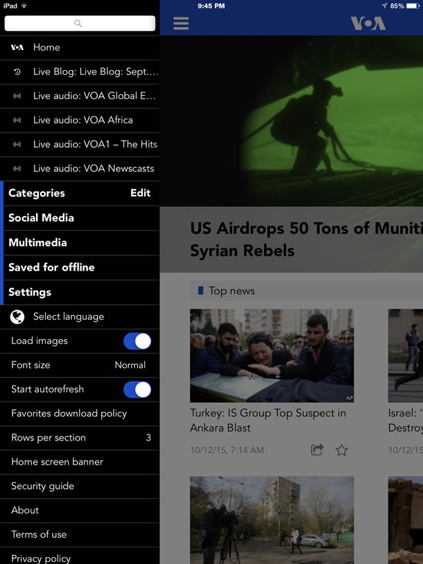
Following Dieter Rams’ famous maxim to use as little design as possible, we always focused on trying to remove as much chrome and distractions as possible from the experience and let the rich photos, video, text, and audio tell the story. In a recent redesign, we went even further and focused on big images, big, bold fonts, and whitespace (the design is shown in Figure 1). Especially on mobile interfaces and on smaller, low-cost smartphones in emerging markets, making the interface as clean and clutter-free as possible is crucial for a good user experience.
Localize everything
The user interface and content within your digital experience isn’t the only thing you should localize when building digital products for emerging markets. All launch and promotional materials down to the app store descriptions and screenshots should be in local language if the app stores support them. For a long time Nokia and Opera have had vast localization support because they are more global companies than Apple and Android. In the past two years however, Android has made huge strides to add more languages and localized app stores. Apple has followed suit, although at a slower pace. It can be remarkably tedious to create six to 10 app store screenshots and marketing materials in 40 plus languages, but since the content within our apps is in-language, the marketing and branding needed to reflect that too. The value of providing a true, rich, authentic user experience from initial app description to conversion, installation, and content pays dividends and helps reach the target audience much faster.
Re-use localizations
When you’re launching a framework and project supporting as many languages as the BBG did, changing localizations was no small feat. The localization effort for every new version and new feature addition, even if it was just a “Submit” button, was tremendous when you have more than 90 news services to translate into 60 languages. We tried to minimize the impact by planning far in advance, doing user testing, and closing the localizations well ahead of launch to get them translated in time and through large batches of localizations. We always tried to minimize the impact when adding new features and to re-use localizations whenever it made sense so we didn’t require frequent translations or re-translations. We also bribed our journalists (who worked as our translators) with chocolate.
When possible, embrace and customize to local design standards

Embracing cultural design helps build your authenticity with the audience. While it’s not easy with the wildly diverse audience we had, we would make concessions as much as possible.
A key design element was making right-to-left languages truly right-to-left and not just switching text to the right side of the screen. Getting this correct, from how the navigation menu opened to how transitions in the photo gallery images moved, was a huge factor in building authenticity. We worked very closely with the journalists from these countries in our newsroom, who acted as our local experts, to nail this important attention to detail (Figure 1).
There are many other areas we wanted to customize to build deeper design experiences closer to native countries, for example less white space in Asian countries where a tighter, design is popular. (This illustrates that you have a lot of content to some of the more culturally color-sensitive countries.) We consciously minimized the color in the core branding to greys, white and black. We wanted to avoid introducing unwanted perceptions based on color in different cultures. The drawback is that the design might seem incredibly boring to audiences, where the cultural design tends to embrace lots of bright and bold colors.

Use iconography to minimize text translations when possible
On small interfaces, and especially in languages without native words for things like “proxy” or “low-bandwidth mode,” localized text could very easily get long and crowd the interface. Whenever possible we tried to find icons that would work across cultures, saving the need for translations and helping people in emerging markets with low-literacy and/or low-tech literacy rates.
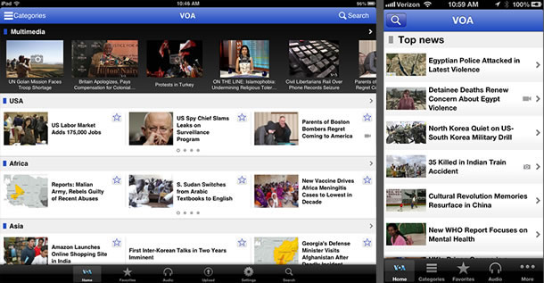
Using icons instead of translated words also helped with make the interface more flexible because some translated words can be very long and when you have to support 60 languages that can easily become a huge headache. (See Figure 3.)
We closely followed the designs and icons of the most popular apps in emerging markets including Youtube, Facebook, WhatsApp, and WeChat, and swam in their wake (so to speak) with our icon selections and designs. Community projects like Font Awesome and The Noun Project can serve as a great place for icon standards and inspiration.)

The interface for the most recent iterative update was simplified and most navigation put into a side-loading “hamburger” menu to cut down on the hierarchy and organize features in a simple side-loading drawer. (Compare figures 2 and 3). Hamburger menus are not perfect solutions, but with a project this large it’s not possible to change designs every month to follow trends. We tried our best to follow design conventions that most users would be familiar with, and the hamburger is definitely the design standard for many digital properties.
Use constant, iterative, multi-level feedback cycles
In an iterative product with so many stakeholders and so many technological, bandwidth, and cultural challenges, it was crucial to pull in as much feedback from all sources as possible. In addition to the journalists and managers we worked with every day, we committed resources to managing, collecting, and responding or troubleshooting customer feedback—especially feedback in the foreign languages of our core audiences through direct and prominent feedback links in the app and app store feedback. We regularly poured through the analytics data and see how, when, and where our users were experiencing our mobile experience to better inform future decisions.
We tested everything on real devices with real humans. Because there are many challenges surrounding typography design in emerging markets because fonts or other styles are not always supported by native mobile operating systems), we needed a human eye and worked closely with our QA team and newsroom journalists— experts in the language and local culture—to ensure that the information was presented correctly.
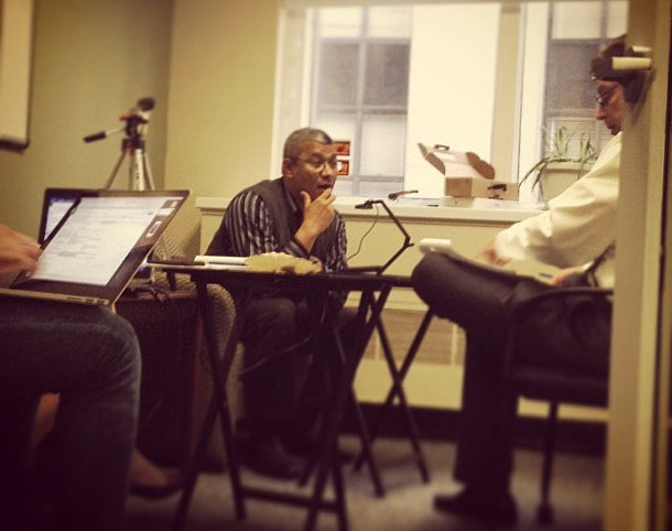
Along with broad user feedback and direct testing on devices, for every major new feature launch and design change we ran in-person usability tests with small groups of native speakers of each language. Fortunately we are based in Washington, DC where there are many people with international backgrounds, especially at the local universities where students could be encouraged to participate by the usability test stipend. (Figure 4)

Everything in Balance
If my three years at the BBG taught me anything, it was how to optimize an experience for the most people while trying to balance technology, cost, user experience, and speed to market. There are always compromises made, but with each iteration, we got better, stronger, faster. The audience, their infrastructure, and their tech tools also changed.
Building mass-market products for the next five billion internet users is incredibly challenging, but also incredibly rewarding, especially when you follow the rapid developments happening in the third world and witness the exponential and transformational cultural change happening as the “rest of the world” gets lit up with the Internet and the amazing opportunities it presents for those of us that won the birth lottery.
