Peer-to-Peer (P2P) fundraising is not a new concept. Nonprofits have been using the strategy for years to fundraise for events. Susan G. Komen’s Race for the Cure is a classic example of a longstanding P2P event. Volunteers register for a race, create a personal fundraising page, and then solicit donations from friends and family. Thanks to social media, the landscape for P2P websites has recently changed. They have attracted more public attention and are rising in mainstream popularity. The new landscape also paved the way for sites like Kickstarter and GoFundMe, which are not affiliated with a single nonprofit.
To stand out in this landscape, designers for nonprofit-specific P2P fundraising websites need to “up their game.” Audience groups for those sites are numerous, distinct, and diverse, and it’s the designer’s job to determine how and when to cater to the needs of each group throughout the website. In reading this article, you’ll learn how to design successful user experiences for multi-faceted nonprofit P2P websites. For those nonprofit organizations who do it right, P2P websites are a major source of revenue. They allow ordinary people to easily raise money for their larger organization, building loyalty and relationships along the way.
Peer-to-Peer Audience Groups
Let’s start by defining each of the audience groups for a nonprofit P2P website:
- Volunteers are the people who register for the event or campaign. They have a connection to the cause and are inspired to fundraise on behalf of their favorite nonprofit. They may be fundraising individually, or they may be part of a larger team.
- Donors are the friends and family members of the volunteers who visit the website to make a donation. They may not be connected to the cause, but they are connected to the volunteer and want to support their efforts.
As their needs and priorities shift, each group goes through different mindsets or “modes” as they interact with the P2P website:
Volunteer Modes
- Thinking of registering – When the volunteer first visits the website, they may research the event, learn how the raised funds are used, and read about what is required of them.
- Registering – Once they’ve made the decision to register, they will go through the process of filling out forms and setting up an account.
- Fundraising – After they’ve registered, they will need to focus on fundraising by personalizing their page, recruiting team members, and soliciting donations. They’ll also need to track their fundraising progress and send follow-up and thank you emails to friends and family.
Donor modes
- Thinking of donating – When the donor first visits the website, they may research the event to learn more about the nonprofit and how funds are used.
- Donating – Once they’ve made the decision to donate, they will complete the donation form.
- Thinking of registering – Ideally, the donor will have such a great experience in modes 1 and 2 that they’ll decide to register, shifting them from donor to volunteer.
When architecting a P2P website, these audiences and their modes should frame the entire experience. Meeting users where they are on their journey through the website will make for a delightful experience that will grow loyalty across donors and volunteers.
Peer-to-Peer Sitemaps
P2P sitemaps must be simple. This is one of the biggest problems I encounter when redesigning these sites. While I try to abide by the “seven plus or minus two rule” for website navigation, I recommend a “four or fewer” rule for P2P sites, meaning there should only be four or fewer main navigation items. To cater to each of our audience groups, the two primary navigation items should be “Register” and “Donate” (or some version of those words) and everything else should be secondary.
The remaining sections should largely focus on content for the “Thinking of registering” and “Thinking of donating” user modes. The goal here is to motivate users to register, fundraise, and donate. Those sections might be named:
- About the Event/Campaign
- Why Participate?
- Featured Participants/Teams (NOTE: Featured participants/teams could also be highlighted on the homepage and About page, and thus, may not require a separate section.)
In addition to simple navigation, a login component and social sharing tools should appear on your sitemap as ubiquitous elements or utilities. Volunteers will need to login to view their donations, edit their page, and send emails to family and friends.
Some additional pieces of your sitemap reside behind the login. The pages found here may change a bit depending on the event fundraising software you’re using, but you’ll likely need some version of these pages:
- Create/Edit your Page
- Send Emails
- View Progress
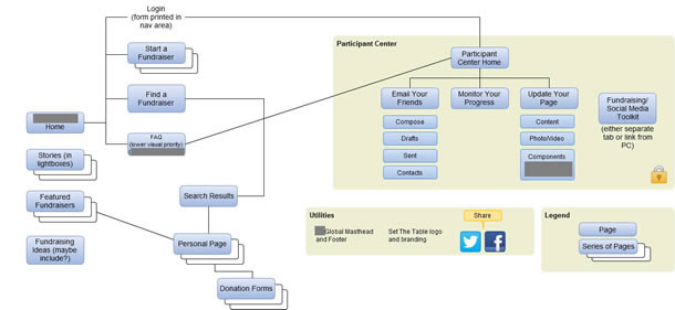
Figure 1 shows a sitemap I recently developed for a P2P site. You’ll notice the only main navigation items are “Start a Fundraiser,” “Find a Fundraiser,” and FAQ. The logged-in section is detailed as well as some content for the “Thinking of donating” and “Thinking of registering” user modes.
Peer-to-Peer Wireframes
Once you have your sitemap defined, it’s time to start building wireframes. There are only a few key actions on a P2P website and it’s important that each wireframe conveys a visual hierarchy that really highlights each action in priority order. For each wireframe I describe below I’ve listed the primary actions in priority order so you’ll know what to feature first and foremost.
Homepage and Event Landing Page
The most important user mode to consider when designing the homepage and event landing page is “Thinking of registering” followed by “Thinking of donating.” It’s also important to include some content for the “Fundraising” mode to prepare the volunteer to fundraise post-registration.
“Thinking of registering” should come first because many potential volunteers will enter your site on your homepage and event landing pages by searching and/or clicking on your marketing emails or social media links.
The “Thinking of donating” mode is secondary because donors most commonly enter the website on the volunteer’s fundraiser page via a link they receive from the volunteer. There will be a small percentage of donors who hear the event/campaign name and try to locate the volunteer’s page from the homepage or event landing page, so it’s important to provide a pathway for this action as well.
To serve these modes for both audience groups, the homepage wireframe and the event landing page wireframe will need to include the following (in order of priority are shown in the table below):
Content to serve P2P site audiences
| Page elements | Examples |
| Primary actions |
|
| Event logistics |
OR
|
| Motivational content |
|
| Standard elements |
|
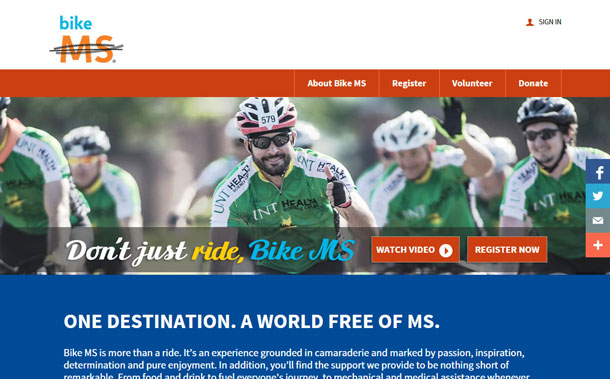
Figure 2 shows the homepage for National Multiple Sclerosis Society’s Bike MS. The site clearly speaks to users in the “Thinking of registering” mode with all of the calls to register and a compelling video describing the Bike MS event experience.
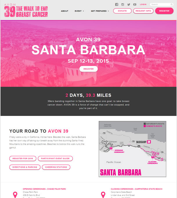
On their event landing page (see Figure 3), the Avon Walk to End Breast Cancer keeps the main navigation simple and very clearly calls out “Register,” “Donate,” and “Request Info” as their primary actions. ”Request Info” is a primary action for this specific event because it’s typically the first step of registration. This is a high-commitment event so the Avon Foundation makes contact with each volunteer to go over the fundraising minimum and the event logistics.
Volunteer’s Fundraising Pages
When creating a P2P site, it’s also important to consider the design of the pages that your volunteers will create and edit. “Thinking of donating” is the most important user mode to consider for this page. As mentioned previously, potential donors will enter your site here by clicking on an email or social media link sent from their friend or family member asking for a donation and thus, those pages may be their only interaction with your site or your organization.
While you want your volunteers to personalize their pages by adding their own images, videos, and stories, it’s important to start with a strong default layout and content since many volunteers won’t personalize their pages. The elements the default version of the page should include are shown, in order of priority, in the table below
Content to serve volunteers
| Page elements | Examples |
| Primary actions |
|
| Motivational content |
|
| Standard elements |
|
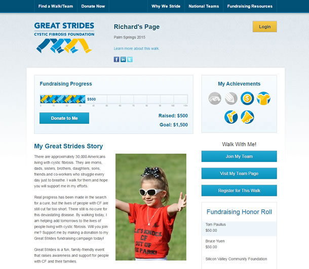
On their default fundraiser pages, the Cystic Fibrosis Foundation gives volunteers a great start setting up their page by including a compelling photo and text describing why you should donate and support the volunteer (see Figure 4). They also prioritize the “Donate to Me” primary action and show the progress to goal to motivate donors.
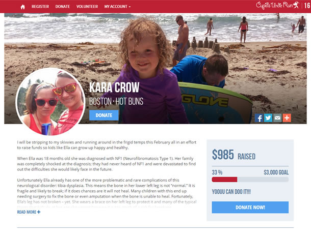
Cupid’s Undie Run also does a great job with their volunteer’s fundraiser pages (see Figure 5). “Donate” is the clear primary action and they rely on their simple navigation to drive users to “Register” or “Volunteer.”
Logged-In Pages for Volunteers
To encourage P2P volunteers to fundraise, you’ll want to design the page they see when they first register and then login to your site. The user mode for this page will be “Fundraising.”
Content for logged-in volunteer
| Page elements | Examples |
| Primary actions |
For team fundraisers, team captains should see calls to:
|
| Motivational content |
|
| Standard elements |
|
Marketing the Peer-to-Peer Event or Campaign
Marketing materials and communications are important parts of the P2P user experience. It can be helpful to think back to our audiences and user modes when developing marketing content.
When launching a new P2P website, users in the “Thinking of registering” mode are the most important targets. An email campaign, mail campaign, or even a text or phone call to past volunteers could encourage users who are in this mode. Additionally, the content on the homepage, event landing page, and the “About” section on the website should speak mostly to users in this mode.
Getting users thinking ahead about the “Fundraising” mode should be a secondary goal for the homepage, event landing page, and “About” section on the website. The last screen of registration should start messaging to users in this mode and email messages should encourage the volunteers to login to the website to personalize their page and solicit donations.
Suggested messages for volunteers to send to solicit donations should target users in the “Thinking of donating” mode. Also, the content on the volunteer’s fundraising page should be geared to this mode.
Since converting donors to volunteers is a goal for P2P sites, the volunteer’s fundraising page should meet users in the “Thinking of registering” mode, as should the last screen and the “Thank you” email from the donation process.
Measuring Success of Peer-to-Peer Websites
After designing and launching a P2P site, it’s important to evaluate the success of the site. Usability studies can provide great insight into areas that may need improvement. Remote, unmoderated usability studies can be conducted quickly and cheaply. I’ve had some success identifying problem areas on P2P sites with the NavFlow tests on UsabilityHub. Ultimately, I was able to show how a new design could really make a difference.
In addition to immediate user testing, evaluating data over time is important for P2P. At first, you can see how the site is faring by comparing your statistics to a benchmark report, but as with any website, it’s best to look at your own data and compare results year-over-year to see how you are doing and when it might be time for a revamp.
Conclusion
Nonprofit P2P websites must meet the needs of two distinct audience groups: donors and volunteers. Adding to the complexity, each audience goes through a variety of user modes while interacting with the site. Designing an experience that is in tune with those evolving modes will set the nonprofit up for a successful fundraising endeavor. Happy fundraising!
