Presenting information in a visual manner such as in an infographic can be an effective way to convey a message. A good infographic will draw you in and can encourage you to share or print it, while a not-so-great infographic can cause your eyes to glaze over and the cursor to hover the ‘x’ icon.
But what makes a good infographic? According to design experts:
- A compelling and credible information
- A good structure and story
- An engaging visual style
- Being concise and shareable
It’s a bit of a magic formula. David Byrne says good infographics “engender and facilitate an insight by visual means—allow us to grasp some relationship quickly and easily.” The simplicity of a good infographic is counterbalanced by the effort required to distill the information into an engaging balance of text and imagery that conveys the message in a concise and shareable way.
When you add accessibility into the mix, further challenges are presented: color contrast presents a visual design challenge, and as Derek Featherstone notes, accessibility is compromised when designers choose to use text as images, hiding them from screen readers. Access IQ has an excellent guide to creating accessible infographics which covers use of color and text alternatives.
UXers understand the value of good communication, especially good visual communication. So it makes sense that we also appreciate a good infographic. With this in mind, we’ve compiled a collection that not only represents the elements of good infographics, but which also does a great job of illustrating UX fundamentals.
The Disciplines of User Experience Design
User experience design is a complex and multi-faceted discipline with specialists and generalists covering many different areas. This visually simple yet thorough infographic represents how these facets inter-relate, providing a great tool for UX newbies and offering an explanation to the uninitiated.
Download The Disciplines of User Experience Design (PDF, 338 KB)

A Quick Overview of User Experience
Simplicity is critical in good user experience design. This infographic uses UI examples to graphically demonstrate the nuances between user experience disciplines.
A quick overview of user experience on StrategyandDesign.co

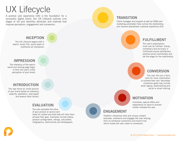
User Experience Lifecycle
This infographic represents another example of simplicity in design. A good infographic does not need to have flashy visuals or even have visuals as the dominant feature. In this infographic the visuals subtly indicate the stages and progress of the cycle, while the words do the work of explaining the steps.
Download the UX Lifecycle (PDF, 139 KB)
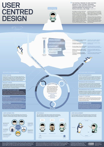
User Centered Design
This beautifully designed poster has immediate visual appeal through the use of color and playful cartoons. It’s not just about cute, though: the visualizations support the text by engaging and leading us through the story.
User Centered Design on paznow.com
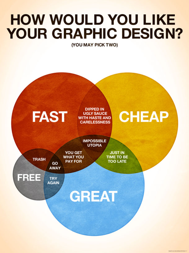
How Would You Like Your Graphic Design?
The premise of this infographic will be familiar to many. Fast, cheap, great: you can pick two. While the poster references graphic design, it can also be applied in many broader settings. The reason the artist’s application of this Venn diagram is so appealing is the element of humor throughout and the honesty of the extra circle for ‘Free’.
How would you like your graphic design on Colin Harman
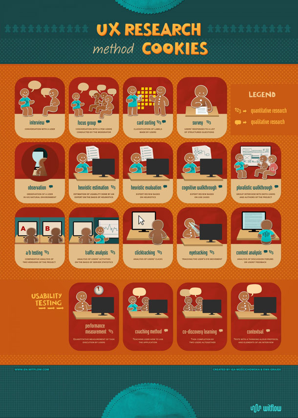
UX Research Method Cookies
If the goal of an infographic is not only to be informative but also to be sharable, we think this one is a winner. Demonstrating the different types of UX research with gingerbread men makes user research methods seem more approachable to non-UX researchers. The handy wall-friendly format helps too.
UX Research Method Cookies on Visually
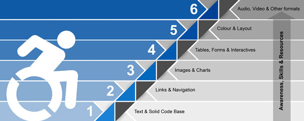
Ramp it Up: Action-based Techniques for Building Accessible Websites
As we’ve already acknowledged, creating accessible content is important, but undeniably challenging. This striking and clear infographic highlights levels of accessibility and is supported by a more detailed, web-accessible version.
Web accessible version of Ramp it Up
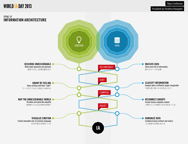
The Spine of Information Architecture
Creatively representing both the emotional and data-driven sides, this infographic breaks information architecture down and represents various complex elements in a deceptively simple way.
The Spine of Information Architecture on Visually
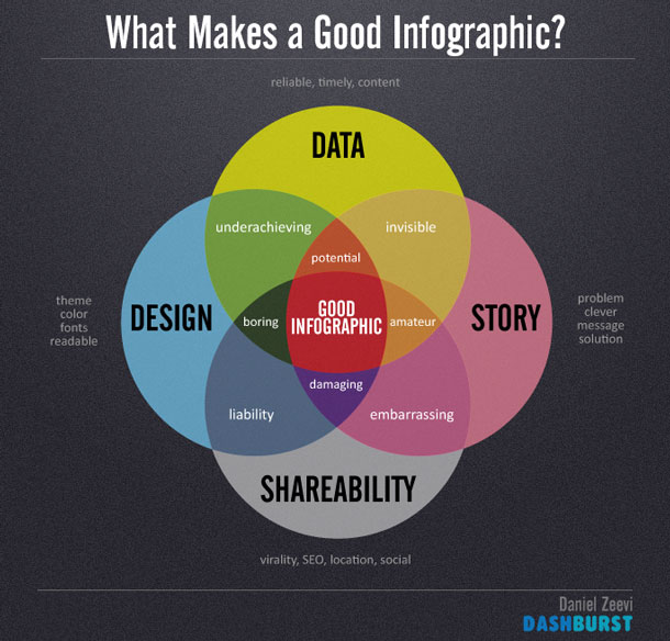
Bonus Material: What Makes a Good Infographic?
We think the previous infographics are visually engaging, tell a clear story, and present information in a compelling yet concise manner. But we couldn’t write about good infographics without sharing an infographic about what makes a good infographic.
What Makes a Good Infographic? on Flickr
Do you have a favorite UX infographic?
