But the truth is, accessibility compliance is no longer something UX practitioners can afford to ignore. In 2018, many organizations received unpleasant letters from law firms threatening legal action because their site or app did not work well for those with disabilities. The notices typically cite non-compliance with Web Content Accessibility Guidelines (WCAG), the accepted standard. This trend will only increase in 2019 and is no longer restricted to public institutions and banks. In fact, on January 15, 2019, the Ninth Circuit Court of Appeals ruled that companies can, in fact, be sued for failing to comply with accessibility standards online. If your company or clients have yet to receive this kind of legal correspondence, it is only a matter of time.
But what if, while making sites and apps accessible, you harm their overall usability? How do you ensure your site or app is both accessible and remains an excellent user experience for everyone?
Where to Start
The process of making your site or app accessible may seem overwhelming, especially if you are facing the threat and deadline of a lawsuit. Thankfully, accessibility is not an obscure new thing. There are plenty of resources and professionals out there who can help you. Remember when smartphones entered the picture and you had to re-learn everything? This is not even half as bad as that.
Get Your Own Accessibility Scanning Tool
Most lawyers use software to scan sites for violations. Good news! Both free and paid versions of this software are available to anyone. Whichever tool you pick, doing your own scan will allow you to see the issues for yourself with just one click. Many scanners will also tell you which WCAG citation applies to each issue so you can better understand how to fix it.
Make Easy Fixes First
Common issues flagged by scanners include missing alt text for images, undetectable focus states, low color contrast, empty headings or links, and missing form labels. You can make many of these basic fixes right now with your existing team. Tackling these items straight away does two things: 1) It makes your digital product more usable for people with disabilities right off the bat; 2) You will have the proof that you are working toward a more accessible site or app, which accessibility lawyers often require.
Understand Your Users
Stopping at legal compliance is not enough. We must make sure we are creating solid experiences for those with disabilities, not just passing a scan. Just like any project, you should learn as much about your users as you can. When doing research, consider accessibility concerns: Could this person also be disabled in some way? Are they using this product without a mouse or with a screen reader? Are they colorblind? Statistically, the likelihood that your users fall into these categories is higher than you might think. It is crucial, as UX professionals, that we strive to understand all of our users.
Use the Same Tools as Those with Disabilities
Your methods for understanding users with disabilities may differ from your typical approach. As always, you will put yourself in your users’ shoes. But now, you might try to use something you have built with a keyboard or a screen reader. Or, you might try using assistive devices to navigate a site you know is accessible and then one that is not. You will quickly notice that there is a huge difference.
Talk with a More Diverse Set of Users
You can also get in-person experience by visiting local organizations for the blind or deaf. See what equipment they are using. Ask people how they interact with websites and apps. Observe them in action. What obstacles do they face? What are their biggest complaints? All of these things will make you better at thinking about accessibility on a regular basis.
Get Help from the Right Experts
Thorough knowledge about WCAG requirements does not come from taking a single class or reading a few articles. It is hard to navigate and interpret accessibility guidelines. Team up with someone who has done it before, and use it as an opportunity to learn from them and build your own expertise.
If you are fortunate enough to have the following experts on hand, include them in your team and work together from the start of the project. If you do not already have these professionals available, it is time to find them.
Developers
Most accessibility changes cannot be made in a WYSIWYG editor. There are functional and code implications for the changes you will have to make. Rely on your developers’ knowledge of how things work and come up with solutions together.
Designers
You will definitely encounter design implications: color changes, link and button state adjustments, visual changes to navigation, and so on. Consulting with a visual designer will help you work out the best ways to maintain brand standards while also meeting WCAG guidelines.
Content Strategists
The WCAG guidelines can require renaming links, creating complicated alt text, rewriting content for better readability, and adding written information to web pages. You need help from a content strategist or a UX writer who has expertise in writing for interfaces.
When to Hire
Do not wait. You need your experts at the start of a remediation undertaking or at the outset of a new digital project. If you are being sued, it is not the time to try to train your existing team. You need to immediately find someone who can check your site against what the complaint is saying. Experts can quickly tell you how bad things really are and can identify the best way to move forward.
Cultivating In-House Expertise
If you are not being sued, you may have more time to develop expertise with your own team. Task at least one team member with becoming an accessibility expert. They should start with basic user research about people with disabilities, including what kind of assistive technology they use, what is frustrating for them, what works for them, and so on. Test and observe real users as they navigate your site or app. Nothing helps you understand the mistakes you are making faster than watching a real person struggle to use something you created.
Your budding accessibility expert should also thoroughly research the WCAG guidelines. They should read case studies, follow experts on social media, devour articles about accessibility, and try solving problems themselves hands-on. When they have a good grasp on the material, have them teach the rest of the team.
Making Tough Decisions
WCAG guidelines can be fairly flexible, and there may be a number of possible solutions for any given issue. What works best for those with disabilities might not be best for the majority of your users or your business goals. All of this means you are inevitably going to need to make some tough calls. Your situation will be unique to your digital product. However, some of the following examples from our accessibility work at truematter may help you create balanced solutions.
The Problematic Search Bar
For a recent client, truematter purposely minimized the importance of search in the site header because it was rarely used. To reduce visual clutter and keep focus on more important navigation items, we originally displayed search as a single icon that expanded into a search field when clicked. To further conserve space, the search featured no traditional label over the field or submit button. In this minimal design, users would simply type their query and hit enter to submit.
WCAG Guidelines Say…
Any form resulting in a change of context (going to a new page, for example) should have a submit button. Having a label for each form field is also a WCAG requirement.
The Issue
We needed to make the search accessible by adding the label and button, but we still did not want to compromise UX or clutter the design.
The Solution
We added a standard HTML label positioned outside of the screen’s viewable area. This allowed people using screen readers to hear the field’s purpose, since they could not see visual clues such as the search icon or search field placeholder text. We also added a button that displays only when the field is expanded. Users can now submit their query by hitting enter or by clicking the button. The solution is fully accessible, represents better overall UX for everyone, and retains a minimalist style.

Figure 1. Original Search Design–Inactive State.

Figure 2. Original Search Design–Active State.

Figure 3. New Search Design–New Active State.
Color Contrast vs. Brand Standards
Our clients expect their digital products to follow brand standards to the letter. That makes sense. After all, they spend time and money developing and protecting their brand. But most branding experts are not aware of WCAG’s minimum color contrast rule. As a result, official brand colors often cause accessibility issues online.
Our truematter identity is centered around a lovely custom shade of green.
Figure 4. truematter logo with custom green brand color.
We use this color in all of our materials. We will not abide any variation or error. In fact, a recent batch of our t-shirts were printed with the wrong color (close, but wrong), and the shirts were shelved forever. Someone suggested we burn them. We are serious about truematter green. So, naturally, we use it throughout our site for links and buttons.
WCAG Guidelines Say…
WCAG Level AA requires a contrast ratio of at least 4.5:1 for regular text and 3:1 for large text. Text is considered large if it is over 24px or over 18px and bold. This is a very common problem. In fact, truematter found ourselves in this very predicament while going through our own accessibility review.
The Issue
We received bad news when we tested this beloved color for accessibility: On a white background it has a contrast ratio of 2.12:1 and monumentally fails the minimum color contrast rule.
The Solution
We tasked our designer with creating a new, high contrast palette for web only that maintains the spirit of our brand while meeting accessibility standards.
We have created new color palettes for a number of clients, but it can be a hard pill to swallow. If we are lucky, the color changes are barely noticeable to the average user. In our case, the color change was far more drastic but still absolutely necessary. We had to swallow a little of our own accessibility medicine.
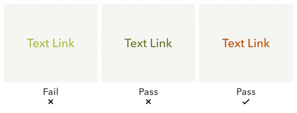
Figure 5. truematter green (left) did not have enough contrast. A darkened version (middle) met minimum contrast requirement, but it was very off-brand and hard to distinguish from non-link text. Our final solution (right) was to use a complimentary orange color for links instead.
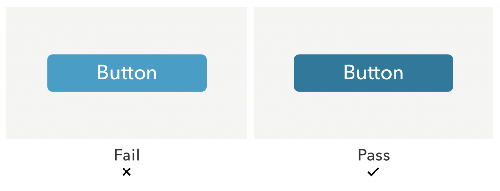
Figure 6. An example from a client who did not have to tweak their brand color as drastically to meet contrast guidelines. The light blue on the left was too low contrast, but when we darkened the color slightly, it passed the contrast check.
Those Pesky PDFs
Just like web pages, online PDFs must meet certain accessibility requirements. Making PDFs accessible can be extremely difficult and time-consuming.
WCAG Guidelines Say…
The mechanics of solving issues with PDFs could be a whole other article. Suffice it to say, difficulty varies vastly by how the document was made and how it is used online.
The Issue
Recently, truematter had big problems with two PDFs on a client’s website. Both of these PDFs were generated dynamically and presented on a templated page (also generated dynamically). The client could not make these PDFs accessible manually, and finding a tool that generated an accessible dynamic PDF would have blown the budget sky-high.
The Solution
One PDF duplicated content on the site verbatim and was intended for printing only. We directed users with disabilities to the accessible on-page content and left the PDF alone. We added a description visible only to screen readers explaining that the PDF exactly duplicates content available on the website and therefore does not contain any information they cannot already access.
The second PDF was more problematic. It was dynamically generated and presented information that was not available on the web page. Further, the content found in that PDF was secondary to the content on the website. Adding that content to the existing web page would have hurt overall usability. In the end, we created a new subpage that presents the PDF information in an accessible, easy-to-digest table available via a secondary link next to the PDF download.
Planning PDF Content
You probably will not be able to avoid PDFs altogether. Sometimes circumstances or clients require them. But, when you can, consider presenting content on a subpage instead of in a PDF. You will avoid headaches trying to make your content accessible if you keep that content on the web page. In fact, we made it part of our content strategy to avoid use of PDFs on our upcoming truematter site. Making that choice right out of the gate informs how we will approach content and accessibility across our website going forward.
Documenting Recommendations
UX professionals love documentation. We document our user observations, research, test findings, and requirements constantly. We should treat our accessibility solutions no differently.
Having the proper documentation will help you defend your accessibility solutions if you get pushback from lawyers. Your documentation will also provide governance guidelines that you can use in the future to look back on how you have solved accessibility problems before.
Your documentation should include…
- all relevant issues
- the WCAG requirements that correspond with each issue
- how each issue should be or was resolved
- why this solution is the best option (when needed)
Keep your document concise and easy to scan. At truematter, we use a table and organize it by type of issue. We cite the WCAG rule, how the issue violates this rule, where the issue occurs on the site, and the solution. Where needed, we include visual examples of the issue or code snippets.
Incorporating Accessibility Practices into Your Everyday Work
To help keep accessibility front of mind, do these seven things for every project:
- Consult with an accessibility expert throughout your process, starting in the planning stages.
- Involve your whole team, making sure they understand how accessibility may change their process.
- Cultivate in-house expertise and an understanding of accessibility basics for all team members.
- Stay up to date with WCAG guidelines, as they change from time to time.
- Keep governance documents updated and make sure everyone on your team uses them.
- Scan your product regularly. Updates and routine maintenance can cause unintended accessibility issues.
- Test your digital products with real users who have disabilities.
Making accessibility a priority will keep the lawyers at bay, save you headaches, and allow you to adapt easily as WCAG guidelines change. Most importantly, investing in accessibility on a regular basis will help ensure that you are providing the best user experience for all of your users.