[greybox]
A review of
Writing is Designing: Words and the User Experience
by Michael J. Metts and Andy Welfle
About this book
A good reference for Methods/How-To and Case Studies
Primary audience: Researchers, designers, and technical roles who are new to the topic or have some or significant experience with the topic. Writing style: Matter of fact, Humorous/Light Text density: Mostly text
Publisher: Rosenfeld Media 186 pages, 8 chapters
Learn more about our book review guidelines
[/greybox]
Writing is Designing is an insightful book for UX professionals, whether their main function is creating content, occasionally writing UX related material as part of their job, or if they have a writer on their team.
The authors, Michael J. Metts and Andy Welfle, succeed in showing that not only is writing an integral part of the design process but that it is also a form of design. That is, from things that happen behind the scenes, like choosing which words to use in writing research questions, to direct user interactions with your app which influence ease of use, brand perception, and much more.
The book has a good mix of case studies, screenshots, and step-by-step guides to clearly illustrate how content influences user experience and how your team can implement good writing practices. Metts and Welfle decided to write in a tone that is “instructional, but not dumbed down.” This is apparent in the examples that they use throughout the book. None of the “bad design” examples are too simple or over-the-top. Instead, you will see examples of actual messages used on user interfaces and clear explanations of why that content was not the best choice and how it could be improved. This is helpful for understanding the effects of word choices on the user experience. Of course, there are also examples of well-designed content to serve as inspiration.
To start, the book covers introductory topics such as the need for writing, the role of writing in strategy and research, and how to create clarity. Each topic touches on important points like usability testing, testing content by removing it from the interface, reducing cognitive load, and writing in plain language.
Ever wondered how to write error messages? The chapter about error messages and stress cases goes into detail about how to approach error messages, which questions to ask, how to write useful error messages, and includes an example from Lauren Lucchese, a design leader and writer, on collecting data for showcasing the benefits of specific error handling.
Chapter five looks at inclusivity and accessibility. It includes information about which words to avoid and which to use instead, how content should flow on a page, and why it is important to use words in addition to colors and icons.
Chapters six and seven cover voice and tone respectively. These are two terms that are often used interchangeably but knowing the difference between them can help brands to make carefully crafted content choices. If voice is the personality of your brand, then tone is how you express it in different situations. One of the examples is from Geico, an insurance company, who changes the usually friendly voice of their brand to a more direct tone when users go to the roadside assistance part of their app. Screenshots from the app show how the visuals and the tone are adapted to cater for the different emotional state their users are likely to be in.
Now that you know more about creating the right content, how do you get buy in? This book shares ideas on working with your team, how to get included in meetings, questions you can ask about specific interactions you are working on, and great ideas on how to show your work. Visuals are attention grabbing, and as a writer, you can use them to showcase your ideas via maps, flows, and examples of what your writing looks like in the design context.
Overall, this book has information and tips for both newcomers and experienced user experience professionals. It can be used to either establish good writing practices or improve existing products and processes through evidence-based content enhancement.
[bluebox]
A Model to Follow
Shopify has done a great job integrating words into their design system, called Polaris. Shopify is an ecommerce service with a myriad of users, from the merchants who sell on the platform, to the people who shop there, to the developers who create integrations for it, and beyond. Shopify uses Polaris to pull together everyone at the company involved in design. And, luckily for us, Polaris is documented publicly for anyone to see. Content strategist Selene Hinkley was one of the system’s earliest contributors, and she played a major role in bringing it to life. Open up Polaris’s website (Figure 8.7), and it’s clear that Shopify understands the role of words as a design tool. You’ll see four things in the main navigation:
- Content
- Design
- Components
- Patterns and Guides
Having content front and center is an intentional decision by the team, as they work to build a design mindset at Shopify that includes words. “I think of information architecture as a really powerful tool for shaping human behavior,” Hinkley said. “How we organize information affects how organizations operate.” They found this was more in line with the needs of their users. “It still fits with the mentality that when you need to ship fast, what you need is there,” she said. “When you have more time, you can scroll down and read.” The teams building design systems like this may have ideas about how they should be designed and structured, but the Shopify team knew that a system has to work for its users if you want it to thrive. Beyond code and components, Shopify’s design system includes topics that provide strategic direction. One example involves guidelines for Collaboration and Consistency 165 naming features and products. It helps teams come up with names that are on brand, proven with research and marketing insights, and consistent across the wide landscape of Shopify products. Polaris is an impressive example, but Hinkley encourages anyone trying to get support for an effort like this to focus on value. “Don’t invest too much energy at the beginning trying to convince absolutely everyone of why it’s a good idea,” she said. “It’s exhausting, and it doesn’t always get you very far.” Instead, Hinkley encourages teams to focus on where they will provide the most value. “Identify your biggest inconsistencies and prioritize those to add first,” she said. By focusing on what matters most, you’ll build something your team needs, and in turn, they’ll build a useful and consistent experience for your users”
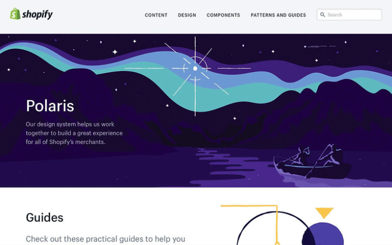
Figure 8.7 Shopify’s Polaris design system
[/bluebox]