Digital interfaces are full of motion. In fact, the UX application of UI motion design has become so important, it’s taking on new terminology of its own—UX choreography. It includes interaction design, motion-based transitions, micro-interactions, and motion that supports the overall brand personality.
Why UX Choreography?
Simply put, motion is more than just decoration. Motion conveys hierarchy, meaning, personality, and a sense of spatial relationship, among other elements. Motion helps orient a user within a digital space, directs attention within process funnels, and creates clear decision-making directives for the user. Motion can convey tone, make complicated tasks feel faster and leaner, and reduce the number of new page loads by consolidating tasks and information. Thanks to motion, an experience feels light and easy, regardless of the time to completion. UX designers worry about all of these factors in other ways, so adding UX choreography early in the planning stages will only strengthen the success of these components.
How to Think About UX Choreography
A design team can think about UX choreography in three different ways, based on the functions they serve: material, functional, or delightful.
Material relates to information architecture and spatial direction. Material orients users within your digital space and helps them keep track of where they’re going and where they just came from. Material motion design will:
- Establish your UI “world” and what its map is like for the user
- Define spatial relationships between different screens and elements
- Reinforce an information architecture model
Material motion design is implemented in the way pages or sections transition between each other; for example, pages can slide left/right when a user goes forward/back, or up/down when a user works their way through a process flow. When successful, it creates a mind map for the user that communicates where they are in your interface, how they got there, and how they advance or withdraw. Poor material motion design can leave a user feeling disoriented or unable to move about the interface efficiently.
Functional strengthens basic UX principles such as hierarchy, usability, feedback, and confidence when using a new digital interface. Functional motion design will:
- Drive users’ attention by improving hierarchical elements
- Optimize perceived user experience (make it feel faster, leaner, lighter)
- Provide visual feedback when actions are taken and prepare the user for the next steps
Functional motion design pulls a user’s attention to the most important elements on a page, or provides feedback when a user takes an action. For example, if someone is filling out a long web form, simple form validation animations can make the user feel more confident by providing feedback at every form field entry; plus, they don’t have to scroll through the whole form if they make an error or miss a step.
Animation transitions can also make a multi-step process feel faster by showing and hiding information based on what the user needs to be doing or seeing in the moment. It’s like serving a large meal in courses rather than putting everything on the table all at once. Functional animations can also indicate next steps by showing hints with hover states, gestural-based peeking, and directing users’ attention to action items.
Delightful reinforces the brand’s personality and is implemented once material and functional motion design are well established. This is the cherry on top that makes the interface nice to use. Delightful motion design will:
- Add humanity and fun
- Establish a brand personality through animation
- Make it feel unique and entertaining
Delightful motion design doesn’t necessarily serve a direct UX purpose, but will connect a user to the personality of the brand and create a richer experience. Delightful interactions should be limited and not overwhelming, so they should be well thought out and implemented perfectly. For example, the website MailChimp has its monkey mascot animated in clever ways throughout the primary process flows to give an otherwise boring task (sending marketing emails) a charming and whimsical feeling.
Who is Doing UX Choreography Well?
Virgin America: Spatial
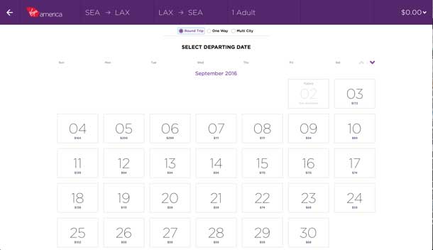
Virgin America is a prime example of spatial motion design done right. When a user books a flight on the website, each step of the process is revealed to the user in a sweeping up/down animated pattern to establish space and direction within a lengthy form. This makes the form feel fast and easy, even though it includes the same number of steps and fields as other airlines like United or Delta.
Coin: Functional/Explanatory
Coin is a product that consolidates many credit/debit cards into one card. This concept is so new that it needs to be explained clearly to the user, particularly because personal financial information is involved. Coin’s website uses animation and function to tell the story of how their product works with minimal copy. This animation prevents the need for paragraphs of text, and it makes the concept of how this product works very easy to understand.

Armani: Delightful
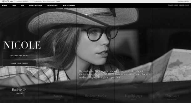
Armani’s Frames of Life campaign website uses motion design, video, and photography to create a stunning experiential website. Although the primary calls to action lead to a more traditional ecommerce experience, the landing page and story pages capitalize on the style of the motion design to elicit an extremely powerful emotional connection and mood that excites the user in a way most websites can’t do.
How to Implement UX Choreography
Adding UX choreography to your existing workflow isn’t that difficult if you break it down and think about how to apply it to your digital interface in pieces.
- Begin by establishing your tone. Describe your brand’s personality in terms of how it would move or feel (for instance, spunky, sleek, calming) and choose animation styles that match that feeling. Speed, velocity, and easing will all affect the brand’s feel through motion design.
- Within each category of motion design (spatial, functional, delightful), list out elements on your site or app that relate to each. For example, navigation, drawers, transitions between pages, and accordions would relate to spatial; form interactions, alerts, and button states would relate to functional; and decorative or supplemental brand motion design would relate to delightful.
- After you have a list of elements, research other sites that features those animated elements in a tone similar to what you’re aiming for. Often times, jQuery and CSS animation libraries already have presets that you can use out-of-the-box with minimal custom coding. Look through those libraries to see what’s already been done.
- Start with any low-hanging fruit such as stylizing jQuery and CSS animations with toolkits and libraries to form a cohesive style of motion. Implement those items as much as you can throughout your website.
- If you’re not able to deploy lots of things all at once, start with a piecemeal approach. Determine global style changes that would make the biggest impact. Ecommerce sites, for example, may want to stylize and animate their form fields, since there are a lot of them.
- For brand personality, think of one or two extra personality items that may be more custom, then work to get as close to perfect as possible. Mascots or logo elements can be used, but they don’t have to be. Use these items sparingly and wisely.
- Most importantly, don’t go overboard! UX choreography should enhance your digital experience by directing users through it in a delightful way. It should not be distracting or disorienting. If you feel that you’ve added too much, it’s safer to scale back or do some user testing to figure out the right approach.
- After implementation, be sure to keep an eye on your analytics to see if your new motion design had any positive or negative effect on conversion.
