How do you define content strategy? If you Google “content strategy definition,” you see lots of conflicting information about what the term means, even among prominent content strategists. The fact is that there probably isn’t a one-size-fits-all approach to content strategy. What works at one company may not be relevant at another.
When I joined AT&T in 2010, we struggled for months to define what a content strategy was. We held meeting after meeting trying to pin down a definition that pleased everyone. Much hand-wringing and chin-scratching ensued.
I decided the simplest approach was to go with the simplest definition. Kristina Halvorson, one of the pioneers of the content strategy movement, once wrote that content strategy is essentially content planning, or not treating content as an afterthought. Most of the time at the large corporations in which I’ve worked, working on projects first involves mapping out an experience based on business requirements and what IT can support, then garnishing that experience with piecemeal content: a product description here, a headline there; intro copy for one page, a button label for another. Done and done.
The problem with that approach is that it creates a disjointed narrative that’s not really focused on dealing with real customer needs. So how do you know what your customers really need? How can you be sure your content is prioritized appropriately? How do you know how much content is too much, and how much isn’t enough? Our organization had always addressed design from a customer perspective. Now it was time to focus on how to use content strategy to enrich our content and make it more customer-centric.
Initially, I boiled “content strategy” at AT&T down to a few simple questions:
- What is the business goal?
- What is the problem or issue we are trying to address?
- What data or research is available to support this effort?
- Who will use this content?
- How will users access the content?
- What is the lifespan of this content?
I’ve had spirited discussions with other content strategists about how wrong-headed they think my approach is. The basic argument against it is that you should have all the proper elements––planning, creation, implementation, and governance––in place before even beginning. I’ve found that doesn’t have to be the case.
It’s a challenge to put some grand content plan into place at any company, much less one the size of AT&T which has roughly 300,000 employees. Introducing new processes is a cultural challenge, especially when people do not understand why it’s being introduced. Therefore, I had to show the merits of planning for content, one project at a time.
Are You (User) Experienced?
AT&T’s Digital Design & User Experience organization is unique in that we focus almost exclusively on improving the digital customer experience. That is, we use data and customer feedback to inform our information architecture and design so that it’s easy for customers to complete tasks. Our job is less about making the sale than it is making it easy for customers to come to our mobile or desktop sites and find the information they need quickly––whether it’s sales, servicing their account, or seeking support.
In my first couple of years at AT&T, I was frequently asked to “do a content strategy” for a project that was already in flight with a deadline quickly looming. Though I knew in those situations that a real strategy was out of the question, I nonetheless proceeded to ask questions: Who was the primary audience? What was the problem we were trying to solve? What research was available? And so forth. Many times there were no solid answers, but those questions did help build credibility for being proactive rather than reactive about content.
After a couple of years of working on minor efforts, I finally got my first real opportunity to lead a full-blown strategic content effort in February 2013. I was asked to help improve the global navigation for both our mobile and desktop experiences. The business goal was to make it easier for online customers to locate and complete the top 44 call drivers (the reasons people call customer service), for example arranging a late payment or enrolling in paperless billing. This effort concentrated only on customers that log in to our website, not those who are merely shopping or seeking support.
Using Research to Inform Content Design Decisions
We wanted to use heavy user research to determine how we should incorporate these 44 tasks into a navigation that was already very crowded, and we wanted to do this for our mobile and desktop experiences. We also wanted to use data and customer feedback to reduce the amount of guesswork that in the past had resulted in a bloated and confusing navigation.
Grouping tasks
We started with a card-sort exercise which involved writing down all 44 tasks on note cards and asking participants to group them in a way that they thought would be appropriate. Next, we asked them to label those groups and offer any suggestions on task wording. For example, when customers call a representative to ask about paying late or paying in installments, the call center reps refer to that internally as a “payment arrangement,” a term that did not resonate very well with online customers.
We reviewed the card sorting results and saw pretty clear patterns emerge around what tasks should be grouped together, as well as what those groups should be called and what the labels should be. The findings informed a basic taxonomy, but we were far from done. We needed to test that taxonomy to see if it provided a clear path to task completion.
Getting the taxonomy right
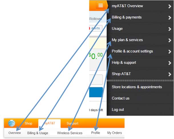
The next step was a tree study that used a low-fidelity tool that users click on to find various tasks (see Figure 2). A tree test focuses only on taxonomy––in this case whether the organization and labeling of our global navigation links made sense to customers. Participants click the areas they think will lead them closer to task completion and then click a button labeled “I’d find it here” when they are finished.
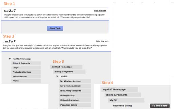
This exercise allowed customers tell us how they thought our navigation should be organized, instead of forcing them to use a taxonomy we created internally. It helped us prioritize the tasks customers were struggling to find and to eliminate the guesswork around labels and organization by utilizing user-centered design. Now it was time to validate this taxonomy with a usability test.
Validating the taxonomy: Mobile first
We wanted to make this a mobile-first effort, so we tested it on a mobile device first. We had 12 participants visit our usability lab in Middletown, NJ over four days in the spring of 2013.
We asked users where they would click to complete 20 of the top 44 call-driver tasks. We observed their behaviors and asked questions about their decisions. As expected, some tasks were easy to complete, others were failed miserably. But the feedback we received gave us strong insight into how to regroup and relabel certain links to at least minimize confusion. Once we felt confident that our customer-driven global navigation was strong enough to launch for our mobile experience, it was time to focus on the desktop version.
Since our mobile navigation was streamlined before we added the call drivers, we were not concerned that the new links would overcrowd it. We would have to remove links and rename column headers to align with the mobile experience, but we knew we would need solid rationale behind our decisions.
Usage data: Which links are being used?
We turned to click data to evaluate which global navigation links were being underused. Click data in and of itself doesn’t usually paint a complete picture, but in this case it told us which links weren’t being used very often. Within each navigation tray, we found the same basic pattern: a few links were heavily used while the rest went largely ignored.
Most of the product owners of the links we removed weren’t thrilled with our decisions, but it was difficult to refute the facts. In most cases we ensured customers still had access to those links in more contextual locations outside of our global navigation. For example, the link for Payment Options––which explains the various methods and locations available for paying your AT&T bill––was relocated to the Make a Payment page.
Design cleanup
Removing extraneous links opened up the global navigation so that we could find room for the top call drivers. But we didn’t stop there. We frequently hear customers talk about having “too much stuff” on our pages, which makes things harder to find. Since our overall focus was on improving the experience, we noticed that the global navigation was still untidy. For example, prior to July 2013 if you had only cell phone service with AT&T you would see “Internet” and “Home Phone” in the global navigation options for Digital TV. If you clicked on those links, you would be taken to a page that said you didn’t have the service, and it provided links to pages where you could shop and sign up for service.
We contacted the prior global navigation owners and discovered that those sections were included for everyone for consistency with the Shop section of the global navigation, which also has those sections (although unlike the ones in the myAT&T section, they link directly to pages where customers can shop and sign up). In our quest to simplify the experience, we requested six months of click data for all the links in the secondary section of the global navigation (the white bar) for wireless-only customers.
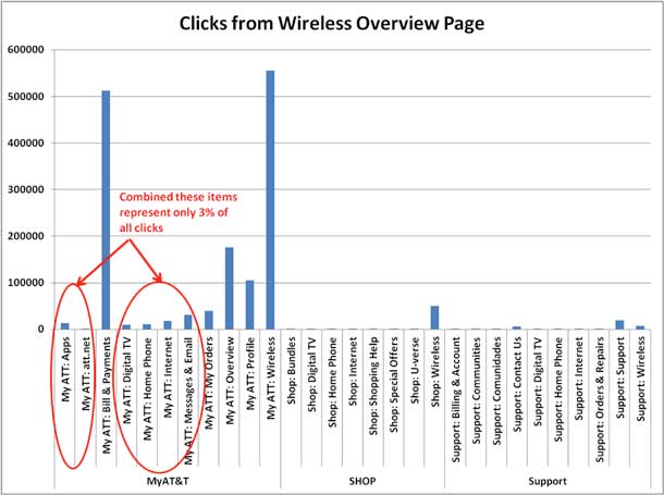
As you can see in Figure 4, the links for Apps, Att.net, Digital TV, Home Phone, Internet, and Messages & Email, made up less than 3% of all the clicks in that section of the navigation. So for wireless-only customers, who make up the bulk of our customer base, those links were unnecessary. Once we removed those links (see Figure 5), the global navigation bar was far more streamlined and customer-focused.

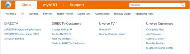
Finally, we reworded the column headers to align better with our mobile navigation and used the test results to place new links in the appropriate locations. We knew there would never be an exact 1:1 match, but the goal was to ensure that the content was consistent with our mobile navigation. As you can see in Figure 6, for the most part we succeeded.
Measuring Success through Remote Validation and Stakeholder Feedback
Measuring the success of a global navigation update is tricky. Click volume shows us which links are being used most, but it doesn’t guarantee that customers like the experience once they click. We can see drop-off rates and completion rates, but those don’t always reflect the overall effectiveness of the global navigation.
A couple of months after launching the new navigation, we asked 218 test participants to log in to their AT&T accounts and try to complete a series of tasks while we monitored them remotely. For the most part, findability was unchanged for tasks that had been part of the global navigation prior to the overhaul. The new tasks rated roughly the same as the prior tasks. But for some of the key call driver tasks we saw success rates between 9-12% over a previous study. This let us know our taxonomy was pretty solid, though we continued to make adjustments to labels and groupings as we acquired additional data over the next couple of years.
Within hours after launching the new global navigation, there were dozens of requests from business stakeholders to make changes to it. To manage the requests, an information architect and a website producer were assigned to help me vet the requests. We set up meetings twice a week to review the job tickets and either approve or reject them, or, more commonly, ask for data to support the request. Since some of the tickets involved the content implementation team, we invited a couple of implementers to our weekly calls. Some business stakeholders asked to be included as well, as did the creators of our support articles. Within a few months we had a comprehensive global navigation governance committee. Because we open the meetings to anyone who wants to attend, the committee has largely been positively embraced.
The interesting thing is that a few years earlier we discussed how to create a content governance committee; since no one could agree on who should be involved we ended up not creating one. In the end, the global navigation committee was created out of a real need to ensure adherence to our strategy; it literally created itself.
Lessons Learned
My initial approach to content strategy––asking questions prior to content creation––had been effective enough to grant me a shot at working on our global navigation, a project that has garnered a lot of attention throughout the AT&T business community. We started with the business objective of working the top call drivers into the navigation, and used customer feedback to drive the organization and labeling. We continually tested that feedback to ensure we were on the right path. We validated our findings after the launch with a remote usability study, and we now govern this global navigation content in weekly meetings. Much like the customer-centered design approach we have used for years, we’re now applying a similar methodology to the creation of content.
Because more people see the value of customer-centric content strategy, I’m continually being engaged in more and more projects. Rarely am I asked to “do a content strategy” for an in-flight project. Instead, I utilize research and testing to ensure that our content decisions resonate with customers and help improve our digital experience.
Our global navigation will no doubt continue to evolve and change, and the hope is the effort we worked on in 2013 will serve as a framework for how that evolution should occur.
It took a few years to build a viable content strategy discipline, and we still have a long way to go, but I truly sense excitement around how content strategy can be an effective way of driving a positive customer experience at AT&T. If I had waited for all the elements to be in place before starting, well…I would still be waiting. My advice is to get started now. Use research and testing to keep your customers top-of-mind, and leverage little victories to get traction and build credibility for your strategic approach.