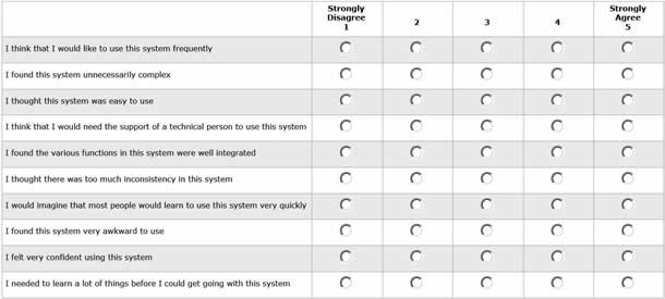
The System Usability Scale (SUS) developed by John Brooke in 1986 is the most used questionnaire for measuring perceptions of usability. SUS is composed of ten statements with responses ranging from 1 (strongly disagree) to 5 (strongly agree) (see Figure 1).
To generate a SUS score, you first have to convert all responses so that they range from 0 to 4, with four being the most positive response. You can do this by subtracting one from user responses to the odd-numbered items and subtracting the user responses to the even-numbered items from 5. Next, you add up the converted values and multiply the total by 2.5. As a result, your SUS scores will range from 0 to 100.
If you use SUS, you hopefully already know this core information, but there is a lot more to SUS than you may think. In celebration of its 25th anniversary, I’ve put together a list of ten facts about SUS not everyone knows.
1. SUS measures both usability and learnability
SUS was intended to be a “quick and dirty” way to measure usability. The ten items were assumed to only measure the single construct of usability. However, recent publications have revealed, through statistical analysis, a subscale of learnability. Items 4 and 10 can be reported as a separate measure of learnability along with the original SUS score comprised of all ten items.
2. SUS is at least as reliable as commercial questionnaires
One of the main things that makes a questionnaire good is its reliability, or repeatability of the responses. A questionnaire is reliable if users respond consistently to the same items. Reliability is measured using Cronbach Alpha, which typically ranges from 0 to 1, with higher values indicating better reliability. For questionnaires, surveys, or tests with major consequences (like IQ tests), Cronbach Alpha scores should be above .9. For less consequential questionnaires (such as perceptions of usability), scores above .7 are considered acceptable.
Even though Brooke’s original SUS publication never contained information about reliability, researchers have reported high Cronbach Alpha scores for SUS, with the most comprehensive examination reporting a reliability of .92. This high reliability makes SUS equal to, or better than, usability questionnaires that require a license fee like SUMI, QUIS, and WAMMI, which have reported reliabilities of .92, .94, and .90, respectively. SUS may be quick, but it’s not so dirty after all.
3. The average SUS score is 68
One of the benefits of commercial questionnaires is that you get a score that’s compared to hundreds of other test scores in a proprietary database. Having relative comparisons makes a score meaningful.
SUS doesn’t come with any guidance on how your score compares to other scores, or even what an average score is. But one benefit to its wide usage and publication record is that we can easily get that information. In looking at SUS scores from over 5,000 users, almost 500 studies across a variety of application types (for example, consumer and business software, websites, and cell phones), the average score is 68. This means SUS scores higher than 68 can be considered above average and scores lower than 68, below average.
We can also use this large amount of data to generate a more precise interpretation of SUS scores. In combining the scores across studies and transforming the data to follow a normal distribution, we can generate percentile scores and grades (we’re quite literally grading on a curve). Figure 2 shows how to convert your raw SUS score into both a percentile rank and a letter grade from A to F.
For example, a SUS score of a 70 falls at around the 56th percentile, indicating that this score is higher than 56% of all applications tested and would result in a grade of a C. Scores above 79 put you in the 85th percentile and the beginning of the A- range (the top 15% of all applications tested), while scores below 51 give you an F (the bottom 15%).
4. SUS scores are not percentages
SUS scores get reported to executives, product managers, and those unfamiliar with SUS all the time. A SUS score of 70 doesn’t mean much to them. It’s only natural then that many usability professionals report it as 70%.
While it’s technically correct that a SUS score of 70 is 70% of the possible maximum score of 100, it incorrectly suggests the application tested has above average usability. As we’ve just seen with the analysis of the large dataset of SUS scores, an average score is 68. Thus, it would be more accurate to report a SUS score of 70 as 56% rather than 70%. Using a percentage is a good idea, but you should first convert the score to the appropriate percentile rank using the graph in Figure 2.
5. SUS can’t diagnose usability problems
In its original use, SUS was administered after a usability test where all user sessions were videotaped. Low SUS scores indicated that the researchers needed to review the tape and identify problems encountered with the interface. SUS scores can provide information on how users perceive the application’s usability, but they won’t tell you much about what’s unusable or what to fix.
In fact, the association between SUS scores and task-level metrics like task-time and completion rates is modest, with SUS scores only predicting around 10% of task performance. Therefore, SUS is no replacement for task-level measures or identifying usability problems.
6. The positively and negatively worded items hurt more than help
There is a long tradition of including a mix of positively and negatively worded statements in questionnaires, for example, “I thought the system was easy to use” (positive) and “I found the system unnecessarily complex” (negative). The intention of alternating items is to reduce acquiescent bias (users agreeing to many items) and extreme response bias (users providing all 5s or 1s on a 5-point scale).
Our recent research with an all positively worded version of the SUS found little evidence of these biases. In fact, it showed that alternating items causes problems. Some study participants would forget to reverse their answers and therefore responded incorrectly. What’s more, 10% of researchers forgot to reverse the even items when computing the final SUS scores. If you want to use the original SUS, you should verify the proper item coding and include procedural steps to ensure error-free completion of the SUS by participants.

7. Difficult tasks lower SUS scores by 8% on average
After analyzing five popular websites and 224 users, I found that including a single difficult task reduced SUS scores by 8% compared to users who attempted no tasks but still answered the SUS. This reduction in SUS scores can be attributed to less experienced users whose scores dropped almost 20%. SUS scores for more experienced users weren’t changed. Having a simple task also didn’t affect SUS scores.
When a test contains many less experienced users attempting difficult tasks, it may make sense to qualify SUS scores, noting they may be 8-10% lower than current users’ attitudes.
8. SUS scores predict customer loyalty
Higher SUS scores tend to go along with more loyal customers. In fact, SUS scores alone can explain between 30% and 50% of the changes in the popular measure of word-of-mouth, the Net Promoter Score. Increasing usability will increase the chances that users will recommend the product to a friend. Users with SUS scores above 80 are much more likely to promote your product (these users are called Promoters) and those with SUS scores below 60 are more likely to say bad things about it (these users are called Detractors).
9. Familiarity results in higher SUS scores
Having prior experience with the interface increases SUS scores. In looking at websites, I found that repeat users generated SUS scores that were 11% higher than first-time users’ scores. For consumer software, users who had more than five years experience generated SUS scores that were 11% higher than users with 3 years or less experience.
10. Five seconds with a system generates stable SUS scores
If you’ve wondered how long you need to expose a participant to an application before administering the SUS, a few seconds may be enough to generate stable scores. The SUS scores of users who had only five seconds to look at a website are statistically indistinguishable from users who spent ten minutes completing two tasks. This suggests that we are able to identify sign-posts of good usability (represented by the layout, fonts, graphics, white-space, etc.) very quickly.
Conclusion
Over the next twenty-five years, I expect SUS to continue to be used extensively in industry and academia. The scale is technology independent, so despite major changes in technology, SUS will still provide a reliable, valid and quick measure of ease of use. Who knows, in twenty-five years we may even see increases in average SUS scores suggesting all those UX improvements are making an impactJohn Brooke 于 1986 年开发的系统可用性量表 (SUS) 是一种使用最为广泛的调查问卷,用于度量人们所感知的可用性。该量表包含十条陈述,回答范围从 1(强烈反对)到 5(强烈赞同)不等。在庆祝 SUS 诞生 25 周年之际,Jeff Sauro 讨论了十个关于SUS的许多人不知道的有趣事实:
1. SUS 度量可用性和可学习性。
2. SUS 至少与商业调查问卷一样可靠。
3. 平均 SUS 得分为 68。
4. SUS 得分不是百分数。
5. SUS 不能诊断可用性问题。
6. 正面和负面措辞项目所带来的负面影响胜过其所提供的帮助。
7. 平均而言,困难任务会使 SUS 分数降低 8%。
8. SUS 分数能预测客户的忠诚度。
9. 熟悉会导致产生较高的 SUS 分数。
10. 接触系统5秒钟就足以得到稳定的 SUS 分数。
文章全文为英文版システムユーザビリティスケール(System Usability Scale Facts:SUS)はジョン・ブルック(John Brooke)により1986年に開発され、ユーザビリティの受け止められ方について測定するために最も広く利用されている質問票である。このスケールは、1(まったくそう思わない)から5(まったくそう思う)の10の記述から成り立っている。SUSの生誕25周年を記念し、ジェフ・サウロ(Jeff Sauro)が、あまり一般には知られていない、SUSに関する興味深い事実を述べる。
1. SUSはユーザビリティと学習能力の両方を測定する。
2. SUSの結果は少なくとも商業用のアンケート程度は信頼が置ける。
3. SUSの平均点数は68。
4. SUSの点数はパーセント値ではない。
5. SUSはユーザビリティの問題の診断はできない。
6. 肯定的または否定的な言葉で表現された項目は、助けとなるよりも害となる。
7. 難しい作業はSUSの点数を平均で8%下げる。
8. SUSの得点はカスタマーロイヤルティーを予測するものである。
9. なじみのあるものではSUSの点数は高くなる。
10. 5秒あればシステムは安定したSUSの点数を計算してくれる。
原文は英語だけになります