How do you take a physical keyboard/mouse-based business application and design it specifically for touch interaction? Your starting point is a set of physical keyboard/mouse-based widgets like list boxes, dropdown lists, checkboxes, and radio buttons. Your challenge is to somehow find a way to map their functionality to a touch interaction paradigm. For applications with data grid displays, row selection must also be mapped to touch. Designing touch-friendly navigation in an online help system is also required, since online help is vital for mission-critical business applications.
As I worked through these design challenges for our retail point-of-sale (POS) application, several user interface (UI) patterns emerged that do the job efficiently and effectively for our users. I’ll describe these patterns and explain why they work well for a full-touch business application. However, to understand the scope of the effort, it’s important to lay out the two major challenges associated with designing interaction for business touchscreen software; first, the greater functionality associated with the business application, and second, the environment in which the application must function.
The Challenges
One difference is that business applications have greater functionality than other applications, so much so that considerable user training is typically required to master a business application. This increase in functionality creates a special UI design problem for business touchscreen software. As Jakob Nielsen mentioned in the Forbes.com interview, “Touchscreens work best for applications where you have very few options, such as small, portable devices with little room for larger numbers of buttons.”
In the retail POS domain, increased functionality requires designing for a large number of user task flows, each of which has multiple steps and travels down a broader set of branching pathways than a self-serve kiosk, mobile device, or even a restaurant ordering system. The resulting complexity increases the effort of designing consistent navigation for saving, deleting, backing up, modifying, and canceling completely at any point along a path.
The variety of POS user tasks also increases the types of interactions that need to be designed. Our users may need to calculate amounts, select individual list entries and apply various actions to them, control printing and other options, search for items, combine and separate groups of items, enter customer information, sell items that cannot be scanned, handle interruptions in individual sales, balance registers, and administer user and system privileges (see Figure 1). Enabling touch for these interactions presents a formidable design problem.

In addition to the greater functionality, the business user’s environment gives rise to a second design challenge: most of the time, self-service kiosks and mobile phone applications are operated for leisure and entertainment purposes. In cases where these devices are used for business purposes, there is typically a back-up process for accomplishing the task. For example, a customer service desk or a full-sized computer email system typically backs up mobile or kiosk ordering devices.
In the business environment, on the other hand, a dedicated, domain-specific business application is used to accomplish mission critical, workaday tasks. There is no back-up process for selling items at a store register. Here the business user’s ability to operate workplace-specific applications is intimately tied to success or failure at work. Critical dependency on software makes business users unwilling to sacrifice time and resources on unproven applications. In the retail world, that means a full-touch UI cannot compromise speed or accuracy in any way.
Designers clearly have a big hill to climb when they try to take a business application into the touch paradigm. Not only must touch-screen business applications support rich functionality and multiple user interactions, but to be competitive, the user experience must be better than the physical keyboard/mouse implementation that is being replaced.
Touchscreen Design: Reinvention vs. Redesign
I use the word “reinvention” rather than “redesign” to describe the touchscreen design experience. “Reinvention” signifies the novelty of thinking required for this kind of UI design, and I would like to explain how I came to this important design realization.
The journey started when I spent time evaluating the few POS applications running on a touchscreen. They used larger versions of physical keyboard/mouse widgets, which were obviously decreasing the user’s speed. Imagine, for example, using your fingertip to scroll line-by-line, up or down, in a dropdown list box of fifty text options.
Simply redesigning widgets to be bigger clearly wasn’t working for touch, and there were no practical touchscreen design guidelines to be found. Facing project deadlines, I decided to go by what I had observed: the only objects that users could touch quickly and accurately were large, finger-sized buttons. With this in mind, I reinvented widgets that used button interactions.
Option Selection Widget
In the physical keyboard/mouse world, users select options from simple text lists, dropdown lists, checkboxes, and radio buttons. Depending on the widget, one or multiple selections are allowed. I reinvented these in a single widget that uses a button array UI pattern, which is shown in the top left of the screen in Figure 2.
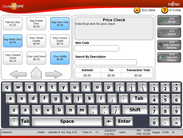
Touch friendly buttons are sized to accommodate the typical adult fingertip. The option label is put on the button. The array can be programmed to allow one or multiple buttons to be selected, depending on requirements. When an unselected button is touched, the visual presentation of the button changes to indicate that the button is selected. When an already-selected button is touched, it reverts back to the unselected visual presentation mode.
Users don’t have to learn a variety of different widgets for option selection. They are always presented with touch friendly buttons that visually turn on or off. If a large number of options must be presented (for example, selecting one U.S. state out of fifty), a separate screen can be used.
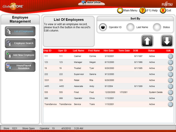
Grid Row Selection Widget
When presented with a grid of information in rows and columns, users sometimes need to select a specific row in the grid to view additional details about that row. In the physical keyboard/mouse widget, either the entire row is a selectable object, or a particular cell contains a selectable text link.
I reinvented row selection in a widget that uses a row button UI pattern, in this case a blue round button with the label “i” (see Figure 3). Although it is small relative to our other buttons, the row button is a touch-friendly target, in contrast to a text link or row of text. The row button must be repeated in each row, which may require enlarging the rows to accommodate it. This is not an issue for most business applications, as the rows typically have to be enlarged anyway to accommodate wrapped text. The challenge is to design a button that is both obvious and touch friendly without overwhelming the visual layout of the grid.
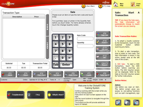
Online Help Window Management Widgets
Online help for physical keyboard/mouse applications is typically provided in a separate screen, which can be manipulated independently from the application screen that it references. Links to help topics are provided in a selection list. Applications may support the automatic display of context-sensitive help topics through a special interaction mechanism, such as the F1 key. Otherwise, the user must navigate to the relevant topic from the primary help screen, typically with the assistance of a search function.
Since manipulating independent windows is difficult on a single-touch UI, I reinvented the help display in a widget that presents context-sensitive help inside the application screen (see Figure 4). After the user touches the Help button at the top right of the application screen, several changes occur. First, the application screen resizes proportionally in both dimensions, while remaining active and touch friendly. Second, the context sensitive help topic is automatically displayed in the yellow column on the right. The user does not have to navigate to the correct topic. Paging buttons are provided at the bottom of the context sensitive help for navigating within the topic, and a zoom button enhances readability. Finally, as the application screen changes, the help content changes to match. If the user leaves the help open all the time, it becomes a self-training tool.
These UI patterns are currently limited to single-touch interaction, but we are moving to multi-touch as well as to wide screen touch monitors. With more interaction options and additional screen real estate, we’ll have a powerful design environment.
From Practice to Theory
When in need of ideas and inspiration, designers often turn to best practices. These are tried and true guidelines that are backed up by a theoretical foundation. Not only do the guidelines work in practice, the theory tells us why they work. This combination increases our confidence level in using them. But when we are innovating, the best practices that work within an older paradigm may not apply, as I discovered. In this case, we have to start with what we think will work based on observation, and later investigate whether there is a theoretical foundation for it.
After seeing that the reinvented widgets worked well for our users, I wanted to know why. Within human factors and cognitive theory, I found two principles that were directly related to touch-screen interaction:
- Human eye-hand coordination is highly refined and accurate, particularly in the act of pointing (wonderfully expressed by neurophysiologist William Calvin in How Brains Think).
- Fitts’s law: The time it takes to acquire a target is a function of the distance to the target and the size of the target. We see a speed-accuracy tradeoff associated with pointing, whereby targets that are smaller and/or further away require more time to acquire (described in various sources such as wikipedia.org).
Reflecting on how these principles work together in the touchscreen domain, I found a strong explanation for why touchscreen interaction is more intuitive and direct than physical keyboard/mouse interaction:
- By combining the presentation surface and the interactive surface, touchscreen interaction enables finger-pointing for target acquisition.
- Finger-pointing brings highly-evolved human eye-hand coordination into play for target selection and is, by nature, an intuitive movement. Speed and accuracy are increased because users don’t have to look down at a keyboard surface and orient their fingers, or locate, grasp, and orient a mouse on a work surface, and then look back up at a screen to acquire the target. Even proficient keyboard/mouse users are slower because attention must still be divided between two surfaces.
- Touchscreen interaction enhances accuracy by increasing the proximity of the interactive surface to the visual feedback.
- The user is closer to the target (the touchscreen) when pointing than when using a physical keyboard/mouse. This proximity makes the human finger even more accurate at hitting a target directly in view on the screen than a human hand would be in guiding a remote pointing device (mouse) or than a finger would be in touching a key on the physical keyboard.
This theory explains why the reinvented widgets worked. A useful guideline for touchscreen design follows from it: a successful touch application maximizes the ability of the human finger to point to the on-screen target. For short, I call this “maximizing touchability.”
It is possible to port a traditional business application to a touchscreen environment, provided you are willing to go beyond simply re-rendering the existing interface on the new device. Maximizing touchability is the key to success.您如何将基于物理键盘/鼠标的商业应用改而设计成基于触摸交互功能?移动设备、自助服务设备和餐馆应用都是触摸屏领域的明星。但对于重负荷商业应用,例如客户支持、零售销售点 (POS) 和办公管理等应用,情况如何呢?在这些领域,触摸屏是否也可以取得成功?2009 年,Jakob Nielsen 在接受 Forbes.com 采访时似乎并不这么认为:
“[触摸屏]之所以具有吸引力,其实原因很简单:与鼠标有些不太直接的风格相比,触摸屏更直观、更直接。对于选项较少的应用(例如空间很小,因而无法放大量按钮的小型便携式设备),触摸屏就非常适合。”
Nielsen 的观点似乎不容置疑,因为当今在使用的全触摸式商业应用是如此之少。作为面向零售应用开发商的用户界面设计者,我知道,客户很希望在其店铺运营中使用触摸屏获得其所公认的可用性好处,这一点确凿无疑。我们已经在全触摸 POS 应用上取得了成功。
转向触摸应用并不会自动保证获得其可用性好处。用户界面必须进行专门设计才能利用触摸交互所带来的好处。仅仅将基于键盘的应用转向触摸屏,并增大用户界面对象的尺寸是起不到什么作用的。那么专门针对触摸交互进行商业应用设计需要考虑哪些因素呢?这就是这篇文章所要解决的问题。
文章全文为英文版キーボードやマウス操作を使った業務用アプリケーションはどのようにしてタッチ操作用にデザインし直せばよいのだろうか。携帯機器、セルフサービスタイプのキオスク、レストランで使用されるアプリケーションなどは、タッチパネル利用分野におけるスターだ。しかしカスタマーサポート、小売店のレジやオフィス管理などに使用される重要な業務用アプリケーションではどうだろうか。タッチパネルで同じように成功を収めることができるだろうか。ヤコブ・ニールセン(Jakob Nielsen)は2009年の時点でそれには賛同しなかったようで、Forbes.comにおいて次のように述べている:
「(タッチスクリーンの)魅力は実にシンプルです。何か直観的で直接的なものがあり、マウスはそれに比べて少しだけ間接的なスタイルなわけです。タッチスクリーンはオプションがほとんどない、つまり小型のポータブル機器でたくさんのボタンを配置するスペースがないような用途に最適です。」
今日業務用アプリケーションには全てタッチ操作で使用できるものはほとんどないため、ニールセンの見解は正しいように見える。ユーザインタフェース(UI)のデザイナーとして小売り用のアプリケーションのベンダーに勤める私は、クライアントが店舗業務のためにユーザビリティの面で評価の高いタッチパネルの利点に関心を持っていることは知っている。我々は全てをタッチ操作で行うPOSアプリケーションですでに成功を収めている。
しかし、単にタッチ操作に切り替えることで自動的にユーザビリティの利点が得られるわけではない。UIは、タッチ操作のインタラクションを上手く活用するようにして特別にデザインされる必要がある。ただ単にキーボード操作ベースのアプリケーションをタッチパネルにしてUIのオブジェクトを拡大しただけでは上手く機能しない。では業務用アプリケーション、特にタッチ操作でインタラクションを行うタイプのデザインには何が必要とされるのだろうか。その質問に取り組んだのがこの記事である。