
[bluebox]
Casey, a 42-year-old single mom currently working on master’s degree, carefully completed each question on the application on CoveredCA.com, the California health insurance portal. Her son has health insurance, but she doesn’t, and she knows she needs to sign up right away.
A few times she stopped to figure out how to answer a question and searched Google to explain terms she didn’t understand. Finally she clicked submit, anxiously awaiting the results that will show her what tax credits she qualifies for and how much plans will cost.
Instead of clear details about her eligibility, she sees confusing terms and no obvious way to continue. “It’s really disconcerting when you go through the process and emotions of finding the plans then find out you’re not qualified for them…You can’t just throw something like this in someone’s face and expect them to understand it.”
She did not continue looking for a plan at that point, and two weeks later when we followed up, she still had not enrolled in health insurance.
[/bluebox]
In early 2014, gotomedia conducted usability testing on HealthCare.gov and CoveredCA.com, two of the portals created as part of the Affordable Care Act in the U.S. We anticipated that users would experience wrong turns and blockades at every step. After all, HealthCare.gov and state-run insurance marketplaces like CoveredCA.com were a major news story when they opened in October 2013. Technical and usability failures meant that consumers were barely able to access the sites, let alone complete the complicated process of applying for and selecting health insurance plans.
When we tested the sites, however, we found a mix of good and bad design. We encountered elements that ran counter to all known best practices of UI design that frustrated even the most patient participants, and some that guided confused users down the right path.
We took three key findings away from our usability testing:
- Small errors add up
- Selecting healthcare is overwhelming
- One-on-one testing adds value
Small Errors Add Up
Despite the major improvements in the technical aspects of these sites by the time we conducted testing, participants still encountered significant technical errors. Participants were repeatedly logged out of the application on HealthCare.gov, losing information they had entered. On CoveredCA.com, the site would sometimes freeze just as users submitted their application, preventing them from seeing their eligibility determination or give them conflicting information, such as they were both eligible and ineligible for a type of plan at the same time. This frustrated many users to the point of quitting. Technical errors certainly affected their experience and were high priority issues to address.
However, small usability problems that participants encountered throughout the process added up to a similar level of difficulty, frustration, and incomplete submissions as the technical errors. Each issue was a low priority finding, but when aggregated, they equaled a high priority finding.
A small issue might be something simple like formatting requirements on CoveredCA.com that led to repeated errors when entering basic information like a phone number and income. For example, the site required users to enter Social Security numbers without dashes and income numbers without commas. One participant said: “Who doesn’t accept commas? They teach you that in school, right?” On HealthCare.gov, one participant struggled to enter his city “St. Louis” until he finally tried “Saint Louis.” He said that he had never had to write it that way. There was no guidance or instructions on how to enter any of this data. Simple backend processing should have been able to adjust the formatting instead of requiring the user to guess what the system wanted.
Our participants became increasingly frustrated by these minor issues. Many cited these as points where they would have given up. Figure 2 shows the steps completed during the usability testing.
What tasks did users complete?
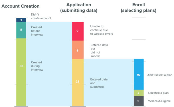
| Step in Process | Number Completing Step | Outcomes |
| Account Creation | 43 | 2 – didn’t create account
8 – created before the interview 33 – created during the interview |
| Application (submitting data) | 41 | 9 – unable to continue due to website errors
9 – entered data but did not submit 23 – entered data and submitted |
| Enroll (selecting plans) |
23 | 15 – didn’t select a plan
3 – selected a plan 5 – were eligible for Medicaid |
Selecting Healthcare is Overwhelming
Choosing a health insurance plan is, in itself, a difficult task. There were often as many as thirty plans to choose from, each with different costs and coverage to weigh. Because of this complexity, users rarely made the decision alone, in one sitting. Family members were often consulted, facts double-checked, and time committed to thinking through the options. One participant lamented that she didn’t have a fortune teller to help her predict whether committing to higher premiums with better coverage would be a good value for her in the long run. Despite the difficulty and both financial and health significance of the decision, the sites could have made the process easier by reducing jargon and clarifying the role of plan previews.
Reducing jargon
The sites used a lot of jargon to describe plans and benefits. Participants often got stuck on insurance terms such as “co-insurance” and “deductible” and would leave the site to search Google for definitions or simply get frustrated. One participant said: “I don’t understand the mumbo jumbo that they’re speaking. They’re using Dr. Seuss language.”
HealthCare.gov did have a useful glossary, but tooltips and definitions were presented in inconsistent ways and users often didn’t notice that this help was available. CoveredCA.com rarely offered definitions.
The sites (and Affordable Care Act) also introduced their own terms that confused users. For example, at the point when users had completed their applications, they were shown a summary of their eligibility for financial subsidies to pay for the insurance. Instead of encouraging users to continue on to choose a plan, the unclear language on this page stopped them as they struggled to understand the words.
Premium Assistance, for example, is a term that describes tax credits that reduce the costs for those who are eligible. When this term was not defined, some participants assumed it referred to customer service. “I don’t know what premium assistance means. Does that mean that they won’t talk to me? Or in a line of twenty people I’d be twenty-one and not one?” When we shared that insight with people entrenched in the insurance world, they were shocked that was an interpretation.
Clarifying the role of plan preview
Participants were also extremely confused by the option to preview plans and eligibility before applying. It was not at all clear that these plans were a preview of plans they might be eligible for. Many had no idea that the plans they saw in this section were not necessarily (or even likely) to be the plans they would actually be offered after completing an application.
Making it clear that this step was a preview would prevent a large number of people from getting stuck at this point. Instead, over and over we saw participants attempting to complete the difficult task of choosing the right plan at the wrong place in the overall process. Participants spent a long time trying to pick a plan from the preview and many went so far as to start spreadsheets or write down the details of plans in a notebook. Some spent up to an hour comparing options. Others didn’t want to continue because they hadn’t finalized a plan selection or wanted to talk over options with family members at this stage.
We eventually told participants that this was just a preview section, and that to see the actual plans available to them, they needed to apply. This exasperated many; by the time they made it to the stage where they could see the plans available to them, they were mentally drained from having already completed the earlier exercise.
The sites would have been more useful if they had made the tasks and goals of each stage of the process clear. Instead, users guessed and exhausted their patience for making these difficult decisions before it really mattered.
One-on-One Testing Adds Value
In all of our conversations with government agencies and people involved in making health exchange sites, we never heard of anyone conducting usability testing or in-person observation of any kind. Instead, we heard about exit surveys and focus groups.
Our client, the California HealthCare Foundation (CHCF), a non-profit grant making philanthropy in Oakland, CA, originally asked us for a heuristic evaluation of the site. They knew that people who respond to surveys or participate in focus groups may have general feelings about their experience, but are rarely able to identify particular interactions that led to their frustration or unease with the process.
We felt that while we could provide details on best practices of web design, we would not be able to fully understand the consumer experience without actually observing consumers one-on-one. Instead we convinced CHCF to take a different route by conducting remote and in-person usability testing so that we could observe real consumers.
We presented findings in meetings with CoveredCA, California’s Department of Healthcare Services, and Centers for Medicare & Medicaid Services (CMS). The government agencies responded positively to the findings. An official from CoveredCA commented during the webinar: “This information will be used to help us further refine, further improve, and make [the site] a much more consumer[-focused] experience.”
Stakeholders discovered that usability testing allowed them to observe the exact moments when the difficulty that users experienced entering data into form fields turned to anger, and saw first-hand how an overwhelming number of plan options led participants to abandon the application process.
Conclusion
Observing real people as they tried to use Healthcare.gov and CoveredCA.com gave us the opportunity to connect the people who use the sites with the people who made them. Showing people who struggled to complete basic tasks and formed misconceptions about what they were doing and why painted a clear picture of what needed to be done to make these sites more successful.
The site creators seemed genuinely surprised by the findings—even those thought to be well-known UX best practices—and eager to address them. Even though usability testing is not a new practice, it was new to the players in this domain. Now that they know about this approach and see the value in user testing, the practice may be implemented in the design and development phases of critical government-run sites that have an enormous impact on the real lives of Americans.
[bluebox]
This work was supported by a grant from the California HealthCare Foundation. You can read the full reports from these projects online at California Healthcare Foundation:
- Covered California Report
- Healthcare.gov Report
- Webinar – Assessing the Covered California Online User Experience
[/bluebox]在推出 healthcare.gov(以及加州 CoveredCA)之后,工作并未结束。通过对健康消费者进行可用性测试,发现医疗保险决策流程过于繁复,并建议了修复问题的方法。文章全文为英文版
healthcare.gov(및 캘리포니아주의 CoveredCA)를 개시한 후, 업무가 중단된 적이 없었습니다. 의료 소비자를 대상으로 한 사용성 검사는 의료보험에 대한 결정과정이 얼마나 힘든지를 보여주었고 문제점을 해결할 방법을 제시하였습니다. 전체 기사는 영어로만 제공됩니다.
Depois do lançamento do healthcare.gov (e do CoveredCA da Califórnia), o trabalho não parou. Testes de usabilidade com clientes de saúde demonstraram como o processo de tomada de decisão sobre seguro saúde pode ser assoberbante e sugeriram maneiras de resolver os problemas. O artigo completo está disponível somente em inglês.
healthcare.gov(およびカリフォルニア州のCoveredCA事業)の立ち上げ後も、改善の取り組みは続いた。このユーザビリティ・テストでは、医療保険の決定プロセスが消費者にとってどれほど重荷であるかが示されると共に、問題を修正するための方法が見出された。原文は英語だけになります
El trabajo no terminó después del lanzamiento de healthcare.gov (y de CoveredCA de California). Las pruebas de usabilidad con consumidores de servicios de salud mostraron cuan abrumador puede ser el proceso de decidir sobre un seguro médico, y sugirieron formas de solucionar los problemas. La versión completa de este artículo está sólo disponible en ingles