For centuries, type has been how we “hear” what we read. It is also generally understood that typefaces and typography are a core element of branding, and expression, of vocal range. Great typography influences understanding, mood, and meaning in countless ways and is an essential part of design and user experience. Truthfully, in many ways, the typography is the user experience: It is the interface between the content and the viewer.
Words Have Power and Typography Is Their Voice
Unfortunately, for many years after the advent of the web, we were unable to apply all but the most basic of typographic design to online content. With the ability to use real fonts and OpenType features—like ligatures, specific figure sets, fractions, and true kerning—the typographic landscape improved tremendously. Still, the reality of viewing content on the web dictates that speed is the most critical aspect of design, and so we’ve traded typographic “vocal range” for page speed. This, in turn, results in fewer font weights and reduced brand fidelity and voice. After all, if the content doesn’t show up there is no user experience (at least not a good one!).
From Many, One (Paradigm: Shifted)
A variable font is a single font that acts as many.
—John Hudson
The advent of variable fonts changes that entire dynamic. As described by John Hudson, a variable font is a single font that acts as many: All the variations of width and weight, slant, and even italics can be contained in a single, highly efficient, and compressible font file. What is more, the format (which is technically part of the OpenType 1.8 specification) is completely extensible. The type designer has complete control over what axes are used, their ranges, and even the definition of new axes.
There are currently five “registered” axes (width, weight, slant, italics, and optical sizing), but the designer can vary any axis they choose. Some examples include the height of ascenders and descenders (see Figure 1), text grade, and even serif shape. The possibilities are nearly limitless. By removing the performance barrier, we open the door for more interesting and dynamic design and far greater ability to express the true voice of the brand. All this while maintaining fidelity to the typeface itself: Only axes exposed by the type designer can be varied. No artificial distortion is allowed.
Web Design, Reinvented
While the technology is still maturing, and type designers are working to become more fluent in this new way of working, the promise for design on the web is ground-breaking. The typical scenario would be to constrain any given design to three to five different fonts to represent every aspect of a site’s design language and voice—including every permutation for body copy and headings. At its simplest implementation, variable fonts would give us the freedom to use different weights for every level of heading, thus greatly increasing their clarity and readability.
One could also use slightly narrower character widths for headings or on data-dense displays of information. In fact, the entire typographic system could be designed to be proportional: weight and width could become multipliers on the standard body copy settings. Doing so would allow these aspects to scale easily along with the body copy, should its settings change based on screen size or user preference. All of the above comes with an accompanying increase in performance due to fewer HTTP requests (fewer font files) and an overall savings of data to download, though this will vary by font and compression used.
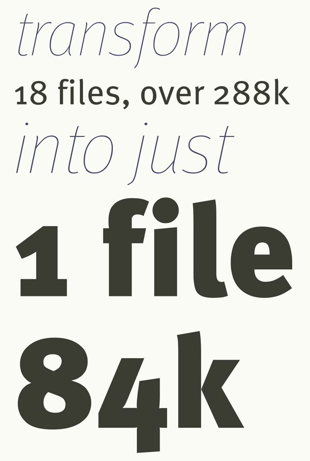
In a project I worked on for Monotype to showcase their first variable font release (FF Meta), the difference was truly striking. Nine different weights of both Roman and Italic versions of the typeface resulted in 18 files—a total of more than 288k of font data—all of which was replaced by a single file of only 84k with several different weights and italics (see Figure 2). While this is not necessarily representative of every situation, it is not uncommon either. My own site, for instance, uses a variety of weights, optical size, and width of Roslindale, from David Jonathan Ross’ “Font of the Month Club,” and does so with a single 62k file (Figure 3).
Still, while these freedoms allow us to be more expressive, some of the truly interesting capabilities will help transform the reading experience itself.
Reinvented Reading on Screen
Some of the biggest challenges in creating a good reading experience are tied to the lack of finesse in proportion and fine details. The mixture of modern CSS and OpenType features and variations presents a powerful combination. Being able to set features like ligatures and hyphenation based on language, turning hyphenation on and off based on screen size, and even tailoring the character width on the smallest screens in order to fit more characters per line without reducing font size, can all make dramatic improvements in the smoothness and comfort of the reading experience.
What’s more, the possibilities don’t end there. Putting more control in the hands of the reader is not only possible, but also entails more functions than one might expect. Giving easy access to adjusting font size, text grade (think “higher contrast between foreground text and background color” without reflowing the copy), and even potentially serif or terminal shape, could all open up a world of improvements for accessibility in general, particularly users with low vision or some forms of dyslexia.
Ready for a Close-Up

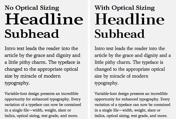
Optical sizing is another feature that was common in metal type but largely lost in the transition to photo-typesetting and digital techniques. More specifically, despite the fact that some designers still create separate optical sizes for different ranges, it is rare and somewhat limited. While not commonly found on sans-serif designs, in past decades (or, more accurately, centuries) it was quite common for the physically smaller sizes of a typeface to be cut with slightly heavier strokes, more open bowls and counters, and, in some cases, even wider apertures, in order to preserve readability (see Figure 4). Newspapers in particular found this critical to ensure lines did not get lost or letters did not suffer too greatly from ink gain.
Optical sizing has made a return in variable fonts and can be either automatically applied where available or set explicitly by the web designer or developer. As mentioned, while it is not as frequent a feature in sans-serif typefaces, it can be used to quite dramatic effect in higher stroke-contrast serif designs. It can make an enormous difference in readability at physically smaller text sizes, to say nothing of how much more refined the type can look at larger ones (Figure 5).
Polish and Poise
With the benefits already discussed, the case for variable fonts is compelling. Still, good typography is not all there is to great design. The range of axes like width and weight give us tremendous freedom to embrace a more editorial design on the web without having to load an exorbitant number of file assets. With the above-discussed variable fonts in place, we have the opportunity to expose them for use by content publishers. Imagine a role for designers inside the Content Management System (CMS) where the website is housed. Through the use of simple controls built into the CMS, the designer would be able to typeset specific headlines or pull-quotes, thus enabling a whole new level of design inspired by what we have been able to do in print, without having to write custom code every time.
The Dawn of a New, Bright Era
All of the major web browsers now support variable fonts. In addition, both dominant mobile platforms support them, as well (you may check support on caniuse.com). Given that you can use CSS feature detection with them already, nothing is standing in the way of putting them into production today. In fact, if your browser supports variable fonts, you will be able to see an example of this on my website, Responsive Web Typography (https://rwt.io). Otherwise, you’ll see the regular “non-variable” versions of the same typeface. Once a browser releases an update that supports variable fonts, viewers will automatically get the more modern experience. With that in mind, we are ready to start lighting up the web today.