Text Readability: It’s All About Color Contrast
Text readability is often an accessibility obstacle in both real and digital worlds. I once got an invitation to an event that looked like Figure 1.

Figure 1. Low-contrast text: Hard to see, hard to read.
So, black on black might be trendy, but I could hardly read the invitation because I couldn’t see the text. If it is hard for people to see text, it will be hard for them to read it. I wondered if some people might have skipped the event all together because of a low contrast invitation and its poor readability.
In websites, many designers consider low-contrast text to be trendy and opt to reduce the difference between text and background. When text doesn’t stand out from the background, it is difficult if not impossible to read content that should be accessible to everyone.
At one company I worked at, all the writers were encouraged to add infographics to their documentation. The idea was great: Everyone had access to the company brand palette and icon library. The only problem was not everyone was aware of color contrast. When something like the infographic in Figure 2 was published, with sky blue and olive-green alternating between foreground and background colors, customers complained that they couldn’t read the text.

Figure 2. Green text on a blue background, or vice versa, is hard to read.
When creating infographics and websites, lots of attention is given to design elements, such as the company brand colors, icons, buttons, and graphics, which collectively convey the look-and-feel. Sometimes, text is considered secondary, or it is even added as an afterthought. It is important to remember that typography is not only a design element, but it also conveys meaning. If text can’t be seen, it can’t be read. If it can’t be read, it can’t be understood.
Color contrast is a major prerequisite for readable text and accessible websites, but often it is not understood or considered important enough by designers. In this article, I’ll explain why color contrast in infographics and user interface matters, what constitutes minimum color contrast for varying sizes of text, and how to check your color contrast ratio. I’ll also explore ways to improve your color contrast ratio, including an interactive Global Information Tracker (GIT) tool that lets you choose accessible color combinations from any palette.
Why Is Text Readability Important?
In customer satisfaction surveys on documentation, customers repeatedly ask for more infographics. They like infographics because they are easier to process and understand than long chunks of text. The text labels in an infographic, however, are crucial to making sense of the infographic. So, although a picture tells a proverbial 1000 words, the few words displayed in infographic labels must be perfectly clear. If you want your audience to understand the text, it must be seen. If you want the text to be seen, it must contrast with the background. The same is true for any data visualization or user interface element, such as a button or dropdown menu. According to Web Content Accessibility Guidelines, all text content must be readable and understandable.
Aiming for Legible and Clear Text
My standard rule for text in any infographic or user interface element is that the text must be legible and clear. To obtain clear text in images and user interface elements, it is helpful to use the following:
- True text—For clear online text, you need to use real text and not a picture of text. If you add annotations to an image, they look sharper as text than if they’re saved as a JPG picture file, for instance. Images of text do not display or scale as well as text because they can pixelate. It is preferable to upload infographics as Scalable Vector Graphic (SVG) files, which scale better and are easier to translate and customize. SVG files are a graphic file format based on XML text, which means they contain real text.
- Large font size—Type should be large enough to read easily, preferably at least 16 to 18 points, with at least 25% leading or spacing between lines of text.
- Easy-to-read typeface—A roman typeface is more readable than italic, oblique, or condensed type. It is harder to read fonts with decorative elements or monospacing, in which all letters occupy the same amount of horizontal space.
- Sufficient color contrast—For clear text, you need to consider the background color so there is enough contrast. According to accessibility guidelines, if there is not enough contrast between the text and the background, it will be difficult to read the text. Sufficient color contrast is a major prerequisite for readable online text and a measurable criterion of accessible websites.
High and Low Color Contrast: What Does It Mean?
Contrast helps us to distinguish one element from another. In web design and infographics, color contrast is the difference between the text color (foreground) and the background color. If the color of the text (foreground color) is too similar to the background color, then the text blends into the background. For optimal readability, there needs to be high contrast between text and background. Low-contrast text compromises readability, rendering your text inaccessible to users.
When there is a significant difference between the foreground and background colors, the color contrast is high so the text will stand out from the background. With high color contrast, it is easy to read the text.
When there is not much difference between the foreground and background colors, the color contrast is low so it will be difficult to discern the text from its background. With low color contrast, it is hard to read the text.
Black text on a white background has the highest possible contrast ratio of 21:1. White text on a black background also yields the highest contrast ratio of 21:1 (Figure 3). When the foreground and background colors are identical, the contrast ratio is 1:1. For example, black text on a black background has the lowest contrast ratio of 1.

Figure 3. Black text disappears on a black background (contrast of 1:1). The maximum contrast ratio is black on white, or white on black (21:1).
With so many colors available in graphic user interfaces, designers are not limited to black and white. The caveat of abundant color choice is that designers must be more aware of color contrast: Not every color combination yields a high enough color contrast ratio for text to be readable.
The color contrast swatches in Figure 4 show examples of good and poor contrast combinations. Good color contrast is shown in the first two rows. These combinations provide enough contrast between text and background, so the text is readable, and therefore accessible. It is easy for users to figure out what the text says.
In the bottom row, there is not enough contrast between the text and background color, so it is difficult to read the text. If users cannot read the text, then it is neither accessible nor understandable.
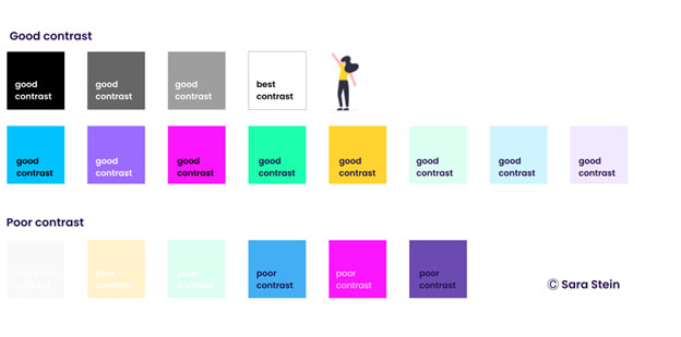
Figure 4. Good contrast versus poor contrast.
Accessibility Standards for Websites
The number one website accessibility barrier, according to the Americans with Disabilities Act (ADA), is poor color contrast. People with impaired vision have difficulty reading if there is not enough text-background contrast.
There are over 61 million people in the United States with a disability, and around 12 million of them have vision impairment, according to the Vision Health Initiative. The European Blind Union (EBU) estimates that over 30 million people are blind or partially sighted.
For a disabled person, trying to navigate an inaccessible website can be compared to physically entering a building with steps. Accessibility standards aim to ensure that everyone can access and understand digital content just like a public building is open to everyone. Although accessibility is usually about making websites more accessible to people with visual limitations, optimal color contrast is required to make text accessible to everyone. The current standard for web accessibility is the Web Content Accessibility Guidelines (WCAG) version 2.1, which is published by the Web Accessibility Initiative (WAI). Launched in 1997 by the World Wide Web Consortium (W3C), the goal of the WAI is to improve web accessibility for users with disabilities.
According to the Web Accessibility Initiative, Web Content Accessibility Guidelines (WCAG) have emerged as the universal benchmark for accessibility. This is evident in the large number of countries that have adopted the WCAG 2.0 standard for government accessibility policies. The WCAG includes specific guidelines on what constitutes good color contrast for text in websites, including infographics, buttons, and other user interface elements.
Besides the WCAG, there are several accessibility regulations for websites that also give specific guidelines for color contrast:
- Americans with Disabilities Act (ADA)—This law requires that privately-owned businesses and government organizations take the necessary steps to communicate effectively with customers having visual, auditory, and speech disabilities. This title is regulated and enforced by the US Department of Justice. “ADA-compliant” implies that a website is accessible, including sufficient color contrast between text and background.
- Section 508—The General Services Administration stipulates accessibility requirements, including color contrast, that must be followed by federal government agencies and contractors, including federally-funded nonprofits, higher public education institutions, and public K-12 schools. These regulations also apply to any contractors working for, or products being sold to, the US government.
- The 21st Century Communications and Video Accessibility Act (CVAA)—This law states that communication devices, products, services, and video programming must follow accessibility guidelines. For example, emergency alerts broadcast on television must have enough contrast to be readily readable.
The number of lawsuits dealing with website accessibility has grown exponentially. According to Vu, Launey, and Egan’s article for the American Bar Association, over 8,000 digital accessibility lawsuits were filed in US federal courts between 2017 and 2020. This alone is reason for organizations to make sure their websites meet accessibility standards.
Color Contrast Ratio
Web Content Accessibility Guidelines (WCAG) aim to make web content more readable so it is accessible not only to people who are visually impaired, but also to the general population.
A major prerequisite for accessible websites is sufficient color contrast. In Designing for Web Accessibility, the WCAG provides specific guidelines for obtaining enough contrast between text and its background so that text can be read by people with moderately low vision without using contrast-enhancing assistive technology. A contrast ratio measures the difference in brightness (luminance) between two colors and can range from 1 to 21 (commonly written 1:1 to 21:1). The higher the ratio, the better the contrast.
Normal Text: Ratio of 4.5
For normal text, the standard for sufficient color contrast, according to the Web Content Accessibility Guidelines (WCAG) 2.1, is a ratio of at least 4.5:1 (read as four-and-a-half to one). This requirement meets the AA conformance level (more about A levels later).
To ensure a contrast ratio of at least 4.5:1 between text and background, the Web Accessibility Initiative (WAI) provides techniques on how to measure success criteria for minimum contrast.
The 4.5:1 contrast ratio accounts for the loss in contrast that results from moderately low visual acuity, congenital or acquired color deficiencies, or the loss of contrast sensitivity that typically accompanies ageing.
Text that is purely decorative, such as words used to create a background, a company logo, brand name, or incidental text in a photograph, does not need to adhere to color contrast standards. The rationale is that because this sort of text conveys no information or meaning, it doesn’t have to be read, so color contrast requirements do not apply. However, text in infographics and user interfaces is generally not decorative; it conveys important meaning that needs to be processed.
Large Text: Ratio of 3
For large text (at least 18 points or 14 points bold), Web Accessibility in Mind (WebAIM) summarizes the color contrast ratio requirement as at least 3:1 (Figure 5). Text that is larger and has wider character strokes is easier to read at lower contrast, so the contrast ratio is less strict than required for normal text. This requirement meets the AA conformance level.
A contrast ratio of 3:1 is the minimum level recommended by ISO-9241-3 and ANSI-HFES-100-1988 for standard text and vision.
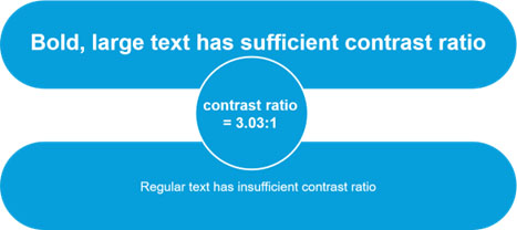
Figure 5. Bold, large text can meet a lower color contrast ratio of 3:1. For normal text, this color contrast is not enough.
Enhanced Contrast: Ratio of 7
If you want to meet the AAA success level criteria for contrast ratio, you need to aim for a contrast ratio of at least 7:1, as specified by Web Content Accessibility Guidelines (WCAG) 2.1.
A, AA, and AAA Levels
Web Content Accessibility Guidelines give three levels for conforming to accessibility: A, AA, and AAA, with success criteria defined for meeting each level.
The higher levels include the requirements for the lower levels. So, if your website has a conformance level of AA, it means you met all the success criteria for level A and level AA.
- Level A is the minimum level of conformance.
- Level AA is generally the level that most organizations aim to meet. It can often be a level that is a legal requirement. The success criteria for level AA are a contrast ratio of at least 4.5:1 for normal text and 3:1 for large text and user interface components.
- Level AAA is the strictest level, and it includes all requirements for level A, level AA, and level AAA. The Web Content Accessibility Guidelines (WCAG) recommend not adopting level AAA as a general policy for entire sites because it is not possible to fulfill all Level AAA success criteria for some content. Level AAA also introduces significant design challenges given the nature of the success criteria. Level AAA requires a high contrast ratio of at least 7:1 for normal text and 4.5:1 for large text.
The color contrast checker in Figure 6 shows that gray text on a white background (with a contrast ratio of 5.48) passes AA levels for color contrast but fails the AAA level. Figure 7 demonstrates the color contrast ratio with different-sized texts: Normal text passes only the AA level, but large text also passes the AAA level for minimum contrast ratio.
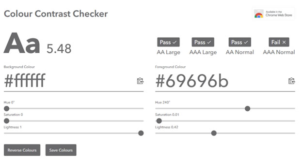
Figure 6. Online color contrast checker: Normal and large text are indicated as pass or fail according to success criteria (https://colourcontrast.cc/).

Figure 7. Normal gray text passes the AA success criteria but fails the AAA success criteria. Large gray text passes the AAA success criteria.
In short, to pass WCAG standards for level AA, you need to aim for a color contrast of at least 4.5:1 for normal text. See Figure 8 for examples of low and high color contrast ratios that fail or pass WCAG standards for minimum contrast ratio.
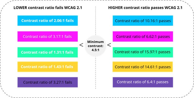
Figure 8. From left to right: Color contrast ratio is too low whereas on the right, contrast ratio passes WCAG standards.
How Is Color Contrast Ratio Calculated?
Don’t worry, you don’t need to calculate the contrast ratio yourself. There are many online tools that calculate it automatically (see the Tools to Check Color Contrast section). The primary algorithm used to calculate contrast ratio was adopted by the Web Content Accessibility Guidelines (WCAG) version 2.1 (Figure 9).
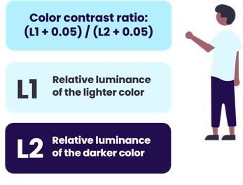
Figure 9. Algorithm adopted by Web Content Accessibility Guidelines V2: Color contrast ratio.
The relative luminance is the perceived brightness of a color, normalized to 0 for black and 1 for white.
- L1 is the relative luminance of the lighter of the foreground or background color, and
- L2 is the relative luminance of the darker of the foreground or background color.
For the sRGB color space, the relative luminance of a color is defined as follows.
L = (0.2126 * R) + (0.7152 * G) + (0.0722 * B) where R, G, and B are defined as:
If RsRGB <= 0.03928, then R = RsRGB/12.92, else R = ((RsRGB+0.055)/1.055) ^ 2.4.
If GsRGB <= 0.03928, then G = GsRGB/12.92, else G = ((GsRGB+0.055)/1.055) ^ 2.4.
If BsRGB <= 0.03928, then B = BsRGB/12.92, else B = ((BsRGB+0.055)/1.055) ^ 2.4.
And RsRGB, GsRGB, and BsRGB are defined as:
RsRGB = R8bit/255
GsRGB = G8bit/255
BsRGB = B8bit/255
Tools to Check Color Contrast
There are several online user-friendly tools that quickly check if your foreground and background colors meet the WCAG standards for color contrast:
For the first two tools, you need to enter foreground and background colors in RGB hexadecimal format (HEX value). The Contrast Checker automatically calculates the contrast ratio and visually produces the results for both normal and large text (Figure 10).
- If the contrast ratio is higher than 4.5:1, you successfully met the AA level standards for color contrast.
- If the contrast ratio is lower than 4.5:1, you need to adjust either the foreground color, background color, or font size.
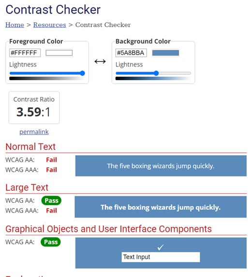
Figure 10. The Web Accessibility in Mind (WebAIM) Contrast Checker generates and visualizes contrast ratio.
If you want to check all the colors used in a single web page, you can run a browser plugin to check all the contrast ratios:
- Lighthouse: You can run this Google open-source tool in developer tools. Running the accessibility segment will detect and highlight any errors found on the page.
- Wave: Similar to Lighthouse, this browser plugin immediately highlights any color contrast ratio errors (for AA level).
Choosing High-Contrast Combinations
If you are working with an existing palette, such as corporate brand colors, how do you know which color combinations give the best contrast?
A color palette builder was developed in GIT—the version control tool—for public use, thanks to Atul Varma, also known by his pseudonym toolness. This easy-to-use tool (Figure 11) helps you build color palettes with combinations that conform to accessibility standards.
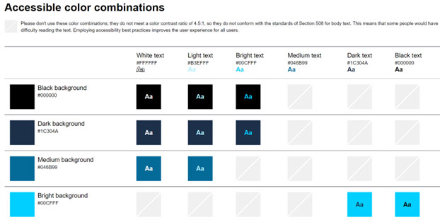
Figure 11. Color palette builder with accessible color combinations.
Once you edit the colors in the palette, only the accessible color combinations are displayed, with foreground text on its background color. Color combinations that don’t meet the WCAG color contrast ratio of 4.5:1 are not shown.
Improving the Color Contrast Ratio
If your color contrast ratio is below the Web Content Accessibility Guidelines (WCAG) standard of 4.5:1 for normal text, you need to improve the contrast ratio.
Unfortunately, there are no shortcuts. There are several possible ways to increase the color contrast, including adjusting the foreground and background colors, or increasing the font size so the text is larger and easier to read.
Sometimes you can fix the contrast ratio just by changing the color of the text:
- If the background is light, change white text to black.
- If the background is dark, change black text to white.
Light or Dark Mode?
Black and white have the highest color contrast with a ratio of 21:1. It is difficult to achieve a high color contrast with other color combinations. So, in terms of contrast and readability, it is easiest to read black text on a white background, or vice versa for people who prefer dark mode.
Another high contrast combination is yellow and black, which has a surprising color contrast ratio of 19.55:1 (Figure 12).
Note that when calculating the color contrast ratio, the result is the same if you invert the foreground and background colors. So, is there a preference when it comes to light or dark mode?
In people with normal vision, reading performance tends to be better in light mode. According to Raluca Budiu in Dark Mode vs. Light Mode: Which Is Better? there is evidence in older readers or those with cataract and related disorders that light letters (white or yellow) on a dark background are more readable than dark letters on a white background. The reason is that some people with low vision have higher acuity and reduced contrast sensitivity, so dark mode with reversed contrast works better.
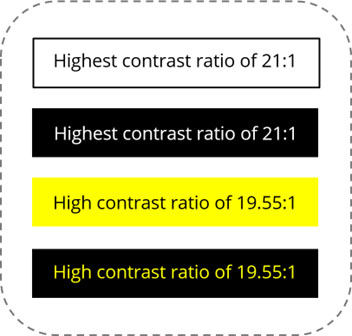
Figure 12. Highest color contrast ratios include white and black, and yellow and black.
The Lighthouse Guild, an organization catering to the needs of the visually impaired population, gives users the option to change the color theme of their website. To make their website accessible to the maximum number of people with low vision, they offer only high-contrast color combinations: white on black, or yellow on black. These theme options can be accessed via the Accessibility button, which is always visible (Figure 13).
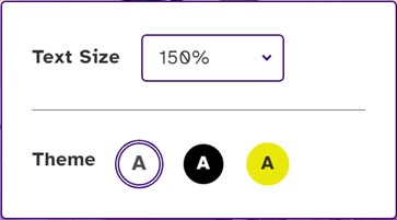
Figure 13. Accessibility in the Lighthouse Guild website: Change the theme or text size to improve readability.
Summing Up
“The power of the Web is in its universality.” In 1997, World Wide Web inventor, Tim Berners-Lee, envisioned an internet that could be accessed by everyone regardless of disability.
The Web Accessibility Initiative (WAI) was formed by the W3C to make the web accessible to everyone. Since its inception in 1997, the WAI has developed guidelines to help web content writers and developers create accessible digital products. The Web Content Accessibility Guidelines (WCAG) have evolved to include the changing needs of people, especially the ageing population, and the demands of current technology.
The latest draft version of these guidelines, WCAG 3.0, was released on November 10, 2022. WCAG 3.0 is more inclusive than previous versions. It will accommodate more disabilities, address a wider array of existing and emerging technologies, including mobile apps and augmented/virtual reality (AR/VR/XR), and be easier to update as technology change accelerates.
The area of visual contrast will be significantly updated. The draft WCAG 3.0 introduces new color contrast calculations that are based on more recent color perception research. The minimum contrast and enhanced contrast guidelines will be changed to a general Visual Contrast of Text guideline.
The proposed new guidelines more accurately reflect current research in human visual perception of contrast and light intensity. The new model of contrast focuses more on perception of light intensity than on perception of color and is more context dependent. Color contrast results can vary according to the size of text and the darkness of the background colors.
The new guidelines stipulate that good visual contrast is not only the domain of users with low vision, but also “sighted users need good contrast between foreground and background to read easily.”
In particular, the guidelines single out the over-40 population as needing high visual contrast: “People with low vision (due to poor contrast sensitivity and/or visual acuity) may need higher visual contrast for readability. This is particularly true for those over 40, and young children.”
Practical guidelines are given on how to increase perceivable contrast; for example, by making the darker color darker or the lighter color lighter. The WCAG 3.0 guidelines also demonstrate visual contrast with examples of different colored texts on black, white, or yellow backgrounds.
In conclusion I’m not advocating that all websites use only black on white, or black on yellow, for maximum contrast. There is plenty of room for creative color combinations, provided the text is readable. Text that is easy to read is accessible to everyone, both visually impaired and sighted populations.
References
- Web Accessibility in Mind (WebAIM): https://webaim.org/resources/contrastchecker/
- Color contrast checker: https://colourcontrast.cc/
- Chrome DevTools: https://developer.chrome.com/docs/devtools/
- Lighthouse: https://developers.google.com/web/tools/lighthouse
- Wave: https://wave.webaim.org/extension/
With over 20 years' experience as a technical writer and currently working at DoControl, Sara Stein is an advocate of visual documentation. She’s designed documentation sites, introduced infographics, and regularly contributes to product UX. A speaker at tcWorld and STC conferences, Sara has also published articles in Intercom, tcWorld, and Medical Writing journals.

