The practice of medicine today has evolved the expectations of both healthcare providers and health information-seekers. The pre-Internet “traditional” information model placed decision-making responsibility almost exclusively in the hands of medical professionals, resulting in a comparatively one-sided discussion regarding diagnosis and treatment. Now, however, Internet resources and other digital tools have replaced the traditional model of patient-provider relationships. We are now in a time of participatory and patient-centered medicine. Patients, more than ever before, actively participate in decisions about their health, including maintaining a healthy lifestyle, pursuing diagnoses, and even collaborating on possible courses of remedy and treatment. In 2013, the Pew Research Center found that one in three Americans goes online to seek information on health conditions, 53 percent of whom discuss their findings with a healthcare provider. This new kind of participatory medicine has a huge positive impact on health outcomes, reducing medical errors, and boosting patient satisfaction. The Internet is a valuable tool for seeking health information, diagnosing health problems, and mediating external systems, such as insurance and appointment-making. While there is ample discussion about what kind of health information people seek, there is limited discussion about how usability-related factors influence health engagement. The most important considerations when designing a good health UX include the following:
- Credibility
- Navigation
- Organization and comprehension
In usability studies beginning in 2013, following prior academic research, we watched health information-seekers select or reject websites, and trust or distrust the information they found. Many of our real-life examples were drawn from a November 2013 study looking into the usability problems surrounding the Healthcare.gov redesign, including a comparison to its partner site New York State of Health.
Credibility
To determine whether a website is credible, users must be able to answer two questions:
- Does this site provide correct and reasonably unbiased information that I can use to inform a safe decision?
- Does this website sufficiently protect my identity, activities, and other sensitive information?
A trustworthy health website must clearly portray up-to-date, verified, and unbiased health information based on scientific research and expert recommendations. Based on our research, a credible health website should include these minimum requirements:
- Credentials of the authors
- Clear statements of any conflicts of interest, limitations to research, and negative outcomes or side effects
- Primary source of information
Credibility also allows users to distinguish between main health-related content and any health-related advertisements that sponsor the website. User perceptions of credibility can also be affected by how the website addresses potential privacy and security concerns. Customers of other websites, such as shopping or finance, respond well to a Norton or Verisign secured seal or other related symbols.Health information sites are a bit more complicated; it is challenging to provide a universal and recognizable health-related seal of quality and safety assurance. We tested some websites and apps that have begun to find ways of addressing this concern. Hula is a health-related app that enables users to find STD (sexually transmitted disease) testing centers, receive results online, and share the results with their sexual partners. For this service to become successful, e-health seekers and providers need to be convinced about the security of their personal health record. Hula’s app and website clearly communicate their adherence to HIPPA and the measures undertaken by Hula to protect their users’ privacy.

Even when best practices are followed, it can be difficult for the average web user to assess the credibility of a website. The New York State of Health insurance site, although a government site, requires enough sensitive information that some users in our study were not wholly comfortable using it. Here is a typical comment:
“I found it surprising that the website asked me why I didn’t want to provide my social security number. It seems like it would be understandable that I would not want to share this information online. I don’t know how secure this website is, and I am wary of trusting it with such a highly vulnerable and exploitable number.”
Credibility can also be informed by the amount and clarity of information, especially for sites that involve a process. NY State of Health again provides a good example, discussed by a user who felt the long application process detracted from their faith in the site.
“[I would like to see a] better explanation of the process. Maybe it’s Step 1, 2, 3, and it clearly indicates what will happen in friendly language. Health insurance has a lot of details, and I felt that the site only wanted to grab my information (not efficiently at that) to subscribe me to newsletters and NOT actually help me find affordable health insurance plans.”
Navigation
Health information is a technical and complicated topic, so users will appreciate an experience that has been simplified as much as possible. Initial impressions related to simplicity in design and website and app navigation have a strong influence on whether individuals will trust and utilize the information on health websites. Overall, the navigation experience on health websites is similar to that on e-commerce websites, but with more complicated information and potentially dire outcomes. A solid information architecture is vital to all websites, but for health information it is particularly important that the homepage and other pages contain familiar, user-centered language. If unfamiliar medical terminology has to be used, a glossary or list of definitions of the terms must be provided in simple language. Both Healthcare.gov and NY State of Health demonstrated how crucial smooth navigation is. Users could not find a list of possible plans (and therefore could not gauge their relative interest) until they signed up for the program. Additionally, the process took a long time to complete, at which point users were frustrated and overwhelmed—certainly not the emotion that one wants associated with something as important as health. Here are some user comments:
“I could never find the list of plans available. I looked everywhere and even searched! There should be a link on every screen that shows that info.”
“I disliked the navigation system. Although I was able to find the information that the tasks asked me to find, I was not impressed by all the text and lack of graphics to explain certain healthcare related terminologies.”
“A lot of the links were embedded inside paragraphs, which made the navigation less smooth.”
“I’d like to see more buttons.”
Organization and Comprehension
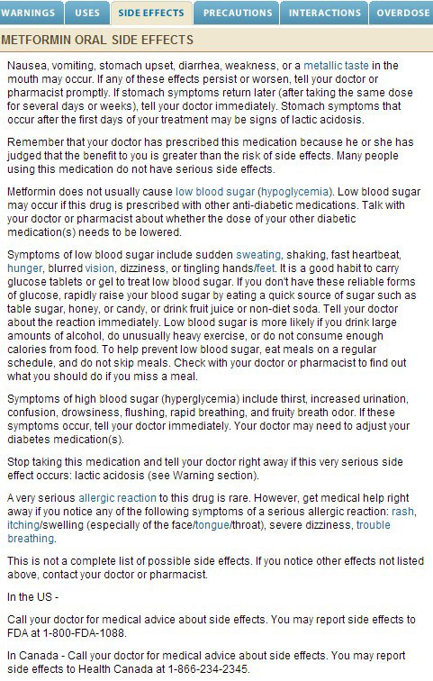
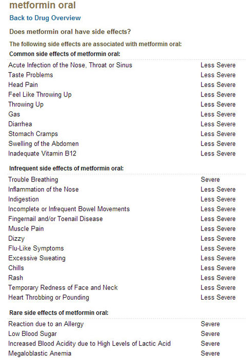
Health information is often complicated, and health websites invariably contain a significant amount of information. Therefore, it is crucial that information be simple, straightforward, and visually appealing. A large number of Americans have limited literacy skills and hampered access to technology, but with the increased use of smartphones, the digital divide is becoming narrower. Health websites need to ensure that their content is easily accessible to all users, regardless of age, socioeconomic status, or education level. Figures 2 and 3, both from WebMD, show the side effects associated with the diabetes drug Metformin. In general, WebMD follows a consistent style and organization when presenting the information about drugs and diseases. However, when users look for side effects related to Metformin on the drug page (Figure 2), they will most likely have to read the entire section to find the information they need. When and if they go to the Metformin page (see Figure 3, also from WebMD) they will find a much more effective presentation. It clearly lists the side effects and the severity concern of each in a clear and divided list. The list is organized for easy scanning and allows for quick comprehension. This presentation could still be improved, but it is far more digestible than an endless block of text. Unfortunately, users are not likely to access the Metformin page.


Where WebMD found a fairly successful way of representing health information, Healthcare.gov and NY State of Health fell behind. Users expressed a lack of confidence that they were choosing the right plan, due to a lack of straightforward, easy-to-digest information:
“I think what I am missing from this experience is the confidence that I am making the right decision about enrolling my family for a particular plan…. Maybe the site could get a little more personal by making me feel like I have just chosen something that has been tailor fitted to my needs.”
“The website could probably explain more about things in layman terms.”
“I dislike that there was too much information on the main page. I felt extremely overwhelmed when I got onto the page because there was too much information. People don’t have time to read every word. Instead what they should have is key points or bullets on the main page, and then a link that takes them to it.”
For the new participatory model of medicine to be successful, individuals will need to be active participants during healthcare interactions. Much of their engagement in the physical world, however, depends on their experiences in the digital world. When individuals rely on credible health information through efficient navigation and organization, they are more likely to comprehend essential health information and take advantage of their own agency in the physical world.在设计良好的健康保健用户体验时,最重要的考虑因素是可信度、导航和易于理解的内容组织。健康保健网站无论对患者和潜在患者是否有效,它们提供的统计信息和例子都证明了一个事实:网站越容易导航,患者就越可能理解关键的健康信息并充分利用这些信息。 文章全文为英文版
우수한 의료 UX를 디자인할 때 가장 중요한 고려 사항은 신뢰성, 내비게이션, 그리고 이해를 돕는 체계입니다. 환자와 잠재적 환자들에게 도움이 되는 의료 웹사이트와 그렇지 않은 사이트에 관한 통계와 사례를 보면, 사이트를 이용하기 쉬우면 환자들이 필수적인 의료 정보를 이해하고 그 정보를 잘 활용할 것으로 예상됩니다. 전체 기사는 영어로만 제공됩니다.
As considerações mais importantes durante a criação de uma boa experiência de usuário com serviços de saúde são credibilidade, navegação e organização para compreensão. Dados estatísticos e exemplos de websites de saúde que funcionam e não funcionam bem para pacientes e pacientes em potencial mostram que, quando os websites são fáceis de navegar, existe maior probabilidade de o paciente compreender as informações essenciais de saúde e empregar apropriadamente essas informações. O artigo completo está disponível somente em inglês.
優れた医療向けUXをデザインする際に最も考慮すべきことは、信頼性、ナビゲーション、および理解しやすいサイト構成である。サイトが使いやすければ、患者は最も重要な医療情報を理解し、その情報を上手く利用することが、統計および患者とこれからかかろうとする患者にとっての使い勝手を調べた医療ウェブサイトのサンプル調査からわかっている。 原文は英語だけになります
Las consideraciones más importantes a tener en cuenta al diseñar una buena experiencia del usuario en atención médica son la credibilidad, la navegación, y la organización por razones de comprensión. Las estadísticas y los ejemplos de sitios web de atención médica que funcionan y que no funcionan bien para los pacientes y futuros pacientes refuerzan el hecho de que cuando los sitios son fáciles de navegar, es más probable que los pacientes comprendan la información médica esencial y usen bien esa información. La versión completa de este artículo está sólo disponible en inglés
