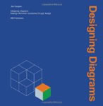
 A review of
Designing Diagrams: Making Information Accessible through Design
By Jan Gauguin
BIS Publishers, 2011
Thanks to information technology and computer-based displays, tables, forms, charts, maps, and diagrams permeate our lives. All these formats supplement what direct experience of the world tells us, what we learn through auditory and other senses, and what texts convey. Information visualization helps us to think and act.
Diagrams are the most free-form and complex of these visualization techniques, conveying structures and processes that are intended to be usable, useful, appealing, easy-to-learn, easy-to-use, and easy-to-enjoy. Designing them well for specific audiences is a challenge to all user-experience professionals.
Fortunately, a new guide by Jan Gauguin has appeared that provides specific introductory instruction in topics such as proportion, use of grids, color, typography, format, and signs (symbols and icons), as well as standard diagrams and an introduction to visual semiotics, the science behind conveying meaning visually. This introduction to techniques and methods is a welcome change from some books that simply show examples of “good design” but do not guide the reader on the path to getting there. The author also provides chapters on specific subject matter, such as organizational structure and operations, demographics, geographic information, and navigation systems.
Other practical topics include using worksheets, methods for getting ideas across, even a work plan. The book does conclude with a “designer’s gallery” intended to show excellent case study material.
Like many books written and designed by professional graphic designers, the emphasis is on quality visuals and a readable book layout. The major critique one might offer from a user-centered design perspective is the lack of topics on viewer/user profiles, use scenarios, and discussion of testing/revision in the design process. However, the content offered provides much valuable guidance.
- Books like these are rare, but important. To place Gaugin’s book in context, here is a summary of some other excellent resources:
- Diagrammatic Reasoning: Cognitive and Computational Perspectives, by Janice Glasgow, N. Hari Naryanan, and B. Chandrasekaran, is unusual in presenting the results of cognitive science and computer science research in exploring how to make effective computer displays that, in many cases, act as user interfaces. One key objective is to determine how best to design diagrams that both human beings and computers can process. The almost 800 pages offer intriguing accomplishments and insights.
- Diagram: The Instrument of Thought by Keith Albarn and Jennie Miall Smith seeks to show how diagramming can be a technique for expressing inner thoughts.
The scope of the examples is more limited, being focused on visual patterns that refer to the authors’ interpretation of patterns of thinking. While more narrow than many of the other publications, the approach is provocative. Like many of the other books, little attention is paid to testing or proof of efficacy.
- Diagrams: A Visual Survey of Graphs, Maps, Charts, and Diagrams for the Graphic Designer by Arthur Lockwood (1969) is the closest publication to Gauguin’s newer book. Hundreds of examples, some charts and maps, most in black-and-white, provide instructive information from the most basic to elaborate explanatory and statistical graphics, with an index organized by subject matter. Of course, in this era, there is no mention of computers.
- Graphis: Diagrams, new edition edited by B.Martin Pedersen is the crème de la crème of beautiful diagrams gathered from professionals worldwide. This book is a beauty pageant, with little or no attention to usability, testing, etc. Nevertheless, in its two editions, it gained worldwide recognition and raised people’s awareness of information visualization, and not only in the graphic design profession.
- Information Visualization by Robert Spence attempts to integrate much information with real-world examples and use of computer-generated graphics.
Like the last book recommended, it tries to describe the representation and presentation of concepts and data in both static and interactive forms.
- Readings in Information Visualization: Using Vision to Think, edited by Stuart K. Card, Jock D. Mackinlay, and Ben Shneiderman, was a major breakthrough publication that featured classic research papers about techniques of discovery and management of information through computer-based displays. Included are the projects that became famous at Xerox PARC, the University of Maryland, and IBM, including the Hyperbolic Browser, Treemaps, Parallel Coordinates, and other innovative multi-dimensional approaches.
- Semiology of Graphics: Diagrams, Networks, Maps, by Jacques Bertin (1918-2010). The noted French cartographer and scientist demonstrates the system he developed for graphic organization of charts, maps, and diagrams. First published in 1967, although this work provides much useful information, this book has not been available for a long time in English.
Each of these documents offers significant contribution to understanding the history, breadth, and depth of information visualization and, specifically, diagramming. Some of the books are now out of print. That should not discourage one from trying to locate them in print or online to benefit from their wisdom. Many are complementary in nature, namely, emphasizing either conceptual or perceptual perspectives. Any dedicated UX professional would do well to consider one or more of these to enhance one’s professional practice. 
Aaron Marcus 对一本最近出版的和五本经典的关于信息可视化的图书作了评论,准确的说,是关于图表的,即以视觉形式描绘结构和流程,从而帮助我们理解关于我们自己及所生活的这个世界的复杂信息,并与其进行交互。
文章全文为英文版
Aaron Marcus는 우리와 우리가 살고 있는 세계에 대한 복잡한 정보를 이해하고, 이러한 정보와 상호작용을 하는 데 도움이 되는 시각적 구조 및 절차에 대한 정보 시각화, 특히 도식화, 시각적 묘사에 대한 신간 한 권과 고전 다섯 권을 리뷰한다.
The full article is available only in English.Uma crítica de Projetando diagramas: tornando informações acessíveis por meio do design por Jan Gauguin
Um livro recente e cinco livros clássicos sobre visualização de informações, especificamente a diagramação, ilustração visual de estruturas e processos que nos ajudam a entender e interagir com informações complexas.
O artigo completo está disponível somente em inglês.
Aaron Marcusが、我々が自分自身とその世界に関する複雑な情報を理解し、相互作用に役立つ構造とプロセスを視覚的に描写する手段である情報の可視化、特に図式化について新刊1冊と古典5冊を論評する。
原文は英語だけになりますUna reseña de Designing Diagrams: Making Information Accessible through Design (Diseño de Diagramas: Información Accesible a través del Diseño) por Jan Gauguin
Una publicación reciente y cinco libros clásicos sobre visualización de la información, específicamente, diagramación, es decir, la representación visual de las estructuras y los procesos que nos ayudan a comprender e interactuar con información compleja.
La versión completa de este artículo está sólo disponible en inglés.
