Successful UX design takes a village. At Red Hat, multiple global teams of designers, developers, and product managers collaborate both remotely and in person to deliver scalable and reliable products. Our teams were efficient working in this hybrid model pre-COVID-19. Face-to-face time established initial direction setting, ideation, and agreement on personas and product direction. Remote working time executed those findings throughout the product design and development lifecycle. Before COVID-19, pairing in-person and remote work allowed us to flexibly and nimbly collaborate to design across Red Hat’s portfolio.
Last year, just as the lockdowns began, our User Experience Design team challenged itself to elevate our design influence across the organization. Our goal was not just to continue to create impactful and intuitive experiences at the product level but to expand our scope to consider these experiences across an ecosystem of products and services. From discovering, learning, and trying Red Hat products to using them in practice, our team needed to map and explore Red Hat user journeys to design experiences that delighted within—and extended beyond—each product. We needed to build an Experience Vision. And for that, we’d need ample collaboration.
Normally, the bulk of this collaboration would take place through face-to-face workshops (see Figure 1) with many stakeholders across Red Hat. However, in the midst of a worldwide pandemic, we had to get creative.
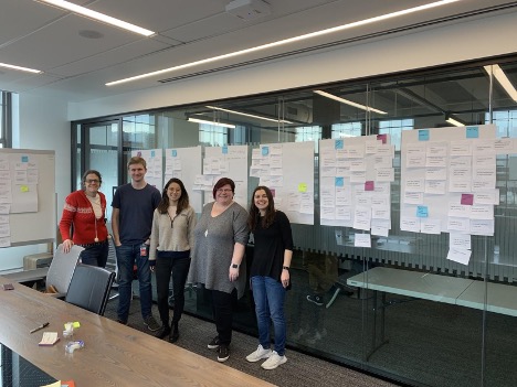
Figure 1. The good old days—pre-pandemic.
Defining an Experience Vision Framework
To start, we needed to define what we meant by “Experience Vision.” We knew that a lot of people at Red Hat would be happy to contribute (more on the open-source, meritocracy nature of Red Hat in a bit…), so we’d need to be sure there was a robust framework holding up the vision work.
In classic UX fashion, we chose to focus the vision first on our target users. We coined our fictitious company name and fictitious people (with characteristics and roles based on real data) and highlighted the phases of their ideal journey with Red Hat’s portfolio—Discover, Learn, Try, and Use (see Figure 2).

Figure 2. The initial details of an Experience Vision.
After defining our users and the main four phases that they travel through in their journey, we laid out three crucial pieces that solidified the framework of our vision (see Figure 3). Within each phase of the customer journey, you will find the following:
- Experience Stories (one or more in each phase)
- Capabilities (one or more for each Experience Story)
- Plans (one for each Capability)
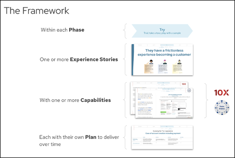
Figure 3. The Framework includes Phases, Experience Stories, Capabilities, and Plans.
Phases, Experience Stories, Capabilities, and Plans correlate to the “Why,” “What,” and “How” questions that shape our vision. Let’s explore how each framework aspect brings us closer to each answer.
Experience Stories
Experience Stories look to answer the “Why?” for our users. Why would our users choose our solution? There can easily be more than one Experience Story within each phase of the customer’s journey, and ultimately these Experience Stories are the high-level statements that can be strung together to hold up the vision end to end. They are written to be durable. Sure, some may come and go based on priority and strategic direction, but this isn’t the type of story you work on for three weeks and archive at the end of a sprint. These stories will drive long term needs and intentions for our users that we should continue to keep in the forefront of our mind while creating.
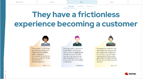
Figure 4. An Experience Story within the Try phase of the customer journey.
In Figure 4, you’ll notice that the title is the most important piece of information. The Capabilities and Plans that live under it support this Experience Story and ensure the experience is the best it can be for our users. When building your own Experience Story, you might add extra details about the users affected by this story or even some supporting quotes from them. Incorporating people and quotes reminds us that these are the people we need to be designing and building for.
Capabilities
Capabilities dig further into the nitty gritty to answer the “What?” behind our designs. What are the features that we will validate and build over the next few years to realize our vision? In our framework, we have two different types of capabilities. Some are “table stakes,” meaning we need to have these to be competitive in the industry. Some are “10x,” meaning they will help us soar past our competition by propelling us beyond anything else out there today. These 10x ideas and the validation of them are a play on the Google Moonshots concept. What are some far-reaching features that we could provide to make our product experience radically better than the others out there?
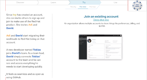
Figure 5. A “Table Stakes” Capability to support our Experience Story around becoming a customer.
In the example in Figure 5, you’ll see that on the left we have a running narrative for our protagonists taking the product journey. This details their mindset and how they are interacting with the capability described on the right. The narrative reinforces the true need for this capability in the vision. When mapping your own Capabilities, a low-fidelity wireframe is likely enough to support your concept. Meaty details around exactly what this capability requires can be read by linking further documentation in your slide deck, like what we’ve done with our “Deep dive doc” link.
Plans
Plans get down to the “How?”: How are we going to work toward finding success in each of these capabilities in order to serve our Experience Stories? This question drives a number of discussions around long-term priorities at a high level and can ultimately serve as a compass to ensure we are continuing down the right path to deliver our capabilities.
Plans can of course change, so revisit this area often as you tackle your work. At Red Hat, we check in on our initial Plan often by asking evaluative questions like, Are we continuing to have the right goals in delivering this capability? Are there any shifts we need to make?

Figure 6. An example Plan to support the Capabilities that will import our Experience Story.
The Figure 6 example shows the capabilities listed all on one page to detail the work that will be delivered over a number of years and the Plan to make that happen.
Putting Our Framework to Use and Creating an Experience Vision in the Face of COVID-19
With a framework laid out, we were in a great place to create at scale. We decided to put the majority of our focus on running virtual workshops that fell into two different categories:
- Ideation: Fill our Experience Vision with fresh, new ideas.
- Validation: Ensure what we’ve added to our Experience Vision is on the right track.
In normal times (it feels cliché to say this now…), we’d have continuous in-person workshops to fill out our vision with ideas, meeting up with customers for face-to-face sessions or chatting with them at events like the Red Hat Summit. As we all have worked from home during a worldwide pandemic, we’ve needed to adapt some of our classic design thinking methods and turn to digital tools to support the new normal of virtual connection.
Video Conferences, Video Conferences, and . . . More Video Conferences
We can’t delay it anymore: Let’s talk about video conferencing. Right now, it feels like something we’re using far too often. Google Meet, Zoom, Webex, or BlueJeans. At Red Hat, we’ve used them all. Each has their pros and cons (Google Meet’s background noise filter is a huge win), but we’ve found that all of them work well.
Regardless of the platform, we’ve found the most important piece about running these virtual workshops is setting the tone for the meeting. Everyone is burned out by what feels like an endless cycle of video calls at this point—and here we go inviting people to participate in a two-hour workshop! Take a very human approach from the start; spend the time to ask everyone how they are doing and acknowledge that all participants are living through a pandemic. These workshops are intended to be the closest thing we can do to getting together in person, and everyone should know that they will be full of chatter and fun. There are never any bad ideas, and silly ones are even invited—so a reminder to be creative and let ideas fly is great. Before getting into the “meat” of the workshop, especially if it’s a new-ish crowd who’s participating, we’ve enjoyed starting out with an icebreaker. A quick virtual scavenger hunt (see Figure 7) is always fun, especially when there are people who have to travel three flights of stairs to find certain things in their homes.
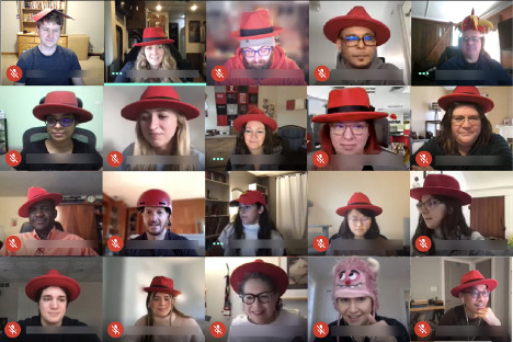
Figure 7. Virtual scavenger hunt results for “Find a red hat.” (Yes, these are all Red Hatters.)
What’s the Best Number of Participants for a Virtual Workshop?
This depends a little bit on the activities you plan to run during the workshop, but in our experience, once you have more than 10 people, there are bound to be some voices that are lost. Those who aren’t comfortable speaking loudly or possibly stepping on someone else’s words to get their thoughts out sit back and take a listening role instead. In a larger group (10+), people can more easily disconnect and turn their camera and audio off without it being noticeable.
If we have a very large group interested in the topic we are workshopping, we have been successful in breaking out into smaller groups who diverge, discuss the prompt, and work through the activities, and then converge (see Figure 8) back together in a larger group to discuss the outcomes. This diverge-converge pattern allows more voices to contribute to smaller discussions, surfacing more ideas to the larger group. Comparing notes after these breakout conversations creates a great forum to share new ideas and discover which ones appeared in both discussions. Diverge, converge, and determine next steps together—and don’t forget to work this convergence time into your agenda!
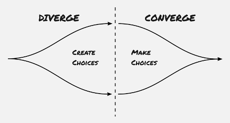
Figure 8. Diverge to create a number of ideas and then converge and decide which are best to move forward with as a larger group.
Can a Virtual Tool Really Replace Sticky Notes and a Whiteboard?
Nothing will replace the satisfaction of peeling a fresh sticky note off a stack and putting it up on the wall with your own hand, but we’ve found that Mural is a great tool for creating virtual stickies on a whiteboard. Jamboard allows for this as well, but with Mural, not only can you recreate “post-its on the wall experience” but you have an infinite canvas along with all of the classic low-fidelity wireframe options right there at your disposal. Icons and images are available to add some flair too. Round it out with a countdown timer and the ability for virtual collaboration and you have yourself a near perfect tool to run a virtual workshop (see Figure 9). With all of these features in one tool, the one suggestion we’d make if using Mural is to spend a few minutes with the workshop participants doing a quick introduction to the tool and the features they will be asked to use over the next few hours. If participants are expected to create on the canvas themselves, a five-minute tutorial for them to feel empowered rather than having to learn a new tool and play catch-up goes a long way.
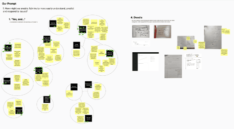
Figure 9. Collaborate with stickies, shapes, text, icons, and more with Mural.
Who Should You Invite to an Experience Vision Workshop?
With respect to ideation, at Red Hat we feel like it’s the more, the merrier. Everyone at Red Hat influences the user experience in some way, regardless of their role or department. Red Hat lives and breathes meritocracy as one of our core values, and it’s essential that this Experience Vision is open for anyone to contribute. From Marketing, Product Management, Engineering, Documentation, or Quality Engineering, it’s the best ideas that win rather than those from people with the highest-ranking title at the company. When we get a lot of interest from people across the company, that’s an excellent opportunity to diverge and converge and make sure we are all learning from each other.
When it comes to validation with customers, it’s sometimes better to be a bit pickier on attendance. While it’s excellent to have representation from all groups to get exposure hours to what customers think, there is still a balance of not overwhelming the customer with a number of people who are observing their every word. At the very least, validation outcomes should be shared with all stakeholders before changes are made to the Experience Vision. Validation is crucial to ensure that we don’t waste effort on designing and implementing a feature that isn’t what the customers intend to use.
Becoming Experience Driven—On Our Way
Creating a living, breathing Experience Vision that is continuously extended and validated gives our global team a steady “north star” for making decisions that help move Red Hat closer to providing a seamless and compelling portfolio-driven user experience. We can quickly analyze new ideas that come in from any source to see if they fit into our vision and, if not, just as quickly label them as distractions. With this Experience Vision in place, we are seeing Red Hat becoming more data and experience driven with each product release. I hope if you try any of these methods to create your own Experience Vision, you’ll find the same in your work.
Liz Blanchard is a User Experience Design Architect at Red Hat. With 15 years of experience in the enterprise product design space, she’s currently leading the UX Design team at Red Hat to create an experience vision for their portfolio. She specializes in design for complex business-to-business IT software challenges.

