Ah, the creative brief. At once the bane of the designer’s tortured existence and a North Star to guide teams along the path to delivering something great. During my years running a small design studio, I used briefs to help plan projects and to keep clients honest during the design process. As I started working in-house, focused on improving existing functionality over developing entirely new websites, I noticed that the briefs I had been creating were not working in this new context, so I stopped using them.
But soon, I started noticing that my teams were suffering. We would go through seemingly infinite rounds of iteration and have to rush production, leading to sub-par experiences. Designers were having trouble getting their teams and stakeholders on board with the work they were trying to do, and designs were compromised as a result. I needed a way to help us bring focus and clarity back to the work so we could move design through more effectively.
Enter the magical short-form creative brief, made famous by Jared Spool. Containing only a few short sections and no more than a page or two long, the brief helps center teams around a concise, brief vision for what they are trying to create.
The Brief, in Brief
The original structure of the brief, as Spool describes, consists of no more than a sentence or two for each of several sections:
- Project Objective: the basic goal of the feature they were trying to develop.
- Key Personas: one to two personas from a master list of product personas, only including details that were relevant to the design.
- Key Scenarios: up to three short scenarios based on research findings, structured as a demo or usability task, e.g., “[persona] is talking to a passenger whose flight is delayed and they need to figure out if there’s a new flight they can get the passenger on today.”
- Key Principles: one to two key principles, chosen from a list of previously created principles, that were most important to consider in the design process.
When I began to adopt this approach a few years ago, I found that it was really helpful for teams, but they felt there were pieces missing. Some teams needed help streamlining the design problem; others tried to focus on too many goals. Most felt that certain key information was missing from the brief, for example, technical constraints or key stakeholders who will have an impact on the design. I also observed that, when working with digital marketing teams that were accustomed to agency settings, the term creative brief evoked a focus on branding and visual design, which ran counter to the team’s goals. As the structure of the brief continued to evolve over different projects and different teams, I started to refer to them as experience briefs, which helped the teams focus more on the end-to-end experience we were creating.
Optimizing for Different Teams
Done well, a solid brief is no more than a page and a half of printed text and can be completed within the course of a 1-hour project kickoff. The key to doing it well is that it is done alongside stakeholders and the team, preferably during the kickoff meeting. I like to treat the brief as a structured interview. My role is to listen, to facilitate conversation, and to reframe what I heard as the content of the brief, which I write in front of the team. After the meeting, I flesh out the writing, refine a few things, and send it out to the team for review. The final brief serves as a touchstone in every future meeting.
Creating the brief in real-time requires a certain amount of thinking on your feet, but the benefit is twofold. First, it creates transparency within the team and shows that you are actively listening. Second, it prevents anyone from arguing that doing a brief “slows down the process” since it is happening during a meeting that you would be having anyway.
Refining the Design Problem
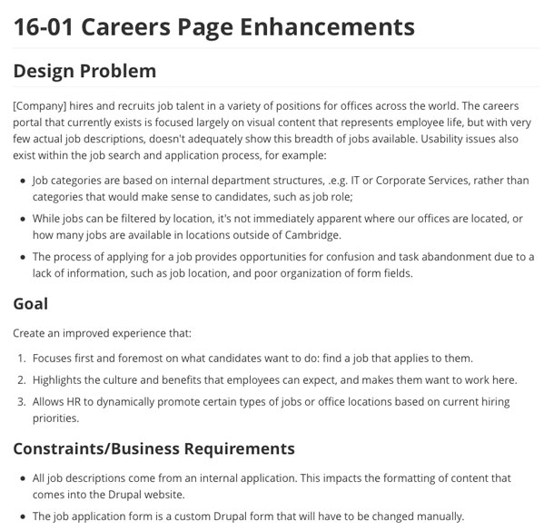
As I began this process with my teams, the first thing I noticed was that keeping the design problem/objective to two to three sentences was difficult. In many cases, people needed to be coaxed into defining the problem in more specific terms than “this is awful and we need to redesign it.” Some teams also felt that the one-paragraph design problem did not include enough information to be useful. Our first adaptation to the brief was to expand the design problem up to a maximum of two paragraphs and to add a subsection for goals and constraints that needed to be considered. Figure 1 shows an example.

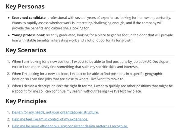
The next adaptation was focused on the personas and scenarios. While some teams already had design personas, other teams were more focused on marketing segments and resisted the persona concept. Additionally, it was often the case that people would come up with infinite scenarios that needed to be considered and had to be prioritized. We landed on a hybrid approach to both problems. For personas, we focused on action-oriented “characters” based on our research, and we used job stories as a framework to capture user goals (see Figure 2). For key principles, we left the process untouched. The team had a set of existing principles I had worked to help them create; from those, we chose the one to two principles that made the most sense.

Once we had the standard brief in place, we found that teams needed a place to capture information that came up during the design process, e.g., links to research notes or meeting notes. For this, we added a “supporting information” section toward the end that made it easy for teams to capture this information.
The Expanded Brief
These days, our briefs are still two pages or less, but we have expanded it a bit and brought some more structure to the format. The following is a rough framework of the process:
- Design Problem: a one to two paragraph description of the problem we are trying to solve, and why it is important to the business.
- Goals: a set of clearly defined goals for this design.
- Considerations/Constraints: a quick synopsis of any dependencies, business constraints, etc., that we should pay attention to during the process.
- Key Personas: One to two personas that are most relevant to the problem we are solving.
- Key Scenarios: Three to five job stories to show the possible scenarios to design for.
- Key Principles: One to three design principles, taken from our list.
- Supporting Information: Any information that is not covered by the above sections. In practice, this may include meeting notes, links to competitive analysis, or key insights from research. Some specific examples include the following:
- Milestones and Deliverables (optional): For larger projects, this section can be used to indicate the general scope of work and key milestones along the way.
- Key Stakeholders (optional): This is especially useful in enterprise contexts, where people who feel left out of the process can end up derailing the design. Use this to make sure that designers are reaching out to these key stakeholders at points throughout the design review process.
Here’s a fleshed-out example from a project I did to redesign a career portal.
Pre-Work to Speed Up the Process
In order to realize the true time-saving power of the experience brief, it helps to have a couple of things squared away up front. Having a set of clear personas and design principles for your product gives you the opportunity to speed up these sections of the brief; instead of guessing which personas or principles apply to this project, you can revisit the whole set with your team and decide which ones to include.
Personas
A solid set of personas (which I like to think of as characters, to borrow Indi Young’s term) not only helps speed up the brief-writing process, but it also helps to align the team on a common set of users. Conduct a Character Sheet Workshop with your team to map out the different types of people your product serves. When creating personas, think not just about demographics and user roles, but also consider the person’s context within your problem space.
Design Principles
If your product or team does not have a clear set of design principles, now is the time to create them. While it is common for teams to come up with abstract design principles, such as “Clean” or “Intuitive,” I have found in practice that design principles work best as directives from our users to the team. “Make it easy to figure out what I have to do next” is more powerful/useful than “Intuitive,” particularly in an enterprise context.
Create a Template
As your team continues to create experience briefs for each project, it becomes much easier to create a template that you can grab and start filling out on the fly. Here’s one of mine that you can use.
Conclusion
When it comes down to it, being a good designer requires much more than pushing pixels or learning the next interesting prototyping tool. You have to help your teams prioritize, reframe their problems, and stay aligned through the messy, thrilling process of creating something new. This makes the experience brief a small but incredibly powerful tool in your design arsenal.
