As recently as 2006, it was advisable to avoid forms altogether when designing a mobile website. Multi-step, link-driven selection list wizards (Figure 1) were considered better practice, as implementing and using forms on the mobile web was considered overly difficult. This led to long pathways to information and an ineffective user experience for people in a mobile context.

There have been gradual improvements in the usability of forms on the mobile web. The arrival of the Blackberry provided some improvement on text entry, which for users has always been and remains a challenge. The iPhone has seen an improvement in the presentation of forms, along with other standard mobile web elements that assist users in presenting familiar UI controls with established interaction methods. Such phones are driving mobile web use disproportionate to their handset market share. Nonetheless, there is still a great diversity of handsets accessing the Internet, and their differences are noted by some as a hindrance to the development of the mobile web.
This article describes some of the specific lessons learned designing with forms as primary interfaces for the Yellow™ and Whereis® mobile sites at Sensis in Australia between 2006 and 2008. It also outlines the evaluation methods we tried and had success with. (Yellow allows people to search for businesses around a location and Whereis provides maps, directions, and map-based search.)
Keep It Simpler
Unless you’re designing for a specific device like the iPhone, you’ll most likely be designing for different browsers and screen sizes, as well as different interaction modes such as touch screen, stylus-driven, scroll wheel-driven, and basic click and select. Each of these mean different methods of making a text field active, expanding a dropdown list, or highlighting a radio button for selection.
Text entry is generally the most difficult interaction a person will encounter on a mobile form.
Form-based input requires considerable attention and dexterity. One of the challenges of designing the homepage for Yellow was balancing the amount of information required on the homepage with the number of steps required to view a results page. We decided to have location entry on the homepage to try to display results as the next page, creating a complex entry point to the site.
Design and Layout
The majority of mobile sites use a vertically stacked layout; it supports the way most people read the mobile web page and was the easiest to implement across multiple devices. Form design follows suit; labels, form fields, and actions are best arranged stacked vertically.
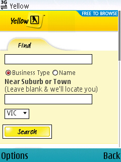
Problems with non-stacked layouts include the impact of limited screen width on text entry fields or drop-down lists, and the difficulty in consistent formatting across a range of devices. Where we did implement adjacent elements, such as on the Yellow homepage (Figure 2), lab participants showed a tendency to overlook the right-floated Name option button when asked to recall the elements of the page. We assumed that this method broke a model of scanning the left-side of the page for cues about the purpose of the page, then honing in on the key elements.
OK/Cancel: Action Stations
Two common usability issues we observed were associated with form submit buttons: difficulty identifying the highlight state, and difficulty with selecting form buttons adjacent to text fields.
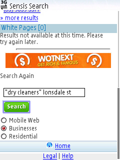
Many phones will accommodate the use of graphical form buttons via CSS. Implementing custom graphical buttons is worthwhile, as most standard browser controls are not visually prominent or large enough to be easily discernible and selectable on a range of mobiles. Figure 3 shows a custom CSS Search button on the Sensis Mobile site; the button is active and the highlight state is visible thanks to color contrast, but adding padding around the button would increase the prominence of the highlight state.
A poor example: Telstra’s location preferences page (Figure 4) includes a Submit action rendered as a link. An opportunity to visually emphasize the key action on the page is missed, and Submit blends in with the navigation links.

As Luke Wreblowski noted in Web Form Design, visually deprecating or removing the Cancel form button can help emphasize the submit action, and in the mobile web there are several other reasons why secondary actions are not useful and should be avoided:
- We observed many users use the browser Back button to navigate away from pages, rather than using on-page buttons. The browser Back button is one of the most accessible controls on a mobile browser, and will usually have a button dedicated to it; on screen controls do not compete.
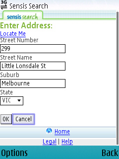
- Some phones that navigate by selecting elements up and down the page do not always select the element that is left-aligned, or the position of the previous element can determine that the right-aligned element is selected first. This can increase the chance of people selecting Cancel in error—disastrous if they lose entered text or a series of selections. Figure 5 illustrates a Cancel button automatically highlighted; if selected this would undo all the text entered on this page.
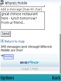
- Cancel gives no indication of the destination page, and people have a reluctance to click on something that may take them further from their task. Figure 6 shows an example where the link Return to map replaces the Cancel button.
Flexible Inputs
In a recent review of Amazon’s mobile web and mobile application offerings, Joel Pemberton of Punchcut notes that one of the distinct advantages of the mobile application is that it remembers your login, something the mobile browser Safari does not do. Many phones still do not support cookies, or provide browser-based password lists for login recall.
There are also times when a mobile website can pre-populate form fields based on previous entry. This can be a disadvantage for people if they have to delete unwanted text with individual keystrokes, or by drag-selecting all with a stylus; both tasks are intensive interactions.
Yellow mobile used pre-population on the last entered search term—the rationale was that building search queries (appending another keyword to narrow the search) or correcting search queries (spelling, plurals/singulars) would be common tasks.
Whereis mobile also pre-populated the address entry page, the rationale being that the state and suburb information could be reusable, and that retaining the street number and name information would provide continuity and avoid confusion for people affected by different presentations.
Detailed statistics would have validated these assumptions, but these specific statistics were not available to us at the time.
Select Lists, Radio Buttons, and Checklists
As with web browsers, form elements will be rendered differently across mobile operating systems and browsers. This means people may not recognize form elements they have previously used on the large-screen web, nor quickly understand their function.
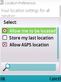
Figure 7 shows how Nokia Series 60 browsers render an active drop-down list—in this case allowing multiple selections. Knowing the phones you’re building to handle these form elements is very useful in anticipating the problems people may encounter using them. In this case, the UI is styled according to the operating system, not the website, and hence can be visually incongruous. Additionally, the search field below the selections provides search capabilities within the drop-down list, and we observed numerous test participants mistake this field for a broader site search. Being aware of problems like these can help determine whether a specific form element is likely to be effective.
Usability Testing Methods
Indoor/Outdoor
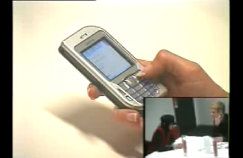
We predominantly tested our applications with participants sitting down in the lab. We captured the actions of each participant on ceiling-mounted cameras—one of which would capture a tight shot of the handset to record the actions of the participant. This generally would not record the screen contents very clearly, so we tried an iSight camera on a gooseneck stand that would sit above the handset, allowing the participant to move the phone with some freedom. To avoid participant discomfort from holding their hand in one place during most of the session, we framed the shot a bit wider, and put markers on the table to show participants where they were in the picture. This area was about the size of an A3 sheet of paper and provided some sense of natural movement.
Numerous mounts for phone and camera are readily available in stores and can be set up easily. We recommend that the setup capture both the actions on the keypad and on-screen, with a second camera capturing larger gestures, such as when participants need to bring the phone closer to their face.
In early 2007, a Sydney company, eyetracker, performed a proof of concept with us on their head-mounted eye-tracking system. We used internal participants and sent them outdoors to find some local businesses. The results were interesting: we quickly got a sense of how little attention the mobile phone could be afforded when actively negotiating a busy shopping mall—the participants’ eyes were barely on the screen. However, the video resolution on the mobile’s screen wasn’t good enough for detailed analysis of usability issues. This technology will evolve and provide a means of assessing mobility and attention usability issues.
Barbara Ballard has noted that field testing is most useful late in the design cycle when the most obvious usability issues have been discovered in the lab. One of the key benefits we found in our limited field testing is in seeing how an application will perform under circumstances that you have not imagined. The weather, the light, the number of people around, and the presence of friends all affect how much attention a person is able to give your application. If the mobile website relies on forms, the attention required of people to complete tasks in context is vital information.
Testing with different handsets
Our approach in usability testing mobile websites was to always try to minimize the impact of the phone’s form factor, operating system, and browser on the participant’s evaluation. While using the participant’s own handset might seem the ideal way to ensure that the participant is not learning a new keypad layout or text entry method, two issues stopped us from doing this:
- Not all participants had mobile internet connectivity enabled on their phone (prepaid accounts in Australia typically do not include mobile internet access). Some did, but people were unsure or anxious about the cost of the service on their mobile phone plan.
The time required to build prototypes that rendered correctly across a range of phones. We used HTML prototype pages which we built ourselves even at early stage testing. Doing this manually to cover numerous handsets has a dramatic impact on the cost of usability testing. - Our approach was to use two different handsets in a session, based on site statistics for handset usage. This approach is not ideal. As mobile internet access becomes more mainstream, it may be increasingly possible for participants use their own handsets, eliminating the impact of learning a new phone’s peculiarities during usability testing.
Designing Flow Getting the flow right
In Yellow or Whereis mobile, launching the search, or searching for a location, is not necessarily the end of the interaction with the form. People launched an average of 1.8 searches per session in Yellow mobile, and getting directions in Whereis mobile would entail revisiting the form at least twice. Allowing people to help users recognize, diagnose, and recover from errors is important, as is trying to design for “expert users” (like removing redundant tip text from the interface).
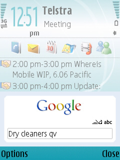
Evaluations indicated the ideal interaction flow could be: launch quickly, then assess, then modify if necessary. A good model for this is the Google search application that can be installed on Nokia devices (Figure 9). (The application can be found on the Google mobile homepage at http://m.google.com/.) The Google mobile web search interface can be launched with a single button press, which can be much quicker than launching the phone’s browser and entering a URL or selecting a bookmark. The search application then launches the browser, establishes an online connection, and returns a results page. This can take some time, but no further action is required, making it easier to launch a search.
Getting Better All the Time
Designing forms for the mobile web provides some unique challenges, including requiring people’s attention to use forms in context, how phone browsers render forms, the difficulty of text-entry on the phone, and how well the website enables recovery from errors.
The iPhone, Blackberry, and other devices are addressing some of the issues that are beyond the mobile website designer’s control. Lab and field-based testing present some challenges, particularly capturing the environmental, on-screen and physical context of people using it. Communicating to stakeholders the difficulty of capturing these elements can help, particularly as mobile recording setups mature. And finally, getting site statistics that capture detailed form inputs and pathways is critical to ongoing improvement to the mobile website using forms.
