While the subject at hand is a serious one, satirists and political cartoonists bring attention to this topic through their own mediums. Take the cartoon lampooning Facebook’s Mark Zuckerberg from a recent publication of The New Yorker and presented in Figure 1.

Figure 1. Facebook cartoon by Farley Katz (Credit: The New Yorker).
My experience leads me to believe designers have a key role to play in closing this trust gap.
This article showcases how outcome-focused design can increase customer trust and maximize an organization’s access to the right data. An organization’s access to this data—as a direct result of customers actively sharing it—is a competitive advantage.
I showcase this by
- briefly describing the relationship between trust and data sharing, along with why this matters for modern information organizations,
- describing the specific data trust outcomes we design for daily in our work, and
- highlighting examples of our process in action.
I “trust” you will be able to draw inspiration and put what you learn into practice quickly.
Trust and Data Sharing
Businesses today are information driven. Our economy is information driven. Sharing our information is how we participate in modern social and economic structures. None of this is news to you.
However, something that might be news is the fact that the relationship between trust and data sharing is becoming clearer. The idea that people care about their privacy (attitudinally) yet share information willingly (behaviorally) is strongly contested. Instead we have come to learn that people share because they feel powerless. They do not have choice.
Regulation is evolving to support this perspective. People are gaining more control. But there is actually a bigger issue that is worth understanding. It’s about governance.
Traditionally, boards have been responsible for corporate governance. They set strategy. They identify and manage risk.
The question is: Do they do this well in the context of information?
Empirically, I argue the answer is no. A quick critical analysis of the skills and experience composition on many boards will likely lead you to the same assessment.
The good news is many boards have begun to tackle and invest more appropriately in this opportunity.
A recent article published in Time magazine by Tim Cook calls on the U.S. Congress to pass comprehensive federal privacy legislation. Figure 2 references the third and fourth of the four principles he believes should guide this legislation.
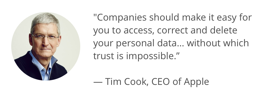
Figure 2. Quote from Tim Cook, CEO of Apple.
Data ethics, privacy, and customer trust have never been more important. If this trend is yet to impact your daily work as a design practitioner or design leader, it soon will.
Designing for Outcomes
The differences between, and the complexity of, the Terms and Conditions provided by some of the world’s leading online services is astounding. Dima Yarovinsky’s work (Figure 3) presents this visually with his showcase display for Visual Knowledge 2018 at Aalto University, Helsinki, Finland.

Figure 3. “I Agree”: A visualization of the Terms and Conditions of some leading online services including Facebook, Snapchat, Instagram, and Tinder. (Credit: Dima Yarovinsky).
Have you ever designed a privacy notice? How about a terms and conditions experience? What about a consent notice?
Most designers have not. In fact, these experiences have rarely been designed. They have been hidden away. They are incomprehensible to all but a select few. This is changing. Organizations are working to become more transparent. People expect to understand what they are getting into. They expect to be in control. They expect to be able to change their mind. They expect the action to be easy.
What this means is that we need to become adept at designing for data trust. We need to empower people to make informed choices about how they participate in the information economy. We need to design for a new set of outcomes.
Through our Data Trust by Design work, we have come to prioritize three specific outcomes:
- Comprehension
- Time to Comprehension
- Propensity to Willingly Share
Designing for maximum Comprehension helps us enter into valid agreements with people. It helps people make more informed decisions. It caters to different styles of learning, a variety of appetites for information density, and the situational context of use.
Designing to decrease Time to Comprehension helps people get on with their lives. It accelerates the pathway to value. It helps make agreements and interactions appropriate for the way we now live.
Designing for Propensity to Willingly Share is a little different. This is actually about making the activity of data sharing—the value we propose to deliver and the types of data processing activities we will engage in—socially preferable. This is not about “getting away with it,” but rather, this is about utilizing data ethically to create incredible outcomes for the people we serve.
Figure 4 outlines an example of Data Trust by Design in action in the context of a progressive consent-based data sharing experience.

Figure 4. An example of a consent-based data sharing experience that leverages Data Trust by Design and considers the high bar of consent set by the European General Data Protection Regulation (GDPR). (Credit: Data Trust by Design, Greater Than X).
By clearly communicating this value and supporting the journey, we can gain access to a broader and deeper view of our customers.
Doing this is not always easy. It requires us to work with a variety of different people and deepen our understanding of their current perspective. From there we need to find ways to shift this perspective so we can do meaningful work.
Here’s How
To achieve the outcomes above, we work collaboratively with our clients. This requires us to complete the following steps:
- Define the context and scope.
- Develop a perspective based on current research and organizational constraints.
- Develop a simple body of evidence to act as our control.
- Define design hypotheses we can action quickly and effectively.
- Get the right people in the room to execute the process.
Let’s dive into the detail, then we showcase some examples.
Define the Context and Scope
This includes all of the normal stuff: time, budget, and expectations. By documenting this explicitly, we develop a clear shared viewpoint.
Develop a Perspective
This is about clarifying what we think we have learned to date. This is ideally based on a broad body of qualitative and quantitative evidence across attitudinal and behavioral dimensions. If it’s not, that’s okay. We roll with the punches and develop a perspective empirically. Specifically, we might define that the current Terms and Conditions are a priority because they take 46 minutes to read and are incomprehensible when mapped to literacy rates.
Develop a (Current State) Body of Evidence
It is hard to showcase the value of our work without a useful comparison. Using our Terms and Conditions example, we conduct usability analysis. We add to this a teardown of the current sign up and onboarding process. This is very likely to showcase some clear gaps.
From there we conduct outcome focused usability sessions with a small group of customers. We add contextual inquiry based on conditional logic.
In this session, we measure for a baseline of our three specific outcomes:
- Comprehension is measured by defining the key parameters of an agreement, then asking people to recall what they have read.
- Time to comprehension is determined by measuring the total time between the first interaction (uninterrupted) and the time the person is happy to enter into the agreement (or not).
- Attitudinal propensity to share is measured by using a Likert scale.
We are likely to learn the following:
- Comprehension is low: Less than half of the group is likely to accurately recall 50% of the key parameters, even after being forced to read (or skim) the entire thing.
- Time to comprehension is far too long. In a banking context, reading terms and conditions for simple products can take up to three hours.
- Propensity to share is low: People will feel subject to a power imbalance. It is likely we would average about 2 (on a 7-point scale).
Interestingly, some recent research we conducted on “a day in the life” of everyday Australians with the Consumer Policy Research Centre showcased an even bleaker picture. People gave up reading after just 4 minutes. What chance do they have at making an informed choice?
All of this helps us understand the gaps. It typically increases the motivation of the people we work with. They want to make things better. A lot better.
Define Design Hypotheses
Again, using our Terms and Conditions example, we define design hypotheses to achieve a set of stated outcomes. We aim to work towards something measurable, like the following:
- More than 80% of research participants accurately recall more than 80% of the key parameters of the agreement.
- Time to comprehension is achieved in less than 2 minutes.
- More than 80% of research participants are “very happy” to share their information in this context.
Note these are stretch goals. Working towards these outcomes takes time and deliberate effort.
We might then propose some loose hypotheses:
- People are far more likely to accurately recall the key parameters of an agreement if we present the information in simpler formats like video and diagrams.
- By changing the form factor to video, people will be able to more accurately recall the key parameters of the agreement much faster.
- By clearly showcasing the relationship between data sharing and the outcome we promise, people have a far greater propensity to share.
Depending on the context, we can drive further specificity into the hypotheses.
Get the Right People in the Room
This is one of the hardest things to do. We have all struggled with it. Imagine running a design sprint on Terms and Conditions without the people responsible for risk or data protection present—there would be too much re-work required after the fact. Rather, we need to enable highly effective cross-functional collaboration early and often.
There are no secrets about how we do this. It is just work. You speak to people. You explain what you are doing. You showcase the existing body of evidence. You empathize with their perspective, their calendar, and their measures of success. You work with them to find a way to make this work.
Having said that, it is possible to be a little more strategic about the exercise. Use the switching canvas presented in Figure 5, which was inspired by Re-Wired Group’s switching formula, to help proactively design for change.
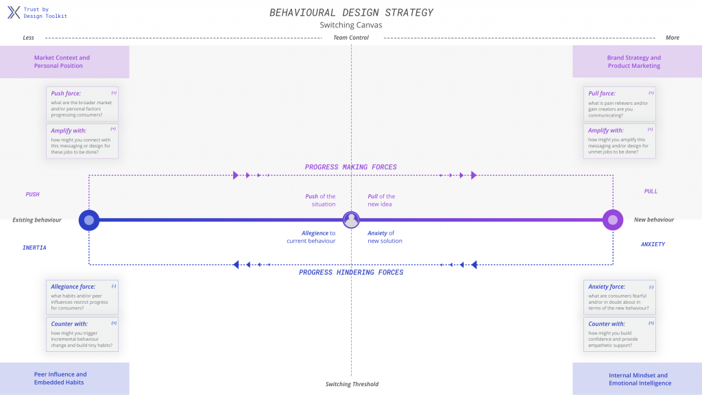
Figure 5. Behavioral Design Strategy Switching Canvas from the Trust by Design Toolkit, inspired by Re-Wired Group’s “switching formula.”
You then execute. Let me provide some examples.
Suncorp Insurance and Trōv
Suncorp is a diversified financial services business. For years they have been seriously looking into how the personal information economy is evolving. They have also been part of the Hayne Royal Banking Commission, an independent inquiry into the (mis)conduct in Australian financial services.
All of this contributes to their perspective. They are making moves to lead from the front.
In late 2018, we were hired to help Suncorp, and their strategic partner Trōv, to design a new type of insurance product—something truly worthy of people’s time and trust.
This was an interesting challenge. We had to navigate the line between cool (our objective) and creepy (the status quo of the information economy). We had to find ways to help guide prospective customers through a journey they could understand and take action from.
Without detailing every aspect of the first phase of our work together, this meant building a program of work that enabled us to quickly consume context, promote cross-functional collaboration, and produce actionable outputs. We needed to do all this in less than a month!
Doing this has enabled us to design a service experience that takes the best of Data Trust by Design and embeds it into a unique insurance context (Figure 6).
“Our work with Greater Than X has been critical in ensuring we design data led value exchanges in a structured and considered manner, enabling us to deliver a customer experience far superior to anything the market has seen before. The team at Greater Than X have helped us tackle this complex and difficult task with immense skill and inspiring leadership.”
— Chris Maccan, Executive Manager, Commercialisation at Suncorp
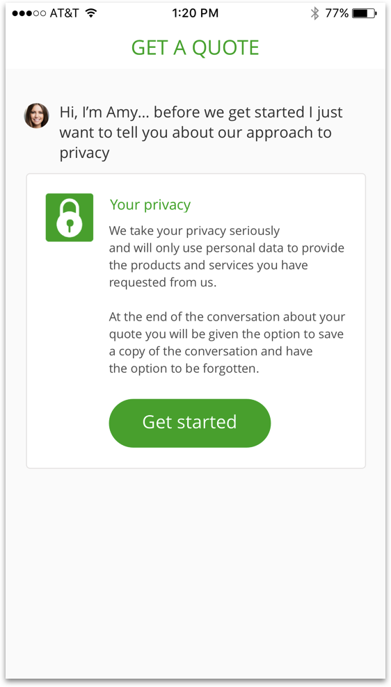
Figure 6. Concept for Suncorp Insurance app’s “Get a Quote” introductory page (Credit: Suncorp Group).
Volt Bank
Volt Bank is a new bank, the first in Australia for a very long time. As a result, they are thinking, acting, and communicating differently.
“The reality is, the trust issues affect the whole sector and so we will need to be part of the rebuild of that trust and confidence.
“We are no longer talking about dissatisfaction, we are talking about distrust, which is a very different proposition and no doubt it is a long and steep climb out of there.”
— Luke Bunbury, co-founder and deputy CEO
After reading this quote, I was inspired to connect with the team. A few weeks later we were working together, and we have not looked back since. Figure 7 represents a portion of our collective efforts.
Volt is now in the process of operationalizing Data Trust by Design. They are also doing some incredible data ethics work. They are framing hypotheses and putting them to the test. They are designing for the three outcomes we referenced above, taking this further to ensure data sharing becomes a valuable and meaningful part of the service experience from the first time someone interacts with the brand through the interactions they experience on an ongoing basis.
I am looking forward to making the switch. My current bank just does not get it.
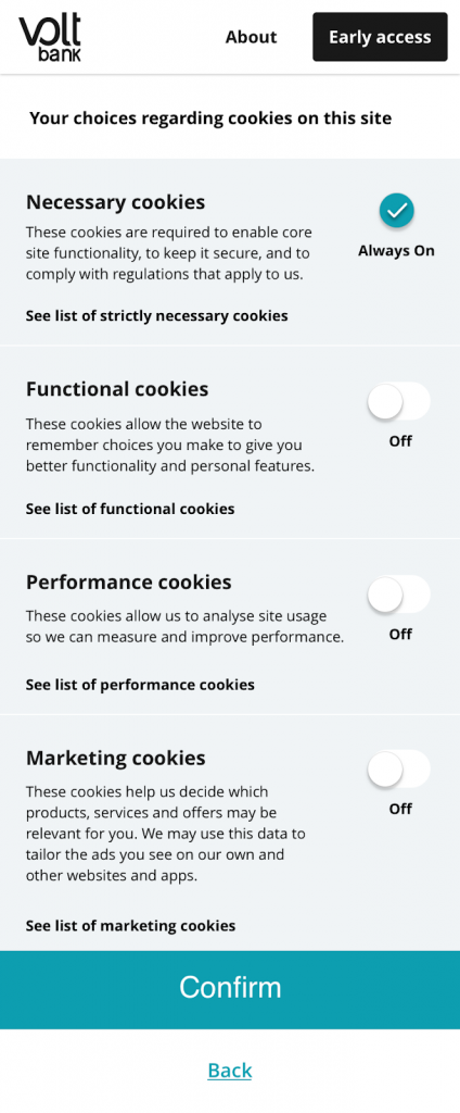
Figure 7. Data Trust by Design layering concept for marketing consent (often referred to as “cookie consent”), as experienced when landing on the Volt Bank website from a mobile device (Credit: Volt Bank).
Showcasing Leadership and Getting Started
At the beginning of this article I referenced the role designers could play in closing the trust gap and maximizing the value of data sharing. I believe this because I have seen it in action.
Designers are curious. They experiment. They navigate complexity and find ways to make progress happen.
This is exactly what organizations need.
They need to curiously approach the challenges and opportunities of the information economy. They need to frame hypotheses and conduct experiments. They need to develop new bodies of evidence, derive meaning quickly, and define an actionable pathway forward.
By showcasing leadership and getting started with the toolkit above, designers can help make high-trust, high-value customer relationships the new normal.
