I hope you will find this article engaging, informative, and intelligent. Might you prefer it to be modern, friendly, and fun? How can I make sure I’m achieving that? What do those words even mean to you?
Feelings play a critical role in encouraging people to use a product or service. Designs that produce desirable feelings are generally more successful. We collect descriptive evidence of these feelings using think-aloud protocols, observations, interviews, and questionnaires. But how easy is it to capture these feelings and communicate them to stakeholders?
Techniques used to elicit verbalizations during usability studies allow some participants to quickly put their feelings into words while others struggle. People with a limited vocabulary, non-native language speakers, and people who believe their opinion is unimportant often find it difficult to describe their experience. Making sure that the experience of less vocal participants is adequately represented in the results can be a challenge.
Giving People Words to Inspire Them
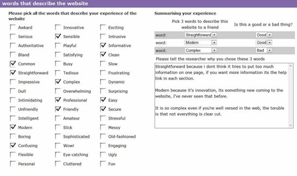
Ultimately, we want to help all participants to produce descriptions of their experience in a way that would enable these descriptions to be easily summarized and communicated to stakeholders. To achieve that, we have developed the Look-and-Feel Tool consisting of forty-eight adjectives that are presented to participants at the end of the test session (see Figure 1).
The inspiration for the Look-and-Feel Tool came from Miner and Benedek’s “product reaction cards.” They asked people to look through 118 cards with an adjective written on each card, select words that described their experience, and explain why they had selected those words.
The act of picking from a pre-defined word list gives participants a broad and shared vocabulary for describing their experience. The eye tracking equipment we use as part of our facilitation process allows us to see participants looking at each word. When they pause, we can ask why a word is attracting their prolonged gaze. The word might not be understood, it might be too strong, too weak, or not quite the right expression of their experience. Asking about words that capture more attention helps us understand the participants’ experience as well as assess the effectiveness of the word list.

How Did We Choose the Words?
The adjectives were generated based on our experience of running hundreds of usability tests. We tried to include a mix of words that:
- Have been used by participants in previous studies (for example, cluttered and slick)
- Balance our perceptions of generally positive and negative words (for example, fun and frustrating)
- Are normally used within standardized usability experience assessments (for example, easy, satisfying, and engaging)
- Can be used with a broad range of products and services (for example, fun as a different experience from sensible, and innovative as a different experience from common)
- Are not all extreme emotional expressions (for example, dull as a less extreme form of ugly)
- Describe experiences stakeholders often want to engender (for example, clean, authoritative, and secure)
- Describe experiences many stakeholders want to avoid (for example, intrusive, amateur, and tedious)
- Acknowledge the visual design (for example, clean and eye-catching)
Uncovering Diverse Meanings
With the Look-and-Feel Tool, people first pick all the words in the list that describe their experience. They then are asked to choose three words they would use to describe the product to a friend. The study facilitator’s goal is to investigate why the particular words have been selected and whether the participant considers these appropriate experiences for the product to produce. For example, one participant chose tedious and dull as neither good nor bad experiences for completing an online application form:
“It’s tedious but that’s alright, filling in forms is dull, I don’t want people trying to make serious forms fun.”
This participant used a word that they hadn’t chosen to describe the website—fun—to help them communicate their experience by using contrast. An advantage of using a set of words is that the words not chosen can also help the participant describe their experience.
Gathering participants’ explanations of why they selected words is important because people bring different meanings to the words. For example, the most frequently selected word—informative—can be used to describe either a good or bad experience:
“I didn’t know that; I can use this stuff; it’s very helpful.” (Informative as personally relevant and useful.)
“Too much to read and it doesn’t look like it’s for me.” (Informative as information overload and lack of personal relevance.)
Even words like easy are described with reference to diverse sources that reflect the individuals’ experience:
“The language was easy to understand.” (Easy to describe text quality.)
“I was able to see what I wanted within a few seconds.” (Easy to describe page layout.)
“It was easy to find my way around the website.” (Easy to describe website navigation.)
The effect is that the chosen words summarize what the participant remembers: things that are important to him or her. This is exactly what we want to facilitate.
Getting the Message to Stakeholders
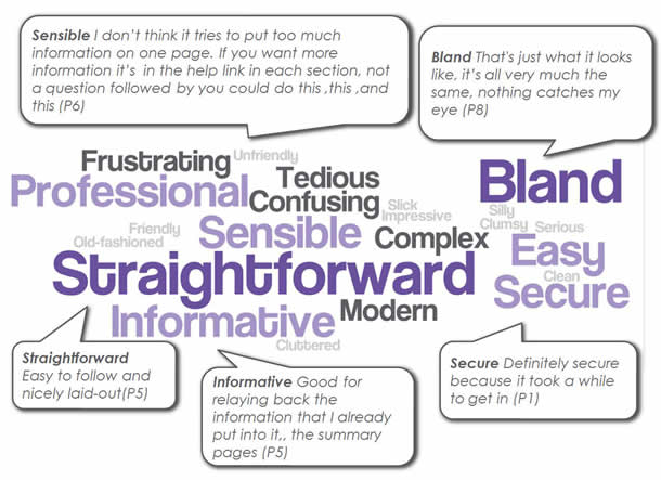
Through use we’ve discovered two further advantages of this approach. First, our clients can quickly and easily understand the process. Second, we can quickly and easily summarize the results in a visual form by using word clouds that use font size to represent the frequency with which words were selected (see Figure 2). Annotating the word clouds with participant quotes helps convey what people actually meant when they chose the words.
Even in this early form, the Look-and-Feel Tool has proven its usefulness to us because:
- It supports participants’ articulation of their experience
- It’s quick and easy to administer
- The results are easy to analyze and can be presented in an engaging, visual way

What Does It Mean to You as a UX Expert?
The tool can be used with diverse products and services to allow different user populations to describe their experiences. We’ve used it across dozens of usability studies that include retail websites, non-profit organization websites, entertainment websites, and mobile phone services.
Over the last year, we’ve compiled a database of more than 300 participants’ word selections. We found that people more often report experiencing easy than satisfying, with engaging being chosen the least frequently of the three adjectives. These relative selection rates could reflect the design’s ability to produce, or fail to produce, these experiences. However, selection rates could also reflect the participants’ understanding and use of these words in everyday language. The low selection rate of engaging could be due to the fact that it’s not a common word for describing experiences. Unlike Likert scale questions, the Look-and-Feel Tool gives people the option to ignore words that are not part of their normal vocabulary.
Making It Better
The Look-and-Feel Tool is not a perfect solution. An obvious shortcoming is a bias towards picking positive words. We considered grouping words into two categories, positive and negative, and requiring participants to pick some from each group. We chose not to adopt this approach because our classification of positive and negative words might not map to the meanings that participants attribute to the words in a particular context. For example, serious might be a positive word for a form and a negative word for a game.
If we wanted to group the words into positive and negative, we would either have to reassess those groupings for every product, or restrict the words to those less affected by context, such as confusing or frustrating. Another possible way of managing the positive bias is to require participants to choose an equal number of what they consider to be positive and negative words.
Based on participants’ feedback, we are replacing words that may be difficult to understand. Words such as condescending and gimmicky have already been replaced.
The basic idea of allowing people to choose words from a list is simple and powerful. But is producing one set of words that can be used by any user population for any product or service a realistic target? What words should be included? And how many words? Feel free to use our list, see how it works for you, and further improve it.
