The flagship product of MathWorks is MATLAB, a program that scientists and engineers use for computation and data visualization. MATLAB users, like many users, don’t want to spend time learning software—they just want to get their work done. They often have large data sets to analyze, and MATLAB provides many tools to help them. The desktop program includes windows for entering commands interactively, displaying charts, saving previous commands, editing files, viewing files and folders, and more. In response to customer demand, we decided to move this product to a mobile platform, beginning with the Apple iPhone in 2010.
Selecting the UI Elements to Include
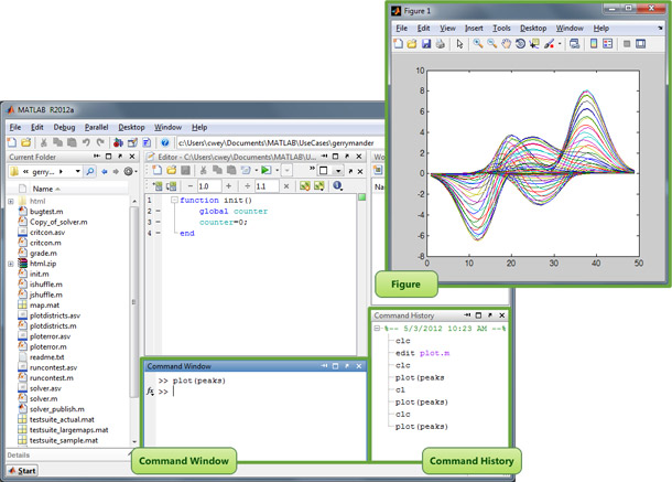
Our first challenge was determining how to map the rich feature set of the desktop product to the limited real estate on a phone. To reduce the scope of our project, we asked ourselves, “What do most of our users need in order to perform most of their common tasks?” We identified three windows that corresponded to the majority of our users’ tasks (see Figure 1):
- Command Window, where users enter commands to perform calculations and create graphs.
- Figures, where users view graphs.
- Command History, where users select commands to rerun without having to retype them.
Translating Elements to the Smartphone
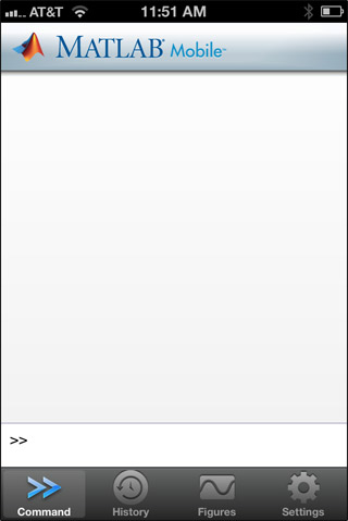
We organized the three essential features—Command Window, Command History, and Figures—in three tabs (see Figure 2). The most important window for users is the Command Window, which allows them to enter commands and create figures, so this is the tab that users see when they start the app. It provides a clean slate for new computations.
Command Tab
Most MATLAB commands use programming conventions that require special symbols. For example, commands like these are common:
- x = 1:.01:100;
- y = sin(x);
- plot(x,y)
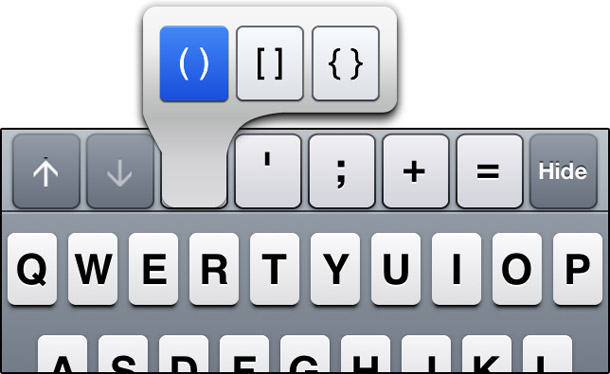
In our initial usability tests, users said it was very painful to navigate to more than one secondary keyboard to enter a command. To make typing easier, we added a row of extra keys above the main keyboard, containing the most frequently used special characters. To support even more characters, we added tap-and-hold pop-ups, following standard iOS behavior (see Figure 3).
Lesson Learned: Balance the limited real estate between leaving enough room to display content and adding features that make interaction easier.
Unfortunately, usability tests showed that people didn’t discover these pop-ups. We resolved this issue by displaying the pop-up on the initial tap. If the user didn’t select one of the pop-up characters, the app inserted the character corresponding to the original key.
Lesson Learned: Don’t assume that following the OS standards automatically produces a design that works for your app or user.
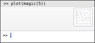
In the desktop product, the Command Window shows the most recently entered commands. We preserved that behavior in the app. In addition, on the desktop, users can enter a plotting command and see the resulting full-size figure in a separate window at the same time. A smartphone didn’t have room to show them together. To reduce switching between tabs, we added figure thumbnails next to the recent commands (see Figure 4).
Lesson Learned: Provide a glimpse of essential information in context whenever possible.
History Tab
In the desktop product, users can rerun commands by selecting them in the Command History. This feature significantly reduces the amount of typing that users must do, which is a valuable asset in a mobile app (see Figure 5).
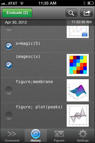
Figure Tab
Our users frequently work with large data sets. They often use graphical figures to find details and irregularities in their data that are otherwise difficult to detect. We originally treated figures like photos: when users zoomed in, the app enlarged everything.
But during usability tests, participants told us this made figures “useless.” They couldn’t see the data values because the axes ended up off-screen. To solve this, we decided to keep the axes on-screen when users zoomed figures (see Figure 6). This was another example of an OS standard that we had to tweak to support our users.

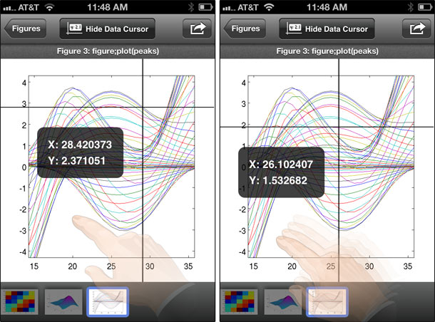
In the desktop product, users can click on a point in a figure with a mouse to see its data value. On a smartphone, it’s hard for users to pick a point because their fingers cover the area they’re tapping. We made crosshairs that users can move to a desired position on the screen, so their fingers don’t cover it up (see Figure 7).
Lesson Learned: When a user needs to select a specific location, find a way to keep fingers from blocking it.
Because it can be hard to select a specific point with a finger even using crosshairs, sometimes users tapped outside the data and no data values appeared. Users thought this was confusing, so we also added a message saying that no data was found.
Optimizing the App for a Tablet
After we produced the iPhone app and had some success in the App Store, we decided to apply our lessons learned and expand our repertoire to another mobile device. Users asked us to create a version optimized for the iPad, so that seemed like a logical next step. We were eager to address some of the pains caused by the small screen of a smartphone, such as:
- Typing. Adding extra keys helped, but didn’t solve the whole problem. Users still needed to switch between keyboards to type numbers.
- Switching between tabs. Adding figure thumbnails to commands helped, but users still had to switch to the figure tab to get a better look at their plot.
Lesson Learned: Take advantage of the extra real estate on a tablet to address some of the pains of the reduced real estate on a phone.
Our Tablet Design
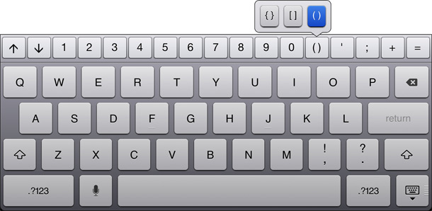
We used the real estate available on the tablet to add all the numbers to the row of extra keys. Users can access every key they need for programming from the main keyboard and its pop-ups (see Figure 8).
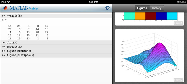
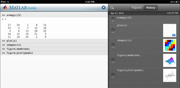
We also provided larger figures with the recent commands (see Figure 9) so that users have less need to switch to the full-figure view. When users do need to see more detail, the full-screen figure is larger, so they can see the data more easily.
The tablet interface also includes a toggle so that users can view the Command History at the same time as the Command Window, and they don’t have to switch between the two to rerun commands (see Figure 10).
Challenges with Cloud Connections
Users generally expect mobile apps to run locally on their device and to be very responsive. Our app connects to the cloud to access our computing engine, and cannot always provide results immediately. For example, zooming figures or viewing data values requires data transfer that takes longer than users expect. We had to find ways to make the system respond while bringing back computation results from the cloud.
Lesson Learned: Design intermediate feedback so that your app has a chance to complete a command in response to a user’s input.
Zooming Figures
So that the app feels responsive as users pinch open to zoom on a figure, the app zooms in on the local image. This allows users to check that they’re zooming in on the right area of the figure (see Figure 11). When they stop pinching, the app shows a progress indicator while it brings back new data from the cloud. Then, the figure is updated with the additional detail.

Viewing Data Values on Figures
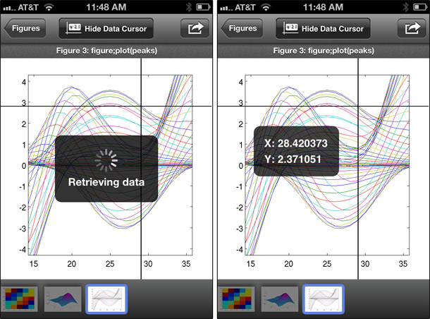
We initially used a tap-and-hold gesture to bring up the crosshairs for selecting a data point on a figure. Unfortunately, users had trouble discovering this interaction. Even when they discovered and moved the crosshairs, nothing happened immediately because the app was retrieving the values from the cloud. Users thought the crosshairs did not have a useful purpose. In our second design, we added a progress indicator, which helped somewhat (see Figure 12).
However, the crosshairs disappeared as soon as the data values appeared. If the user selected the wrong point, then they had to tap and hold again to redisplay the crosshairs. On our third attempt, we kept the crosshairs visible even after the data values appeared, but then we needed a way to make the crosshairs disappear. So, we added an explicit data cursor mode with a button to turn it on and off.
Losing Network Connections
Because devices are mobile, users move around and can lose their network connection. To address this issue, we save users’ information and state between sessions, both on the device and in the cloud. Even when they’re not connected to the cloud, users can continue to view their recent commands and figures. Because the cloud saves the state of the last session, when a device reconnects, users can continue working where they left off instead of starting with a brand new session.
Lesson Learned: Allow users to continue working despite dropped connections by saving session information and data on the device and in the cloud.
Conclusion
When we moved our desktop application to a mobile device, we found that the primary constraints were limited real estate and unreliable connectivity to the computing cloud. Our primary lessons: include only the essential features, balance the display of user content with contextual information, find ways to provide immediate feedback even when connections are slow—and always be willing to iterate on the design.如何将功能丰富的桌面程序塞进连在云上的轻量移动应用中?MathWorks 团队从为复杂数学计算所设计的软件包中选择了一些关键功能,做成一个科学家和工程师可以在任何能够上网的地方使用的应用。本文讨论从这个案例中获得的一些经验,可以适用于任何需要转移到移动应用上的桌面程序。
The full article is available only in English.클라우드에 연결하는 경량의 모바일 앱에 압축할 수 있을까요? MathWorks 팀은 복잡한 수학 계산을 위해 설계된 소프트웨어 패키지로부터 몇몇 중요한 기능을 선택하여 과학자와 엔지니어들이 인터넷 액세스가 있는 어디서나 사용할 수 있는 앱으로 제공합니다. 이 사례 연구 기사는 모바일 앱으로 이동되어야 하는 어떠한 데스크톱 프로그램에도 적용할 수 있는 우리가 얻은 몇몇 정보를 알려 드립니다.
The full article is available only in English.Como você espreme um programa para desktop com diversos recursos em um aplicativo móvel leve que se conecta à nuvem? A equipe do MathWorks escolheu alguns recursos-chave de um pacote de software projetado para cálculos matemáticos complexos e forneceu um aplicativo que cientistas e engenheiros podem utilizar em qualquer lugar com acesso à internet. Este artigo de estudo de caso discute algumas de nossas lições aprendidas, que poderiam ser aplicadas a qualquer programa de desktop que tenha que ser movido para um aplicativo móvel.
O artigo completo está disponível somente em inglês.どうすれば機能満載のデスクトッププログラムを、クラウドに接続する軽容量の携帯アプリの中に詰め押し込むことができるのか。MathWorksチームでは複雑な数学計算用に設計されたパッケージソフトから2、3の特徴的機能を選び、科学者やエンジニアが、インターネットへのアクセスが可能な場所ならどこでも利用できるようなアプリケーションを提供した。この研究記事では、この事例から得た教訓、つまりデスクトッププログラムを携帯アプリに移行しなければならないどのようなプログラムにも当てはまる教訓について議論している。
The full article is available only in English.¿Cómo se logra meter un programa de computadora de escritorio que está lleno de funciones complejas en una aplicación móvil ligera que se conecta con la nube? El equipo de MathWorks eligió unas pocas funciones clave de un paquete de software diseñado para realizar funciones matemáticas complejas y produjo una aplicación que los científicos e ingenieros pueden utilizar en cualquier parte donde tengan acceso a Internet. En este artículo sobre el caso de estudio se analizan algunas de las lecciones aprendidas, que se podrían aplicar a cualquier programa de escritorio que se deba trasladar a una aplicación móvil.
La versión completa de este artículo está sólo disponible en inglés.


