One year ago, Karen had never used a computer in her entire life. Nor had she ever transferred money to an account in an online banking system. Bank tellers always took care of that for her. Until now.
After agreeing to participate in an online banking usability test, Karen is sitting in front of a computer feeling a bit anxious. She is full of doubt about whether this is really something for her. Maybe she has even started to regret that she made a commitment to participate in this usability test.
How does user research and research about the aging brain help designers and developers make design decisions to support people who have never used online applications before? How about those users who have found it overly demanding, or have little or no experience with computers?
Obstacles to Online Banking
A survey of digital behavior among 3,000 persons over 60 years old found that 34% had not used the Internet in the past three months. The most significant obstacles to using an online banking solution were that people did not know how to get started and that they found existing online banking confusing.
With banking services increasingly becoming digitalized, these individuals were stuck between society’s expectations and their lack of digital skills or personal motivation.
Against this background, Danske Bank, the largest bank in Denmark, created an online banking system intended specifically for this group of customers. The project was given the working title “Easy Bank,” a translation of the Danish Letbank, which in turn was a pun on Netbank, the Danish term for online banking.
Research Shows Aging Starts at 20
The human aging process starts around the age of 20. Yes, 20. Beginning at that age, the body slowly loses some of its abilities. Research from Nielsen Norman Group showed that from age 25 to 60 years, our ability to use websites declines by 0.8% per year. Based on research of senior citizens age 65 and older, researchers identified a number of challenges that seniors face when they are online. In User Experience Magazine (in 2009) Patricia Siple drew on Adam Gazzaley’s research to explain how the aging brain changes.
Determining Relevant Information
One effect of the aging brain is that it gradually loses the ability to distinguish between relevant and irrelevant information when attempting to achieve a specific goal online.
During our online banking usability tests at Danske Bank, participants were sometimes distracted by a set of links that were intended to help customers if they needed assistance during login, for example, if they had forgotten their password (Figure 1). The links were difficult for some to ignore: instead of completing the assigned usability task, participants began exploring the links instead.
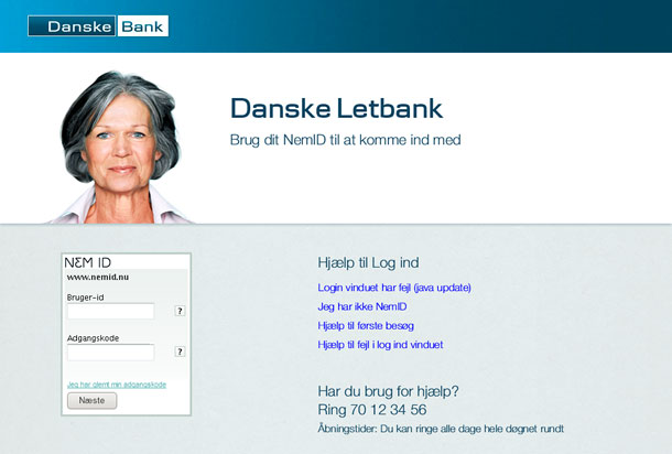
What happened can be roughly described as a kind of information overload in the senior user’s cognitive system that had dramatic consequences: not only did it slow down the processing of relevant information, but it also created a poor memory because less of the relevant information was absorbed.
Our most difficult obstacle was the challenge of showing users the most important information and reducing the less relevant information that could distract them from their main tasks. This quickly became our primary objective during the prototyping process.
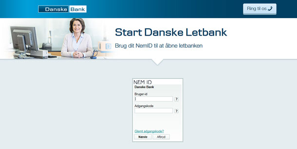
Our next design resulted in a much simpler logon page: no links, but access to the phone number for customer support (Figure 2).
Less Functionality Means Less Complexity
One important part of reducing distracting, less-relevant information, was defining a minimally viable product that consists only of functionality that would actually be used by this target group and that was also absolutely necessary to constitute a meaningful product for the users.
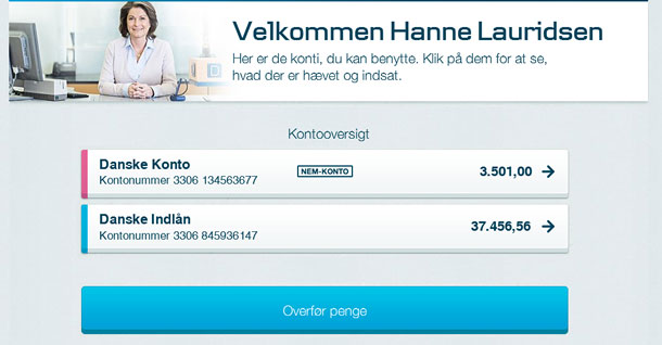
Our Easy Bank eventually consisted of only four functions—View Balance, View Transactions, Transfer Money, and Pay Bills—which are the functions most frequently used by banking customers. Also, each of the functions was stripped of specialized features and settings that would have made the experience more complex.
In this case, the small number of functions made it possible to create a UX design without a real top left or hamburger menu, reducing complexity greatly for users and enabling them to relate to only a single button leading to three actions in the usability test (Figure 3).
Wizards Instead of Form Pages
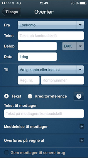
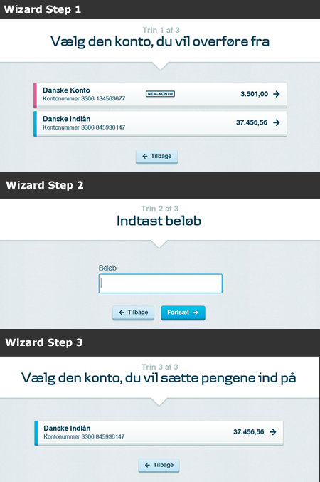
Conventional form pages leave limited room for explanatory text and force the user to consider multiple input fields at once. These form pages provide an overview of what is to be done, for example, when transferring money. Our target group needed a reduction in the number of pieces of information shown at a time, so we chose wizard flows to lead users through what had been designed conventionally as a single form page (Figure 4).
The first round of usability testing confirmed that the wizard approach was working very well for this group of users. Participants successfully progressed through a number of steps, one at a time. At each step, they entered only the information that was requested on the screen, usually in one input field per page (Figure 5).
Wizards reduced the number of factors that users had to interact with on each page. However, we found that if a page had two or more input controls that meaningfully belonged together because of interdependency, it was difficult for some users to choose the primary control first. In this particular case, the user had to pick a value in a drop-down and then enter numbers into one or two fields, depending on what was chosen in the drop-down. Test participants often entered information directly in the field without having used the drop-down first (Figure 6).
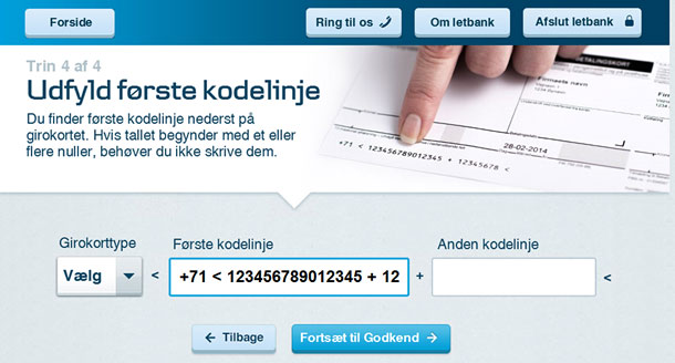
This was the most severe usability incident that occurred in our first round of usability testing. The information had to be entered correctly according to a certain payment standard. One option for solving this issue was explaining what to do to the user. But adding text to a screen that is already relatively complex would only increase the information overload.
Progressive Disclosure
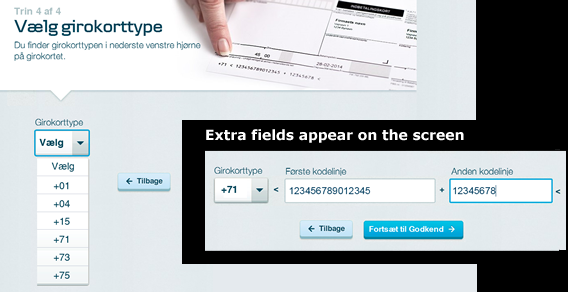
In our next round of usability testing we combined the wizard approach with progressive disclosure. In Universal Principles of Design, authors Lidwell, Holden, and Butler define progressive disclosure as gradually and progressively disclosing information to the user as the user needs or requests it. The effect is that the information is processed more effectively and is perceived as being more relevant. It also significantly reduces the number of errors.
Using a progressive disclosure design, the amount of information shown in one step was reduced even further, which had an immediate effect on the degree of complexity that test participants experienced. Now users had to first choose the type of form they needed to pay, and afterward, depending on their choice, the relevant entry fields were shown (Figure 7).
Learnability of New Technology
Learning to use a new device or a computer is like learning to master a new language. If you’ve never used a computer before, how can you possibly know what you are expected to enter in an input field such as “Amount” or “Date,” or in a search field? Research by Jakob Nielsen found that seniors have a harder time using inflexible search engines and forms and concluded that websites should be more supportive and forgiving.
Input Field Flexibility
Our usability testing showed that the input fields had to accept a wide range of date and amount formats, including types that are not normally accepted. The most obvious example was that some test participants entered the letter “o” instead of the number “0”. For that reason, we allowed the letter “o” to be automatically interpreted as “0”.
Illustrations as Guides
The target group not only had limited or no experience with computers; they also had limited experience doing banking transactions themselves. For example, some participants typically had other people pay their bills, and some had never noticed the identification number printed at the bottom of the bill. So how would they know what numbers to enter and, even more importantly, where to find them? (See Figure 8).
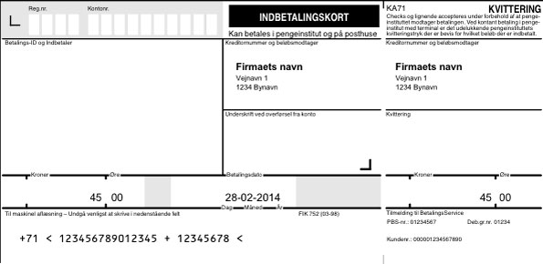
During usability tests we noticed that locating the identification number was further complicated by the fact that numbers were printed at the margin area of the bill, an area that did not even seem relevant to look at because important information was not expected there. The margin area was thus a blind spot. Additionally, the numbers were surrounded by special characters that might look strange to the inexperienced.
Usability testing revealed that illustrations showing where to find the numbers helped to some extent. But the realistic appearance of the illustrations sometimes led test participants to try to enter information directly into the fields in the illustration and not in the fields on the web page.
We ended up with a new kind of illustration that had a finger pointing at the relevant part of the bill, depending on what information the user needed to enter.
Reduced or Impaired Vision
As the body ages, the eyes also suffer a physical decline, and this is probably the best-known challenge that seniors face. In fact, as Jakob Nielsen notes, people’s eyesight is reduced enough to require a larger font as early their forties. There are also changes in color perception and sensitivity and a need for increased light because of pupil shrinkage.
High Contrast Interface, Large Font
One obvious design choice that helped users with these challenges was to implement a relatively high contrast between text and background. Another was to give seniors at least a 12-point font, as recommended by Nielsen. We set the font size relatively high, ranging from 18 to 46 points. This had the unintended consequence of forcing us to keep screen text to a minimum because of the space needed for large fonts.
Discernible Input Location
Our research also showed that it can be challenging for some seniors to spot the blinking cursor on the screen and to see where input from the keyboard appears. To overcome this challenge, we added cyan blue borders to the active field on the screen (Figure 7).
Back to Karen
At the beginning of her usability test, Karen was feeling doubtful when she sat down in front of the computer and started using the new online banking system. As she carried out the tasks one by one, she gradually began showing more and more confidence. When she had completed the tasks and the debriefing interview began, she suddenly said, “This is actually easy to do. I had imagined that it would be harder. The explanations are really great.” And then she added, “You can hardly do anything wrong. I would no longer be afraid to use it.”
All Users Benefit from Forgiving and Supportive UX Design
As we said, our brain and the rest of our body gradually begins to lose the ability to use websites and other digital solutions starting about the age of 20. For that reason, we need to start designing for the aging brain and body long before people turn 65.
Senior citizens are sensitive to usability problems and do not recover as easily as other users. Including seniors in our target group sets the bar even higher for what qualifies as an easy and usable UX design.
Streamlined UX Design Helps the Distracted User
We can all benefit from an increased focus on UX, not just because aging happens to us, too. Consider how we use mobile digital devices in contexts that are very different from the conventional office desktop setups where users focus their full attention on the interface and the immediate task for which the interface was designed.
Today, customers do online banking while they are on a bus, on their way home from work, at the dinner table during a conversation, or in the living room talking with the rest of the family or while the television is on. They are often multitasking and only directing part of their attention toward the device or computer. Additionally, light reflections hit the screen, which is also likely to be moving and shaking.
Such situations are far from ideal, and they affect our ability to process information from digital devices. The human cognitive system does not have the capacity to process all available information systematically, so it must select what to focus on and what not to focus on.
This means that we must design digital solutions for users who deliberately limit their cognitive capacity for a specific task by not giving it their full attention and are multitasking instead.
In this regard, we all benefit from UX design that mitigates the challenges that seniors face—a forgiving and supportive UX design that allows us to have an aging or a multitasking brain.