I discovered AI video editing the way a lot of us did—first with curiosity, then with a little obsession. One evening, I downloaded a couple of new apps, tools like HeyGen™ and Capcut™,and I tried to turn a rough idea into a video clip a few seconds long. It worked… sort of. I typed a prompt, waited, and got a video that was almost right, but the pacing was off, the tone drifted, and a few shots didn’t match the script in my head.
So, I did what the products invited me to do: I prompted again, and again.
It’s the pattern most of these tools are currently built around:
prompt → output → prompt → output
They iterate until the user either gets lucky or runs out of patience.
When the results fail to resonate with the user, it’s easy to blame the underlying tech. Video generation models and editing copilots are still early; they hallucinate visual details, they struggle with continuity, and they flatten nuance. It’s a common experience. But after a few of my sessions, I have realized something important: Even if the models were perfect, the UX is still asking users to work in the dark.
The biggest friction isn’t that AI is immature. The biggest friction is that I couldn’t see why the AI did what it did, and I couldn’t intervene at the right level. I could only react to the final output. It felt like directing a production crew that never shows you the shot list, never explains the edit decisions, and only lets you shout notes after the cut is locked.
This is where proof-first UX can help.
The Core Problem: Iteration Without Insight
Prompt-based creation is seductive because it feels simple. Supposedly, the user can describe the thing they want, then get that thing. But creative work rarely fails because the description is wrong. It fails because of these oversights:
- the tool made assumptions the user didn’t know it was making,
- constraints were applied silently, including eye movements, the angle of the characters, camera position, time limits, style defaults, or asset choices, and
- the system took a chain of steps that the user never got to review.
Note that many apps are now giving the option to choose avatars as assets, and the AI creates videos from these assets. Yet some or many assumptions are still being made.
Then, the user debugs through guesswork:
- “Maybe I should specify the camera angles.”
- “Maybe I should mention the emotion.”
- “Maybe I should tell it to avoid jump cuts.”
- “Maybe it misunderstood the vibe.”
This loop is expensive. Not just in time, but in confidence. The user starts to feel like the outcome depends on secret rules, not skill. That is a UX problem because the experience is designed around outputs, not around understanding the user’s why and how behind the output.
What Proof-First Means (In Human Terms)
When I say proof, I don’t mean mathematical proof… obviously. I mean this: Visible reasoning artifacts show what the system believes, what it chooses, and why.
A proof-first interface treats the AI’s output as the end of a process that the user can inspect, not a magic trick that the user can only accept or reject. In practical UX terms, proof-first means the system answers these questions before the user asks:
- What did the system assume?(audience, tone, pacing, style, content boundaries, and defaults)
- What steps did the system take?
(script, storyboard, shot selection, edit plan, timing, transitions, and music) - What evidence did the system rely on?
(user’s prompt, chosen templates, referenced assets, or learned prior style) - How confident is the system? Where is the system guessing?
(low confidence on scene continuity, uncertain brand tone, or ambiguous subject) - Where can the user intervene, and what happens if they do?
(edit the plan, not just the output)
This is the key shift. Don’t make users iterate on the prompt to fix the plan. Let them adjust the plan directly, as much as possible, unless the user realizes the prompt itself is wrong or should be improved.
Why Video Tools Feel the Pain First
Video or even visual assets are a perfect stress test because they have so many moving parts:
- narrative structure (beginning/middle/end)
- pacing and rhythm
- continuity and shot coherence
- visual style
- artistic choices
- music and audio cues
During my research, I did find that the HeyGen output, via the chat editor, always lays out a storyboard of the act before confirming the video-generated output. But a single prompt is a tiny interface for a huge design space. The AI must fill the gaps. Ultimately, every gap becomes an assumption. When assumptions are hidden, users can’t discern whether the tool is misunderstanding them, overfitting a template, or simply limited by available assets or model capability. That ambiguity forces the user into repeated prompting, which may seem like creative iteration but often behaves like trial-and-error debugging.
A Practical Framework: The Proof Ladder
The proof-first UX framework approach can increase transparency and user control, but it does add a bit of complexity to the workflow. The key is to keep the proof succinct and contextual, so users can understand what the system is doing and intervene only when needed.
Disclosure of Defaults
Why it matters: Users stop fighting invisible parameters.
When the user does not specify key settings, the AI should show the defaults applied, such as target duration, aspect ratio, tone, pacing, music genre, and caption style. This helps users understand the baseline that the system is operating from and prevents users from fighting invisible parameters that quietly shape the output.
Disclose these default parameters:
- pacing (fast cuts)
- how many seconds each act takes
- lighting assumptions
- character looks
- emotions
- eye movements
- and more
Assumption List
Why it matters: Users can correct the interpretation rather than rewriting the whole prompt.
The AI should explicitly surface the assumptions made from the prompt and context, for example, whether it assumed a playful tone because the user used casual language or emojis. Displaying these assumptions lets users correct the interpretation quickly instead of rewriting the entire prompt to steer the model back on track.
Explicitly list inferred choices, similar to these AI writing tool examples:
- “I assumed you want to avoid sensitive claims, so I softened absolute statements and removed phrasing that sounded like a guarantee.”
- “I assumed your audience is non-expert, so I avoided jargon and added simple definitions where terms could be ambiguous.”
Plan Preview (Edit Blueprint)
Why it matters: The user reviews the cut before the time and their credits are spent consuming generation.
A plan preview gives users a fast way to sanity-check the cut before spending time on generation, and it reduces wasted iterations when the plan is misaligned. I really love the direction some apps are taking by first generating a quick storyboard and then explicitly asking the user, “Hey, is this what you actually want?”
An edit blueprint includes these:
- script beats/captions
- shot list (Scene 1: close-up, Scene 2: wide, etc.)
- timing marks
- transitions
- audio cues
Inline Intervention
Why it matters: Inline intervention reduces the need to prompt around without controls.
A proof-first UX could make the proof editable so users can adjust key decisions before full generation, such as swapping a shot type, changing pacing for a segment, locking brand colors for captions, choosing a music energy curve, or even enforcing continuity rules such as keeping the same outfit across scenes when swapping a shot type. Inline intervention should help users steer the result with fewer cycles.
Note that it is somewhat debatable whether many users want to do infinite editing up front, or would rather see a first draft and react to it. It does add system complexity because generation is already in motion, and interrupting or rewinding mid-run is not trivial. A practical middle ground might be to keep interventions minimal and optional; a solution could be a system that includes a few high-impact knobs rather than a full editor.
Traceability and Diffs
Why it matters: Users trust the system because they can see the cause-and-effect.
When the user changes a parameter, show what changed:
- “This update shortened Scene 2 by 1.2s and removed a transition.”
- “Music was re-timed to match the new cut points.”
Confidence and Constraints
Why it matters: Users identify the problems accurately.
Expose uncertainty and constraints, so users know what the system is confident about and where it is improvising. The AI can indicate low confidence in scene continuity in a specific setting or a constraint where no matching B-roll was found, so a substitute was used. Understanding confidence and constraints helps users identify problems accurately and decide whether to tweak the inputs, provide assets, or simply accept the limitation and move on.
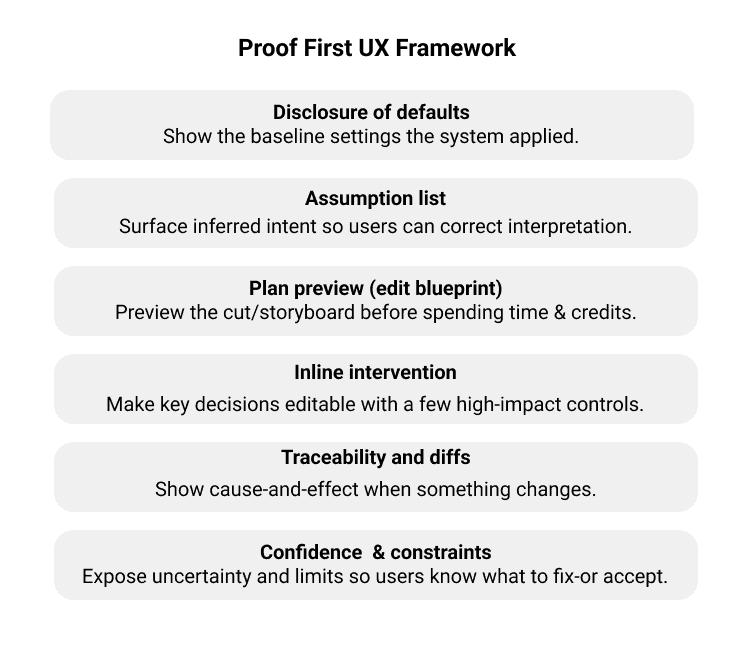
Figure 1: Proof-First UX Framework.
Will Users Actually Use the Proof?
This is the right skepticism. More transparency may seem helpful, but users don’t like additional steps. In reality, people may not read the proof all of the time. Users may skim it when the output looks fine and rely on it only when something feels off or when it’s high-stakes. So, the answer isn’t to show everything. The answer is progressive proof: The proof is minimal by default, expanded when there’s a mismatch, and includes deeper details and evidence for power users who want to trace differences. Users will skim the proof when the outcomes are acceptable and rely on it when the outcomes are wrong or high-stakes.
In other words, the proof should be available for users when they need it.
Table 1: Pros and Cons of Proof-First UX
| Benefits | Trade-offs |
| Fewer prompt loops: Users fix the plan directly.Higher trust: Users see why outcomes happened.Better learning: Users learn what inputs matter (and why).Better collaboration: Artifacts in the proof become shareable (“Here’s the cut plan, approve?”).Clearer failure modes: Limitations are visible, not mysterious. | Complexity creep: Too much proof becomes noise.Cognitive load: Some users just want to make it good enough.Perceived friction: An extra step can feel slower if it’s not designed well.False authority risk: Proof can make weak decisions seem to be legitimized.Privacy/IP concerns: Traceability requires careful handling of assets and prompts. |
These cons aren’t reasons to avoid proof-first UX. They are design constraints to keep the proof succinct, contextual, and editable.
Designing for Steerability, Not Surprise
Currently, many AI creative products optimize for wow moments: the instant reveal and the dramatic before and after. But sustained use, especially by professionals, depends on something less flashy: steerability. Proof-first UX is ultimately a steerability strategy. It turns a generative system into a partner, one that can explain its draft, take direction, and adapt without forcing users to resort to ever-more-elaborate incantations.
If you’re building AI creation tools, my recommendations are simple:
- Treat the prompt as an entry point, not the whole interface.
- Make the system’s assumptions visible.
- Let users edit the plan before the render.
- Use progressive disclosure so novices aren’t overwhelmed.
- Expose confidence and constraints, so users know what to fix and what to accept.
It can be argued that proof-first UX is really just about getting better at prompts and that there’s a cost to that framing; however, that quietly shifts product responsibility onto the user. “Just write a better prompt” is often what people say when the interface doesn’t expose the controls that users need.
This argument is brittle when small wording changes can lead to big swings that become hard to debug as something goes wrong. A single prompt interface doesn’t scale as workflows get longer, rather it becomes more constrained or more collaborative. Prompt craft matters, but as a control surface, it’s a tax requiring users to do translation work that the product could make explicit. In other words, prompt craft is what users invent when the product won’t let them steer.
Proof-first UX reduces the tax on users by turning intent into something users can inspect and edit, rather than prompts they must rephrase until the model finally guesses correctly.
The future of AI video editing isn’t one perfect prompt. It’s a workflow in which the user can say:
“Show me what you’re about to do…
then let me change it…
now render.”
That’s proof-first UX. And it’s how we stop prompting for luck.

Bhakti Bathia is a Senior UX Designer and human-computer interaction practitioner with experience across India, Japan, and the United States. Her work spans digital reading and shopping experiences, industrial IoT interfaces, and AI-driven UX, with a focus on designing clear, trustworthy systems that scale under real constraints. She has led UX for products showcased at major industry venues, designed interaction models for emerging modalities like voice, and built AI-assisted reading experiences used at scale.
User Experience Magazine › Forums › Proof-First UX Framework: Stop Prompting for Luck and Design for Accountability