Case Study: An Educational App
I am the co-founder and Head of Product of a Software as a Service educational technology called Eli Review (or sometimes referred to as Eli). My colleagues and I created Eli as part of a research project at Michigan State University, and I wrote the code and built the database for the prototype. As we were building Eli, we did not imagine that this proof-of-concept would become a commercial product with a global user base. We were our only users, along with our co-located students: all of us in the same building—usually in the same room—working synchronously.

Because we were our only users, I built the prototype based on our understanding of and assumptions about teaching and time. In our classrooms, every assignment was assumed to have a deadline of 11:59:59 p.m. in Eastern Standard Time (EST), because that is how we typically structured our due dates and that is the time zone where we and our students lived. The prototype had no way of measuring time at all; submissions were either recorded on the due date or not.

When the product was commercialized, our developers wrote new code, but copied all of the assumptions from the prototype, including those about time. As a result, instructors who valued specificity in measuring the timeliness of student submissions were frustrated. Instructors and students living anywhere outside of EST, such as our earliest users at Washington State University or San Francisco State University (both in Pacific Standard Time), struggled to understand when things were due. Our users in Sweden and Singapore had to work even harder to coach students in how to translate Eli Time into their local time.
We learned the hard way about the cost of those assumptions: not just about how time works in technology, but also how our users experienced it.
The Messiness of Measuring Time
Humans have been keeping time for at least 20,000 years. There is an entire field of study—horology—devoted to it. In the United States, the National Institute of Standards and Technology (NIST) has a Time and Frequency Division dedicated to precision timekeeping. NIST provides the “official time” for the entire country while the U.S. Naval Observatory Master Clock draws from the NIST clock and provides regular time updates to everything from satellites to kitchen stoves.
Time is incredibly messy, especially as humans have tried to standardize its measurement. For example, February 30 happened twice, there was no December 30, 2011 (in American Samoa), and then there was the whole Y2K affair (fear that computers worldwide would fail at midnight January 1, 2000). Time zones, recurring events, leap seconds—all of these methods for observing time are attempts to account for the rotation of the Earth and its rotation around the Sun.
Formatting Time Values
A critical aspect to working with time, even before considering databases and interfaces and functions, is how to format time data. Two of the most common formats are Coordinated Universal Time (UTC, a replacement for Greenwich Mean Time) and the International Organization for Standardization (ISO) standard 8601.
Developer Zach Holman offers a definitive breakdown not only of the history of timekeeping, but specifically of UTC vs. ISO 8601 formatting in his web article “UTC Is Enough for Everyone…Right?” The key distinction between the formats is that UTC does not have time zone data embedded in it because it is a time zone (the universal one). ISO 8601, however, can include an offset from UTC so that the time zone in which the date was recorded can also be stored with the time value itself.
Table 1. Time zone formatting example.
| Format | Time Formatting | Example |
| UTC | YYYY-MM-DD HH:MM:SS | 2019-01-31 23:59:59 |
| ISO 8601 | YYYY-MM-DDTHH:MM:SS+/-HH:MM | 2018-05-28T15:47:57-08:00 |
As Holman noted, there are lengthy and ongoing debates over which format is better. One of the key factors in deciding is the method in which the time data is stored and computed.
Databases and Computing Time
Educator/entertainer/developer Tom Scott produced a fantastic video breaking down the problem of designing programs that deal with time: the complications of time zones, leap years, historical changes, and the occasional leap second. His conclusion is that it is madness to maintain your own time system, so instead rely on libraries or plugins developed by people who have dedicated their lives to understanding these strange rules and exceptions (and to thank the programmers).
Our app was built to utilize a MySQL database, and it has very specific rules for how it handles time. Most importantly, it has two different data types that support time data at the level we require: DATETIME and TIMESTAMP. In both cases, time is stored in UTC format by default. DATETIME is a constant value, while TIMESTAMP is transformed relative to the server’s time zone setting. So, 8 p.m. remains constant with DATETIME, but if the server settings change from EST to PST, 8 p.m. becomes 5 p.m. with TIMESTAMP.
Table 2. Time formatting example.
| MySQL Data Type | Time Formatting | Example |
| DATE | YYYY-MM-DD | 2019-01-31 |
| TIME | HH:MM:SS | 23:59:59 |
| YEAR(2) | YY | 19 |
| YEAR(4) | YYYY | 2019 |
| DATETIME | YYYY-MM-DD HH:MM:SS | 2019-01-31 23:59:59 |
| TIMESTAMP | YYYY-MM-DD HH:MM:SS | 2019-01-31 23:59:59 |
To further complicate issues, neither DATETIME nor TIMESTAMP can store values in ISO 8601 formatting without a heck of a lot of effort; some experts argue that it is simply not safe to store ISO 8601-formatted dates in a MySQL database. The only alternative, then, is to store all time in UTC and then localize the time for each user by converting UTC into their local time zone.
The UX and UI of Time
Everything so far has been about laying the infrastructure to make sure the values needed for working with time are in place. In the case of UX and time, if the database does not contain time data (for example, the DATE data type), there is no way to represent time back to the user. But with time data stored properly (for example, the DATETIME data type), there is a lot more freedom in how to represent time.
To display time information for the user in any kind of UI, some work needs to be done to transform UTC values into something recognizable to non-technical audiences. This can be done on the server side using functions like the DateTime format in PHP or, on the client side, using Javascript libraries like moments.js to transform DATETIME values into appropriate, useful strings (for example, “January 1, 2019”). For front-end engineers, the W3C has specific rules for time operations.
Fixing Our Time Mess
Having done our homework on how time works technically, we set about understanding how our users (teachers and students) specifically experience time and how the app could evolve to support those experiences.
User Stories and Time
In the six years between the release of the commercial version of Eli Review and our decision to improve its time features, we heard from many, many users about their frustrations and hacks. Before any sketching or drafting of requirements, I worked with our team and our users to condense those years of feedback into the following user stories:
- As a user, I want the system to recognize my time zone and display all times in my local time so that I do not have to do that math myself.
- As a teacher, I want to specify the time a submission is due, not just the day.
- As a teacher or a student, I want to see the timeliness of an assignment submission so that I can know how early or how late it was turned in.
- As a teacher, I want to know the time zones in which my students live and their difference from my own so that the due dates I choose avoid as many conflicts as possible.
The biggest lesson we learned while coming to understand the scope of these use cases was that not only would it make the system better meet user needs, but that it is an important example of inclusive design. It is not exactly the same as the A11Y Project and issues of accessibility, but not respecting time and time zones definitely makes the earlier version of the app less inclusive and usable for people who do not live in Eastern Standard Time.
With the user stories in mind, I prepared an extensive set of requirements for our developers. I determined how the UI for selecting dates and times would change (primarily by choosing a new third-party “datepicker”). I also combed through the entire app, documenting every instance where time surfaces in the UI and describing in detail how that instance needed to change.
What Changed
The following is a brief summary of all of the high-level changes to Eli Review that were required to support our new time-related user stories.
- System time zone: We chose to adopt UTC as our time format and to localize time for users based on their time zone settings.
- Database: Every instance of a DATE field in the app’s MySQL database was changed to a DATETIME field, making it possible to store time in all instances.
- Date picker: We chose to have a new UI tool for selecting both dates and times.
- Date difference: The system required a simple function to calculate the difference between times, which was important for instructors who wanted to assess the timeliness of student submissions.
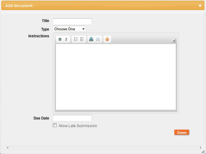
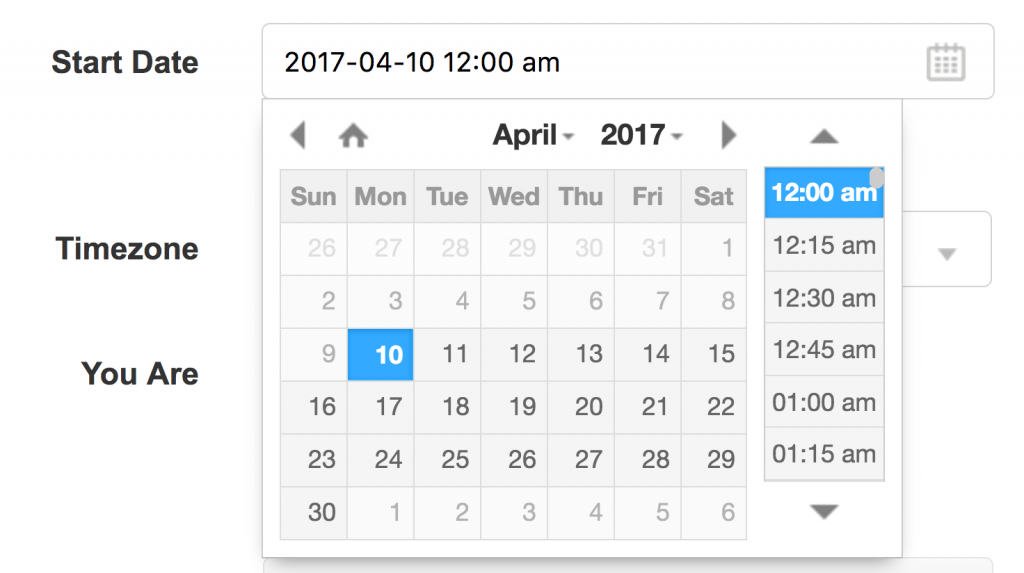
The first noticeable change in the UI was the addition of time options to all date inputs. As demonstrated earlier, the app only allowed users to enter date information (in the MySQL DATE format YYYY-MM-DD), but for this improvement I chose an open-source datepicker by XDSoft that would enable convenient date and time selection. Our developers used it to replace the jQuery UI datepicker, and it made a tremendous improvement, both functionally and aesthetically.

The second noticeable change is the addition of the “Timezone” select menu to our sign-up form and account settings. The dropdown has time zones generated from a list maintained by the Internet Assigned Numbers Authority, so it includes unique cases, such as Arizona not recognizing daylight saving time. The browser also makes a best guess at the user’s local time using browser data, when available, and selects that time zone automatically.

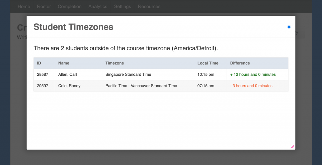
Student Time Zone Summary: For the use case where instructors need to know student offsets, we added a new “Student Timezones” display for instructors that could be opened via a link next to each date picker. This modal window offers a reminder of time differences for students who live outside the course time zone. It has proven to be a particularly helpful feature for instructors in fully online courses who have to think about how due dates affect students who live around the world.

Task Submission Report: With a new time comparison function, I was able to use time data to give instructors a class-level view of all submissions and student timeliness. The report uses both text and color to flag students who did not complete their work by the deadline, which makes it easy for instructors to see who is engaged and who is not.

Course-Level Completion Report: With the task completion report done, I was able to abstract one level further to help instructors see timeliness over the duration of an entire course. This report uses colors and iconography to identify which students have completed their tasks on time and which students are struggling. The report also collapses into a text version for a screen reader to ensure its accessibility.

Takeaways
Helping our users hack their way through a lack of time support for so many years taught us a few (painful) lessons about software development. Primarily among those lessons include the following:
- Find and test assumptions early: It was not until well after the prototype had been commercialized that we realized the corner we had painted ourselves into by assuming the only variable that mattered was a date. We did not know enough to interrogate ourselves early in the process. If we had, we might have converted more customers and saved the time and development money required to fix it.
- Do not underestimate how users test a system: Students are notorious for pushing boundaries and gaming systems, and it turns out that time and due dates are one of the most common ways they will do that. As we were developing time support, it became clear that students would push deadlines to the point where submissions needed to be tracked down to the microsecond, not unlike the stock exchange, where a microsecond can mean millions of dollars.
- Keep listening: More time-related use cases have arisen since we released the updates, including custom deadlines and grace periods.
When it comes to time, there are specific things that can be done to keep the user experience in mind.
- Check your own bias: One way I have continued working against my EST bias is to add the time zone whenever I reference time, particularly in work emails, as a reminder to myself that others may see a time reference and not know what I mean. For an even more user-centered approach, consider including both your time zone and the time zone of the recipient.
- Focus on time: Identify the ways in which time affects users and develop time-specific use cases to make sure those needs are addressed.
- Discuss time with developers: Work with database engineers early to ensure time needs are addressed before any code is written.
- Make a list of time functionality to test regularly: In addition to the basics of QA testing (for example, does form data save correctly), consider testing the following time-related functions to make sure they work as expected:
- List / sorting: Does chronological sorting work as expected?
- Calculations: Is the math that compares two dates correct?
- Time zone changes: Is the list of time zones in select menus updated regularly?
- User localization: Are dates formatted appropriately for users in different locations?
Finally, one of the biggest takeaways is to think about where the data populating an interface comes from. UX implications are obvious on the surface level, but when we need to make changes, decisions made far below, all the way down to the database, can dramatically affect how users interact with our products.
