A number of factors affect the success of a product, such as whether or not it fulfills user needs, market opportunities, cost, functionality, technology, and user experience. Arguably, the strongest factor is the approval of users.
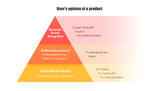
When users engage with a product they experience a range of emotions, some of which are positive and some negative. In turn, those emotions affect user adoption. For example, users might stop using an app if certain processes confuse them, or they might keep using an app if they find it delightful and easy to use. Ultimately, positive emotions may result in a bond between users and a product contributing to the approval of users.
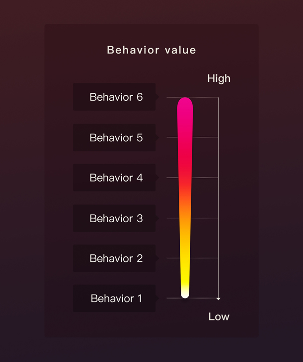
Useful and reliable interactions meet the basic demand of users, while good experience builds emotional dependence of users on a product. Persistent dependence generates brand recognition and brand loyalty. As brand loyalty is built, the mindset of users shifts (see Figure 1).
In the face of homogenous competition, we have to discover the specialty of our products to win the market. For example, we might provide extra services or a superior user experience. In order to discover the best way to refine products and win the market, a systematic approach to tracking user behavior and deducing emotion is necessary.
Building a Model
To build brand loyalty, we must capture detailed user behavior and subjective feedback for every key area of our product, understand which aspects evoke neutral, good, or bad emotions, and identify areas of improvement. When assessing the performance of a product, most businesses only focus on Key Performance Indicators (KPIs) such as Daily Active Users (DAU), Monthly Active Users (MAU), Pageviews (PV), and Unique Visitors (UV). However, those KPIs do not reflect the reason and emotion behind user behavior.
As a user interacts with a product their perceptions and emotions are dynamic and multifaceted. A positive experience when interacting with an icon inside an app, for example, might look something like this:
- Sense: See the icon
- Recognize: Recognize the meaning of the icon as something familiar
- Understand: Know the consequences of action when selecting the icon
- Act: Take action with the icon
- React: Determine if the consequences of selecting the icon met expectations, and feel satisfied if expectations were met
To get a more thorough understanding of each KPI they must be split into several single targets that correspond to specific areas of interest within a product. Understanding the reasoning and emotions behind the user behavior reflected in a KPI provides us with more guidance to make improvements.
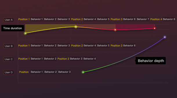
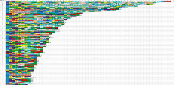
Although user behavior tracking models based on big data are widely used in the industry, each product is unique and requires its own model. Figure 2 shows a four-user sub-section of a user behavior model built for an app, and Figure 3 shows the full raw data with many users. The data contains the following elements:
- Position: A section, page, or control of interest within the app that a user interacted with and that a product team had an interest in tracking
- Behavior: The action taken by users in each position (see Figure 5 for example behaviors)
- Behavior depth: The level with which users interacted with positions of an interface
- Time duration: The length of time users stayed in each position
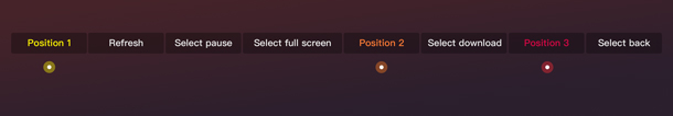
When creating the model, positions and the behaviors at those positions should be defined to mirror the objectives of the research. Businesses typically consider some behaviors to be of higher value than others, and those high-value behaviors should be captured in the model in addition to some moderate and lower value behaviors that may be helpful in providing context and building a story (see Figure 5).
Analyzing Data
The general research process we follow starts with compiling the behavior route for all users using big data (for example: viewed pages, selections, exit pages). Embedded in the position and behavior data is each user’s stopping position. At the end of each row on Figures 2 and 3 you can see the position (page or function) where users exited the app. Since behaviors often reflect mood while users experience an app, there was likely some reason they exited the app. Having those data allows us to hone in on where users ended their session and study that area of the app in more detail. We can also detect when a user didn’t finish a task we expected them to finish, when they spent too much time in a certain position that we thought they might move through quickly, when users took a different path than we anticipated, and when there were irregular selections due to misunderstandings.
After capturing and analyzing the user behavior data, we can conduct additional qualitative research to assess understandings, pain points, and the emotional changes of users while they interact with a product. For example, we can interview several short-path users to explore the reasons why they left a product prematurely.
This process allows us to create a comprehensive story of the user behavior path so we can locate real problems within the product and design effective solutions. Those solutions can then be used to conduct additional quantitative and qualitative research.
A Case Study: The Bubble Area Within the iQIYI App
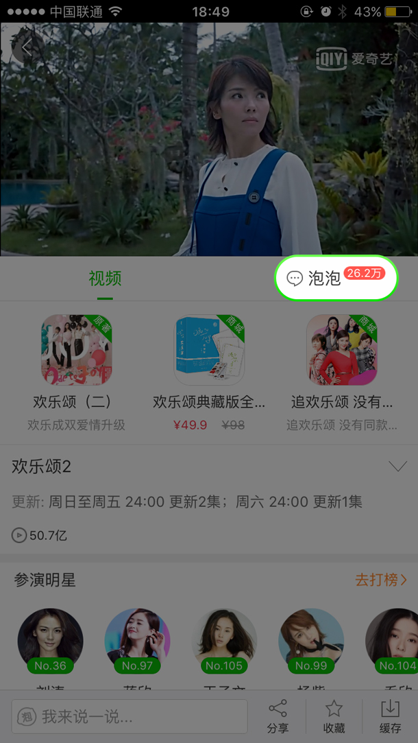
To illustrate how a user behavior model can be used to iterate on a design, we will use the Bubble area within the iQIYI app as an example. In the Bubble area of the app, users often watch videos and comment on them. As a business, we consider comments on videos to be high value behavior since commenting is often associated with users spending more time in the app and being more engaged.
The target users of Bubble are fans. The fans can follow their idols, express their feelings towards the idols, make friends, and communicate with their idols online. Sometimes celebrities are invited to Bubble to interact with their fans, for example, when introducing a new movie or TV show. We wanted a better understanding of whether or not we were providing a good video viewing and commenting experience for users and if there were any improvements we could make.
Iteration 1
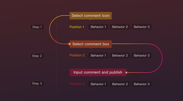
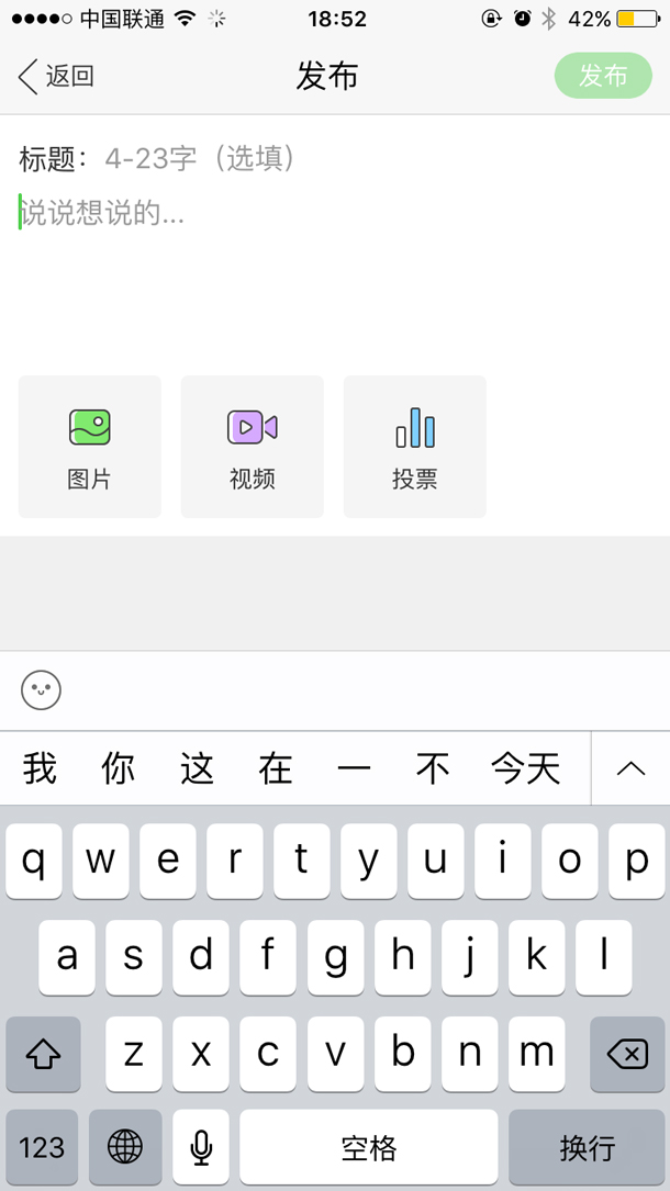
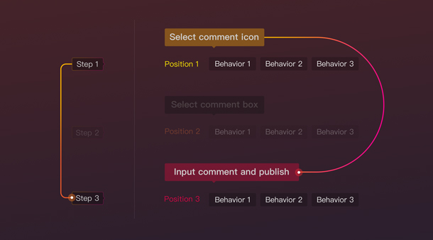
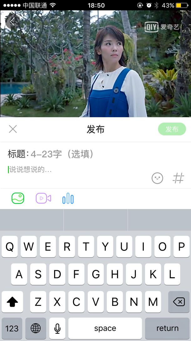
To post comments using the first iteration, users were required to follow a multi-step process (see Figure 6):
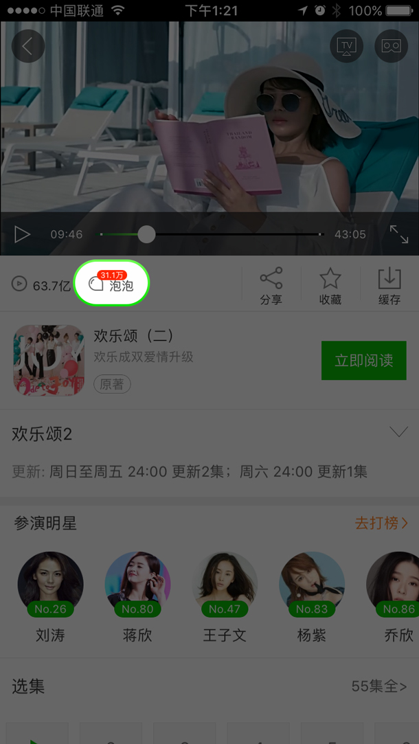
- Select the comment icon (in the red circle in Figure 7)
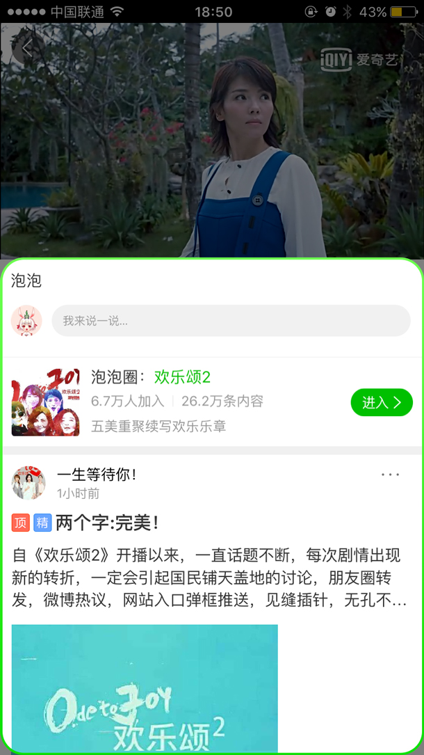
- Read the comments on the comments overlay and select the comment field to go to the comment page (see Figure 8)
- Publish comment (see Figure 9)
Our KPIs were Video Views (VV) and engagement (number of comments, shares, and saves). Our data showed less than ideal engagement with the comment area of the screen and a low number of published comments. The number of users commenting on the video was far less than those saving, sharing, and downloading videos. We were able to identify several problems with the first iteration:
- Users did not realize there were comments on the page.
- Users did not understand they had to refresh the comments area to see new comments.
- Several steps were required to publish a comment.
Iteration 2
For the second iteration, we added an input bar for users to directly type comments on the page (see Figure 10). Additionally, we added a refresh button on the input bar so that users could select it and receive the newest comments (see Figure 10).
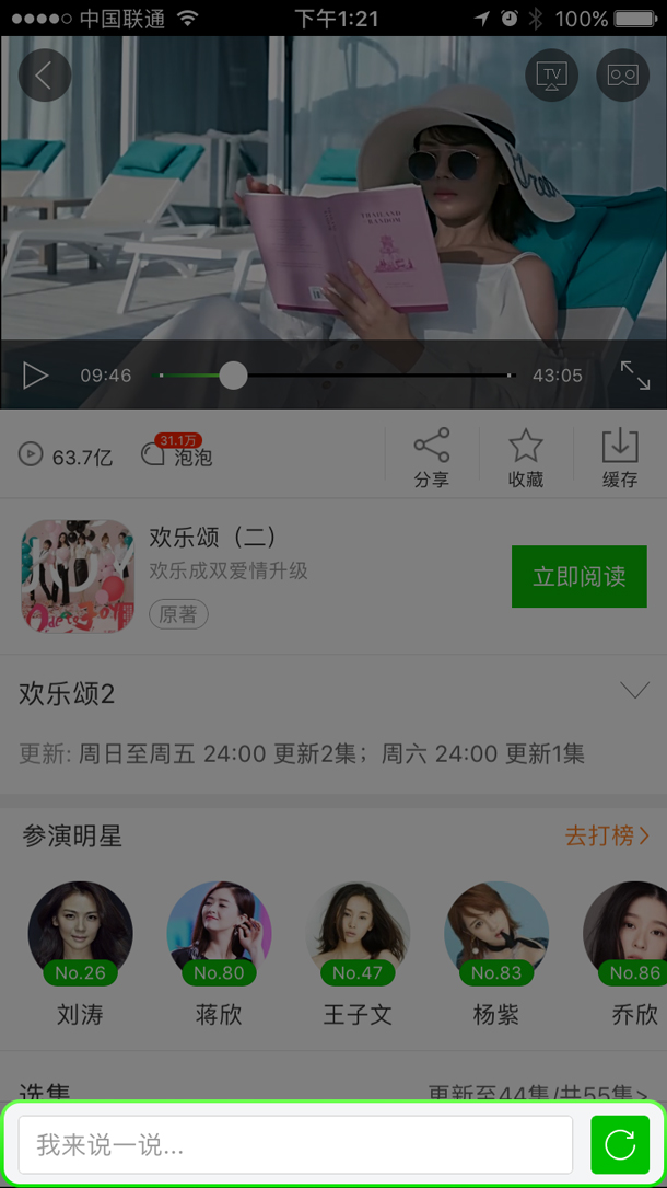
In the second iteration, users only needed to take two steps to publish comments. They no longer had to go to a separate page to input comments like they did in the first iteration, resulting in a more streamlined interaction. The improved user flow is shown in Figure 11.
Our quantitative and qualitative data allowed us to identify several more remaining problems with the second iteration:
- Users didn’t understand the meaning of the refresh button and didn’t know what it did. They assumed it would reset the video player page or erase a comment they had entered, so they very rarely selected it. This issue was discovered during face-to-face interviews.
- Users didn’t understand the comment icon.
- When users selected the input field, the input page covered the video player, which interrupted the process of video watching. This was observed in the data as users abandoning the comment page without entering a comment.
Iteration 3
We made further improvements and created a third iteration that used a two-tab design—one tab for video and one tab for comments (see Figure 12).
The default view upon first arrival was the video tab. To read comments users had to select the comment tab (Figure 12). To refresh the comments users could drag the page. We also changed the Bubble icon into one more understandable, similar to a comment or message icon. The input bar stayed on both of the tabs so users could select the input field at the bottom of either tab.
We also refined the input page into a half page so that users could make comments as they watched videos (see Figure 13). Because of the new tabs, the save, share, and download buttons were relocated to the bottom bar to the right of the input field (see Figure 14).
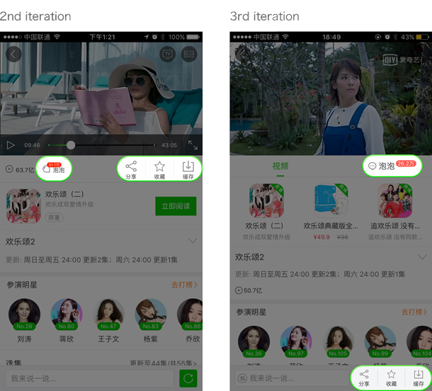
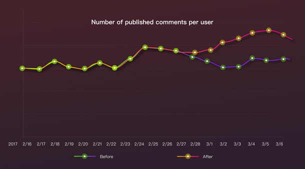
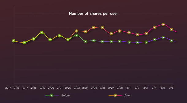
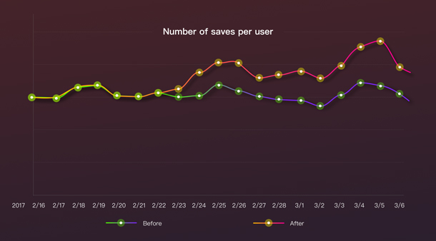
After those changes, the number of published comments per user increased significantly (see Figure 15). Additionally, engagement with the share and save features increased (see Figures 16 and 17), while the download activity remained similar to what it was before.
Originally, we were worried that adding a tab would narrow the space beneath the video player, limiting the amount of content we could display, and reducing the amount of interaction with Bubble and other video content. However, the data showed that t did not happen. We speculate that the increased market share of phones with larger screens allows us to fit more content, in general. We also tweaked the height of the tab to minimize how much screen space we were using. If users were interested in comments when on the video player tab, they could easily select the comment tab to view the specific Bubble area dedicated to communication via commenting.
Conclusion
In general, users experience positive or negative emotions towards a product and brand by using and feeling the details of a product. By building user behavior models to capture data on business objectives, we can assess user attitudes towards our products and take further action to make improvements.

Li Wei works at iQIYI, a Chinese entertainment company that provides streaming media and related service. As a design director, Li Wei leads a user experience design department of around 100 designers. He focuses on design strategy/management and enjoys systematic design methods to balance business needs and the user experience.