About a year into a very complex, long-term project, we were sitting in a design meeting when our project manager turned to us and asked, “How are we doing with usability? How will we know that we found all the usability issues and we are ready to ship?” If you were in the room with us, you should have seen our reaction! We were surprised to say the least. We had been reporting on the usability testing outcomes on this project all along; how could he not know if we were ready? After we closed our jaws and took a few deep breaths, we teased him a little by saying, “Weren’t you there for our presentations?”
Have you ever been in this situation? Does this sound familiar? The project manager was paying attention, yet he didn’t have any insight into the readiness of the product for our customers. We asked him what information was missing. He replied, “We are tracking other sub-teams’ progress over time, but I don’t have anything for the UX team. Can you provide something like a scale from 1 to 10 to show how usable our product is?” We agreed to come back to the next meeting with some ideas.
We already had a comprehensive UX process that included user research, product definition, and iterative usability testing. We had always felt that by following our UX process we would have discovered and fixed all important usability issues so a product should be ready to ship at the end of our process. We reported UX progress metrics that were based on the number of usability studies completed and their outcomes. Apparently, this wasn’t a very effective way to communicate. So what metric(s) would be better to describe the level of product readiness from a usability perspective? Initially, we thought about this “challenge” as a way to communicate a product’s usability growth. Eventually, we started using the term “usability maturity.”
For us, usability maturity is not a measurement of corporate or organizational maturity; nor is it a measurement of usability for a released product. Usability maturity is our way to measure and track usability evolution during product development so we know when our products are ready to ship. This technique is especially useful for managing large-scale, complex projects.
Usability maturity is not a shortcut for usability activities; it is simply a model that combines basic program management principles and a little math with our usability process. Getting back to our challenge, we decided that the goals of our new model for usability maturity should include the following:
- An easy-to-understand diagram that shows usability progress
- A repeatable process that could be applied to any type of project
- A consistent usability scoring methodology that can be used with any type of usability testing method
- A common understanding/usage of the usability scoring (the score needs to mean the same thing across projects)
- The ability to detect which things are negatively affecting usability maturity
- Confidence that the product is ready to ship
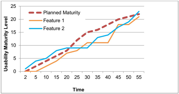
Figure 1 is the first usability maturity diagram we envisioned. Our idea was to show a graph where one can compare the progress of the actual, measured usability maturity levels for each important feature of a product against the planned usability growth.
In order to build this “Usability Maturity Model,” we defined a set of metrics that we call “Key Usability Performance Indicators” (KUPIs for short). These metrics define:
- The type of unit that will be tested, which takes into account the fidelity, the level of interaction, and system integration
- The type of participant performing the study (internal or external)
- Testing outcome, which is any quantifiable data from the usability studies. (Examples of the quantifiable data are explained later in the article when we discuss testing.)
NOTE: These are the KUPIs that we selected, but if they aren’t the right ones for your products/process, you can use your own, such as the total number of errors, time on task, and SUS scores.
In order to populate the chart, we used our KUPIs and some math to predict maturity levels over time. Here’s how those maturity levels are calculated (Figure 2):
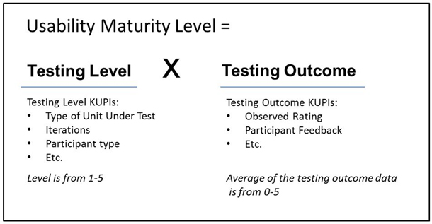
The equation has two basic components: testing level and testing outcome. Each component has a maximum value of 5. By multiplying the testing level and the testing outcome together, the maturity level can range from 0.5 to 25. From our experience, 25 is probably not attainable because it would require perfect testing outcomes.
Testing Level KUPIs
Testing level KUPIs are used for both planning and measuring actual usability maturity levels. We will cover planning first and then show how KUPIs are used for testing outcomes.
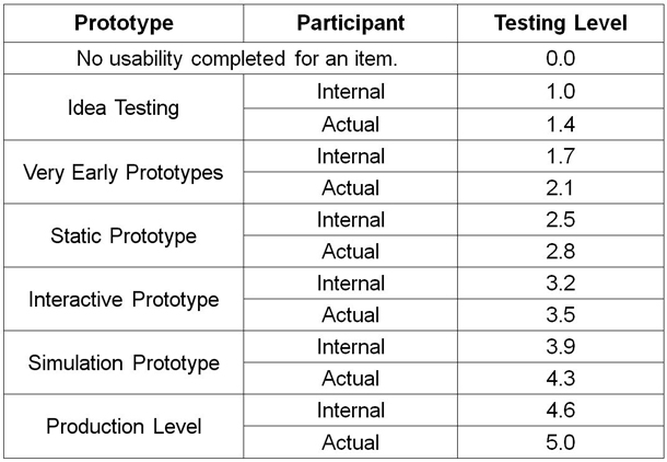
Multiple KUPIs are used to define your testing levels. Figure 3 is an example of using two KUPIs. The first KUPI, Prototype, should be familiar. Idea testing, however, might be new. We wanted to be able to measure the testing for activities like focus groups or interviews. These activities can also include sketches, flow charts, and value propositions. The KUPIs account for six levels of units to be tested (with increasing fidelity and interaction) and two types of test participants. The resulting testing levels are then distributed evenly from 1 to 5. Our example uses two KUPIs, but you can use up to three. After three, the increments between testing levels would be too small to have any meaning.
Planning should be a dialogue between UX, the development team, and the project manager. At the end, everyone wants a high maturity level, but the team needs to take into account:
- Features that need to be measured
- Resources
- Timelines when features and prototypes will be available for testing
- Complexity
- Usability risks (for example, unknowns, new ideas, new technology)
- KUPIs to be used
Overall, the slope of the planned maturity level depends on the project’s needs. Figure 4 is an example of a usability maturity plan for three features.

Each feature is planned separately, and the slope is based on its design risk. Design risk is the cost to the user and to your company. If a user is unable to use a feature, design risk levels can be used to help prioritize which features you will focus on.
- Feature 1 has high design risk, so the maturity curve is steeper earlier in the project to increase confidence that the final maturity level can be attained. A high risk item could be related to using new technology or developing a new feature that has never been tried previously.
- Feature 2 has lower design risk and is deemed to have little impact on the overall user experience. The team agreed that the final maturity level can be lower.
- Feature 3 will start later than Feature 1, but also has some design risk.
How to plan
The planned maturity levels for each feature are estimated based on the expected testing levels and outcomes at various milestones. We usually plan for testing outcomes of 4 (out of 5.) This allows for growth with some room for improvement, but any number will work. For example, you might feel that 3.5 is good enough for an early prototype. Or you might prefer that all the outcomes are 5s (plan for highest possible outcome.) We will discuss in more detail about testing outcomes a little later.
In Figure 5 we mapped out the following for a single feature:
- Column 1: The week when usability testing will occur
- Column 2: Testing level KUPIs used
- Column 3: Planned testing levels (refer to Figure 3)
- Column 4: Estimated usability testing outcome
- Column 5: Planned maturity level (multiply testing level by the testing outcome).
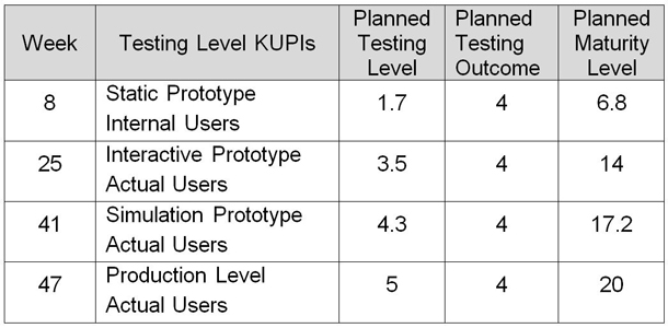
A note about planning features: This planning process is repeated for all of the features in the project.
We work in an Agile environment and our sprint teams are organized by feature, so we decided that the best way to communicate usability maturity was by feature as well. This way, each feature team can see their progress.
For each product feature being tested:
- Each feature is made up of a set of user stories or tasks.
- Each user story or task is usability tested, and the testing outcomes determine the feature’s maturity.
- Each milestone is aligned with the sprint cycle for the project.
KUPIs for Measuring Testing Outcome
Now that we have a usability maturity plan, let’s get down to performing, measuring, and tracking the usability activities so we can show the actual maturity levels. Usability testing is planned and executed as per your normal practice. Just remember to identify which tasks in your test protocols go with which feature/user story so that you can compile the data more easily.
We often test multiple features/user stories in the same usability study, but sometimes we only test a few user stories for a feature. It’s okay to mix and match your user stories in different studies if you have testing outcomes for all of them. Remember that any user stories that are not tested will lower a feature’s maturity level.
Usability testing methods and testing outcomes
All testing outcomes will be a value between 0 and 5 no matter what type of testing method is used. It’s up to you to determine what 0 to 5 means for each testing method. But, it is the testing level that affects the range of the maturity level. The testing method does not affect the calculation of the maturity level.
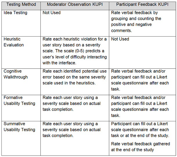
Figure 6 below outlines the KUPIs that we use for different usability testing methods.
For example, on Project A, we performed a heuristic evaluation on a static prototype, and the testing outcome was a 3.2. On Project B, we performed a cognitive walkthrough on a static prototype, and we got a testing outcome of 3.5.
The testing level for both Projects A and B was 2.5, because we used internal participants. The maturity levels for static prototypes were 8 and 8.75, respectively. As you see, the testing method didn’t dramatically change the overall maturity level. The difference in the maturity level was due to the usability of the static prototypes.
It is important to use the appropriate testing method to ensure the quality of the testing data (for example, you don’t want to perform a heuristic evaluation when a formative study is more appropriate). If you use an inappropriate testing method, you will still get an outcome of 0 to 5; however, the measurement will be unreliable.
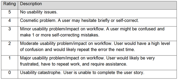
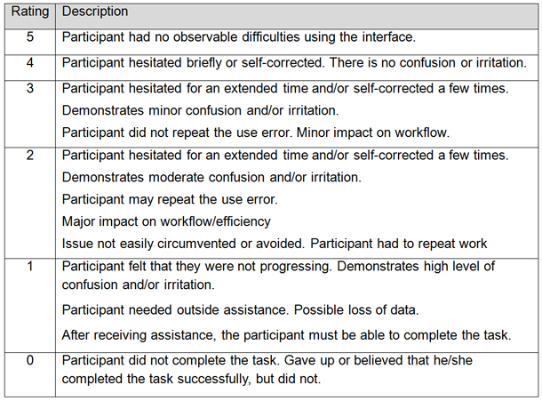
We also gather the participant’s feedback. We typically provide a SUS (or other Likert scale survey) that can be mapped to each user story being tested. You can use other types of subjective KUPIs as long as you can convert them to the testing outcome range of 0 to 5.We typically use two KUPIs for usability methods that include participants (observed rating and the participant feedback), but you can use any number of KUPIs. The key is that the KUPIs, whether subjective or objective, use the same scale (0-5). We chose these KUPIs because they match the type of qualitative feedback that we typically get in our business. We created two usability rating scales used by moderators to generate the Observation KUPI (see Figures 7 and 8). We have a detailed description for each level that highlights the major differences between the levels. It is important that these ratings are applied consistently between moderators and between tests.
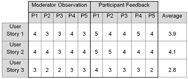
Compile all of your feedback as you normally would at the end of each study. In addition, you tally up the KUPIs as shown in Figure 9. For each user story, all the results are averaged for all participants.
Calculating testing outcomes
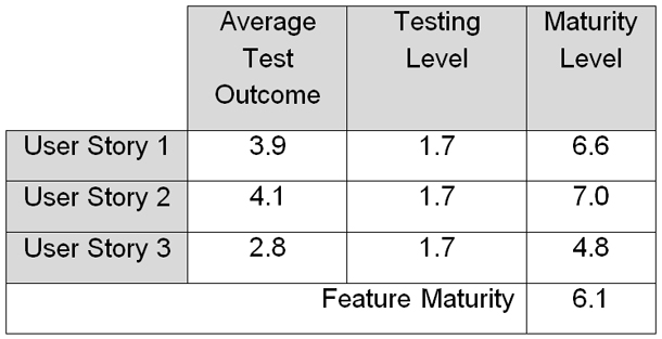
The next step in calculating the maturity level is to multiply the testing outcome by the testing level (see Figure 10). Finally, average the maturity levels for all the user stories to calculate the feature level maturity level.
Tracking Usability Maturity
In the previous paragraph, we calculated the maturity level for one feature that had three user stories. These calculations are repeated for each user story every time you perform a study. This can be a lot data to manage; for a whole project, there can be tens of features and hundreds of user stories. We struggled trying to plot the data in Microsoft Excel, so we developed a custom tool to record and display all the data, KUPIs, and testing outcomes that we’ve discussed. Eventually, you will start to see trends. Figure 11 illustrates the planned project maturity level in green and the actual user story maturity levels for a feature.

Taking a step back, you can roll up the user stories to show the actual feature maturity level, which is the average of all the user stories’ maturity levels (see figure 12).
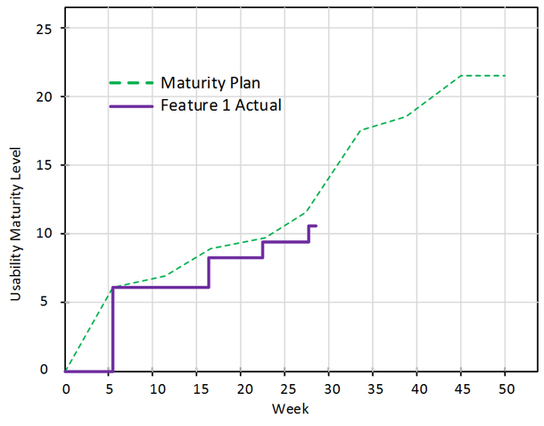
You may notice that actual maturity levels are not curves but are shown as steps. When we first saw this, we thought that a curve would look a lot nicer. But in actuality, it would be misleading, because a curve implies gradual improvement between time periods even when no testing occurred.
Communicating Maturity
Outcomes are shared with your team as usability activities are completed. Typically, you share feedback about designs that worked well, usability issues that need to be addressed, and new information that was uncovered. You will also want to show your new usability maturity dashboard to demonstrate how well the project is tracking against the plan.
The communication goals for the maturity model include:
- Illustrate usability progress in an easy-to-understand dashboard
- Provide the ability to detect items that negatively affect usability maturity
- Demonstrate confidence that the product is ready to ship
The main thing to look for when viewing the usability maturity dashboard is where the actual and planned maturity levels do not align. For example, in Figure 13, you can see that each feature’s maturity curve has areas that are both above and below the plan.
There are three common reasons why a feature could track below the plan: delay in completing the testing, poor testing outcomes, and lower than expected testing levels. The dashboard points out the discrepancies, and it is up to you—the UX representative—to research and communicate the root causes. Reviewing the individual user stories that make up the feature may help determine the root cause.
For example, in Figure 13, Feature 2 was tracking below the plan in two places. By reviewing the user stories we were able to determine that the area highlighted in red was caused by lower than expected test scores. We identified one user story that failed usability testing that affected the overall feature maturity level.
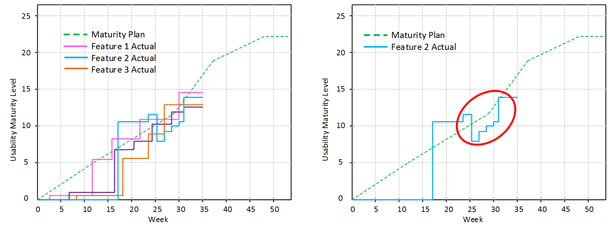
Figure 14 shows that Feature 3 was tracking below the plan, as well. Even though the usability testing shows that usability maturity was increasing, the testing was delayed. This is demonstrated by the flat line between weeks 0 and 8. A lag in the maturity level can be because prototypes are not available or there is a delay in the usability testing. We identified that the delay was due to prototypes not being available. After discussing this with the project team, we determined that this did not adversely affect any other development work and we still had time for other feedback. We were able to absorb the delay, so we adjusted the prediction curve to account for this. Otherwise, the actual maturity levels would always be behind the prediction curve.

Project managers may like using the dashboard to get a high-level view of how the project and each feature is doing. Looking at trends helps predict if the features are going to hit the predicted maturity levels. You can further enhance the dashboard by adding a color progress indicator to each feature to identify how they are doing.
- Green shows that the feature is tracking at or above prediction.
- Yellow and orange show that the feature is tracking below the prediction. Orange shows that usability studies are needed whereas yellow is used to show that prototypes are needed.
Are We Ready To Ship?
If you were on the project team and looking at Figure 15, do you think we are ready to ship?

In this example, we had several team members say that we weren’t ready to ship because we didn’t meet our final maturity level prediction curve. The UX team identified that production-ready prototypes were not available for Feature 2 when we tested at week 37. Even though the testing outcome was good, we had a lower than expected testing level, which resulted in a lower than expected maturity level.
You can see that trending for Feature 2 had steadily increased since week 28, and the most recent testing had good outcomes, as well. We expected that the production-ready prototype would have tested well on week 37 as planned, and we were confident that the feature was OK to release. You will also notice that some of the other features were slightly below the predicted maturity levels, but the team decided that given all other aspects of the project, the usability levels were still acceptable. We agreed that the product was ready to ship.
Conclusion
Since the initial presentation of this usability maturity model concept at the UXPA International Conference in 2017, we have implemented it on five projects and have received positive feedback from a number of stakeholders:
- Our project managers really like the fact that they could quickly see problems that could affect the project schedule and were able to react sooner.
- The project teams loved the charts that show usability progress.
- Upper management liked that they can compare usability progress consistently across projects using the model.
- Our UX analysts liked that they could easily identify the causes of the lower than expected maturity levels.
While the maturity model has a number of advantages, there are some tradeoffs to using the tool. It will take some development effort to:
- Create a tool to perform the calculations and display the graphs
- Identify the KUPIs and transpose them to the 0-5 scale
For each project, you will also need to:
- Create user stories and features
- Build the prediction curve
- Input the testing outcomes into the tool
The investment of time and energy in performing this work may not be as beneficial for a smaller project with a short timeline.
Some of the things we learned or confirmed include:
- Different types of projects, project management techniques, and processes did not affect the maturity levels.
- If there is a legitimate delay in the project plan, we need to readjust the planned maturity level, so the graph doesn’t always show that you are tracking behind the plan.
- It is almost impossible to exactly match the predicted maturity levels, so we now account for this variation during project planning. For example, we agree that the product is ready to ship when the maturity level is within 5% of the final prediction.
- When calculating a feature’s actual maturity level (which is the average of all the user stories), don’t forget to account for untested user stories. For example, if you only plan to test four out of five user stories by a certain date, the fifth one has to count as a zero at that date.
- Actual maturity levels should be shown in a graph as a step function because a curve would imply that maturity level increased when, in actuality, no UX activity has occurred.
We enjoy using the Usability Maturity Model; try it for yourself! We started a blog on LinkedIn if you would like to send us your comments: https://www.linkedin.com/groups/8610948