What do Twitter and the game Angry Birds have in common? Their users are intrinsically motivated to use them. This motivation is important for both apps and sites from a revenue generation perspective: the frequency and duration of use of Twitter supports its advertising revenue, and the engagement of Angry Birds players leads to advertisement revenue and higher conversion of in-app purchases. Even content-oriented apps and sites are concerned with customer engagement in order to generate an experience that draws return users.
The use of Twitter and Angry Birds promotes what Mihaly Csikszentmihalyi calls “optimal experience,” or “flow”. He describes flow as “being completely involved in an activity for its own sake. The ego falls away. Time flies. Every action, movement, and thought follows inevitably from the previous one, like playing jazz. Your whole being is involved, and you’re using your skills to the utmost.”
Activities as varied as playing music, rock climbing, and scientific investigation have been described in this way. While this state of mind is extremely personal, it is facilitated by participation in activities that have several characteristics:
- A clear goal
- Sufficient skill and confidence to complete a task that leads to the goal
- Ability to concentrate in the moment
- Immediate feedback
- Control over your actions
In this state we lose a sense of time and a sense of self-consciousness. We also feel happier, more motivated, and more productive.
Promoting flow is a great goal for the UX designer, and the right design can support this zen-like state for many activities. However, a lot of applications are not used long enough to promote flow, or are used in distracting environments such as a call center or a warehouse, in which designing an application for flow would prove difficult. A better place to begin is with the user’s peace of mind, or a sense of confidence, assurance, and absence of frustration in using the application to achieve his or her goal. When we can’t design for flow, we can use the following flow design principles to create a design that promotes peace of mind for the user, ultimately leading to an increase in productivity and system usage:
- Things should work as expected
- The user should always know how things are going
- Interaction should be distraction-free
Things Should Work as Expected
Users bring expectations to every experience. When these expectations are met with elegance, users respond with delight. When something doesn’t work as expected, they get distracted and may become anxious or frustrated. Distraction makes users lose focus on their current task and reduces their peace of mind. As designers working to create an optimal experience, we should try to avoid distracting our users.
It is surprising how often applications disregard even the most basic expectations regarding feedback. Jakob Nielsen spelled out some of these expectations more than twenty years ago: an application should respond within one second to avoid interrupting a user’s flow of thought; users will become distracted and begin to perform other tasks if an application’s response time exceeds ten seconds. Others have added to this, suggesting that users expect to be able to complete sub-tasks in less than a minute and an entire task in less than ten minutes.
The “busy” indicator in web applications is a good example of timely feedback that reassures users and facilitates peace of mind in using the application. This indicator should be used for any interaction that will take longer than one second to complete.
Another set of expectations that people have is dependent on the context of the application in use. Web standards have come a long way in supporting usage context at a high level, and conventions such as the placement of login and logout links in the upper right corner meet expectations also. However, simply following standards and conventions does not necessarily promote users’ peace of mind. We have to understand the overall context and support specific contextual expectations.
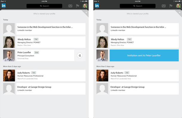
The LinkedIn iOS app has a view that lists the people who have recently visited your profile (see Figure 1). There is a button on the far right of some of the people on the list. Selecting the button sends an invitation to connect to those the user is not already connected to. When the button is tapped, there is no confirmation pop-up. It is a smooth, distraction-free experience. But there is also no way to revoke the invitation. Because I’m not a big fan of inviting strangers to my LinkedIn list, I expect that there would be a way to undo my mistake. Since there isn’t, my confidence in using the app diminishes, and I am less likely to use it.
There are a few questions a designer can ask to ensure that an application meets its users’ expectations:
- Does the app support natural human expectations of feedback?
- What feedback will promote a user’s peace of mind?
- What are the contextual expectations users’ bring to the app?
- How can the app promote confidence in this context?
The User Should Always Know How Things Are Going
Another characteristic of flow is the understanding of the current goal and how we are progressing toward it. An indication of progress promotes confidence in the use of an application, which also supports a user’s peace of mind.
Navigation in software applications has been a topic of investigation for many years. Breadcrumbs, clear labels, and proper navigational elements all contribute to a solid information architecture and positive user experience. However, simply following all of these best practices may not promote confidence in the use of an application, or help the user focus on the task at hand.
Consider the form used to list an item for sale on eBay (see Figure 2). It’s a one-page form which works well in some applications. There are breadcrumbs at the top of the page and navigation elements are clearly labeled. Unfortunately, the form is long and users can lose sight of where they are in the listing process. By simply numbering the form element groups and indicating the total number of steps (for example, “2 of 4”), users would know where they are and how much further to go.

Contrast this with the wizard used to purchase a plane ticket on Delta.com (see Figure 3). The application clearly spells out that there are five steps in the process. There is an indicator at the top of the page that provides feedback to reassure the user of their progress toward the goal of booking a flight. This design pattern has been around for years. It may not be appropriate for every design, but the navigational cues that it provides help users know where they are in the process.

There are three questions a designer can ask to ensure that users know how things are going when they use an application:
- What are the users’ goals and what tasks support these goals?
- Can users always know how things are going and what to do next?
- What indicators will promote the users’ peace of mind?
Interaction Should Be Distraction-Free
Nothing interrupts flow more than distractions. When you are focused on completing a task and the phone rings, isn’t there something inside of you that is perturbed? Web and mobile applications can interrupt flow in the same way with unexpected distractions.
Distractions come in many forms. Imagine using Facebook or Twitter without the infinite scroll feature. Imagine that after every ten updates you had to hit a “Next Page” link to see more. I doubt you would enjoy the experience as much. The free flow of updates is one aspect of the interface that draws people in and keeps them connected for a period of time.
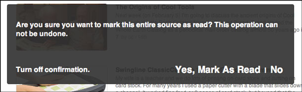
A continued source of distraction is the confirmation pop-up. When a user purposely hits a button, the expectation is that it just works. A confirmation pop-up distracts from the flow of the experience. The RSS aggregator Feedly displays a confirmation pop-up when the “Mark As Read” button is clicked (see Figure 4). An undo feature would be better in this case; it would facilitate the flow of the interaction and help the user feel comfortable trying out new features without the fear of failure.
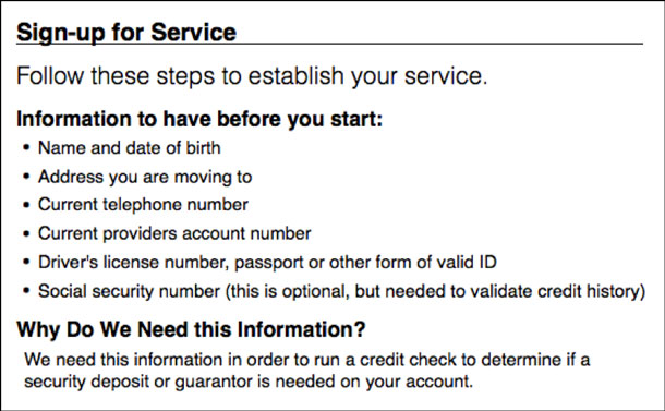
Another potential distraction is a request for uncommon information. Some applications may require the user to enter information that is not readily available, such as an account number or social security number. For example, an electric company had a change of address form that requested the user’s account number. Site usage analytics showed a substantial loss of conversion when users were asked for this information. When the company added a list of required information at the top of the form to give users the opportunity to gather everything (see Figure 5), the conversion rate increased by over 300 percent.
There are a few questions a designer can ask to ensure that the user interaction is distraction-free:
- Are there any interactions that prevent users from having a clear path toward completing their goal?
- What is the cost of failure when users accidentally activate a feature? Will they want to undo it?
- Does the application ask for information that users may not have readily available? Would the lack of this information interrupt the flow of their experience?
Conclusion
An application that promotes the concept of flow is a great goal. However, one must spend at least fifteen minutes performing an activity to get into a state of flow, and the best experiences for many applications are completed in ten minutes or less. Therefore, specifically promoting flow may be impossible.
By applying a few of the flow principles, however, we can increase peace of mind and engagement. For work process products, peace of mind can optimize workflow and increase throughput. When consumer applications improve engagement, people are more apt to use them longer, which leads to an increase in revenue. While your product may not be the next Twitter or Angry Birds, incorporating a few of the flow principles in the design will lead to a positive experience.追求流畅感对用户体验设计人员来说是一项重要目标。但是,当这一目标由于界面性质或其使用环境而难以实现时,设计人员应该以让用户“安心无忧”(充满信心并且没有挫折感)为目标。这可以通过运用以下三条“流畅感”设计原则来实现:
- 流程应按照用户预期运行。
- 用户应该始终知道流程的运行状态。
- 交互应避免分散注意力。
文章全文为英文版몰입의 촉진은 UX 디자이너에게 대단한 목표입니다. 그러나 이러한 목표가 인터페이스의 속성 또는 사용 맥락으로 인해 도달 불가능할 때, 디자이너는 사용자의 “마음의 평안(자신감과 좌절감 제거)”에 목표를 맞춰야 합니다. 이는 다음의 세 가지 몰입 원칙을 적용함으로써 가능할 수 있습니다:
- 일이 예상대로 효과가 있어야 합니다.
- 사용자는 항상 상황이 어떻게 돌아가는지 알고 있어야 합니다.
- 상호 작용 시에는 주의 산만 요소가 없어야 합니다.
전체 기사는 영어로만 제공됩니다.Promover Fluxo é uma grande meta para os designers de UX. Entretanto, quando esta meta não pode ser atingida devido à natureza da interface ou de seu contexto de uso, os designers devem ter como alvo a “paz de espírito” dos usuários (um senso de confiança e ausência de frustração). Isso pode ser feito aplicando-se os seguintes três princípios de fluxo:
- As coisas devem funcionar de acordo com o esperado.
- O usuário deve estar sempre ciente do andamento das coisas.
- Na interação, não pode haver distração.
O artigo completo está disponível somente em inglês.「フロー」の促進は、UXデザイナーの大きな目標である。しかし、障害となるものの性質や使用状況が原因となってこの目標が達成不可能である場合、デザイナーは、ユーザーの「安心」(確信があり、不満がない感覚)を目的とすべきである。これは、以下の3つの「フロー」の原則を適用することにより達成することができる。
- 物事は期待どおりに作用すべきである。
- ユーザーは進行状況を常に把握しているべきである。
- 相互作用には心の動揺があってはならない。
原文は英語だけになりますPromover una plena inmersión del usuario es un excelente objetivo para los diseñadores de UX. No obstante, cuando este objetivo es inalcanzable dada la naturaleza de la interfaz o su contexto de uso, los diseñadores deberían centrarse la “tranquilidad” de los usuarios (una sensación de confianza y ausencia de frustración). Esto se puede lograr mediante la aplicación de los siguientes tres principios:
- Las cosas deberían funcionar como se espera.
- El usuario siempre debería saber cómo va todo.
- La interacción debería estar libre de distracciones.
La versión completa de este artículo está sólo disponible en inglés