When you stop to think about it, the job of interaction designers is about persuading people to do something. We design juicy-looking buttons and place them “just so” on the page to entice people to click them. We remove distractions and streamline processes so that customers glide effortlessly from browsing to buying. We create whole applications aimed at getting people to check in more frequently, diet more effectively, work out more consistently, or do more, more, more of whatever it is that meets our persuasive goal.
What Is Evil Design?
Sometimes our aim is charitable: we are persuading people to do something that benefits society more than it benefits them. Sometimes our aim is motivational: we are persuading people to do something that will benefit them even if they wouldn’t choose to do it unaided. Often our aim is commercial: we are persuading people to trade something that will provide equitable benefit to our company and to them. Sometimes however, it seems aims are less virtuous, and companies seek to get customers emotionally involved in doing something inequitable—something that benefits the company more than it benefits the individual.
And that, perhaps, is the definition of evil design: to get customers emotionally involved in doing something that benefits you more than it does them. Now, your first reaction may be to deny that this would ever happen in your company, much less that you’d be complicit in it. But somewhere, someone in the interaction design profession is building these interfaces, because they aren’t accidental. They are the result of applying psychological principles or design patterns to arrive at an emotionally engaging experience.
Example Evil Design Patterns
Let Users Advertise Their Status
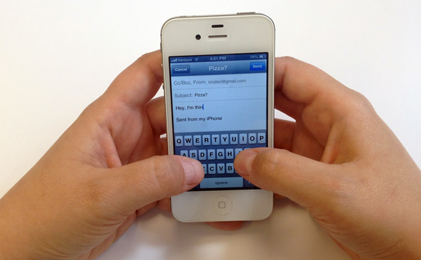
It’s hard to define which interfaces are truly evil because different people will derive different levels of intangible value from their interaction with a site or application. Take for example the ubiquitous email signature “Sent from my iPhone” (see Figure 1). I hope that the person who created that default signature setting got well rewarded for their work. It is the perfect embodiment of effortlessly viral aspirational content. Taken at face value, it is little more than an advertisement for a product—something that benefits the company more than the customer. Yet users seem strangely reluctant to change it. This inertia stems at least in part from what that small phrase says about them as individuals. Even more than half a decade after the device’s release, the phrase is still prevalent at the bottom of people’s emails, and it can’t be because no one knows how to change the setting.
The iPhone default signature remains partly because it’s boastful in a socially acceptable way. The designers found a way to let users advertise their status as owners of a shiny, desirable gadget. This design pattern, encouraging users to build and advertise their status within a community, lets people feel more important. It affects customers at an emotional level but serves a very financial goal for the company. Who benefits more? Financially, it’s quite clear. Emotionally, it’s hard to say.
Pre-Pick Your Preferred Option
Psychologists have known for a long time that if they show you specific words or pictures beforehand, you’ll find it easier to recall those items, or related items, in a later test, even after you have consciously forgotten the specific words. This effect is called priming.
This is one reason why you see so much brand-related advertising. Rather than specifically telling you to buy a certain thing, the advertisers build a picture of a brand associated with a specific location (a bar), emotion (happiness), or occasion (a celebration). When you are in a bar for someone’s birthday party, all that brand priming comes straight back from your subconscious brain and hits you. You aren’t going to get a rum and cola; you’re going to get a Bacardi and Coke. You’re not going to buy a beer; you’re going to buy a Budweiser.
Couple this priming with inertia and you have the perfect conditions for encouraging people to select a given option. By making the option seem familiar beforehand, and then presenting it as the default choice, it’s easy to guide people’s behavior.
Use Negative Options
In the United States, many employers offer personal retirement savings plans, 401(k) plans, for their employees. Sign-up is typically optional and, once started, employees can choose how much to contribute. In their 2001 Quarterly Journal of Economics article “The Power of Suggestion: Inertia in 401(k) Participation and Savings Behavior,” Brigitte Madrian and Dennis Shea reported that those employers who automatically enrolled new employees saw higher rates of contribution than when employees had to make the personal effort to enroll. In both instances, it turned out that many employees couldn’t be bothered to change the default (pre-picked) state.
This inertia could have major implications for the future financial health of the country since participation in personal retirement plans reduces the burden on future government-run social services. Interestingly, many of the automatically enrolled employees kept both the default contribution level and fund allocation, which shows that it makes good sense to set the default option to the behavior that you want to encourage.
The last example almost certainly falls into the category of motivational rather than evil design. But the designer of that company’s healthcare policy leveraged the same concepts of priming and inertia that are also used to trick us into signing up for junk email. However good we get at spotting the marketing opt-in checkboxes on registration forms, we must still read them very carefully. Is the box pre-checked? Is it offering to opt us in or to opt us out? Is the second box, which talks about sharing details with third parties, also pre-checked? Is that one opt-in or opt-out? The company’s goal is to get you to start receiving its emails because you’re less likely to make the effort to unsubscribe after you’re signed up. This is the basis of the negative options design pattern: sign people up to receive something until they specifically choose to stop receiving it.
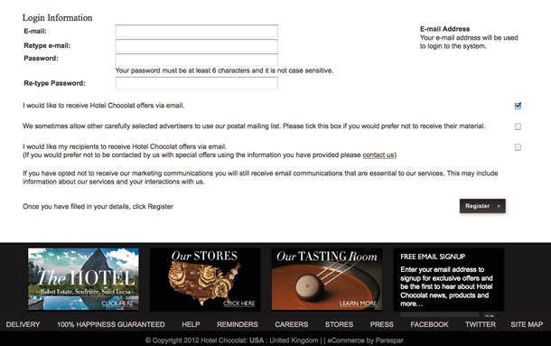
Take for example the three innocuous-looking checkboxes on the Hotel Chocolat website that can have major repercussions on the future size of your email inbox and those of the people you send gifts to (see Figure 2). Read carefully: which boxes need to be checked or unchecked to not receive emails?
A study by Steven Bellman and his colleagues, described in the 2001 ACM article “On Site: To Opt In or Opt Out? It Depends on the Question,” found that simply using a negative option doubled opt-in rates. Phrasing an option as “Notify me about more surveys” with the checkbox unchecked (that is, people must take an action to get the additional surveys) led only to a 48 percent uptake. Changing the text to “Do NOT notify me about any more surveys” while still leaving the checkbox unchecked (that is, people need not take any action to get the additional surveys) produced an astounding 96 percent uptake. Of course, as Bellman notes, not all of the individuals who opted in (or rather didn’t not opt in) in the second example are actually good prospects, but the apparent consent rate is incredibly impressive. Often it’s easier just to keep doing what we’ve always done than to make a change, even if that change would save us time, money, or the hassle of a spam-filled inbox.
Make Options Hard to Find and Understand
The trouble is that persuasive design is a slippery slope. The boundaries between motivational, commercial, and evil design are wavy. They fluctuate over time. It’s typically an acceptable business practice to play up a product’s best features rather than be entirely objective. On the other hand, we also expect to be made aware of the implications of sharing data with a service, rather than having them buried in a privacy policy that nobody is likely to read. And people don’t read Terms of Use or Terms of Service documents.
It took four months and 3,000 downloads for someone to claim the reward that PC Pitstop hid in the Terms of Service document for one of their products. Only 0.06 percent of ISP Embarq’s customers read the updated Terms of Service document that allowed the company to spy on, and insert ads into, each data packet they sent through their Internet connection. Putting opt-outs in out-of-the-way places and obfuscating with hard-to-parse text seems to be a common business practice for introducing changes that are more likely to benefit the company than the customer.
Conclusion
I’m not approaching this topic from some holier-than-thou angle. I’m sure people can poke many holes in the persuasive techniques I’ve used in the products I’ve helped to design. Instead, I’m suggesting that a catalog of these techniques will help us to recognize and respond to them. Sometimes that response might be to avoid giving our business to sites that we see using the pattern. Sometimes the response might be to repurpose a pattern for good. Sometimes the response will undoubtedly be “that’s exactly what I was looking to implement in my product.”
My response has been to search out these persuasive techniques and describe them as design patterns. This article touches on four of the fifty-seven patterns I describe in detail in the book Evil by Design. As Don Norman says in the book’s foreword, “the more the tactics are understood, the more readily they can be identified and resisted, fought against, and defeated.” Please join the conversation about these techniques online at evilbydesign.info.让我们来看看四种能轻松地劝说和诱导人们从浏览过渡到购买的劝说式设计模式。
交互设计师的工作就是劝人们做某事:我们设计一些外观有趣的按钮,并“恰到好处”放在页面上以诱使人们点击,我们去除各种干扰因素,并简化流程,从而使客户轻松地从浏览过渡到购买,我们创建的整个应用旨在让人们更经常访问。作者在《蓄意而为》(Evil by Design) 一书中共介绍了 57 种设计模式,本文将讨论其中的四种劝说式设计模式。
文章全文为英文版사람들을 설득하여 탐색 수준에서 쉽게 구매 수준으로 유인하는 설득적 디자인 패턴 4개를 살펴봅니다.
인터렉션 디자이너의 업무는 사람들이 무엇인가를 행동하도록 설득하는 것이 관건입니다: 즉, 매력적으로 보이는 버튼을 디자인하고 페이지에 “보기 좋게” 배치해 사람들이 클릭하도록 유인하며, 어수선한 것들은 제거하고 일련의 과정을 능률적으로 처리함으로써 고객이 별 어려움 없이 자연스럽게 구경하는 수준에서 구매로 전환하도록 하고 고객의 더욱 빈번한 주문을 겨냥한 전반적 애플리케이션을 창출합니다. 본 기사는 저자의 책 Evil by Design에 설명된 전체 57개 중 일부인 4개의 설득적 디자인 패턴을 살펴봅니다.
전체 기사는 영어로만 제공됩니다.Um olhar sobre quatro padrões de design persuasivo que induzem e atraem as pessoas a passarem da navegação para a compra, suavemente.
O trabalho dos designers de interação é persuadir as pessoas a fazerem algo: projetamos botões atraentes e os colocamos “cuidadosamente “na página para atrair as pessoas a clicá-los, removemos distrações e simplificamos processos para que os clientes passem suavemente da navegação para a compra, e criamos aplicações completas que visam fazer com que as pessoas finalizem a compra com maior frequencia . Este artigo analisa quatro padrões de design persuasivo que fazem parte de um conjunto de 57 padrões descritos no livro do autor, Evil by Design.
O artigo completo está disponível somente em inglês閲覧している者を説得したり、気を引いたりして、楽々と購入へと進ませる4つの説得力のあるデザインパターンを概観する。
インタラクション・デザイナーの仕事は、つまるところユーザーを説得して何かをさせるということである。私たちはユーザーにボタンをクリックさせるよう、とても魅力的に見えるボタンをデザインして画面ページの「まさにそこ」と思われる場所に配置したり、気を散らせるものを取り除いてプロセスを合理化して顧客が閲覧から購入へと無理なく進むようにしたり、より頻繁に見てもらうことを目的として専用のアプリケーションを作成したりする。この記事では、筆者の書籍である『Evil by Design』 に記載されている57のパターンの中から4つの説得力のあるデザインパターンを取り上げ、レビューしている。
原文は英語だけになりますUna mirada a cuatro patrones de diseño persuasivo que atraen y convencen a las personas a pasar de navegar a comprar, sin esfuerzos.
El trabajo de los diseñadores de interacción se trata de persuadir a las personas a que hagan algo: diseñamos botones atractivos y los colocamos “casualmente” en la página para que las personas hagan clic, quitamos todas las distracciones y optimizamos el proceso para que los clientes se deslicen sin esfuerzo de navegar a comprar, y creamos aplicaciones enteras cuyo único objetivo es que las personas las visiten con mayor frecuencia. Este artículo analiza cuatro patrones de diseño persuasivo que son parte de un conjunto de 57 patrones descritos por el autor en su libro Evil by Design.

Chris Nodder is an independent UX consultant and writes about research and design techniques for agile UX teams at QuestionableMethods.com. He was previously a director at Nielsen Norman Group and a senior user researcher at Microsoft. Chris is the author of the new book Evil by Design.