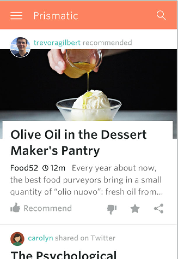
You’re walking down the street during lunch time. Your phone buzzes as your favorite app lets you know about a restaurant with a specialty dish it’s sure you’ll like (based on other meals you said you enjoyed). You’re hungry and the recommendation looks great, so you decide to try it. You walk in, order the dish, and enjoy it very much except for the side item it comes with. You provide this feedback in the app and look forward to more great recommendations based on your inputs (Figure 1).
What makes this work is that the system can collect input to alter itself, so it can provide the best experience for you. It does this using computer algorithms that construct a model based on data input and applies that data to make predictions or decisions. These machine learning algorithms help a system improve on a task automatically over time as the system “learns” from the new data and changes accordingly.
For product designers working to design the ideal experience for a user, machine learning technologies can afford some exciting and interesting opportunities, as well as some challenges. In order for machine learning algorithms to perform well, they need to be fed the proper data. The data the algorithms use in most cases is collected directly from user behavior, and the behavior is captured through user interactions with a product. This is where design comes into play. An interface must be designed that users can interact with in a way that’s helpful to the machine learning algorithms and ultimately, to the user consuming the recommendations from those algorithms.
Listen to the Data Through Explicit and Implicit Signals
We can learn from users through either the explicit or implicit signals we collect when they interact with the product. Both methods have their merits and drawbacks. The best solution usually contains some combination of the two.
Users send explicit signals when they tell us what they like or dislike directly. For example, during the initial sign up process for Prismatic, users can select specific topics they want to follow. If they do, we can treat that as an explicit signal that they are interested in reading stories related to that topic. Similarly, a user clicking the “like” button on a story they enjoyed gives us explicit feedback.
The benefit of explicit signals is that a user tells us directly what they want. Explicit signals can also be gathered early in the interaction, such as during sign-up. We can take users at their word, using their information and preferences directly without having to draw inferences about what they mean.
However, a drawback of asking users what they want is the user’s susceptibility to reporting bias. A user may also indicate they are interested in reading about world politics and not select cute animals as a topic of interest. However, when presented with both types of stories, that user may click on more cute cat videos than articles about world politics.
Another type of data collected is implicit signals, where we infer a user’s intention and preference through their interactions with the product. For example, if a user of our service has read five stories about a particular topic, we can reasonably presume that the user is interested in that topic. In this way, their reading behavior becomes an implicit signal about their preferences.
Using implicit signals can help overcome the reporting bias of explicit signals because we can observe their behavior directly. Also, implicit signals are easier for users because they simply use the product as they like without having to take the time to enter their preferences.
But implicit data has some drawbacks as well. For one, the data takes time to collect. Users want to see value in the product as soon as possible, and this delay creates a design challenge. How much information should we request from the user up front via explicit signals (allowing faster but possibly less accurate assessment), and how much should we wait to learn as they interact with the product over time (providing delayed but potentially more nuanced information)? One solution is to look for other implicit signals to utilize while collecting more long term data. For instance, we can encourage users to connect a social account which would provide sources of information about their interests. We’d get a combination of explicit data and implicit data early, and could show relevant options even before we’re able to collect implicit data from within the product.
Another weakness of implicit signals is that they can be noisy or hard to interpret. An example: we interpret clicking into a story as an implicit signal of liking a story. But in reality, we don’t know if the user enjoyed the article or was just lured by the headline and image in the feed but didn’t ultimately find the story interesting.
Both data collection methods have their strengths and weaknesses. The challenge is finding a good balance in the information we collect and triangulating among the signals.
Table 1. Explicit vs. Implicit Signals
| Explicit Signals | Implicit Signals | |
| Positive aspects | Less ambiguous signalCan be gathered up front
Users can see value of product sooner |
Less effort and burden for the userOvercomes reporting bias |
| Negative aspects | More effort for the userSusceptible to reporting bias | Learning through inference can be ambiguousTakes time to collect |
Make Data Collection Easy
The goal of a good user experience is to minimize how much effort data collection requires for users. A lightweight source of input is to provide actions a user can take, such as buttons to recommend a story or remove from the feed. This allows the user to give positive or negative feedback with just one click. Small changes in the design of these buttons can have a big impact on the quality of the signal we get from users.
Let’s take the “like” button as an example. It seems simple, but think about how much more precise the feedback would be if it was clear whether the user meant “I liked this,” “I learned something from this,” or “I recommend this.” Making the interaction clear can have a large effect on the quality and quantity of data we can collect, and on the machine learning recommendations that result from that data.
Even after designing buttons that make the action clear, it can still be hard to interpret. For example, if a user dislikes a story, is it because the user doesn’t like the content, the topic, or the author? Similarly, on Facebook, if someone “likes” a post about coping with cancer treatment, do they find the information useful or are they sympathizing with their friend?
One solution is to allow users to optionally provide more information with each lightweight action to be more specific about what they mean (Figure 2). This helps the software learn more quickly as it combines explicit signals with explanatory actions.

The additional information collected in follow-up opportunities helps remove ambiguity in the data, especially when patterns are aggregated across all users.
When making design decisions, the more that designers understand how the machine learning algorithm works, the better they can plan actions to leverage the strengths of the algorithm. This synergy of technical understanding and userfocused thinking is vitally important when designing for machine learning products.
Design for Recommendation Engines
The next challenge is how to design a product that smartly reveals what’s going on behind the scenes, and how information can flow from the engine to the user.
In general, the goal of the interface is to hide the complexities of the software algorithms and keep the product easy to use. Think about the last time you ordered an Uber or a Lyft car. The interface made it appear simple. You entered your location and didn’t have to be concerned with how the algorithm picked the best driver. You were informed that a driver would arrive in X amount of time in Y car and this was enough information.
Yelp is a product that displays a set of recommendations based on the specific inputs and filters a user provides. The result could be a collection of restaurants listed by proximity, using filters explicitly set in the interface, such as price or cuisine type.
In these two cases, users don’t need to understand the details of how they are matched to a car or why restaurants are included. However, when making automatic recommendations to users, revealing some of the behindthescenes process can improve the user experience by showing how the recommendations are made. This sort of transparency can help bridge the gap between the user’s inputs and interactions and the results they get. Users are more forgiving of an algorithm that recommends content if they have some sense of why they are receiving it. For example, when you get a recommendation from Spotify for an artist you dislike, you may be more understanding of the suggestion when you see that it was included because of a prior choice in a song or artist.
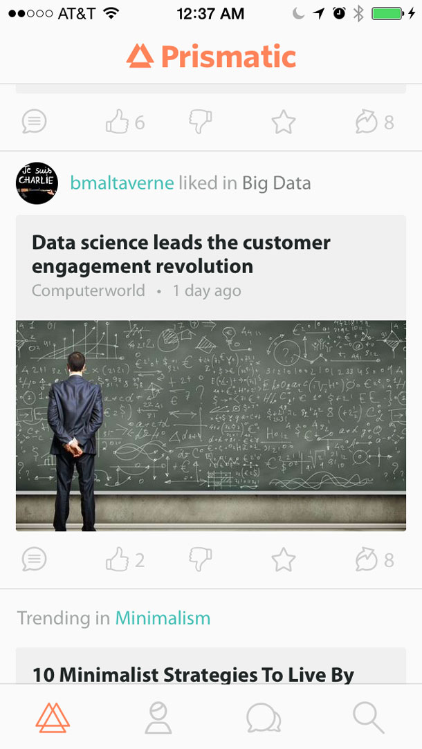
So, how do we show enough of the process to make users comfortable without overwhelming them with data? One way is to map some of the machine learning algorithm’s recommendation logic to simple sentences, which are called “explains.” They appear with story recommendations and describe why a user is seeing an article. The brief explanations (Figure 3) are an effective yet lightweight way of giving the user enough information to increase their understanding of their impact on the product without overwhelming them.
Designing and Testing Unique Experiences
One of the goals of products that use machine learning to create a unique experience for each user. On a news site, one user may see many stories related to their hobby, while another may see stories related to their job. A person may see a lot of content that is visually oriented with photos, whereas someone else may only see text. This is exciting because it allows for a richer and more personalized experience. But it’s also tricky, because the design has to account for all the possible permutations and variations.
As we work on the interface, rapid iteration and incorporating feedback from users throughout the design process is important. However, there is a special challenge—it’s difficult to build a prototype for user testing when the product’s core feature takes participants’ data and uses it to select content. The new experience relies on actual data. To this end, we rely on pushing changes to the product early and often (or to a subset of users) with data instrumentation code to track how they use the product, which helps us understand product usage. When we get enough data back, we can then triangulate the information with qualitative surveys and in-person studies to further understand product usage and iterate from there.
Use Personal Data Responsibly
Feeding a recommendations engine means that personal—sometimes very personal—data is collected about users and combined with patterns across other users in order to make predictions about what consumers may like. An ideal data set offers the ability to understand a user very deeply, sometimes more than they understand themselves. This knowledge can come off as creepy and even make some users feel unsafe, depending on how the information is used. As designers, making the user comfortable and safe is a top concern.
There are some famous examples of what happens when designers don’t think carefully about how recommendations are used and what the consequences might be. A couple from the news:
- Target (correctly) deduced that a teen girl was pregnant by algorithmically analyzing her shopping behavior, which included activities as innocent as buying a large purse and moisturizing lotion. Based on this, Target sent pregnancy related marketing materials to the house she lived in with her father. Sophisticated technology, even when accurate, can expose highly personal information in unexpected ways.
- Facebook (correctly) deduced that one of its users was gay based on some of his activity on the site, and suggested an ad about coming out. Not surprising, the user felt that his privacy was violated.
When done well, personalizing a user’s experience is an improvement. The key is sensitivity about the data being collected and displaying it in a way that makes the user feel comfortable that their privacy is respected. Getting it right takes good UX research to understand what the boundaries for displaying sensitive information are what “comfortable” looks like.
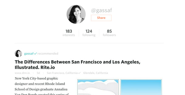
It’s also important to be clear about what data is displayed publicly for anyone to see, versus what is kept private. Feedback from our users over privacy concerns suggested that it was best to only display public actions under a user’s profile (likes, shares, and comments) and display the private actions (read and saved stories) under a separate section in the product (Figure 4). Making this change helped clarify which actions and data are public versus private.
Guidelines for Designers
When designing software for recommendation engines, a few helpful guidelines:
- Use both quantitative and qualitative data to inform decisions and optimize designs. With all the data collected for the machine learning algorithms, it’s easy to rely on quantitative data and forego the qualitative data. Quantitative data can tell you what a user is doing with your product, but to understand the “why”, you must talk to your users using appropriate qualitative research methods. When making design decisions, we first start with high level goals. To keep track of the success of these goals, translate them to success metrics that can be tracked with data. Some of these metrics can be optimized in the machine learning algorithms automatically. But you can also employ methods like A/B testing and bandit tests to further optimize the designs.
- Observe what other products are doing in this space. Study apps like Facebook, YouTube, Spotify, and Rdio to get a feel for what may work for your product and what may not. For example, seeing many machine learning products utilize “explains” could lead to employing a similar pattern in other products.
- Designers and machine learning experts must work closely together. The ideal partnership is one in which problem solvers with domain expertise in design and in machine learning are both at the table, discussing and making decisions with user goals in mind. It may also help to have frequent learning sessions where designers and machine learning experts educate each other.
Designing for a recommendation engine is an ever-evolving and constantly challenging area of user experience. Because the technology is so embedded in the interface, your product will meet user goals better when the design and machine learning experts work together as one team, rather than as two separate disciplines.
[bluebox]
More Reading
- What it takes to build great machine learning products by Aria Haghighi
- The Iceberg of Jobs-to-be-Done by Eric Portelance
- Finding the Right Job For Your Product, Christensen, Anthony, Berstell and NitterHouse, MIT Sloan Management Review, Spring 2007
- Implicit feedback for recommender systems by Oard and Jinmook, Proceedings of the AAAI workshop on recommender systems. Wollongong, 1998
- Evaluating the Robustness of Learning from Implicit Feedback by Radlinski and Joachims, ICML Workshop on Learning in Web Search, 2005.
[/bluebox]

Gina Assaf is an interaction designer at Prismatic, an internet and media tech startup company in San Francisco, focused on using machine learning to recommend relevant content to users based on their interests. Gina has a Masters in Human Computer Interaction from Carnegie Mellon University and a Bachelors in Computer Science. She is passionate about understanding users and designing thoughtful products that solve important and real user needs. Twitter: @GinaAssaf