While there were many insights on moderation, the co-authors took particular note of another aspect of the work—the findings reports generated by the 16 participants.
Of course, we are not the first people in the history of UX to take a more detailed look at reporting practices:
- The UXQB has published an example report with annotations.
- ISO 25062 specifies a Common Industry Format for usability test reports.
- In 2012, UXPA Magazine published Hanna and Risden’s “The Perfect Report.”
- A prior CUE study (CUE-7) specifically addressed considerations for presenting recommendations in reports to stakeholders.
- UXPA published an article by Molich, Hornbaek, Krug, Scott, and Johnson summarizing the findings — “Recommendations on Recommendations.”
- Among those who have addressed the topic in their respective books on usability testing are Joe Dumas and Ginny Redish (1999), Jeffrey Rubin and Dana Chisnell (2008), Steve Krug (2009), and Carol Barnum (2010).
But how do we know whether report writing practice reflects the recommendations and strategies presented in the articles and books on the subject? Although the CUE studies are a great resource for reports (with previous report sets publicly available from CUE-2, CUE-3, CUE-4, CUE-6, CUE-8, and CUE-9), none of these report sets has been analyzed from the perspective of the approach used to present the findings. Having participated in the workshop, we found ourselves perhaps uniquely qualified to share what we observed in the approach used by our colleagues in CUE-10 to write their reports.
Background on CUE Studies
Rolf Molich, a pioneer in the field of usability research, has been organizing comparative usability evaluations for decades. Starting in 1998 with a small study of a calendar program by four UX practitioners, Molich and colleagues have been presenting the results of these studies with a goal of demonstrating how effectively usability principles and methods can be universally applied. Molich’s view is that the profession does not yet have established methodologies that will result in consistent findings, regardless of the researcher conducting the research. The published research resulting from many of these CUE studies has contributed to the body of knowledge in our profession and has often engaged practitioners in lively debate over interpretations of the CUE results and implications for our field.
The CUE-10 Study
The current study—CUE-10—invited 16 practitioners to conduct a usability study of the popular low-cost European airline website Ryanair.com. Each participant was asked to comply with the following rules prepared by the organizers:
- Conduct three usability test sessions of Ryanair.com.
- Use the tasks provided.
- Develop a moderator script for the test sessions.
- Record each session such that both the participant and the moderator are visible, as moderation was the focus of the study.
- Stop the session at a maximum of 40 minutes.
- Write the findings report for this study.
- Post the videos, moderator script, and report to a common Dropbox folder.
In preparation for the workshop held in Boston in May 2018, each participant was required to complete the following:
- Review the videos of three other workshop members.
- Study the reports of each group member.
- Attend the workshop to discuss the small group findings, followed by the whole group discussion of findings.
The workshop focused almost entirely on a discussion of the moderation styles of the 16 participants. Very little discussion revolved around the reports, beyond some informal comments by some participants over the wide variability of report styles and approaches.
Because we were particularly interested in a deeper discussion of the reports, we gained permission from Molich and our fellow workshop participants to request their feedback on their approach to writing the report via a survey and follow up with some of the participants with an in-depth interview.
Overview
We observed in the reports wide variations in content, structure, style, format, tone, and polish. The following provide some examples of these report variations:
- Nine of the reports were presentation-style while seven were document-style.
- Some teams organized findings by severity; others by task or category.
- The number of screenshots included in the reports ranged from 0 to 47.
- Some teams made considerable use of color to communicate, while others stuck to black and white.
In short, they were all really different, as is evident just by
looking at some thumbnails of different reports’ pages (Figure 1).
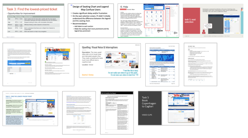
Figure 1. A sample of screenshots from 13 CUE-10 reports shows a wide variety of approaches.
But how comparable are these reports to what the participants usually do in their day-to-day work? Did any aspect of the CUE-10 study change the way teams created reports? The 13 teams who completed a survey about their CUE-10 reporting said their reports were, on average, 61.5% similar to their usual reports (median = 70). Some restrictions specific to CUE-10 affected a few reporting choices for some participants. For example, as each team conducted only three sessions, some CUE-10 teams left out more quantitative information that they might have included with a larger participant sample.
Other CUE-10-specific factors that may have affected reporting choices include the following:
- working alone
- fixed session length
- fixed order of task
- a requirement that the reports be anonymous
- an audience of peers instead of a client
Finally, and perhaps most critically, the explicit focus of the workshop was moderation, not reporting, and some participants allocated their available time for this extracurricular activity accordingly.
And how representative are the reports for the field as a whole? Acknowledging that no set of 16 people can fully represent the entire population of UX practitioners, the teams do exemplify multiple segments of the profession. The CUE-10 Call for Participation specified that “participants must have at least two years of relevant, practical usability experience. They must have moderated at least five usability tests. We will consider a limited number of applications from people who have less experience, including students.” Indeed, there was one student group, and the other participants had from 5 to 40 years of experience. CUE-10 participants included practitioners from medium-to-large companies, institutes of higher education, and consulting firms of varying size. Some primarily had design rather than research experience.
Methodology
Besides participating in the CUE-10 activities and submitting our own reports for that effort, we reviewed in detail all the reports submitted by the other teams. Danielle analyzed the components and style of each report, setting up a spreadsheet (Figure 2) to compare the reports. Carol conducted a qualitative review of the reports, documenting “style” issues ranging from the use of internal industry jargon to document/presentation design, variations on how to count findings (for example, percentages, numbers, or more general categorization of “some, many, most”), inclusion and placement of positive findings, and presence or absence of next steps.
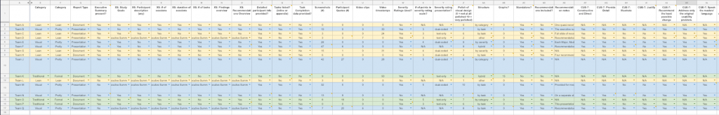
Figure 2. A portion of the report analysis spreadsheet shows the categories of analysis used.
We surveyed the other CUE-10 participants about how their CUE-10 reports are similar to or different from their typical reporting practices. Questions included, “Overall, how representative is your CUE-10 report of your usual reports?” and “For which audience (e.g., fellow participants or Ryanair client) did you write the CUE-10 report? How did this affect your reporting choices?” We also completed the survey, bringing the total number of responses to 13 of the 16 participating teams. We then interviewed five of the teams for 20–60 minutes each, during which we discussed their report and survey responses and any observations they had about other teams’ reports.
Analysis and Observations
Of the 16 reports, we concluded the following:
- Seven were document-style (for example, Word), and nine were presentation-style (for example, PowerPoint, Keynote).
- Eleven included an explicit executive summary; five did not.
- Eleven included detailed participant information; only two (your co-authors) included the participants’ first names.
- Four included the tasks verbatim, either inline or in an appendix.
- Nine included task completion data.
- Fourteen included screenshots. Overall, the number of screenshots (including screenshot fragments) ranged from 0 to 47 (mean = 14.7, median = 8.5).
- Eight included participant quotes. The number of quotes ranged from 0 to 27 (mean = 5.6, median = 0.5).
- Eleven used some kind of severity rating scale. Of those eleven, the number of points in the scale ranged from 3 to 6 (mean = 4, median = 4). Of those eleven, six dual-coded the severity presentation with both color and text, and five displayed severity findings using text only.
- Seven structured their findings by task, while three used a category-based structure and two ordered things by severity. Three reports used structural styles inconsistent with any of the other reports. One specifically said theirs was “an unordered list of the most significant problems.”
- Only three reports contained graphs. One contained 15 graphs, and the other two used one graph each.
- Nine reports included recommendations, none of which included a visual rendering of a proposed change.
- Five reports used some kind of jargon, such as “Gestalt principles” or “affordance.”
- Only two reports used embedded video clips: one had 6, and the other had 7. Five other reports included timestamps of relevant video. These counts were much higher, ranging from 24 to 50 (mean = 32.6, median = 30). We heard from one CUE-10 participant that he only included timestamps because the report was for a CUE study, and we speculate that this is an issue for which the workshop environment was particularly impactful.
Discussion
Overall, we broke down the CUE-10 reports into three main categories: We are calling them “Lean,” “Traditional,” and “Visual.”
Lean
Six of the 16 CUE-10 reports fell into this category. The Lean reports were minimalist in nature. They typically provided little to no context about the study itself, instead going straight to the core findings and recommendations. These reports might take the form of a document, presentation, or even a team email. A lean report might include a few screenshots or participant quotes if they are particularly illustrative, but such features were not prevalent. One CUE-10 participant with a lean reporting style described it as “basically meeting minutes from the team debrief about the study.”
The main advantage of this reporting style is the conservation of time and human resources that would have been allocated to more robust reporting. The main disadvantage is a lack of context and repeatability—a stakeholder who reviews the report later would not be able to make much sense of it. These reports also lack the “thud factor,” which is beneficial when there is a need to impress upon management that the value of the work is commensurate with the money they spent to have it done.
Lean reports seem best suited for collaborative cultures in which the practitioner and project stakeholders work closely together throughout the study and stakeholders are actively involved in attending sessions and discussing their observations. Done well, these reports can also provide just enough information for people familiar with the project or product but who were not intimately involved in the study. Finally, use of a Lean report requires an environment without rigid documentation requirements.
Traditional
Three of the 16 CUE-10 reports were Traditional reports. Unlike Lean reports, the Traditional reports were comprehensive and detailed. In addition to detailed findings and recommendations, these reports include a great deal of meta-information about the study itself, such as participant breakdown and dates and location(s). They are rather text-dense and tend to include as much quantitative information as was appropriate to gather in the study. The ISO 25062 Common Industry Format might be considered the gold standard in Traditional usability study reporting. The three Traditional reports in the CUE-10 study were inconsistent in the degree to which they used screenshots and participant quotes, but they all included an executive summary and used a rating scale to indicate the severity of each finding.
The potential benefits of Traditional reporting include study repeatability and reduced liability risk. The downside, of course, is that these reports take a considerable amount of time and effort to create. As such, the effort is difficult to justify in many cases. One other possible and serious disadvantage is that all of this effort will be wasted because people tend not to read them thoroughly.
Traditional reports are most appropriate in situations that call for reliable documentation or extensive rigor. One example would be a regulated industry like medical devices, in which a company must demonstrate to regulatory authorities that they completed a valid and thorough study of their product. Another might be a high-risk industry like air traffic control, in which there are legal risks associated with not being able to prove that a company studied their product accurately and thoroughly. These may also make more sense for summative evaluations than they do for formative evaluations.
Visual
Seven of the 16 reports were Visual reports. These are characterized primarily by their visual design. These typically provided some context about the study—though not usually as much as a Traditional report—and detailed explanations of findings and any recommendations. These tended to include more screenshots and participant quotes (26.9 vs. 5.2 and 9.6 vs. 2.4, respectively, compared to the Traditional and Lean reports combined). Graphic styling is often added to such components as severity ratings, participant quotes, or recommendations, to distinguish the various parts of the report.
The same way visual design is the most important aspect of establishing website credibility and thoughtful plating makes food taste better, a nicely packaged report may have a positive effect on stakeholders’ consumption of it. These reports, however, also take considerable time to produce, though templates tend to make the process more efficient.
Visual reports are valuable when a practitioner needs to command and hold attention more easily, especially in a world where our short attention spans and people’s expectations of visual polish are the norm. Visual reports are also useful if there is a need to present findings to higher levels of management. Most of the CUE-10 participants who used this kind of report have past or present experience working as third-party consultants. (Full disclosure: The co-authors both submitted reports of this type for CUE-10.)
Other Thoughts from Participants
In their interviews, some participants indicated they do vary their report type depending on the specific circumstances of a study. And while participants indicated they might incorporate a few details from other CUE-10 reports into their future reporting, they maintained their overall reporting style was appropriate and that they would continue to use it. One participant went so far as to say he felt like he should do more evangelizing within the industry so people would use the lean reporting style more frequently.
Summary
So, what do these findings tell us? You may be shocked to learn that “it depends.”
Do you work with a truly involved, participatory Agile team that tests frequently and understands what usability testing is all about? Go Lean.
Do you work in a highly regulated industry? Is there a reasonable chance there might be a lawsuit suggesting the product makers were negligent with regard to usability in a way that caused serious harm? Do you have some concrete, summative data to communicate? Then a Traditional report is for you.
Does your report need some design polish to be better received? Visual might be the way to go.
In any case, what we learned in our review of these reports is that there are trade-offs between time investment and robust reporting, including particularly time-consuming aspects of report writing and design. In reviewing our colleagues’ reports and surveying and interviewing them to understand their report writing rationale, we concluded that there is no one “right” way to compose a usability study report. As with so many UX situations, it depends.
Thanks
The authors would like to thank Steve Krug and Chauncey Wilson for their constructive criticism on a draft of this manuscript.