Monash University in Melbourne, Australia is committed to creating both usable and accessible websites and applications for both students and staff. To achieve this end, Monash has an in-house usability and accessibility team within the university’s web center, which I manage. We work with staff within the university, as well as external contractors, to ensure that websites and applications we develop are both user-friendly and accessible.
In late 2006, Monash University received a complaint from a student who could not complete an Adobe PDF form. This form was to provide evaluation and feedback about the subjects the student had completed that semester. As a student with a disability, the student had access to the Disability Liaison Unit who could assist her in completing the unit evaluation form. However, as the student pointed out, this required her to disclose her disability, which she thought was unfair. It is a common misconception that disclosing one’s disability will lead to further discrimination.
We initially tried to solve the problem by evaluating external products, but we quickly found that there were no external products that could provide both the required level of usability and accessibility and the backend features we needed. We quickly made accessible HTML forms specifically for the student, which gave us a single semester in which to come up with a solution.
The team was drawn from the three units involved:
- The Centre for Higher Education and Quality (CHEQ) at Monash University, responsible for the delivery of student unit evaluation forms at the end of each semester.
- The Flexible Learning and Teaching (FLT) area within the Monash Information Technology Services division.
- People from my team, the ITS Web Centre, Usability and Accessibility Services at Monash University.
The Original Form
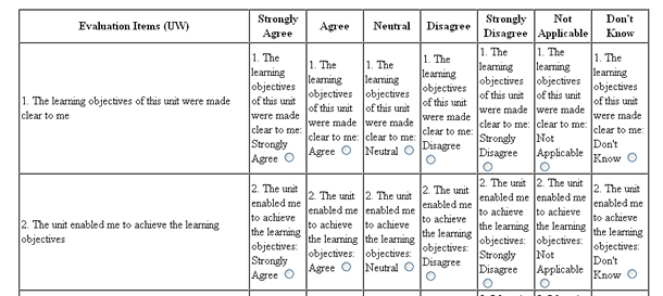
The original form was in Adobe PDF. There were different versions for different academic units. Each form had an entire page of instructions, followed by two pages of a complicated layout of questions and answers. An example of this is seen in Figure 1.
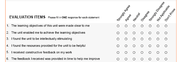
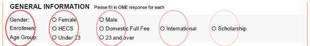
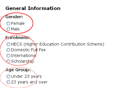
There were between fifteen and twenty of these questions within each type of unit evaluation form. In addition, although the form was anonymous, general demographic questions were also included (Figure 2).

Usability and accessibility of the original form
Usability and accessibility are not the same things, however they often overlap. Because the starting point of this project was an accessibility complaint made by a student, we started by concentrating on complying with the W3C Web Content Accessibility Guidelines, Version 1.0.
However, with such a complex form, usability must play a role in the accessibility of a form. The W3C has acknowledged that they cannot properly address the issues faced by people with cognitive disabilities, and it is in this area that usability becomes mandatory when developing accessible applications. Often the best way to make a site accessible to people with cognitive disabilities is to make it usable.
The initial form had been built in a non-W3C technology (PDF). Even if the PDF form had been tagged properly—which it was not—and all possible accessibility features in Adobe Reader switched on, the form would still have been deemed inaccessible according to the W3C Web Content Accessibility Guidelines, Version 1.0.
In addition to the form being inaccessible, the form contained some obvious usability errors. For example, grouping of the General Information was problematic (Figure 3).
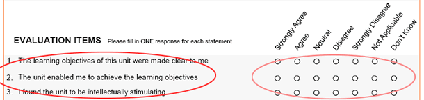
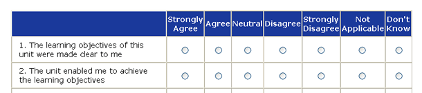
Grouping was also problematic in the morecomplex questions (Figure 4).
The Accessible Form
When building the unit evaluation form application, Monash University aimed for compliance with Level AA of the W3C Web Content Accessibility Guidelines, Version 1.0. However there were additional accessibility features added to the final form.
The accessibility features can be broken down into the following categories:
- Information
- Labeling
- Layout
- Interoperability
Introductory information
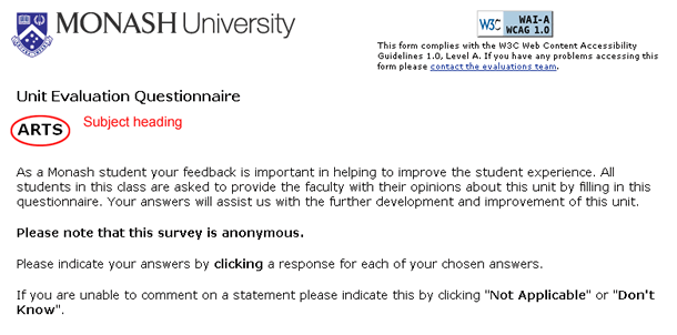
We started by tackling the entire A4 page of introductory information (Figure 5). The form heading was overly complicated, displaying a unit code instead of a more appropriate subject name. White space was not utilized effectively. Some information, such as how to fill out the form, was extraneous, and in other instances it was given too much prominence, as in the privacy statement.

We drastically cut the introductory information, including replacing the unit code with the subject heading. We opted for a much shorter, more welcoming introduction and moved the detailed privacy information to the end of the form. We also added contact details in case a student needed help with the form (Figure 6).
Labeling
The general information area was easy to deal with: we simply grouped the field and field labels so they looked like they belonged together (Figure 7), and coded field labels using the FOR and ID tags to achieve the same effect for people who are using screen readers.
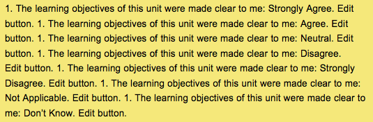
The complex questions posed more of a problem. Visually, they worked reasonably well. But when we looked at them from a screen reader’s point of view, they fell apart.
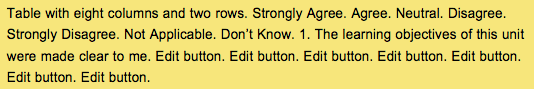
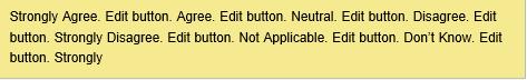
Screen readers operate in “forms mode” when encountering a form. With forms mode on, the screen reader would say “Edit button” ten times when dealing with Figure 8. Even if you toggle forms mode off (and most users don’t do that), it’s only slightly better (Figure 9).
One obvious solution was to use TH ID and TD HEADERS to mark up the table. The screen reader would then read the relevant header
(“1. The learning objectives of this unit were made clear to me,” and “Strongly Agree”) immediately before reading the content in the relevant cell.
But this doesn’t work in a form. In forms mode, a screen reader reads only the field label of a particular field—but not the questions. So even using TH ID and TD HEADERS, all you would hear would be the text shown in Figure 10.
We solved the problem by incorporating the specific question into each and every field, and then hiding it from our visual users by using style sheets (Figure 11).
The screen reader now reads it like Figure 12.
Layout
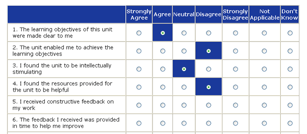
The original PDF form asked users to deal with a big blocks of questions. It was easy to lose your way when you got past the first few in each block (Figure 13).

In the HTML form, we gave prominence in three ways:
1. Giving each radio button more space and a border (Figure 14).
2. Highlighting the current row.
3. Leaving a darker highlight behind as the user chooses an answer (Figure 15).

We created these effects using JavaScript. We thought hard about it because the code is not W3C-compliant, but we decided that because it enhances functionality, as opposed to providing additional functionality, it was okay.
Interoperability
The original Adobe PDF form could not be used with the keyboard. It was also necessary to click exactly on the button in order to activate it. These buttons were only 14 pixels wide by 14 pixels high (when the PDF form was set at 100 percent). People with physical impairments such as arthritis or Parkinson’s disease have trouble using a mouse, so the form would be essentially inaccessible to them with buttons so small.
The HTML form provided large buttons as well as the ability to click almost anywhere within the bordered cell to activate the button (Figure 16).
The Benefits
There was an unexpected benefit: the new backend process was much easier to use than the process for creating the old Adobe PDF forms.
Previously, each unit evaluation form had to be created individually, and up to 3,500 forms were created. Each form also needed to be uploaded to the web and then downloaded between one to several hundred times by the students enrolled in the course. On average, approximately 25,000 forms were completed each semester.
We rolled out the new forms to all Monash students in December 2007. They were very well received by the students. The new forms were automatically generated using information about the student when they logged on. This reduced the number of forms that needed to be created from 3,500 to twelve—one for each faculty. The backend would then automatically fill out the unit code, location, and campus.
Help desk calls for the original PDF forms averaged 150 calls per semester, and each call would take approximately a half hour. In the three semesters that the new unit evaluation forms have existed, there have been no help desk calls for the evaluation forms.