Zoll Data Systems makes a touchscreen electronic medical record program for fire and rescue and Emergency Medical Services (EMS) professionals working in the field. Their previous version was outdated and difficult to use. When the company followed a user-centered design process for the first time, the new version fixed a number of critical usability issues and resulted in an extremely successful user experience and a financial success for the company.
The software runs on Windows-based touchscreen tablet and notebook computers. The previous version was successful, but was built on old architecture and technology. The interface was an old-style Windows desktop application, with no workflow. It was not conducive to touchscreen use in emergency vehicles by users wearing gloves and caring for patients, often with severe medical situations.
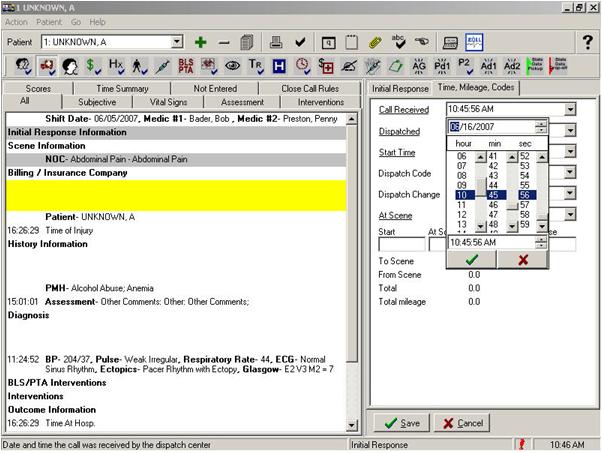
The previous user interface (shown in Figure 1), used standard Windows desktop interface elements that were inappropriate for a touchscreen interface. Many of the interface elements were difficult to use. For example, there were over thirty icons in the toolbar, making it difficult to remember the functionality associated with each icon. Two rows of small tabs also made it awkward to navigate through the interface, especially using the touchscreen. The text area was also very small. Finally, many non-standard, custom controls were created for common data-entry UI elements, such as dates and times. These custom controls caused many usability problems.
Phase 1 – Field Observation and Requirements Gathering
As a usability consultant, I acted as usability team lead for the new user-centered design process. We started by collecting functional and usability requirements from existing and new customers and users. The project manager and I rode in ambulances and fire and rescue vehicles in Florida and Texas for four days. We observed EMS and fire and rescue professionals using the product in the field, and gathered their feedback on the user interface. The results from this phase were used to further refine functional and user requirements.
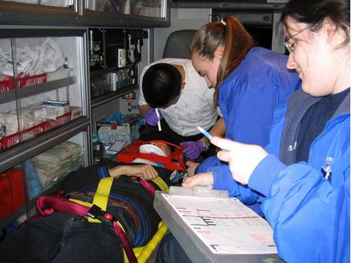
One key observation was that a large number of EMS and fire and rescue professionals, like many others in healthcare fields, are not comfortable with computers and electronic data collection. Their primary role is to care for and transport patients in emergency situations. Many are used to using paper documentation rather than electronic data collection systems (see Figure 2). This observation led us to define additional user requirements regarding training, intuitiveness, and directed workflow navigation.
Phase 2 – Interface Design and Prototyping
The project’s design phase involved iteratively creating and reviewing conceptual and functional prototypes. We also achieved tremendous end-user input and involvement through conferences, blogs, and design reviews. The new design incorporated these key interface design and usability concepts:
- System-driven UI for common tasks (wizard). The new design allows users to enter data in a customer-customizable, field-level and screen-level workflow. Users can also navigate the UI independent of the workflow.
- Auto-advance to the next field or screen when appropriate for tasks. Single-selection fields allow users to enter data and to quickly and automatically navigate to the next field or screen.
- High-contrast color palette (for daylight use). We conducted extensive research on interface design colors, fonts, and contrast for use in extreme indoor and outdoor lighting conditions.
- Buttons, icons, controls, and selectable items are large enough for easy touchscreen access.
- All list selection is made using large-font lists with custom scroll buttons (no drop-down lists). All lists are displayed with large, selectable targets. Large scroll buttons allow page up/down and top/bottom of list navigation.
- Data entry can be delayed until a more convenient time. A customizable “Quick Log” screen allows medics to time-stamp procedures with one click. Then, at any time, users can go back and complete the required information for each entered procedure.
- Immediate validation with hyperlink to error fields. When a patient record is completed, a validation screen displays a list of errors or incomplete fields. By clicking on an item in the list, the user is taken directly to the appropriate field for action.
- Configurable screens and a database-driven UI.
Phase 3 – Final Product Design
After prototyping each functional area of the application and each type of documentation data entry, we turned the prototype and a functional specification over to the development team. As the usability team lead, I worked closely with the developers to review the application interface and interaction as development progressed. We also asked existing customers to review the new application as it was built.
After market introduction, the new product has been extremely well-received by customers and users. Two years of user and business feedback shows that the return on investment (ROI) for the company has been tremendous.
The product has received rave reviews and exceptional user acceptance. Training time and costs have been greatly reduced, which is a major selling feature for products in this field where there is high employee turnover. Training time was reduced from one week to three hours. One large customer could not get a competitor’s product up and running for a year. With Zoll’s new product design, the customer went “live” in two weeks without any training.
The interface redesign project cost approximately one million US dollars. Within two years, the new product design enabled the company to gain new and larger clients. They doubled the product’s customer base, more than doubled the number of licenses, and more than tripled the product’s revenue for the company. This success also allowed Zoll to increase the product’s price and offer additional product modules that contributed to the overall product revenue.
While usability improvements often improve a product’s acceptance, the company actually closed many new deals specifically because of the product’s usability and user interface.
Because of the success of this project, new major products or product redesigns within the company follow the user-centered process described here, and incorporate ongoing end-user involvement.
The Evolution of the Design
1. High-level screen layout and navigation area prototype
The new design introduced a new page layout with navigation areas designed to provide consistent and intuitive button location and interaction, while maximizing the main work area of the application.
- Top-level navigation buttons across the top
- Sub-section buttons displayed down the left side
- Application navigation to the inbox and to major actions, such as completing a call, accessing the Quick Log, Scratch Pad, and Options on the bottom of the screen
- Page navigation in the bottom-right corner
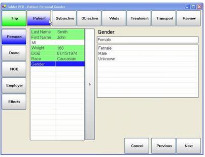
2. Prototype screen for specifying the patient’s gender
The vertical area in the left on the main area displays a summary of the data fields in the particular section.
Color highlighting helps users see the status of the data.
- Green fields indicate already entered data
- White shows fields that had not been entered
- Blue highlights the current field.
Selecting a value for the field automatically advances to the next data element in the workflow.
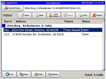
3. Inbox Screen
The first screen shown after logging in displays the Crew’s Inbox, detailing a list of their current assignments.
Double-tapping an item or pressing the Open button opens that patient’s documentation screens.
4. Data Entry Screen
In this typical screen, the user is filling in the name of the state where the patient was picked up. A list may default to the appropriate state if the company works in one state. A long list, such as state, displays an on-screen keyboard for users to enter letters to more quickly navigate than using the scroll bar area.

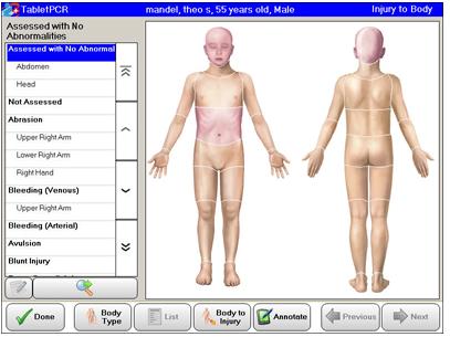
5. Graphical Body Navigation
Users were most excited about the new design’s use of body illustrations for graphical assessment, navigation, and selection. Users can touch a specific body area to navigate further or to select that area.
6. Body Type Selection Screen
Users were able to select the appropriate body type for their assessment. Touching the Body Type button displayed a pop-up window showing male, female, child, and infant body types.
