Augmented reality, or AR, is becoming mainstream. Sources from TechCrunch and ABI Research to Business Insider state that the industry of AR and VR (virtual reality) combined will reach more than $100 billion by 2020. Key players like Google, Microsoft, and Apple are making major investments in AR technology. Earlier this year, Apple introduced an iOS Dev toolkit called ARKit at the Apple Worldwide Developers Conference. Just one year earlier, Apple CEO Tim Cook foreshadowed the likelihood of AR’s ubiquity:
“I do think that a significant portion of the population of developed countries, and eventually all countries, will have AR experiences every day, almost like eating three meals a day. It will become that much a part of you.”
What Is AR?
But what is augmented reality? Perhaps the most common image that comes to mind is of Tom Cruise in the 2002 movie Minority Report. He’s standing in front of a large screen, looking smart, waving his gloved hands around, and manipulating hundreds of small pieces of information in front of him. This provides a helpful illustration of information layered onto reality that can be manipulated through some sort of technological element. But what does that really mean?
Merriam Webster’s Dictionary defines AR as “an enhanced version of reality created by the use of technology to overlay digital information on an image of something being viewed through a device (such as a smartphone camera).” Similarly, the Oxford English Dictionary defines AR as “a technology that superimposes a computer-generated image on a user’s view of the real world, thus providing a composite view.” These definitions both emphasize an experience with technology over an experience with the world and other people in it.
Even Wikipedia describes AR as “a live direct or indirect view of a physical, real-world environment whose elements are ‘augmented’ by computer-generated sensory input such as sound, video, graphics or GPS data.” This definition does include ideas about “a real-world environment,” but it’s still largely a tech-first definition.
The challenge with tech-oriented definitions is that they tend to keep the tech at the heart of the matter and neglect the people, or end users. As a result, applications are driven by what kind of technology is available for an AR-enhanced project, rather than being driven by the type of human experiences we want to create through augmentation. To resolve this, we need to bring user experience (UX) more prominently into the AR conversation.
Toward a Human-centered Definition of AR
First, we need to reframe the definition of AR away from its technology alone and toward a human experience. Simply put, we define augmented reality as “a human experience with the world that is enhanced by technology.”
Now, this definition could be applied to a lot of things that we’re all used to working on, not just AR. But that’s also our point. AR is a means to an end, not the end itself. AR should be less about technology doing things to people and more about people engaging with the world around them, and having that world enhanced by technology where and when appropriate.
In the sections that follow, we break this idea down and describe methods for focusing on a human experience. We then provide a set of design principles to consider when designing layers onto the real world. We conclude with a summary of technological considerations to engage with once the people and places of the experience have been sorted out.
Focusing on a human experience
The first part of our revised definition is about “a human experience” because we want the end user to be front and center. So, let’s talk about people and the kinds of research we need to do in an AR context.
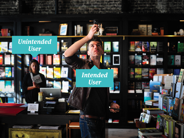
We need to apply user-centered design when it comes to AR, rather than technology-driven design, so that we don’t augment reality with a bunch of stuff no one needs. To accomplish this goal we must do the legwork to uncover the latent needs of our end users to decide what augmentations to layer into their world. The first step in user-centered design is to define your users. AR makes this a little tricky. In an AR context, your users are everywhere. They aren’t just the people who are opting in to use your product; they are also the people being affected by the augmented experience other people are having. These are our intended and unintended users as shown in Figure 1.
For example, consider the now famous AR game Pokémon Go. The intended users were the players, but because the landscape for the augmentation was so extensive, many people found themselves unintentionally involved in the game. People walking down the streets were bombarded by groups of players trying to catch Pokémon or find Pokémon gyms. Players were also reported showing up in cemeteries in unprecedented numbers. Though cemeteries are public places, they are typically ones of remembrance.
The experience of these unintended users attempting to engage in acts of remembrance, while also inadvertently becoming part of the landscape for game play, is an important one to factor into our design thinking. What we’re describing are not entirely new problems. Mobile phones and other pervasive technologies have shifted our social norms around what is acceptable in public places. But the augmented reality movement will exacerbate these issues even further.

Using methods that let us see
In order to inform and inspire design that addresses the needs of intended and unintended users, we need to use methods that allow us to see. Phone interviews and surveys aren’t going to do the job. We’ll need to dig up our applied ethnographic methods, which allow us to both observe and talk to people. Contextual inquiry is one of the most effective methods for achieving this goal.
Contextual inquiry is the practice of engaging with end users in their environment rather than in a lab-based setting. As the intended user engages in key activities, the researcher is also able to observe the unintended users in the environment who may be affected by an augmented experience.
Contextual methods can be expensive and time intensive, however, and since not all audiences will be accessible for direct observation, we need to balance them with other methods that let us see. Diary studies and photo elicitation techniques are effective, lower-cost alternatives to understanding both intended and unintended users within their contexts. For these methods, researchers give participants prompts to gather information about people’s motivations for use, social experiences, and environmental contexts. Researchers follow up with the participants to ask about their images, videos, and other artifacts to understand the personal meaning, value, and use of the objects and experiences within a given context.
Seeing the environments that our designs will live in is hugely helpful in any project, but it’s mission critical for AR. We need to know what it is we’re augmenting in order to truly enhance it. And when it comes time to test ideas and designs, do as much of the testing as you can out in the wild. Labs are fine for testing features and functions at a detailed level, but we need to really vet AR concepts out in the user’s world. It’s the only way to know whether we will positively or negatively affect our intended and unintended users.
Considering the real world
The second part of our revised definition is about the end user’s experiences with the world. Much like our intended and unintended users, AR experiences occur in expected and unexpected places. So we need to think about more than just our targeted use contexts. Some questions to consider include:
- Where do you expect users to experience this augmentation?
- Where else could they experience this augmentation?
- Could this experience occur with other people?
- Could users have to navigate in the real world while using this augmentation?
Designing for users in potentially public spaces adds many criteria to consider. As we examine the myriad places that users could inhabit while having an augmented experience, it becomes clear that ensuring user safety is important. If we’re going to enable users to have AR experiences out in the real world, then we have a responsibility to ensure that those experiences don’t place users in harm’s way. To ensure safety, we need to make sure that the real world is prioritized over AR content. A balanced AR experience shouldn’t supplant the end user’s perception of reality with AR.
Mediating Your Users’ Reality
AR is about mediating reality with technology. When we’re designing for people out in the real world, we must think about how much mediation is necessary to accomplish the goal of the augmentation. AR that focuses too heavily on augmentation will ultimately diminish the user’s experience with, and ability to focus on, their actual reality. To ensure that the experience uses the right degree of mediation, we need to keep a few guidelines in mind as we design, such as keeping your augmentation simple, designing for a narrow depth of field, and prioritizing line of sight.
Keeping your augmentation simple
Simplicity is an essential guideline for ensuring proper mediation. Referring back to our Tom Cruise example, he appears to be extremely adept at managing a plethora of digital screens, and that’s great for Tom Cruise. However, most people won’t be as effective at using intensive or distracting AR, especially if the augmentation involves navigation. With this in mind, it’s imperative that AR experiences avoid overstimulating users. The more an augmentation attempts to grab attention, the more users will focus on it, instead of reality.
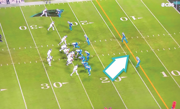
In 1998, NFL broadcast networks began applying a judicious amount of AR to televised football games, which is one of the earlier mainstream implementations of augmented reality. During the broadcast, TV viewers would see a yellow “first down” line appear on the field. The yellow line spans the width of the field, 10 yards from where the team on offense has the ball, and helps to highlight the distance that the offensive team needs to reach. The yellow line is designed to appear as if it really exists on the field, as shown in Figure 2. Its application is so subtle that many NFL viewers often forget that it’s NOT real. The yellow line is a perfect example of simplicity as an effective guideline for AR, as it achieves its communication goal without users being distracted by or focusing on it.

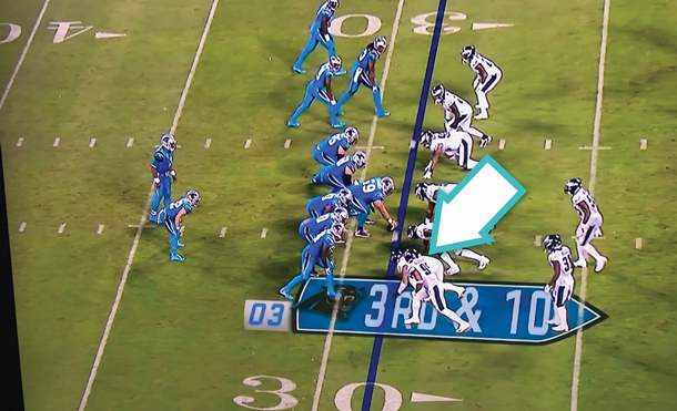
In recent years, NFL networks have expanded their AR repertoires by adding more elaborate visuals to accompany the yellow line to provide even more information to the viewer. In contrast to the original yellow line example, however, the newer AR elements are too visually complex. The unnatural depth shown in the Figure 3 example creates dissonance and distracts from the game. The AR takes precedence over reality, negatively affecting the viewing experience.

Designing for a narrow depth of field
A narrow depth of field in AR means that the augmentation will only draw focus to objects within a reasonable range. If an object in the real world is outside of the user’s natural focus, then that object likely doesn’t need to be highlighted by an augmentation. By supporting users’ natural perception of depth, the AR can more effectively integrate with reality, regardless of the location of the user. Whether the user is navigating by foot or vehicle, only displaying content within a specific range helps the user to effectively parse AR content, prioritize reality, and ensure safety.
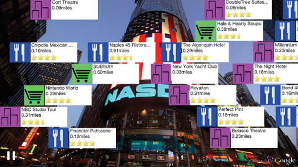
In the example in Figure 4, an Android app displays nearby points of interest (roughly three-quarters of a mile) on top of the real world. The depth of field is very wide, which has a number of significant impacts on the experience. The absence of a visual hierarchy between the points of interest makes it difficult to quickly grasp which locations are closer to the user. If the AR narrowed the depth of field, the user could parse the information more effectively, and also retain focus on the real world.
A secondary impact of the wider depth of field is the overabundant points of interest displayed on-screen. The AR obstructs the user’s line of sight, making it difficult to see the real world behind the augmentation. This example is a tablet app, but one could imagine how problematic this would be for users navigating in a vehicle, or wearing some form of AR glasses.

It’s easy to think about depth of field with a visual augmentation, one that presents layers of information within an acceptable range of the user. AR isn’t just about what you can see, though. AR experiences can leverage other senses to augment user experiences. A concept from Harman demonstrates how aural augmentation can enhance a user’s focus by employing an appropriate depth of field (or in this case, field of hearing). (Watch the video on YouTube: https://www.youtube.com/watch?v=r-d_DucmVzw). The AR prioritizes real world objects that are close to the user (in this case a train and a friend) to help ground the user in their real-world experience.
Prioritizing line of sight
When users are having AR experiences in a wide variety of places, ensuring adequate line of sight (or field of hearing) for your users is critical to ensuring their safety. Many popular AR concepts “pin” user interface elements onto the user’s view of reality, allowing them to see information contextual to their surroundings. As a broad concept for enriching a real-world experience, this sounds great. However, this content can also distract users or block them from seeing something important in the real world. Prioritizing the user’s line of sight leads to AR experiences that transmit only essential information to the user, and in so doing, helps ensure their safety.
Returning to Pokémon Go, the AR mobile game that launched in the summer of 2016, we see the importance of prioritizing line of sight for the sake of human safety. Pokémon Go encourages users to go explore outdoors and use their mobile devices to find and “catch” digital creatures. The game makers wanted to create something that inspired youth to go outside and be social. Unfortunately, it worked too well. Soon after launch, national news outlets reported on throngs of people wandering the streets at all hours of the night, distractedly staring at their mobile devices.
While the idea of getting your users to go outdoors is a noble aspiration, the makers of Pokémon Go didn’t consider all of the places that users might have this augmented experience. The method of catching Pokémon in the game requires users to hold a device in front of them, and use their fingers to “catch” a digital creature. This causes users to focus on their device (and the digital creature superimposed in front of reality) and not on their surroundings, causing significant line of sight issues for end users.
The notion of oblivious pedestrians wandering the streets is alarming. Even more alarming, however, is that the game makers didn’t realize that the game enabled (and to some degree rewarded) distracted driving practices. In a 10-day study conducted shortly after the game’s launch in the summer of 2016, the Journal of the American Medical Association reported that Pokémon Go was responsible for more than 110,000 incidences of dangerous driving practices. In the same period, other news outlets reported on 14 automobile accidents directly related to Pokémon Go.
The study concluded, “It is in the public interest to address augmented reality games before social norms develop that encourage unsafe practices.” And that’s really the point here. In these nascent stages of AR, we have a responsibility to consider the potential impacts of an AR experience before releasing it into the wild. When conceptualizing an AR experience, if we understand our user’s needs and we consider the expected and unexpected places that the AR will occur, we can ensure a safer AR experience.
To contrast the Pokémon Go example, the automaker Land Rover has a vehicular AR concept that prioritizes line of sight in an interesting way (Watch the video on YouTube). Instead of adding AR content to augment the user experience, Land Rover uses hidden cameras to make the front part of the vehicle transparent to drivers moving on rough terrain, so that they can safely navigate the environment. This augmentation uniquely prioritizes line of sight using AR to strip away, rather than add, obstructions. It may feel counter-intuitive to think about removing obstructions as a form of augmented reality, but when we focus on people and places, those are the kinds of innovative design solutions we can come up with to truly enhance reality.
Technology to Enhance People’s Lives
The last part of our revised definition is about how we enhance a user’s world with technology. This is the area that most of the literature focuses on because AR traditionally has had a tech-first orientation. Thomas Caudell, a researcher at Boeing, coined the term augmented reality in 1990 after creating a head-mounted device that projected unique sets of plane schematics onto electrical panels. Being able to quickly “toggle” between different sets of schematics helped Boeing electricians work more efficiently. The head-mounted device enhanced the electricians’ visual senses, so that they could see something they couldn’t readily see before.
Head-mounted displays have been considered a go-to technology implementation for augmented reality, but that form of technology hasn’t made much headway into mainstream public acceptance (beyond industrial or gaming contexts). When we start to think about the types of AR experiences that will become mainstream, think about technology that is readily accessible, easier to use, and connected to our senses.
AR is a sensory experience
Many AR examples focus on visual layers. However, AR is really about all of the senses, and augmenting what you can see, feel, smell, and hear.
- Visual AR. Visual AR is (perhaps, obviously) about enhancing sight. If your users need to be able to see something they couldn’t see before (like a complex circuit path in an electrical panel), or they need to remove something that was obscuring their view (like our Land Rover example earlier), then a visual augmentation might be the right way to go.
- Olfactory AR. There aren’t many examples of olfactory AR to pull from yet, but like our other senses, it’s an important one to consider. Some studies say that smell is the sense most connected to memory, so an olfactory augmentation deployed in this context could hypothetically add a lot of value.
- Touch in AR. Touch AR can be used to enhance users’ tactile experience with objects in the real world. Your users could benefit by receiving new or enhanced information through touching everyday objects.
- Auditory AR. This is really where we think we’ll see the most AR technology advances next. Augmenting people’s sense of hearing can be very powerful in applications ranging from navigation to meditation and more.
Enhancing Human-to-Human Experiences
One of the best examples we’ve seen that takes into account all of the key elements raised in this article is an auditory augmentation called Wayfindr. Wayfindr’s goal is to empower vision-impaired people to overcome isolation through audio-based navigation. The design team—a collaboration of the Royal Society for Blind Children and ustwo—started with people and took on a human-centered challenge rather than a technology-driven one. They thought about and designed for the needs of not just their intended users—individuals who are visually impaired—but also the unintended users, that is, everyone else trying to get to work in the morning at the same time.
The team thought carefully about the places the augmented experience would occur. They observed, co-designed, and prototyped in the wild of London’s Underground. They used just enough technology to mediate the experience to keep it simple and focused. They narrowed the depth of field so that navigation instructions were given at the right place and time. And they prioritized line of sight, or in this case field of hearing, without obscuring other important sounds necessary for navigating a subway station. Wayfindr tackles a human challenge with a human-centered augmented experience and won the Interaction 2016 conference’s “Best in Show” award.
Just like Wayfindr, as you encounter new projects and opportunities, start with people. Consider both your intended and unintended users. Think about the places they’re in and mediate their world carefully. Then select the right technologies to enhance the right senses. We are on the cusp of something becoming ubiquitous. And it’s on all of us to make sure we do it the right way, augmenting our reality to truly enhance our human-to-human experiences. As Steve Jobs famously said, “You’ve got to start with the customer experience and work backwards to the technology.”


